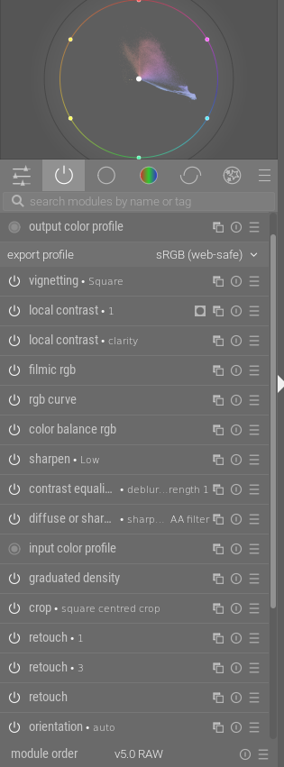
Toward the very end (i.e. at the top) there is “output color profile” that manages any necessary color space transformation required to display a result.
So even without using a tone mapper you get an image. But “you get what you get” at this stage.
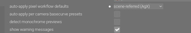
Also, if you select “auto-apply pixel workflow defaults” in preferences>processing, e.g.:
Then your selected tone mapper will be turned on at the start of editing. Remember that the workflow order is not the same as the pixelpipe, so this will always come toward the end of the pipe (but before output color profile). And you could choose to turn off the module if you want to try another approach (i.e. another tone mapper).
Edit: I am no longer certain about display color space transformation. My apologies to all for any confusion.
I didn’t try to cover everything. Remember there is “input color profile” at the beginning, and that typically most dt modules operate in the large color space Rec2020. It’s good for editing but the gamut is larger than that of an sRGB monitor.
And, as you know, I am not the expert here. But I think I’ve learned a bit over the past 6 months (my time with dt).
I don’t think so really… If you want to be that 1:1 about the scene then even when we look at it our eyes have limitations and perceptual alterations made by our brains are imparting limitations as well.
Ultimately right now we have the displays we have for digital images. They are getting better. My TV just crapped out yesterday and one model I looked at reported a peak brightness of 5000 nits… Nevertheless to view the final image it has to be presented on a display and it will be done so as allowed by the specifications of that display
The scene referred workflow is doing its best to keep the data linear and use as much of it as possible up to that point. This helps with artifacts and one would hope the best quality signal or processed data package before conversion to display… If we were to confine and edit in a display referred way for a particular display then down the road as technology improves I think the edits will be less robust.
In any case you can only go by what you can see and for the user that is their display. You still need to make some form of edit to give the data to that display to make for pleasing color, contrast etc… in that effort scene referred is a way to do those edits on the data captured by the camera in a more linear way using as much of the data as possible… At least that is how I see it…
That is an astute observation. Indeed, raw sensor data is just that, data and can’t as such be displayed. The data only becomes an image through development. There is thus no possibility of viewing a raw file without cooking it. All the “raw file viewers” really are just very basic raw developers. But by necessity, they do cook the data, otherwise it wouldn’t be visible.
In that sense, the raw developer is not lying. It is merely doing its job, transforming data into image.
Your question, however, was whether all editing shouldn’t thus be taking place in the display referred side, where the image has already been formed.
This seems intuitively correct at first glance. However, display referred editing comes with a few significant downsides:
Bright pixels have at that point been clipped to white. Their color information has been irretrievably lost, even where it existed before the tone mapper. Thus when a display referred tone curve or clarity lowers the brightness of white pixels, it can only make them grey, not retrieve their color.
Second, increasing the brightness of non-white pixels pushes them towards saturation, but without the tone mapper, they just devolve into the “notorious six” (Red, Yellow, Magenta, Blue, Green, Cyan), instead of gracefully fading into white. (Try increasing the tone curve in Capture One for a bright blue sky, and see it clip into Cyan)
Third, the previous issue also leads to color and contrast being inextricably linked. You’ll notice that changing contrast in e.g. Lightroom also always changes saturation. Similarly, saturation always changes image brightness.
This is what display referred editing solves. Contrast changes pixel brightness, but leaves saturation well alone. Clarity and dodging/burning change pixel brightnesses, but they roll off into white just as if you had exposed your photo thus from the beginning.
Of course Lightroom etc. know about these problems, and have implemented workarounds. The “luminance” tone curve includes its own little tone mapper to save you from the notorious six. They leave some internal headroom in their renderer for retrieving a small amount of color from almost-white pixels. (BTW, Lightroom is fairly good about this, Capture One and DxO are ok, too, but some others not so much. Wiggle the tone curve too much in some of them, and they can break quite nastily)
Having used Capture One and Lightroom (and display referred Darktable) for several years before I came to Darktable, I can tell you from experience that many editing tools simply work better if they operate scene referred, and that their scene referred nature does not make them feel any different. After all, image formation in the tone mapper is a natural part of raw development, and Lightroom’s Exposure and Highlights don’t feel out of place just because they come before the tone mapper.
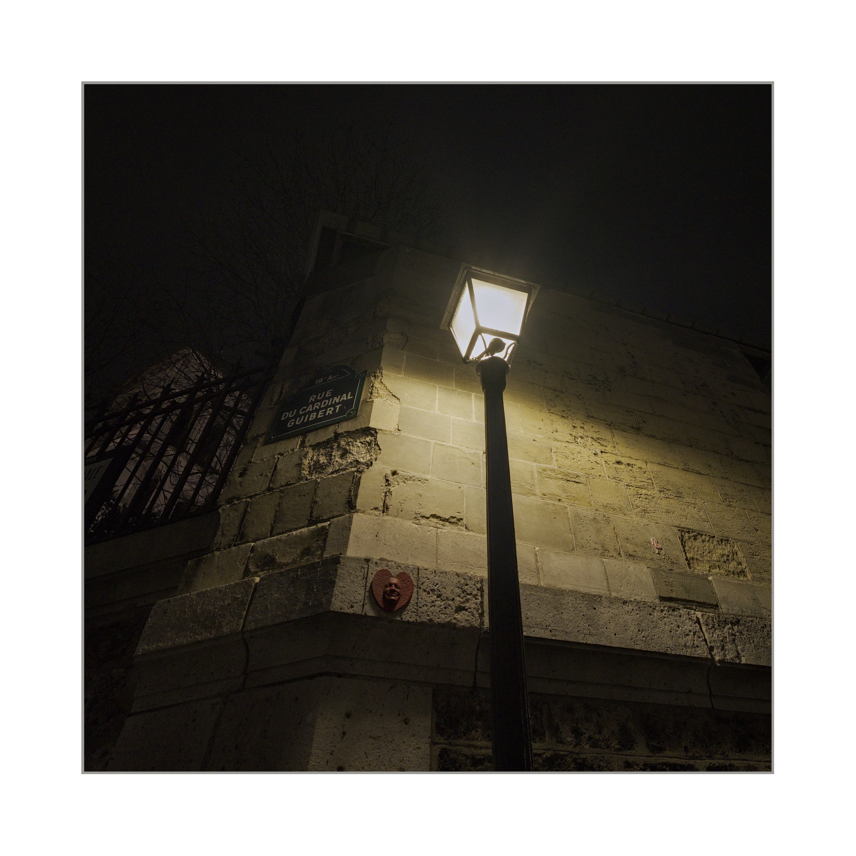
Two men are standing under a street lamp in the park at night:
M1: “Are you looking for something? Can I help you?”
M2: “Yes, I lost my keys.”
M1: “Do you remember exactly where you were standing when you lost your keys?”
M2: Points to a darker spot in the park.
M1: “Then why are we looking here?”
M2: “Because there’s no street lamp there.”
If only there was someone who could make this lamp mobile…
I, for one, am not looking forward to ever brighter displays. I find viewing images on current displays unpleasant enough, too bright and painful on the eyes in the highlights; the last thing I want is to see is backlit monitors becoming even more aggressively bright. I know lots of people love the vividness of highly contrasty and saturated images, but not me. I like my prints with dull and flat higher tones
I recently purchased a Spectra 6 e-ink photo frame called the Reflection frame. It’s a neat piece of kit, no subscriptions or anything, just a simple phone app that you load images into, then tap your phone of the corner of the photoframe to upload.
e-ink has limitation, the most important from my perspective being that just like B&W kindle screens, the brightness of the background screen is poor, quite dark and dull, which limits the maximum highlight tone to somewhat below what I would like to see. I believe the contrast range of the current tech is limited to about 1:30 and it would be better if it could be boosted to 1:100 or so, IMO. Nonetheless, in good strong daylight I find it quite effective with the right image and much more print-like than any backlit monitor.
I don’t know how far they can take this tech, at the moment I think of it as “promising” rather than general purpose, but I very much like the direction of travel rather than where we are going with backlit monitors into ever more HDR.
e-ink in strong daylight looks pretty good to me, even if the tech isn’t quite there yet. A couple more iterations and it may genuinely be able to standalone as an electronic version of a print.
I just wanted to thank you for your patience and hand holding (or nose holding, as I very much needed to be dragged along) in explaining the tone mapping modules and persuading me to see how I could profitably use them.
I have now rebuilt my personal workflow around the concept of using the exposure module as the first step, getting the mid tones to where I think they need to be, and ignoring any effects on shadows and highlights, then switching on AGX to get those tamed.
I’ve edited 20 or 30 images now using this approach and I’m finding myself comfortable with it, and that is had created no new issues at all and I can use it just as speedily (perhaps more quickly) than my previous workflow.
The most negative thing I can say about the AGX-based workflow is that it makes no difference for some images, which is an excellent result - introducing new stuff and finding it makes things worse can be soul damaging! This means I can just routinely use it without worrying about anything.
I’ve already seen some examples of where it is helping, particularly in controlling bright highlights that my previous workflow could struggle with. I’m looking forward to gaining more experience with the new approach and perhaps in time starting to explore some of the tweaking possibilities that exposing the tone compression step to user control provides.
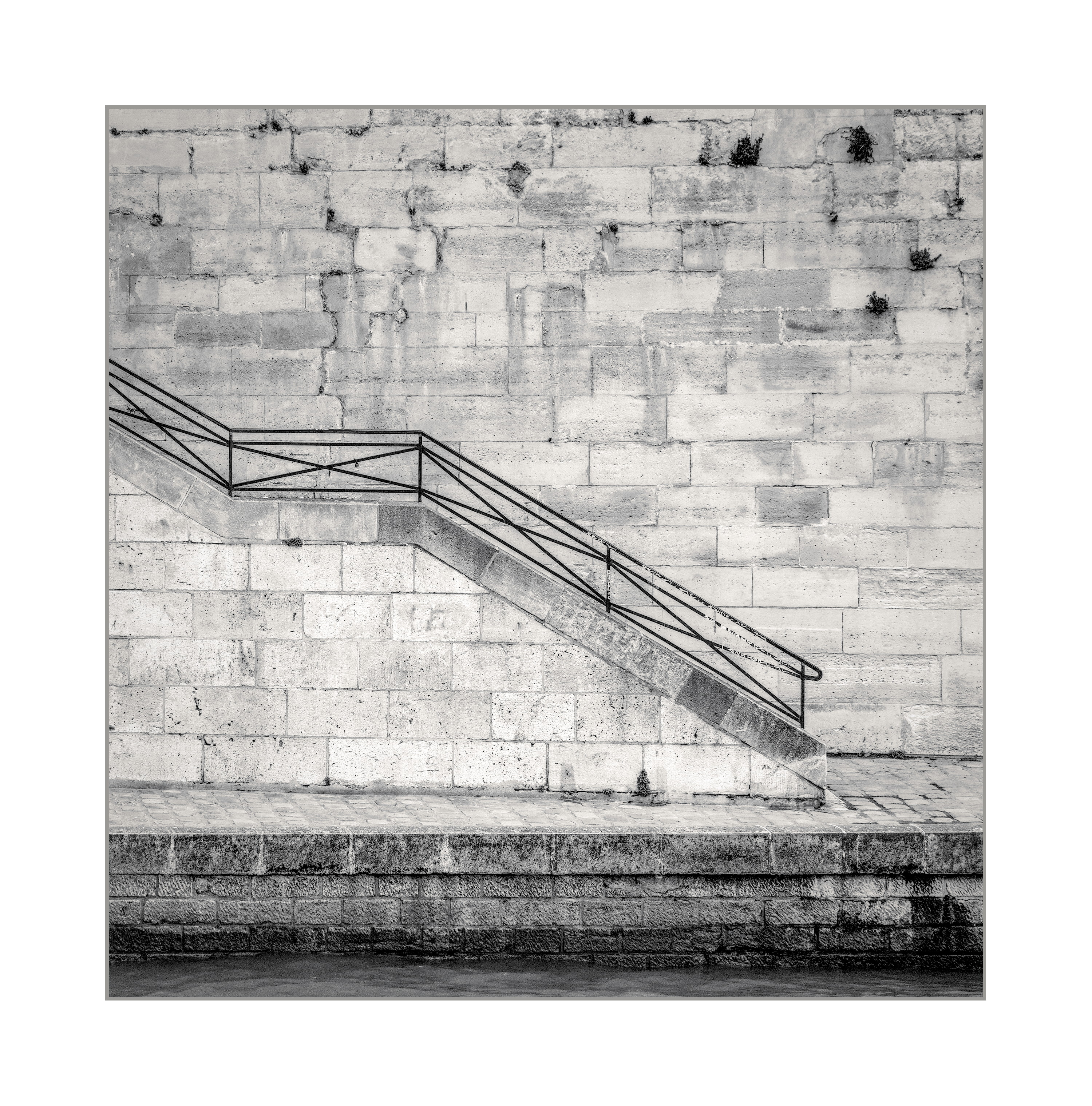
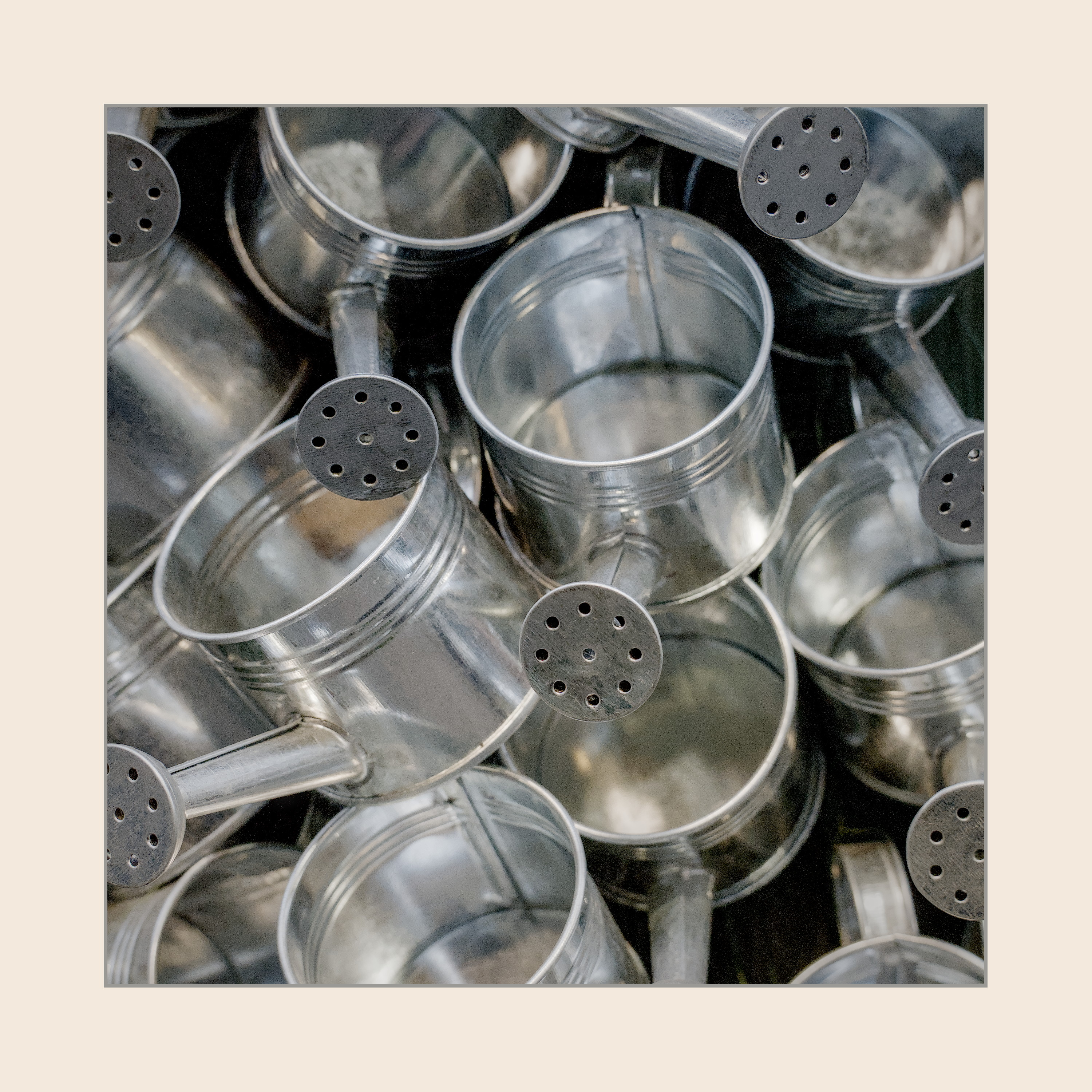
I’ll post some sample images edited with the new workflow just to prove it works
I’m often happy to take a back-to-basics, beginners’-question-time look at things, especially in this whole imaging processing area, where my understanding is, at best, shallow.
One thought floating around my head as this conversation has progressed is that the image I see in front of me is always, from beginning to end, limited by my display’s capability.
Q. So what difference does display/scene referred make?
A. As you push those sliders around, nasty things are much less likely to happen if “the maths,” the cooking, is being done in scene-referred.
Something nasty might have been called “artefacts.” But… I think I’m getting the point, as others have covered the same though process.
It is the same with televisions. With two excellent TVs side-by-side, some (maybe most) people will choose the garishly bright, over-saturated LCD model, while I will always choose the OLED model that the others say is “too dim”.
It entirely depends on your room: in a bright room, you need a bright display. A room with an un-blockable window, for example, or an ergonomically lit office. Make sure to get a display with as good an anti-glare coating as you can get.
In your own home theatre room, go for the dark display, and look for the darkest black point you can get.
IMO, it comes to the intent. In the case of the TV, I try to make it as realistic color as that I see naturally around me. In photography, What is the intent? Is it to make the screen look like the images printed on a paper (Artistically or otherwise)? Or is it what actually the photographer saw (or felt) at the time of capture?
Then, also the philosophical argument arises. A perticular color one individual sees could be different than the other person. A extreme case of it that would come to my mind would be the color blindness in some part a population. On top of that, there will a variation of it that depends on the race and environment.
So what is Red? is what I see as individual in daily life or the interoperation of it on the paper, or the screen? Is the screen a TV or my phone? – and not lets add the age to the mix.
I am sorry if I sound like I am babbling. But these are the questions
that I ask myself.
This is such a rewarding outcome to see from your participation here. Your edits in the next post are also very nice. It is good to have an open mind especially when it comes to darktable. There are so many possibilities and so many different ways to do stuff here. The beauty and the curse of DT, but I see it only for its beauty.