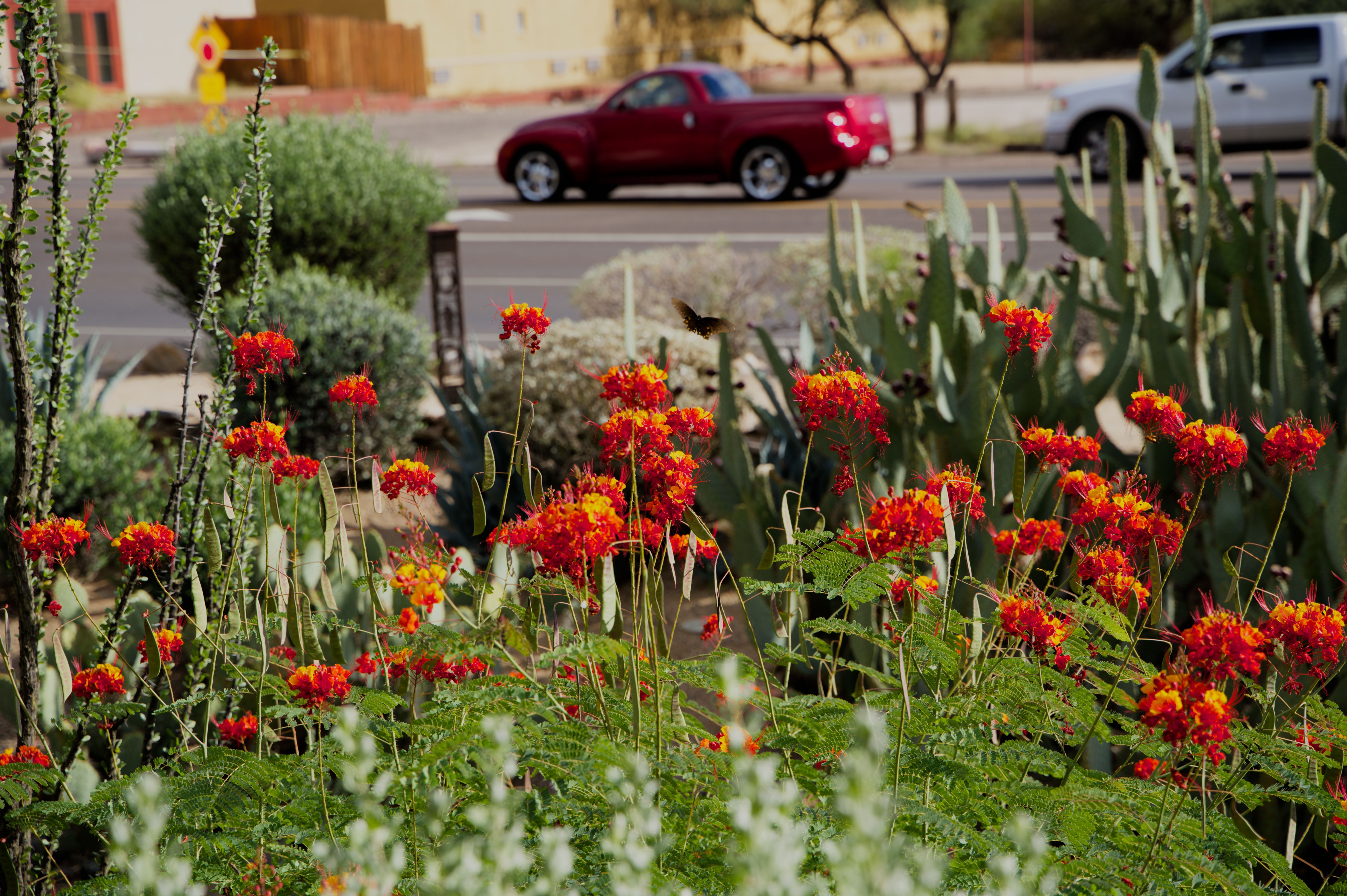
I need to report a certain progress. After learning basics of the scene referred workflow, I can handle most pictures no problem now. Both on my XT1 and A7C. My typical approach is, when I am not happy with out of camera jpeg, I use it as certain reference and work on raw to get to levels I want. However once a while I run into situation when I just cannot get raw to being even close to jpeg. I am attaching the mystery pictures and asking for a rescue.
Now in this specific example, getting to even basic colors seems to be impossible. Not sure if is vibrance or saturation of especially green leaves and flowers. Would appreciate a basic edit.
Are you using the default input profile from DT or your own ICC…any calibration of monitor or camera??
Also just to note…this looks like a file that DT gets the wrong raw white point…this can affect the edit…looks like DT uses 16383 and it should be
According to the metadata in your file…you could check but I think this will be consistent so you should make a preset to auto apply this value so that HLR works properly…
Thanks for the challenge!
I couldn’t get it quite the same as the jpg. Those yellows on the flowers in the jpg are classic ‘clipped’ yellows and dt doesn’t really ‘do’ those. At least with me.
What do you think?
My jpg export looked different from the view in dt… not sure why. I’m not good with colour management.
I tried changing output color profile to adobergb to try and it looks better.
Ha I thought I was asking @andy but valid also for you…if you have one you can also use the routine added to CC …it will help sort color wb and exposure based on the patches and give you a set of values that tweak your input profile to be more accurate… you can experiment by downloading a test shot from imaging resources…it could possibly even help a bit for your color but really a good daylight shot or others done with your camera to match the lighting is the best…
Thank you for all insights and edits. I need to study it further. Steven’s edit is closer and Todd’s closest (but takes several seconds on Mac M1gen1 to render). I attached cropped/combined image including out of camera:
If you want to try it you can import the preset and try it…again most accurate at 100iso and ~1EV… channelmixerrgb_Sony Iso 100 1.06 EV.dtpreset.txt (1.1 KB)
Rename before importing by dropping the txt extension…
It also happens with older models (I use an A68, for which exiftool also reports a white point of 15360). Sony puts the white point in the makerdata section of the metadata. That part is poorly (read: “not”) documented and not always fully read by the libraries involved, or dt doesn’t know which tag to ask for.
It seems that the correct white point is always 15360, so it’s easy enough to create an auto-applied preset for the “raw black & white point” module with that value (I limited the preset to my camera model, but it looks like the same preset would be valid for most or all Sony models)
Here is a 2 second edit with the new sigmoid… Auto exposure at 50% Contrast bump in sigmoid and basic color preset of CB module… dashing off but looks like it keeps those oranges and greens around where you like them…
It’s actually because they were computationally lazy and did a per-channel lookup with their tone curve. It’s a common practice, but has a flaw known as “hue twisting” - most of the time you don’t see it, but sometimes it causes weird behaviors and that’s the #1 reason why some people complain about “sony colors”
There are alternative tone curve implementations that give some of the benefits of per-channel lookup without hue twisting - I personally consider RT’s “Curve Mode” documentation to be the best description of this - Exposure - RawPedia
The new sigmoidal tone curve module written by @jandren is pretty close to RT’s “Film-Like” mode in its hue/saturation behaviors, but with some additional tweaks/improvements. To use it you’ll need to run a build that is the absolute latest and greatest dev build from git.
Ha its only one image but it might give you some hints at ways you can approach it… Its funny those greens in this image I think people love or hate… I actually tend to like them with a bit more blue/less yellow so that they don’t become fluorescent as you can see in some edits esp when people crank up the saturation… I do like your photo… only noticed the moth / butterfly while zooming in… thanks for sharing…