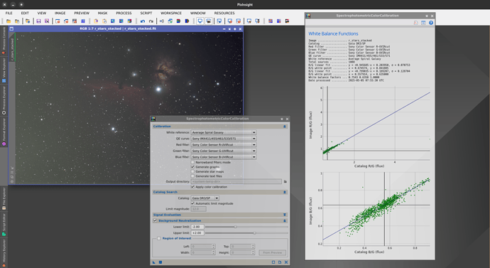
I tried SPCC in Siril and compared it to PixInsight and I have to say Siril did not do very well. As you can see in PixInsight the colors are more vibrant, there is a lot more blue and yellow in the stars and nebulosity. I used the same background extracted image for both and here Siril performed better. Always loved background extraction in Siril and it still performs great.
This is impossible to compare if you don’t provide fit results (plots at the end of the process in PI and Siril)
And the image to reproduce. Because I’ve updated something in SPCC after the beta 1 release.
This is the stacked fits file right after stacking. About 800x15s subs.
I’m off to bed right now. Tomorrow I’ll take a look. It’s funny to think that PI gives something good when you look at the fitting results which are… totally awful. It looks like it’s giving something good with a lot of luck.
It looks like in Siril you have the STF set to unlinked autostretch. That does not apply the same stretch to each channel, so I suspect the Siril result is fine but the autostretch is making the display look bad. What does it look like if you activate the chain icon at the bottom to change the autostretch mode to linked channels?
Here is a little clip showing the impact of linked / unlinked autostretch:
The unlinked looks badly matched like your result. You should use linked autostretch to preserve colour balance and then it should look right.
Damn you are right. I had it set to unlinked because it was all green. Now they look almost similar.
OK, good news.
However, I still think that the fit results shown in PixInsight are really not good. And it’s weird that it gives a good result.
OK, I’ve figured out why the fit results on PixInsight are so horrible. It’s probably because you did the platesolving under Siril and PixInsight doesn’t fully recognize astrometry, especially distortion (and this is a shame because we use standard keywords).
I advise you to do everything under PI or Siril. But not to share processes.
Thanks, good to know.
The button to link/unlink is not very clear. I never know if it is linked or unlinked. The button gets darker but I have a problem with that. Can’t you change the button so you can clearly see if it is linked or unlinked. Maybe write linked/unlinked next to the button. Do something because the way it is now is confusing.
This is how GTK handle toggle button. Sorry.
I don’t want to add text we want something small here.
Since Cyril’s comment we came up with a better way of showing the status more clearly by updating the icon and tooltip. In master the icon now shows a linked RGB chain for “linked” mode and a broken and greyscale chain for “unlinked” mode, and the current state is shown in the tooltip. Hopefully this helps.
That looks like a good solution.


