Yeah, that was my thinking. Bonus points for making “the scan” grow vertically (7m19s) as the image is processed.
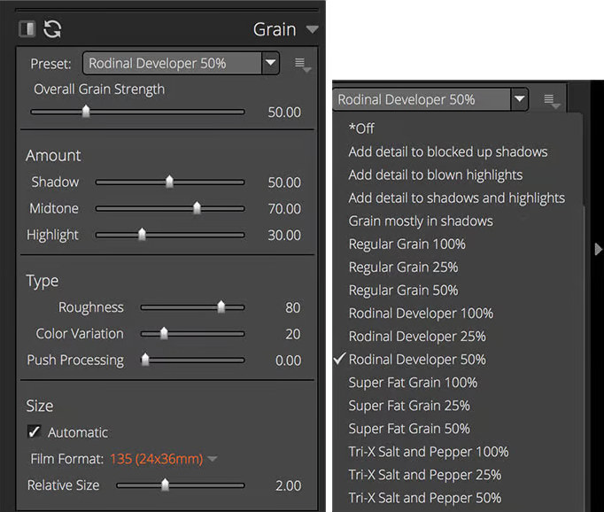
That’s wonderful! I’ve resorted to screenshot for documenting settings. Another alternative would be to embed settings as XMP metadata (like Adobe does).
Considering how far from a usable image a color negative is, there’s more than a million ways to interpret a negative if you digitize it. It was meant to be printed on paper using a color enlarger. That’s the process agx-emulsion attempts to simulate.
Ok, that makes more sense and looks better for the yellow layer!
It bugs me too actually. When thinking about the solution for this part of the modeling, it felt a bit dirty to rely on the double LUT interpolation of the density. However, this gave the best results and sounded more grounded to the chemical nature of the process.
I found this file from Kodak on 125px database, with some Q&A about Portra.
They say: "PORTRA 160NC and PORTRA 400NC Films have the same contrast and colour saturation as the previous generation. The contrast of the new PORTRA 160VC and PORTRA 400VC Films has been lowered and the colour saturation has been increased (via interlayer interimage effects). "
They suggest that the difference is based on “interlayer interimage effects” referring to the ratio of normal coloured couplers and DIR couplers in the emulsion.
I will definitely add Portra 160 and 800 in the future. On the current Portra 400 sim you could try to reduce the amount of DIR couplers (their amount is just guessed right now, and according to your perception might be to high and this is good feedback, use dir couplers amount), and you can also reduce the gamma of the print paper via print gamma factor for tuning contrast (also affects saturation).
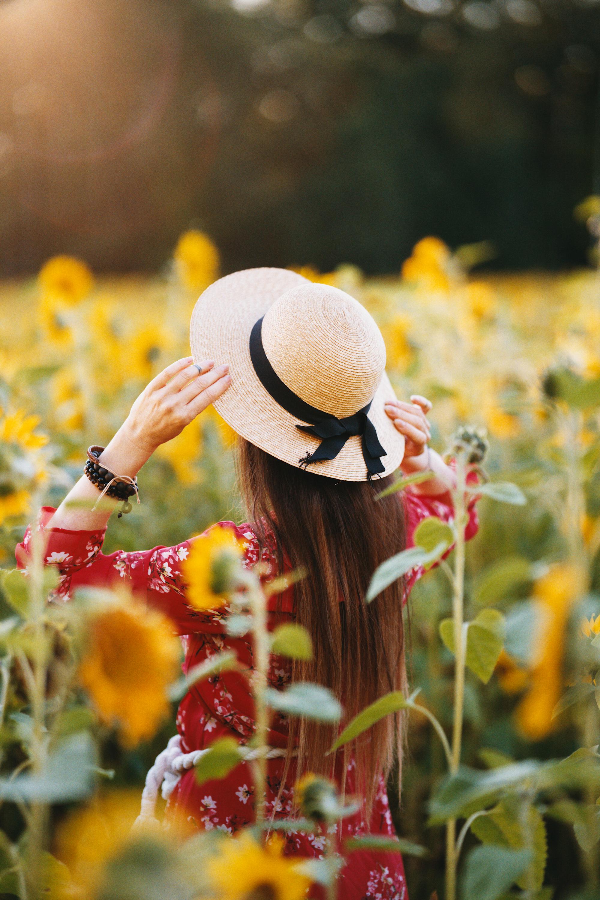
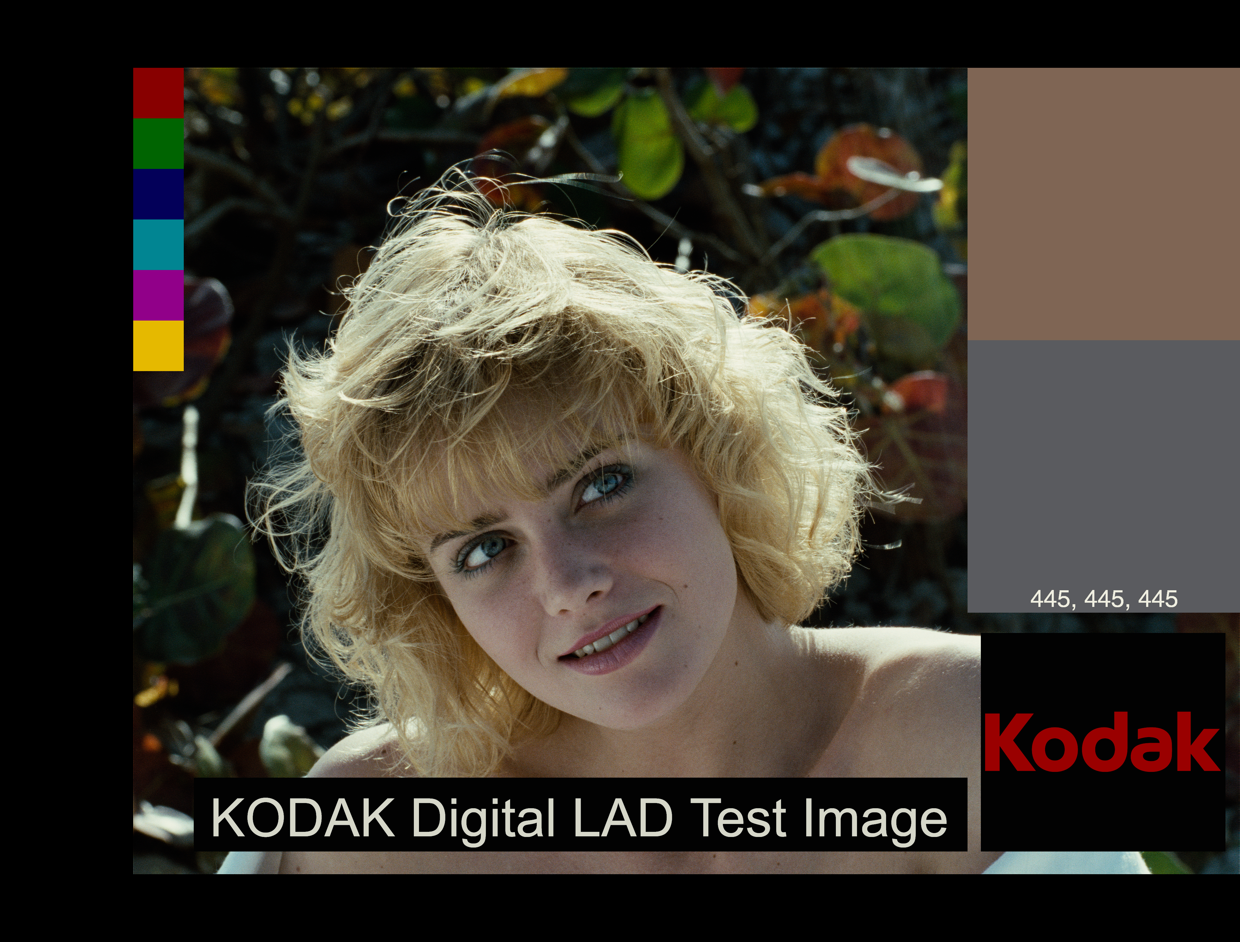
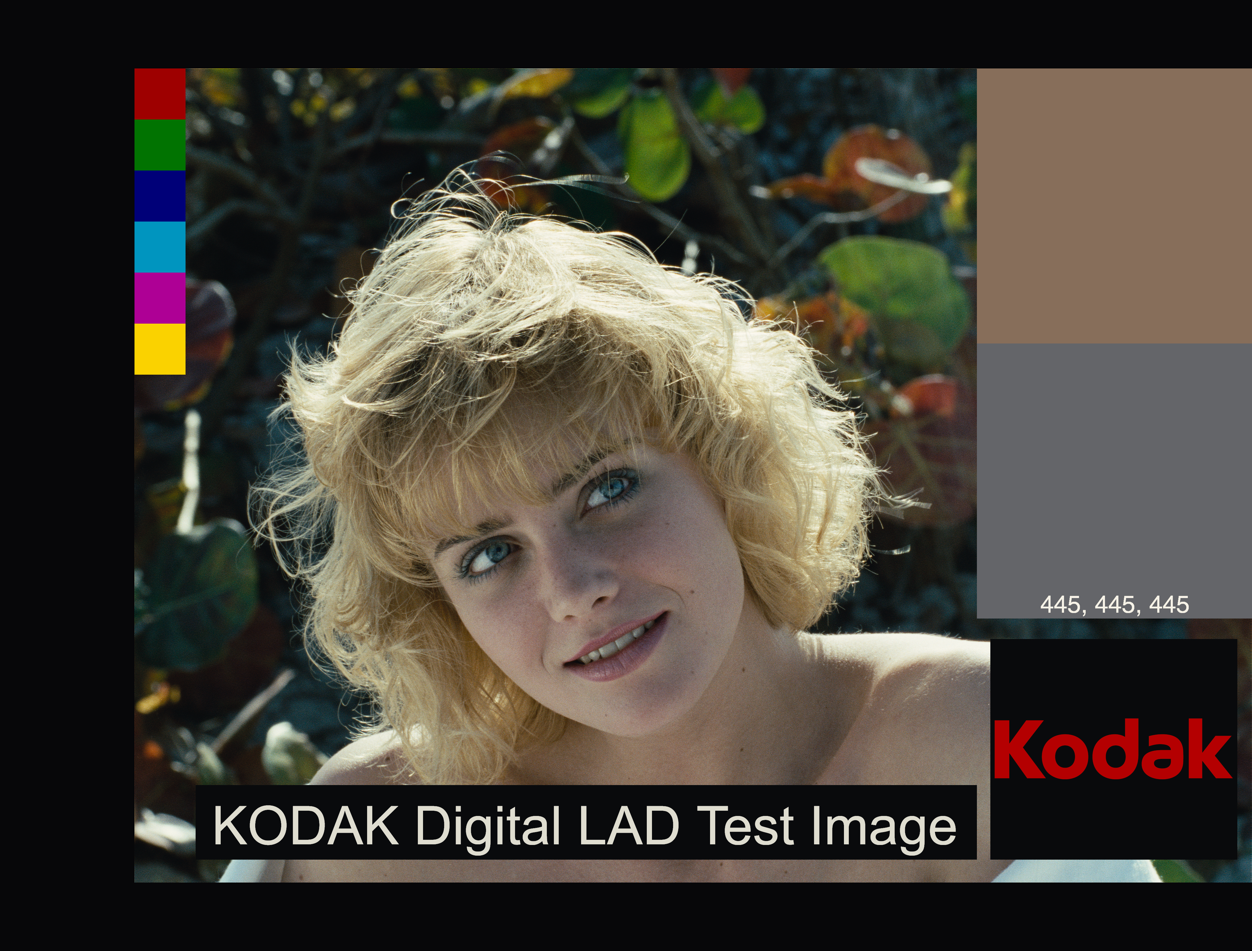
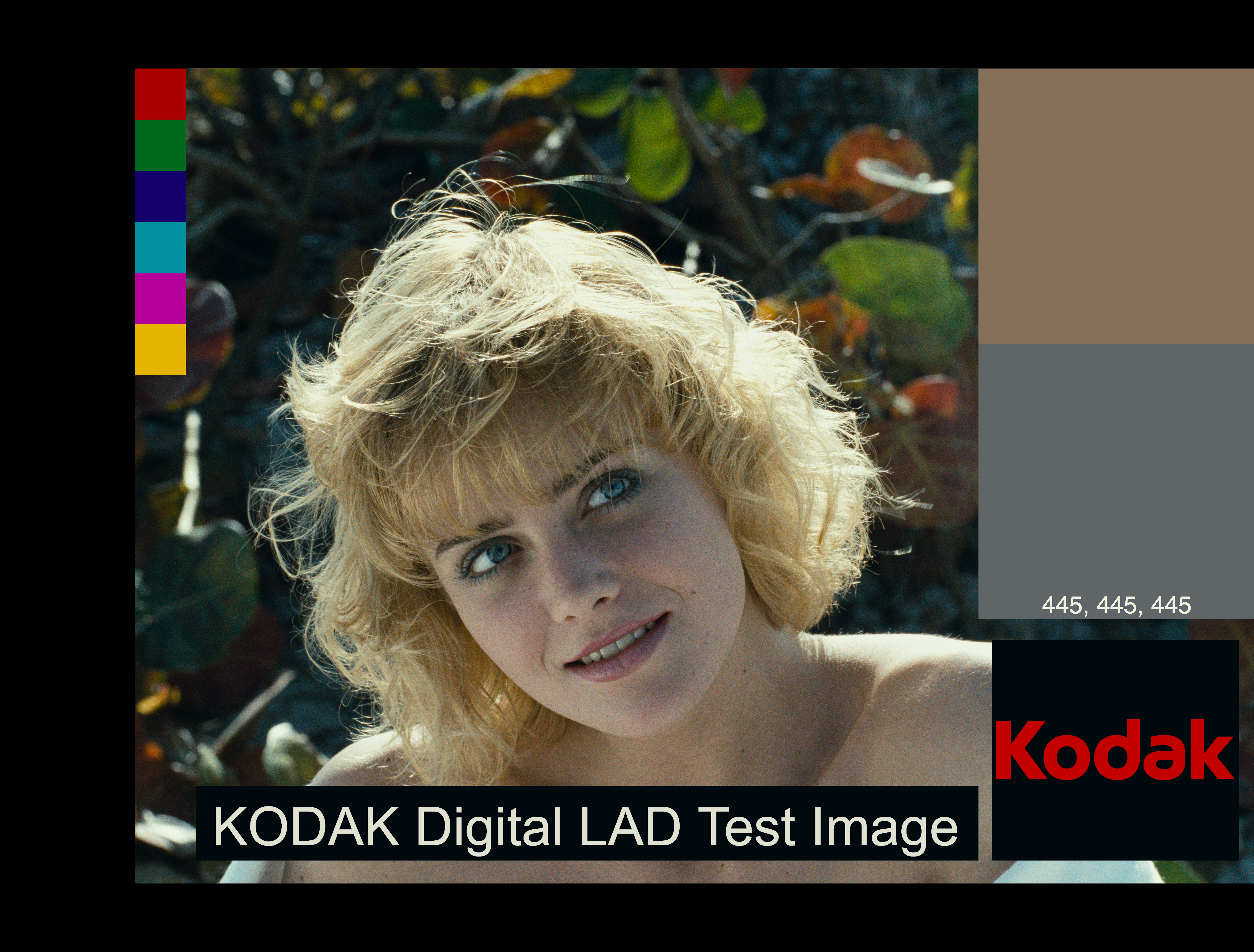
Here is an example using Kodak Portra and Endura Premier. This is the current default output:
Thanks for the further info on those sliders. I will experiment! I think I was to meak with the couplers slider in my previous tests.
Regarding that Kodak pdf though, it seems to be from 2006 and that’s before the suffix drop tweak. The non suffixed Portra 160 was released in 2011. The pdf is interesting even if its about earlier run of tunings of the film.
I completely agree with the comment of @mikae1, that when you digitize the negative the way you interpret them can drastically change the output, and choices needs to be taken. Therefore comparisons and “output matching” are not given or straightforward.
The negative is designed to capture as much as possible of the scene and to produce and intermediate image that needs to be interpreted, and it is by definition low gamma (and contrast).
What process did you use? Did you save the agx “negative” and developed it next to the film “scan” in dt?
Agx output normally has the printing process built in right? Which should means the characteristics of the paper play into it as well. Your photographed negative can’t simulate that part of the process?
Oh, helpful! Had completely overlooked this. Should gamma 1 be the “right” amount as per the tech sheets? Speaking of all these settings. Is there a way to save the settings as a default? My settings seem to disappear when closing and opening napari.
Exactly, when print gamma factor=1 the density curves of the paper are the ones on the datasheet. Factors higher or lower than 1 stretch the density curves accordingly. The effective gamma of the paper is “original gamma x print gamma factor”.
Unfortunately, the defaults settings are hardcoded in the gui file for now (easiest and quickest implementation). So there is no easy way to save a presets or new defaults at the moment. Of course you can manually change the python gui file, but it is not a very good solution for future updates. When I will implement the loading of the settings files, it will be possible, though.
Does the negative size settings change the grain scale in any way? I’ve been thinking about how I enjoyed Alien Skin Exposure’s way of handling grain scaling.
It was possible to set film format and the grain size was automatically correctly scaled. The default grain size in agx-emulsion seems a bit small with my 24 MP files at default settings. I’ve been scaling up. “Seems small” is based on my experience from 15 years ago when I used to scan negatives every (work)day. So, I could very well be misjudging.
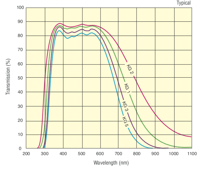
I explored solutions to have color print film working, and I discovered a little detail that I overlooked. Usually lighthouses in enlargers and cine print heads have heat absorbing filters that effectively block light in the NIR and above. This is done to not deposit to much heat on the negatives, that is produced by light sources like tungsten-halogen or carbon arc bulbs.
From a quick search, heat absorbing glass from Schott is an example of these kind of filters. And especially “KG 3” would be a typical filter found in cine print heads.
Adding this filter to the color enlarger magically fixed the fitting of neutral YMC filters for all the film stocks when printed on Kodak 2393 print film.
I also re-optimized Kodak Vision3 50D using Kodak 2393 as the reference printing medium instead of Kodak Portra Endura as I did for all the other photography film stocks.
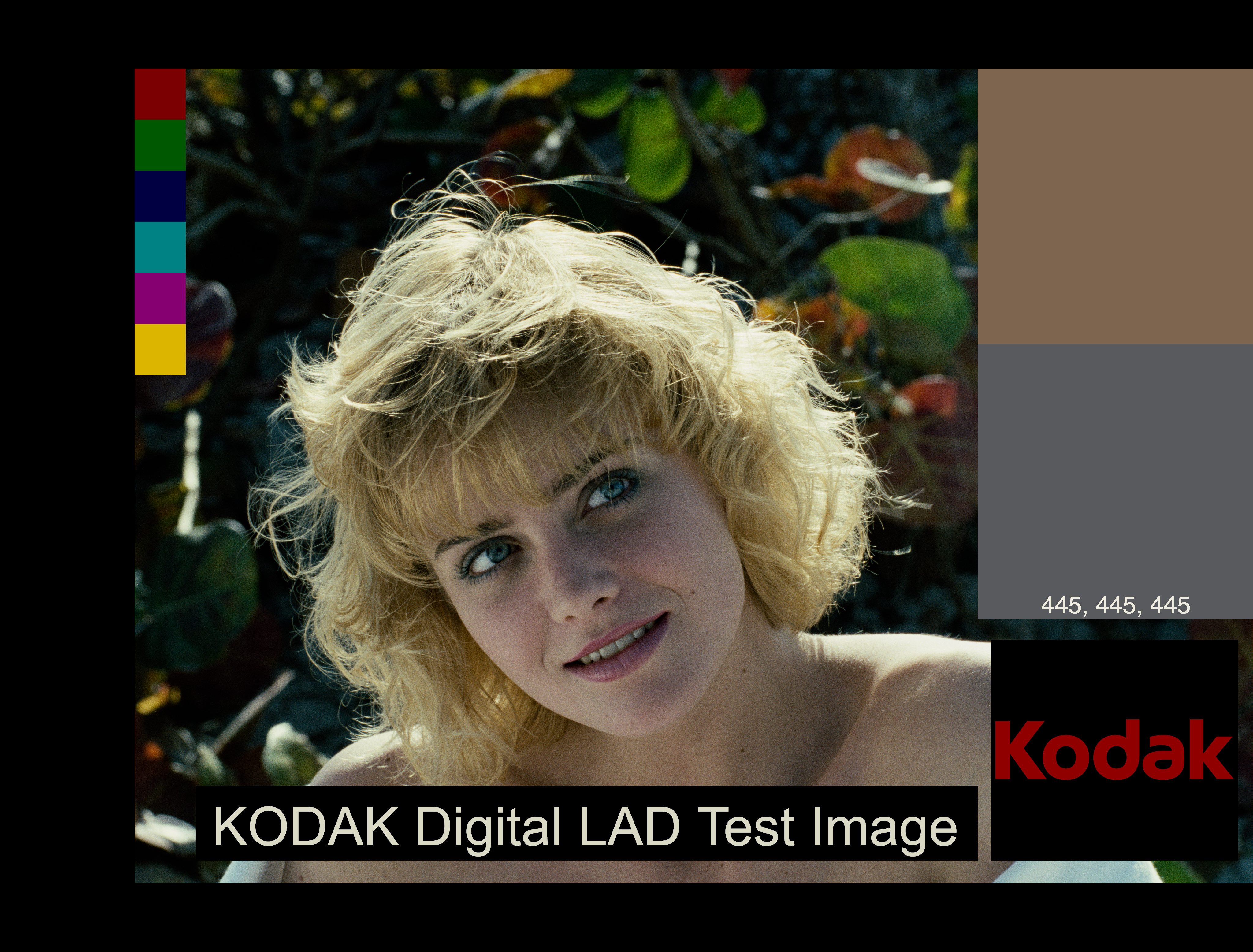
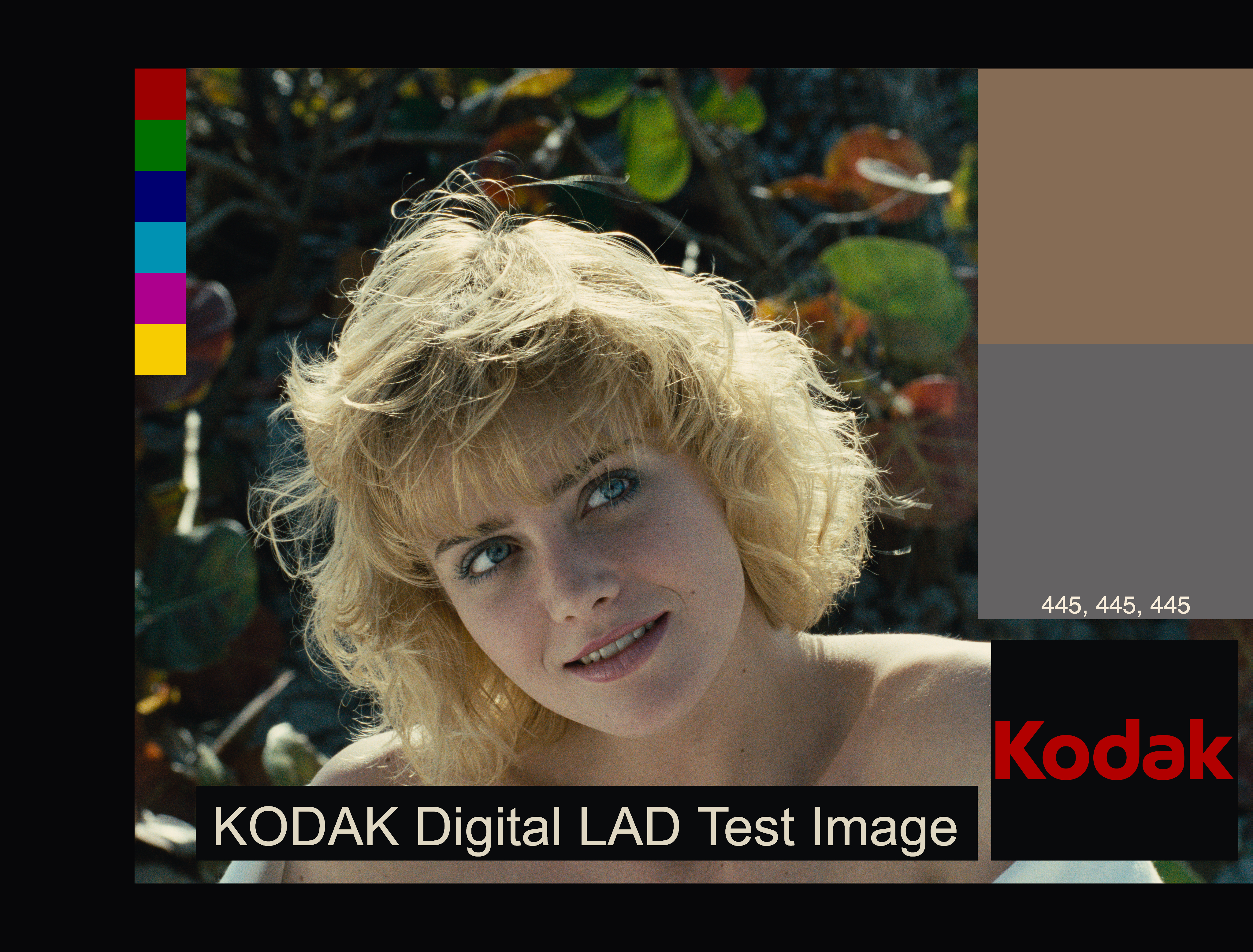
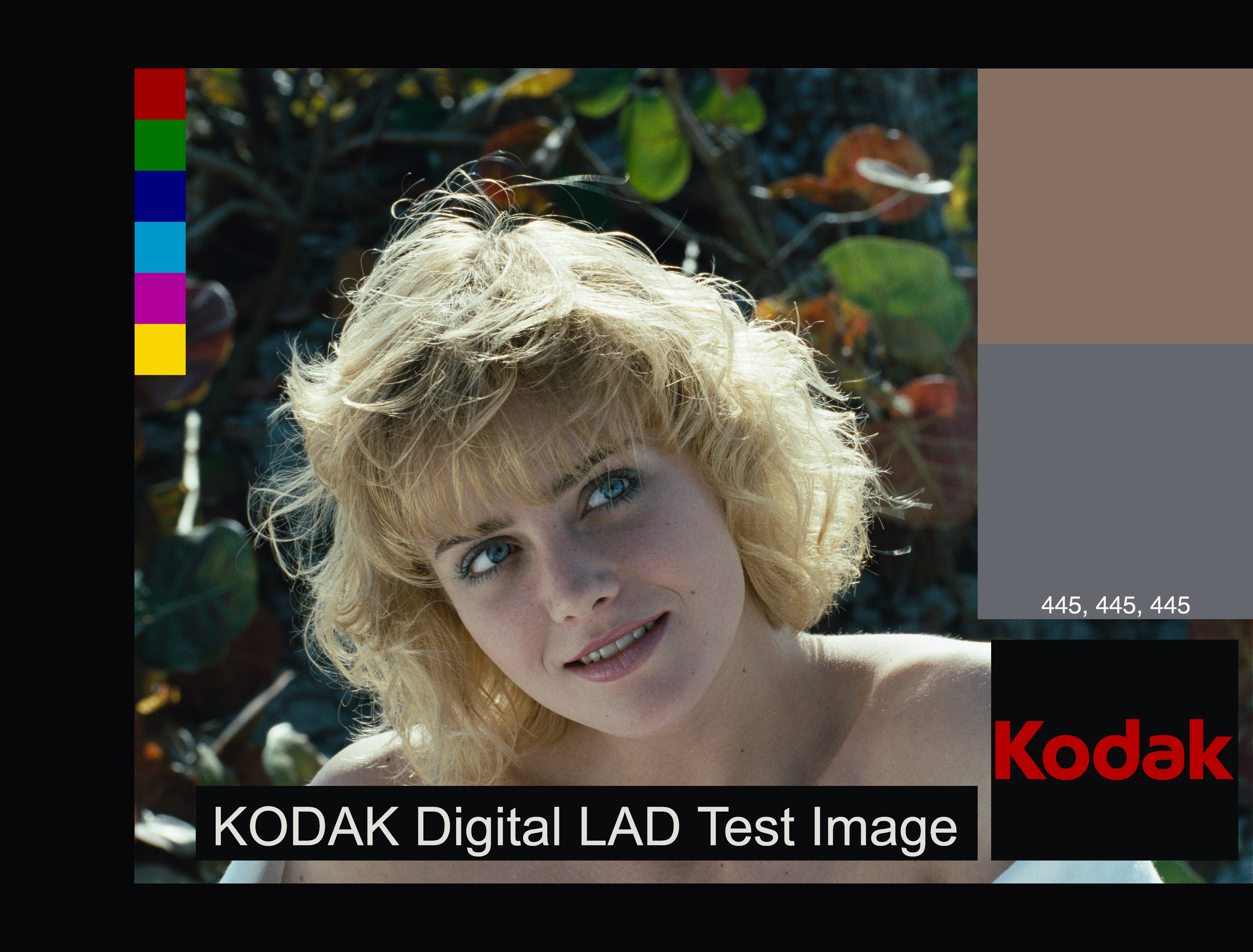
Here is an example with this new additions added to the main branch:
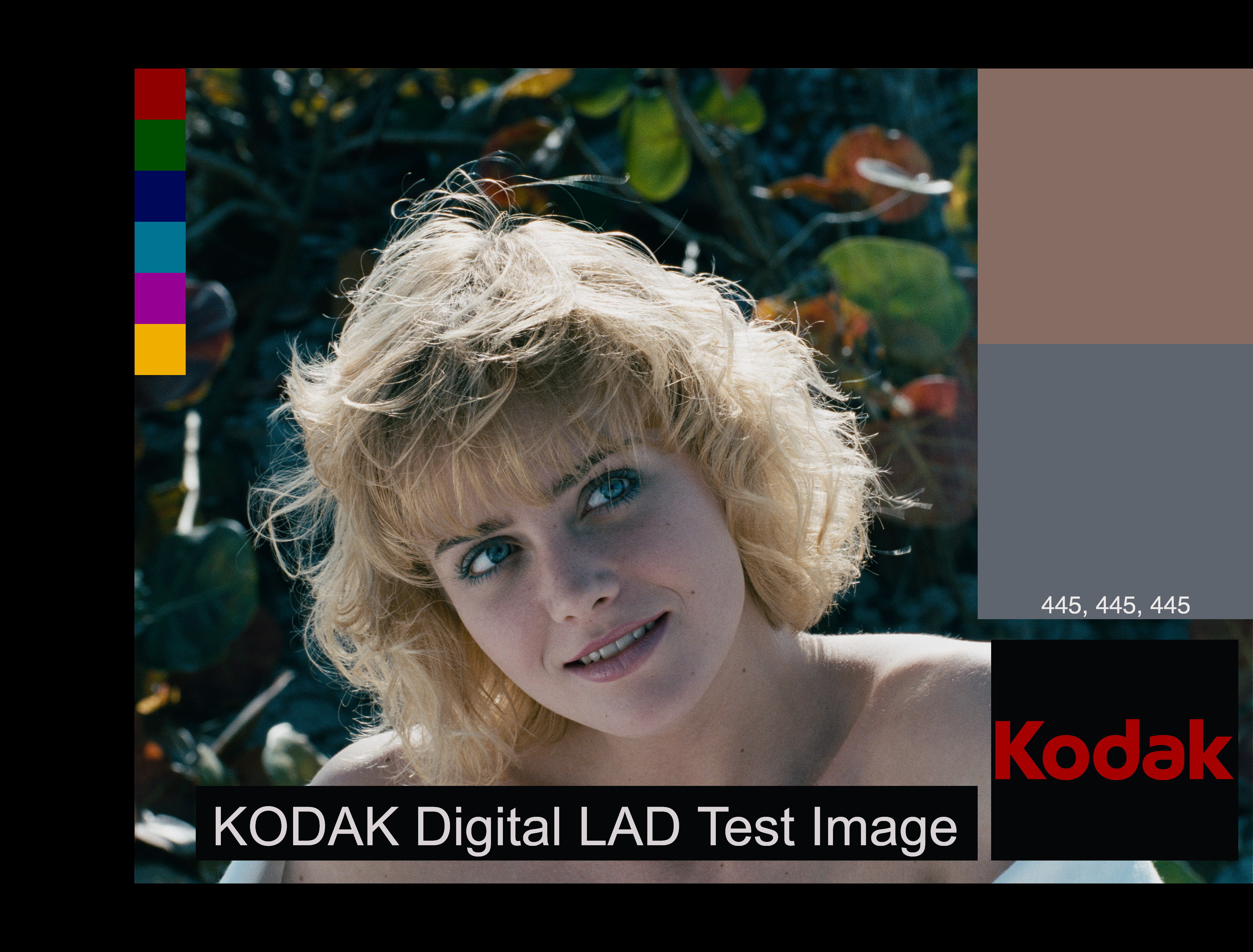
darktable default edit: sigmoid (contrast=2), and everything else same as the input image to agx-emulsion
Kodak Vision3 50D printed on Kodak 2393 has very neutral colors. The closest to a straight edit from darktable. Moreover, regular photography film, such as Kodak Gold 200, from these example looks a little more neutral when printed on cine print film Kodak 2393.
The negative size affects the statistics of the grain. Smaller negatives will be more grainy. It affects also the size of the dye clouds at extreme magnifications.
I believe that at normal magnifications (normal scans), the size of the grain is mainly affected by the resolution of the scanning/printing device. You can use grain blur and scan lens blur, both in pixel to fine tune this. I usually do not touch scan lens blur, though.
On 20-ish MP files I am pretty satisfied with grain blur = 0.85-0.95. Give it a try.
It could be automatized, but I found that I needed precise control on the ultimate spatial “unit of the image”. Anyways, the bulk of the appearance is done by the stochastic particle model that reacts fully to the negative size.
That sounds like a lot of experience ! So you are definitely the most expert on this!
For video color grading, colorists often use the Kodak 2383 instead of the 2393. Apparently the 2393 has deeper blacks, but the 2383 seems to be chosen most of the time by color grading gurus such as Cullen Kelly.
It’s written in Python and darktable in C, so it isn’t that easy. @hanatos has ported it to GLSL for vkdt. In this post I asked some darktable devs how hard it would be porting to darktable, but I haven’t seen a reply.
I truly agree! I’ve been using it quite a lot now and the basics are beginning to become more intuitive to me. Haven’t delved into all the options though.
i think i’m nearing feature completeness with this. here is the module documentation draft, including some explanations from @arctic’s OP. so far it doesn’t have halation yet, but couplers and can resize up to 4x (if your GPU can). i’ll probably work on performance improvements / better spectral integration / maybe experiment with slightly better or faster grain and coupler implementation.
i’m out of this game, but i suppose it’s tedious. you’d probably have to do it 2x (cpu and opencl) and judging by some other modules and their counterparts in vkdt, it’ll be something like 10x-100x slower. there’s also a thing about cropped roi/multi-pipeline processing and gtk gui that will be extra work. vkdt has a DAG, not a linear pipeline, so i can route the required lut textures easily. no idea how that’s done in dt nowadays.
I think of this tool as a proof of concept and rapid development. Andrea highlights this in his original post. Once the process is nailed down, then i can see it being replicated into other software based on the current license (GPL3).
I agree with the answers by @hanatos, @mikae1, and @g-man!
Consider this python project a bit of a tech demo for now. The output is ok, and there is potential, but I am still exploring and refining things. Since one month ago, for example, it improved a lot, thanks to the feedback and contributions starting from this forum! I am very glad of this!
I digitized the plots from the datasheet of Kodak 2383 (still haven’t committed, I wanna check a few other things).
It looks more vibrant and colorful than 2393. Overall I find the output produced by 2383 data more appealing. If we believe that what we are predicting with the simulation is close enough to real life, I see why it is preferred. Sims with 2383 data look less neutral, though.
Here’s also three different 2383 LUTs applied to the same test image. Left is Koji 2383, Middle is Resolve 2383 (D60), Right is another 2383 LUT that normally has a whitepoint around D55 but I adapted it for this example.