A wb tool might certainly be useful in many cases, since setting web before the filmsim in the colour module often delivers quite strange results. I think I am fine with the fine tune sliders too, most of the time they are enough and when not, setting the number outside the range of the slider should suffice.

Awesome!!
And yeah, not-so-important stuff should probably remain hidden to keep it looking somewhat clean.
1 Like
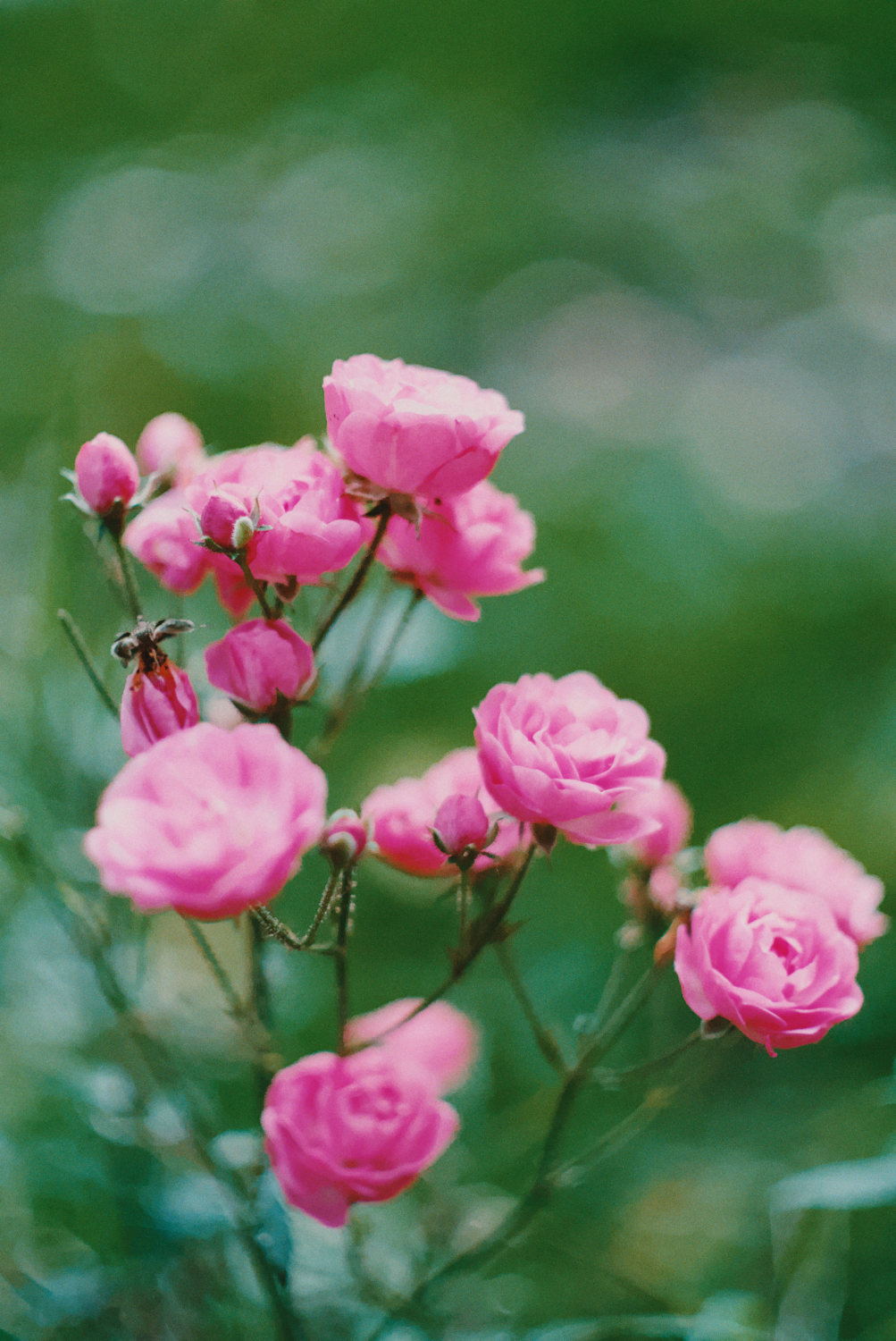
It is pretty interesting what a big difference halation makes on the effect of couplers. I was playing with the recent playraw submission (link), and this is filmsim in vkdt, fujifilm 400h and kodak 2393, couplers set to 1 and default amount of halation, and then with halation off:
As we can see, when halation is enabled, couplers have a much more natural looking effect with increased saturation but less of the very obvious haloing around edges with high contrast.
3 Likes
interesting, thanks for this observation.
i’m not entirely sure which way would be the most physical to apply couplers and halation… in particular which one is applied first? also i increased the radius of the coupler support a bit as compared to the original agx-emulsion (see discussion about photographic reference above where a particular image showed much larger halo regions).
also the kodak 2393 paper is experimental as far as i understand.
[edit] was talking some nonsense, I think halation should happen first, as it happens during exposure, and couplers when developing, right?
And yeah, a coupler amount of 1.0 is already quite extreme, but the haloing has been bothering me with some particular images at the 0.25 range too, so I see this as a welcome effect of halation (in addition to the fact that halation looks great).
And referring to the last point, I went and tested other film-paper combos, and it seems the difference and effect is the same regardless of which are used!
Anyways, to me halation makes it look better, no idea about the physical accuracy ![]()
1 Like
Hi, I have been seeing some of your ‘play-raw’ examples and its really cool to see the final result.
I too have been working on my own film simulation. It’s interesting how we came up with different solutions to similar problems. I started with negative film but I got hung-up on trying to simulate a scanning process. More recently, I completed a simulation of reversal film (ektachrome) that I am very happy with. I’m not planning to open-source it but I may share a few details here or via message if you’re interested.
Perhaps I will revisit my negative attempt soon with some new ideas.
1 Like
Hi! Firstly, thank you for this treasure trove of information!
I’ve been working on my own version of a film simulation and have recently gotten to the point of having a series of photographs that I have taken digitally and on film. (Of the following images, the first is film, second is digital – these are inverted using Darktable with no other corrections)
I’ve found that when not simulating a scanning process or print process, stocks like Portra 400 have a very flat look and strong teal/blue tint. I’ve been able to replicate this with my scanning (as seen in the images attached) but I’m wondering how scanning labs end up with a totally different look:
Is it really just scanning profiles that are adjusting images this much? I feel like with my simulated image matching the color my at home scan my simulation process is correct, but I would like to get closer to what the lab provides. Any tips anyone?
1 Like
Negative film is designed to be printed, not scanned with a regular digital camera. Think of print paper like an animal that can only see certain wavelengths of light. So, when you look at a negative through your camera, of course it’s not going to look right. Lab scanners are built with spectral sensitivities similar to print paper, so the results come out closer to what you’d see in an actual print. If you just invert a negative on a digital scan, you’ll end up with a misinterpreted image, that’s not what Kodak intended.
5 Likes
Did you use negadoctor? That can take care of the red/orange film base, which likely gives you the blue/green shift after inverting the image.

Or is the point that you want to do everything yourself, to learn and/or to improve the process?
2 Likes
Hello! I’ve been searching wide and far for a good film emulation for stills, and this truly looks like a hidden gem! I’ve worked as a colorist in Davinci Resolve, but have no experience with the RAW-editors mentioned here.
Managed to install the 0.1.0 version through python and tried to read through this megathread, but excuse me if some of these questions have already been answered:
Which app is most suitable and fully featured for this workflow? (VKDT, Darktable, ART) - for colours, halation, grain etc.
I see some of the programmes use LUTS, which in the video world often equals worse image quality and compressed colour data - and luts doesn’t transfer grain, hallation etc. Is there a difference between the python versions processing and the LUT-based processing of the other programmes?
Is there a planned 1.0 release and does it make sense to wait for that?
1 Like
i can only really speak for vkdt, which implements most of the python original quite faithfully, but with some differences. it supports processing of positive raws, scans of negatives, multi-layer grain, halation, and DIR couplers, though not with a pixel-identical implementation. vkdt implements the algorithms on GPU, which makes it easier to wait for the result (much faster).
darktable does not implement any of this, though there is something called “AgX” (as opposed to “agx emulsion”), which is troy’s sophisticated tonemapping engine and not based on film simulation or spectral input.
ART implements something that is similar/equivalent to a LUT approach, it does not transfer grain, halation, or DIR couplers.
(you maintainers correct me if that information is outdated or plain wrong ;))
yes, see above. IIRC Art uses some per-pixel external script. i don’t know whether that first goes through a discretised/quantised LUT or whether it would at least avoid these kinds of artifacts.
i know i have a plan for vkdt 1.0, can’t speak for agx emulsion. since this is open source… i don’t think waiting for 1.0 makes much sense.
1 Like
I’ve tested out some old photos in VKDT now. Easily the best colors and texture I’ve gotten without any editing.
A question about halation: The highlights look great and bloom in a nice manner, but the halation seems to affect the midtones more than I normally see in analogue film - decreasing the midtone contrast quite a lot. Is this intended or am I missing some setting? (Just using the node preset as it is).
2 Likes
I’ve been testing some of the old images from this thread. I have to say both vkdt and agx now create images that don’t look much like the samples when following the recipes stated. Generally speaking the results are more “unnatural” than the original results. As if the effect was stronger now.
What are you seeing? Have i lost my mojo or have the developments changed the results that much?
hmm can you give an example? i mean i just implemented the convolution with the default weights. if it’s just a matter of changing these values, i can update the default.
i’m not aware of any such changes. the one thing i know we experimented with is the auto-white balance when exposing the paper. you can always tune manually i suppose.
I’m seeing a similar look with the agx app so it’s either me or changes to both apps since the initial versions. Will show examples when I find the time. My greens are basically brown/yellow with portra and from my film experience I expect a different look where greens turn rather dark and kind of blueish?
hmm can you give an example? i mean i just implemented the convolution with the default weights. if it’s just a matter of changing these values, i can update the default.
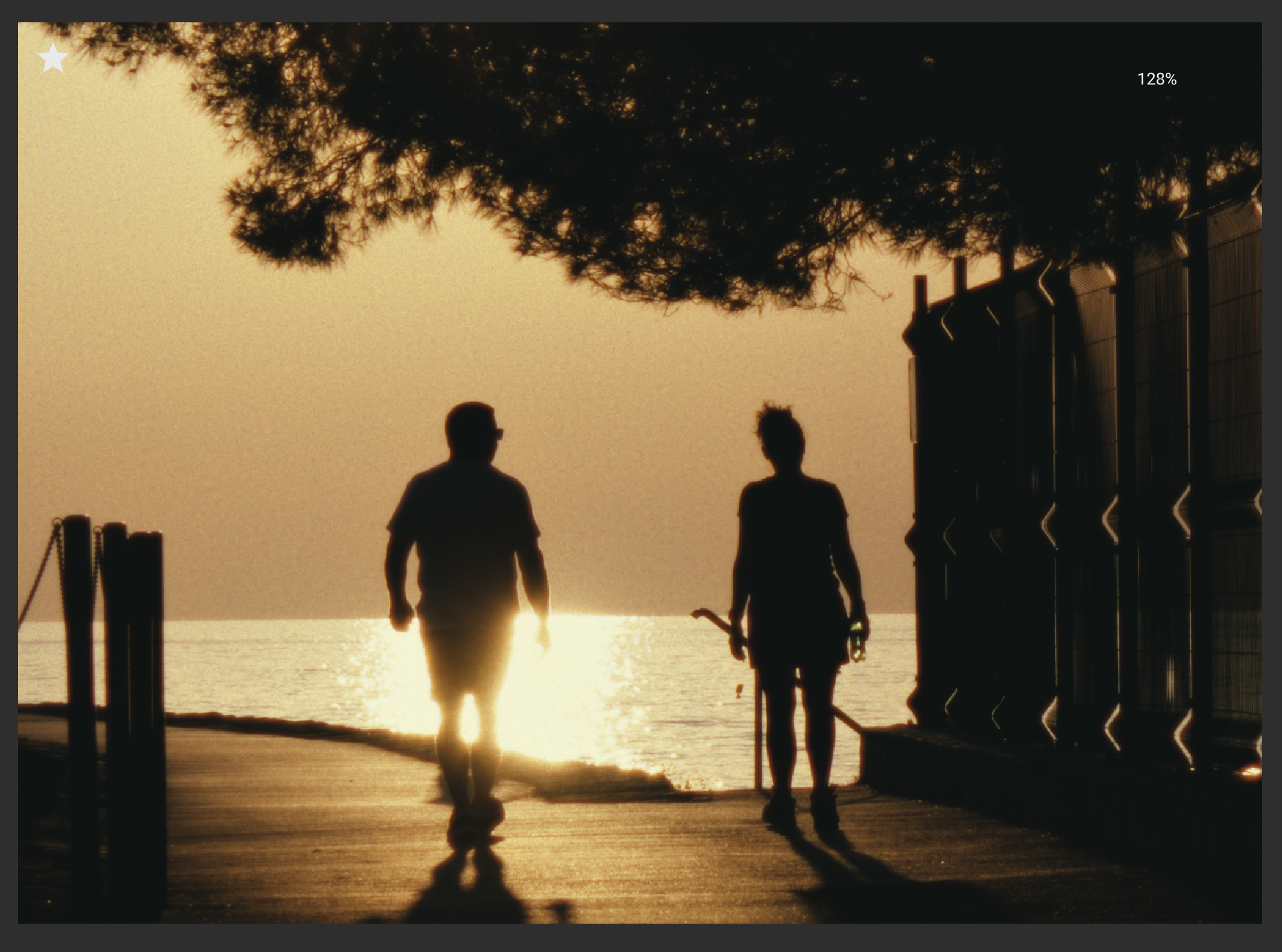
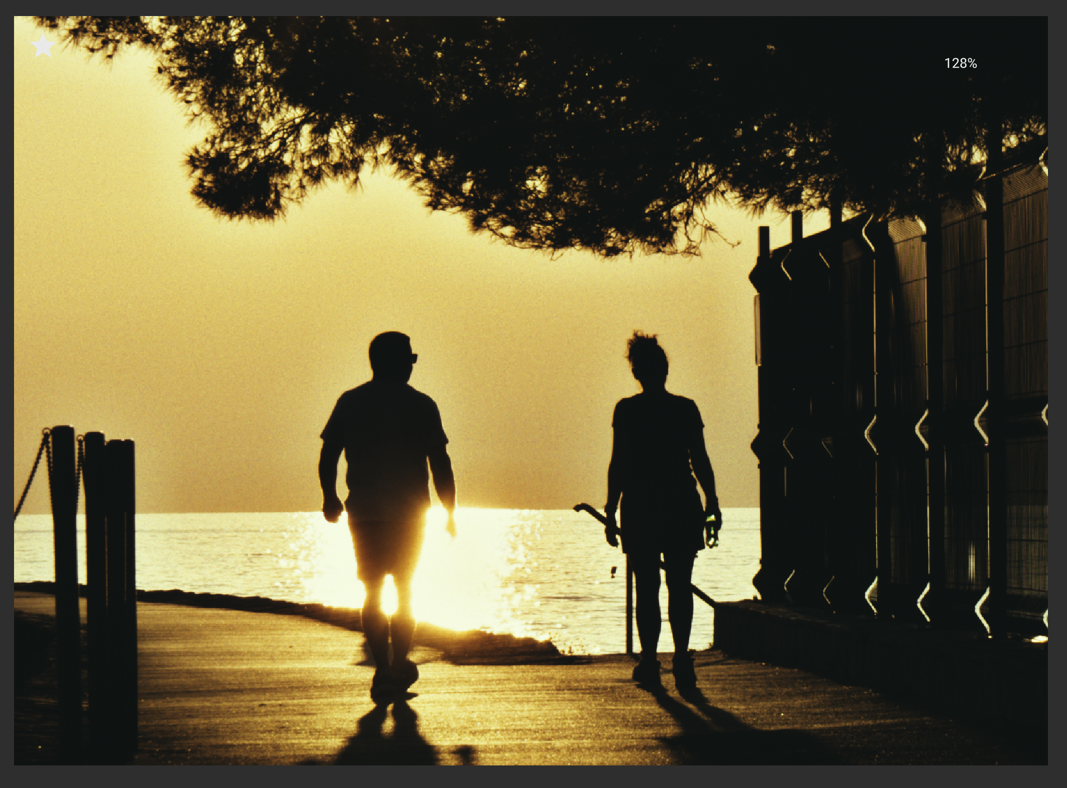
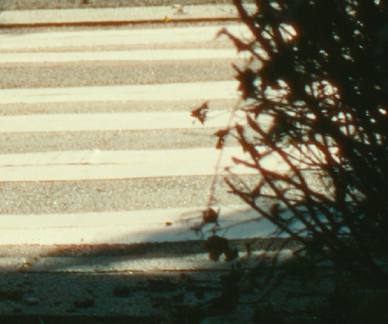
Area with highlights and contrasts without halation:
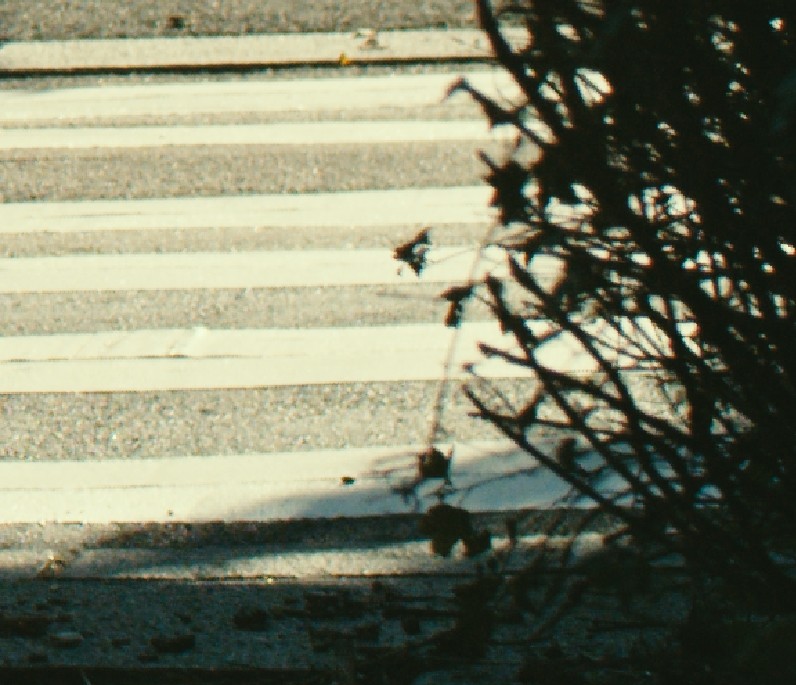
Area with highlights and contrasts with halation. Looks pleasing and halation performs as expected.
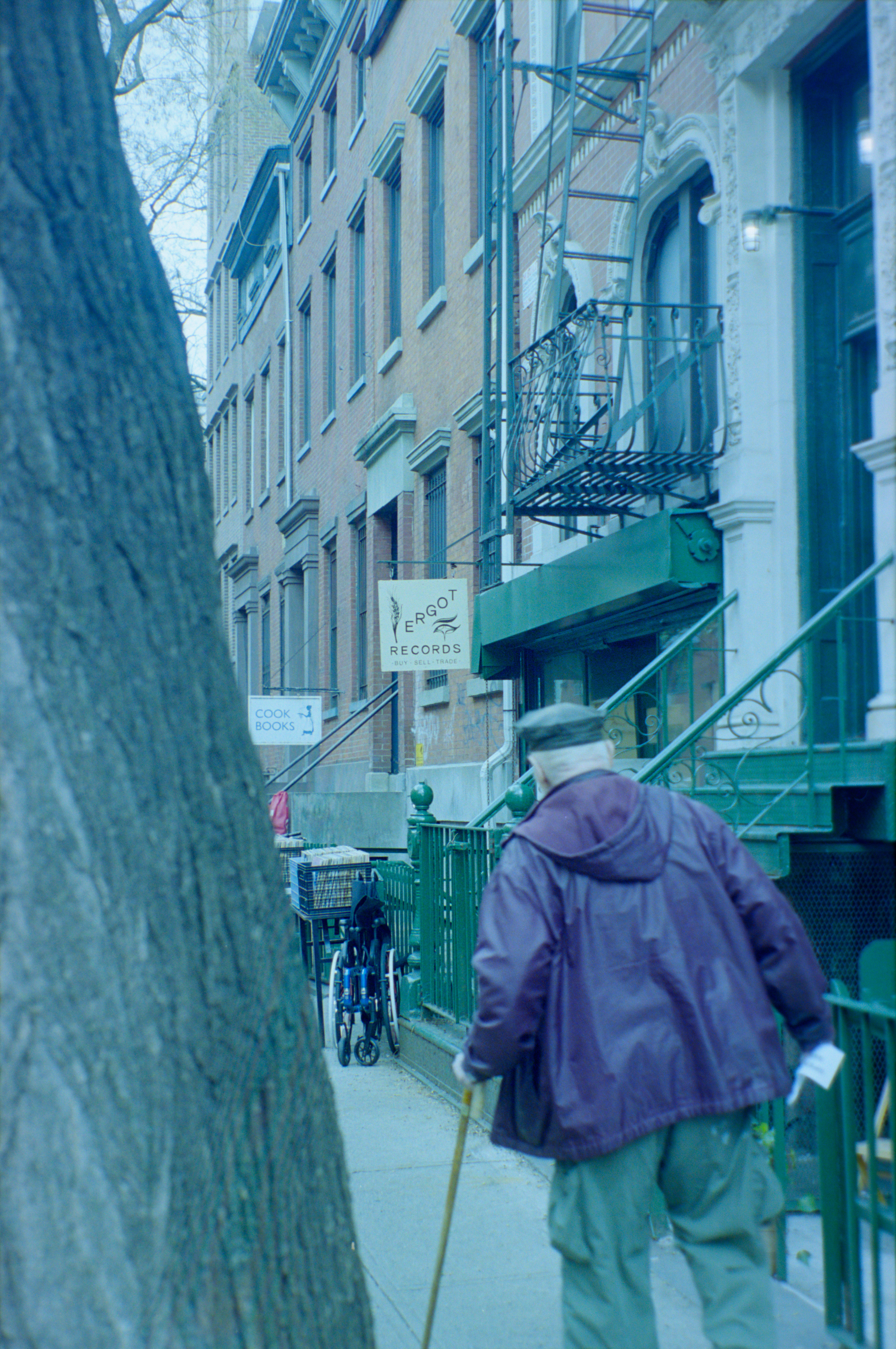
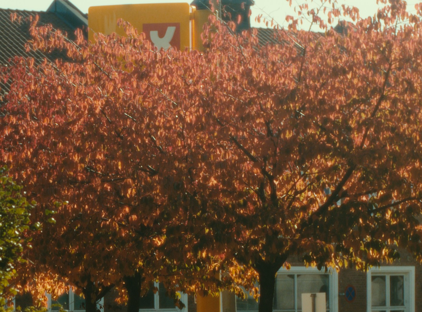
Midtone area without halation:
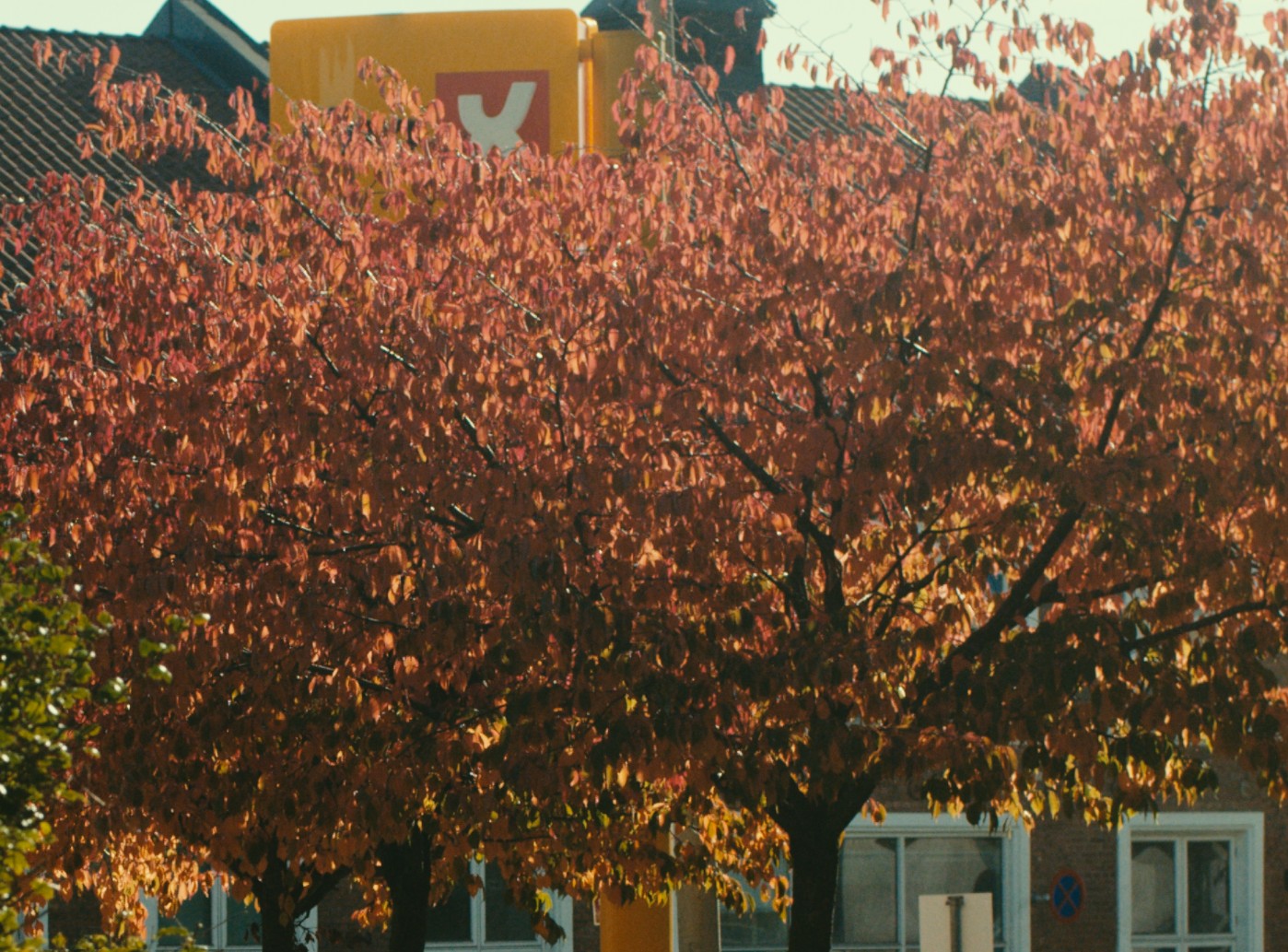
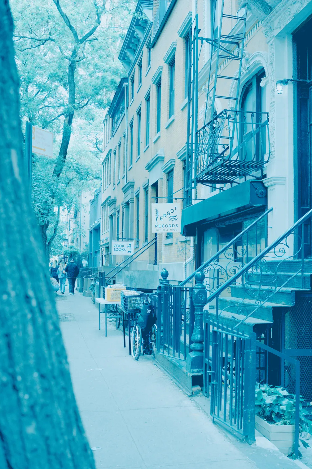
Midtone area with halation: Everything seems very glowy, as if shot with a very strong promist filter. Even the darker areas at the bottom of the tree are washed out. This is not usually expected behavior of film stock, even when the halation-protection layer is removed (Cinestill etc.)
1 Like
if it’s just a matter of changing these values, i can update the default.
Playing with the halation settings, I cannot pull back this effect in the midtones without reducing the halation of the whole image.
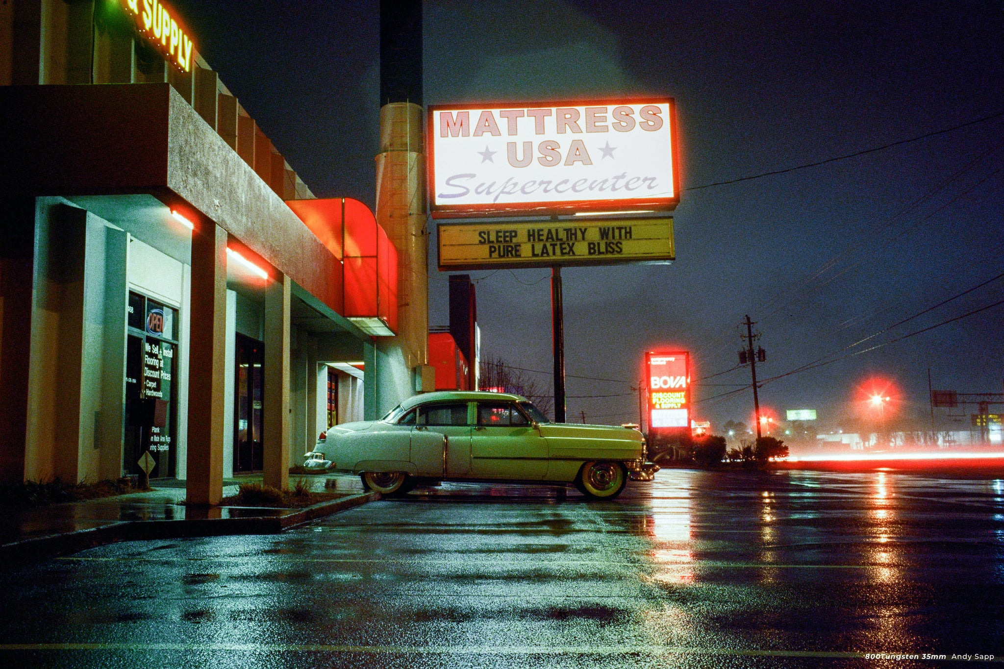
Example of a Cinestill 800T scan. This must be the most halation-prone film out there, but even though the highlights are blooming like crazy, the midtones and shadows retain perfect clarity.
4 Likes