I meant spektrafilm reference dev branch
Okay I will set it up and see if I find any major differences on the same images.
I’m finally on the nightly version, the module looks real good right now. Some of the presets gave me a few interesting ideas that I haven’t thought of before.
I don’t know if it will be of any use, but the way I mainly use the module is by having the following presets as my starting points and then going from there:
spektrafilm_base_thick negative.dtpreset (1.2 KB)
Thick negative, i.e. underexposed film that is recovered a little bit during the print. The result is high saturation, high contrast, harsh tonal transitions.
spektrafilm_base_thin negative.dtpreset (1.2 KB)
Thin negative, i.e. an overexposed film that is then printed a little darker. The result is subdued saturation, slightly lower contrast, very smooth tonal transitions.
spektrafilm_base_fuji superia.dtpreset (1.2 KB)
Base preset for fuji colours. I’m not sure why, but the X-Tra 400 and CP200 at their default settings look pushed 1~1.3 stops, so this preset is basically resetting them to normal
spektrafilm_base_vintage slide.dtpreset (1.2 KB)
Subdued contrast, lower saturation slide development. Looks a little like the 60s~80s motion film when applied to a softly lit scene, i.e. overcast or equivalent (e.g. wb-corrected blue hour, shade, etc)
spektrafilm_base_ISO 800T.dtpreset (1.2 KB)
Night time base setting for my workflow. To be used with daylight WB. Looks like an ISO 200 daylight film corrected to tungsten and pushed 2 stops, with adjusted grain. Very high contrast (which looks good when underexposed) with deep blacks and a faded white point.
4 Likes
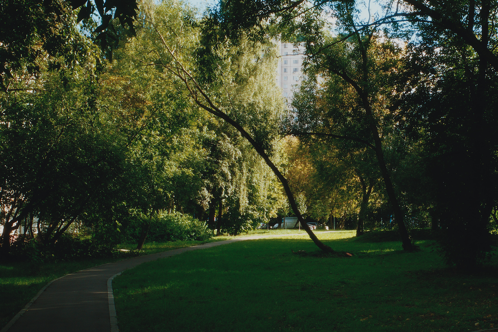
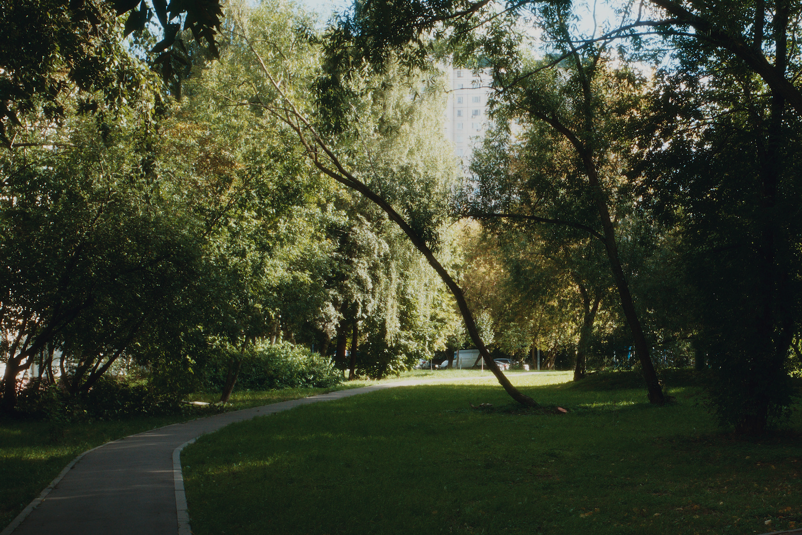

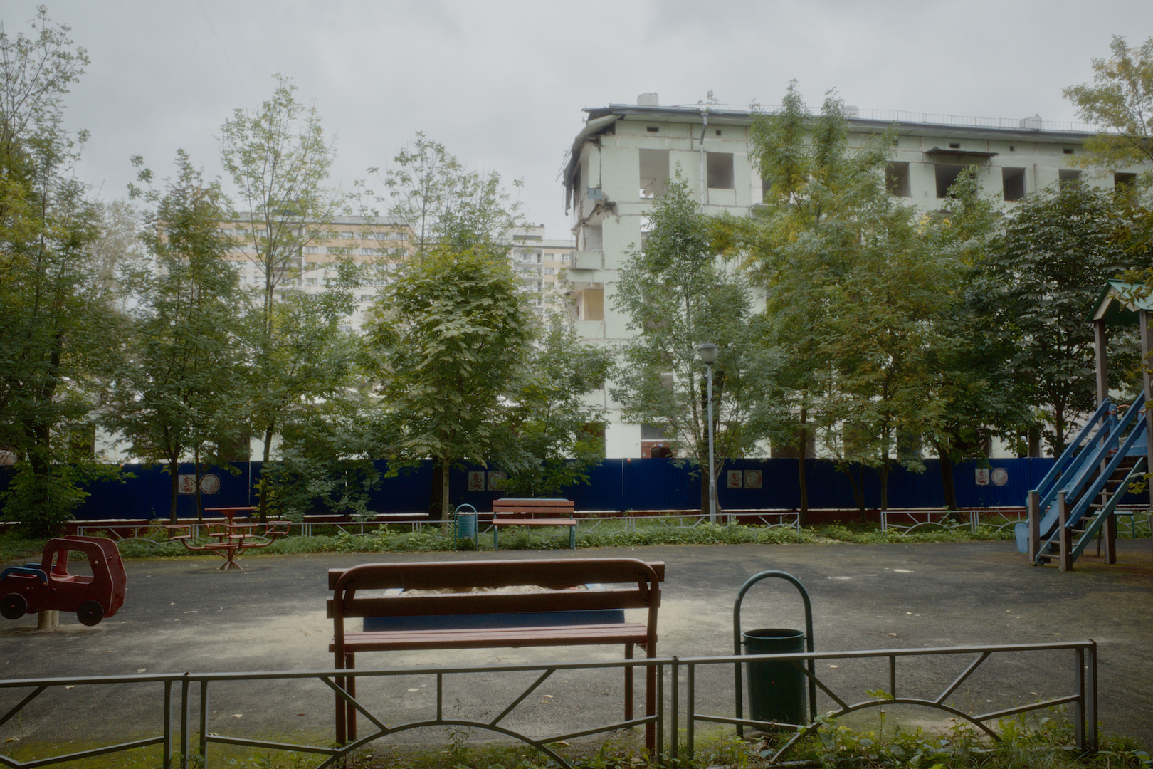
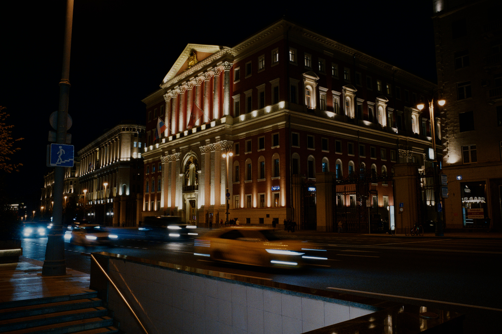
Also I would like to propose setting Gold200 as the default film stock, preferably with 1.10 contrast of the auto (portra endura) print paper as well, I think it yields the best result when left uncorrected.
I find that the Portra400 is turning all foliage yellow, so you need to either be very careful with the white balance (by setting it colder than daylight) or you need to correct it during the print - I found M+3 Y+3 to work quite well for that, but it changes the dynamic for the midtones quite heavily.
I wonder what your experience has been like?
2 Likes
Agreed
3 Likes
I find the bandwidth and surface adaptation features fairly interesting, clipping/filtering the sensitivities before integration is not the same as compressing the gamut. I hope we will have more controls over these features in the future, the Resolve OFX has those.
I learned alot from following this thread and the overall project. Thank you for your efforts !
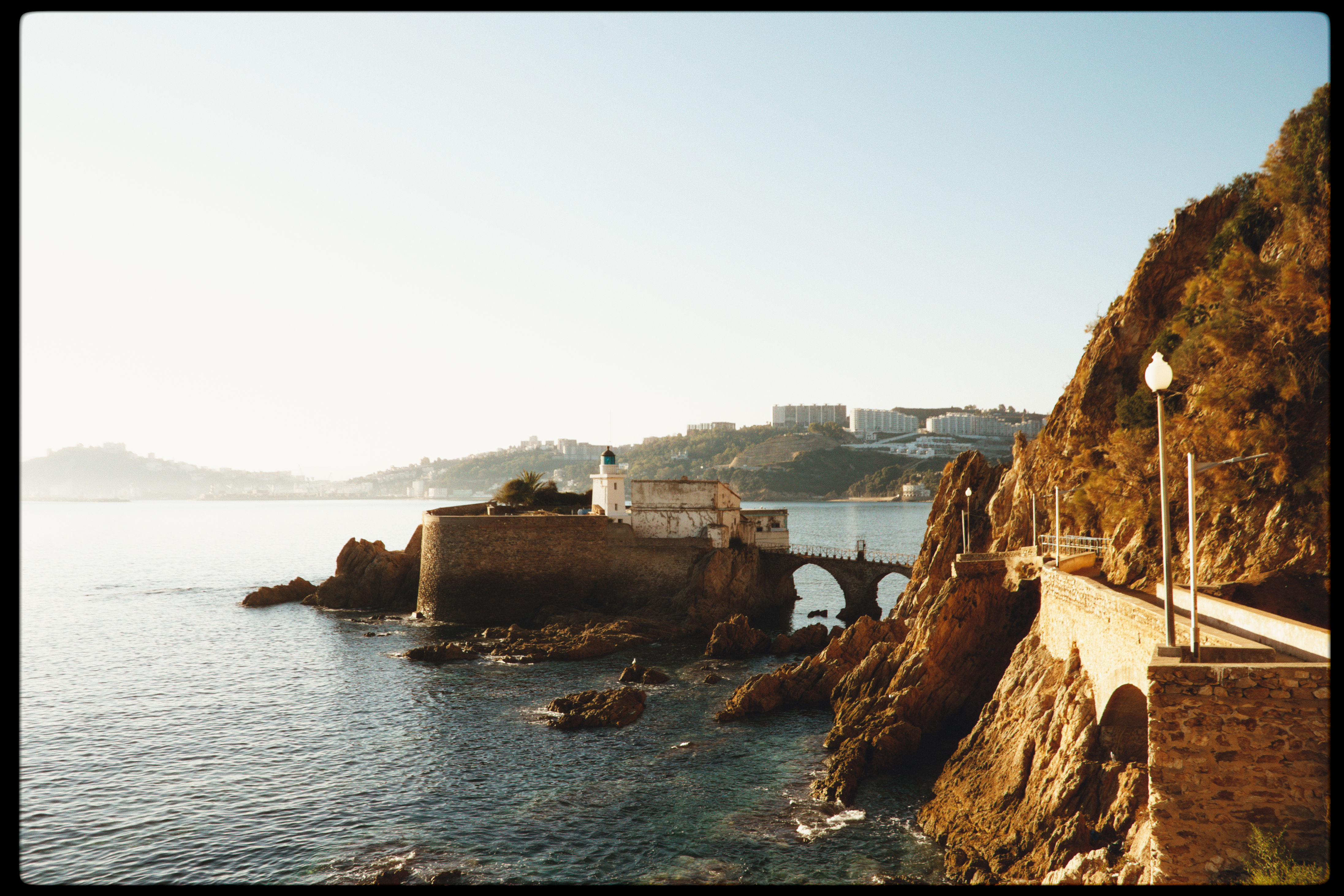
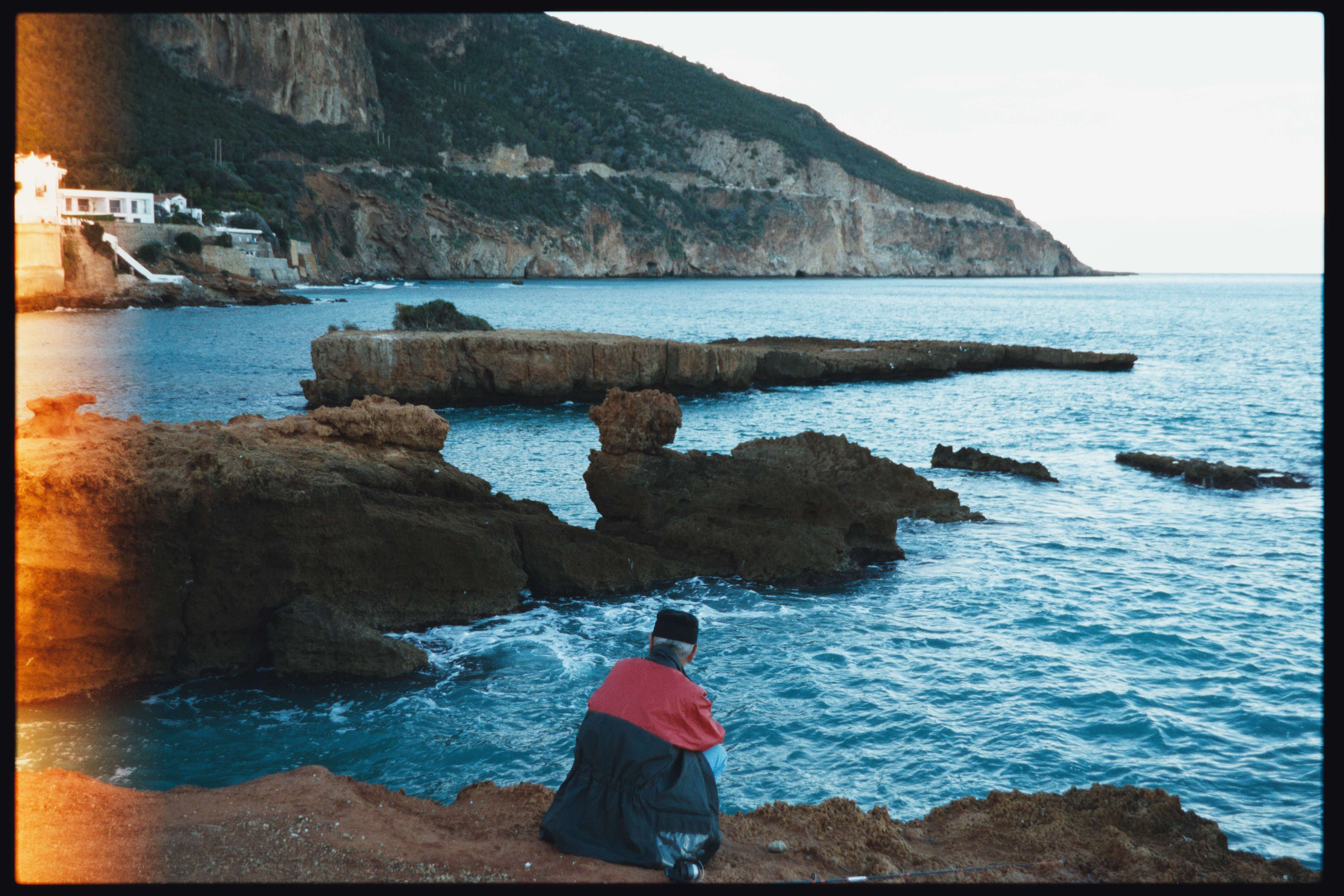
8 Likes
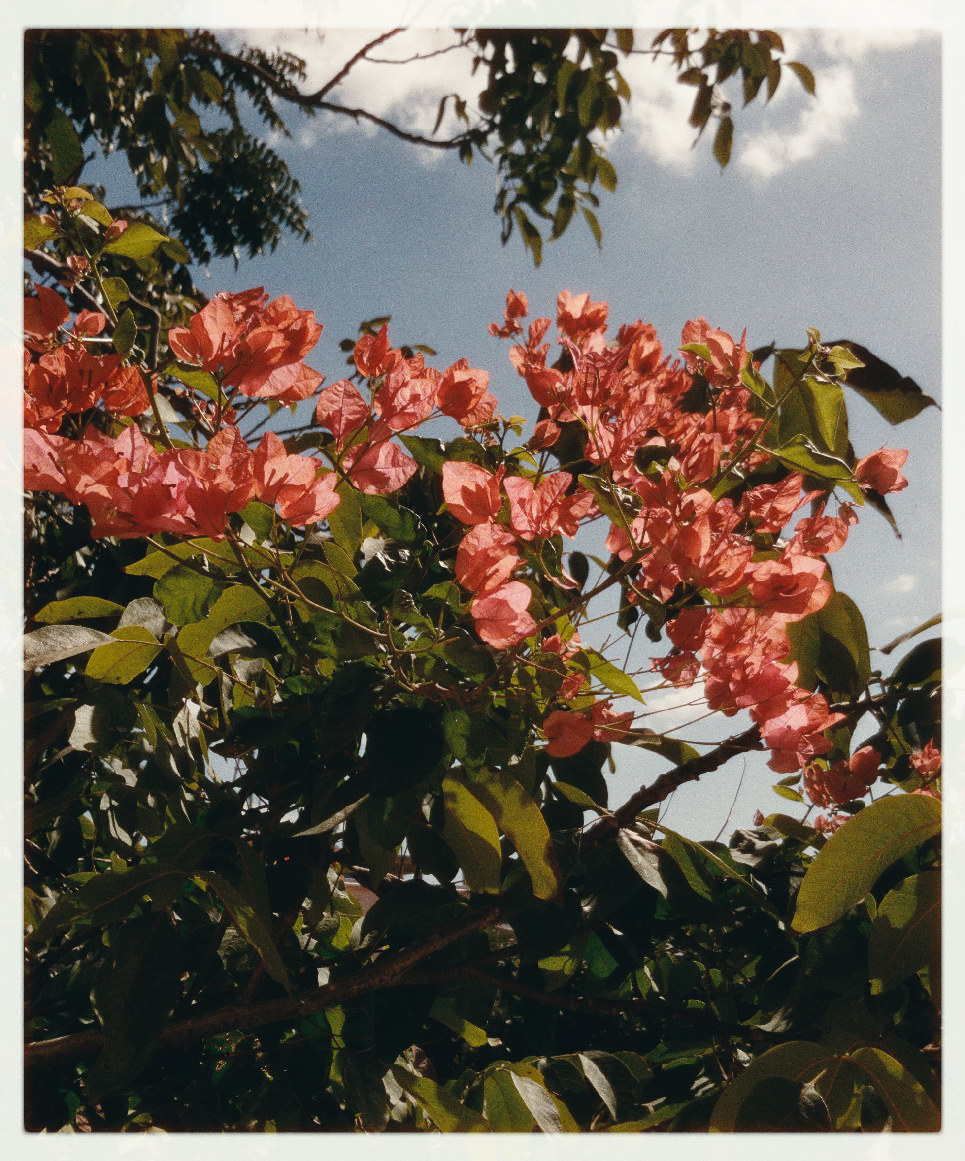
I have read the documentation as well as many posts here. Still I am not clear the intended use of the this module.
Is it to use it when the final image needs to be printed? or is it to give a feel and look of the printed image on the screen,
Finally, how do I deal with an actual film negative that was scanned? Do I still need to go through the negadoctor module?
Maybe is the name “Spektrafilm” throwing me off.
You can read the initial post of @arctic Spectral film simulations from scratch to get a better understanding what spektrafilm sets out to do.
Your images look very pleasing to my eyes!
3 Likes
I think is a lot of confusion because people think Spektrafilm is an alternative to the Negadoctor module when in fact it is something completely different. Maybe in the documentation it should be said that this module should not replace Negadoctor to avoid confusion?
Oh thanks !
1 Like
It’s mainly the latter - it’s a tone mapper that results in a look of a developed, printed, and then scanned film photo. For slide film, the printing stage is dropped.
You use it like any other tone mapper: normalise your scene first via the scene-referred modules, then turn it on and give the photo the final touches. It’s much more stylised than something like AgX in how it renders the colours and the tones. To the point that just applying the default settings will already give you a very good result
1 Like
Thanks for the presets, I like them.
Same rules apply -
Use the “last” color calibration module to fix the white balance, this one works for most daylight scenes. Experiment with the negadoctor sliders - they are a lot of fun. I kinda wish I used it back when I shot film, much more convenient than the Photoshop way 

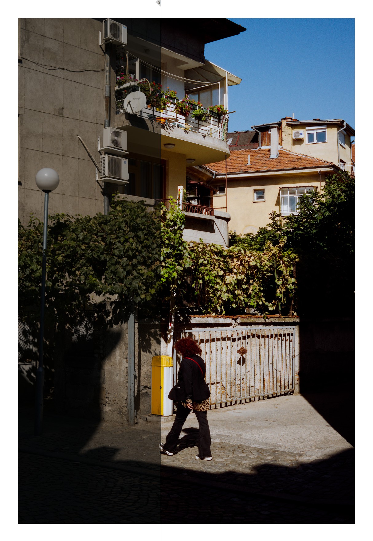
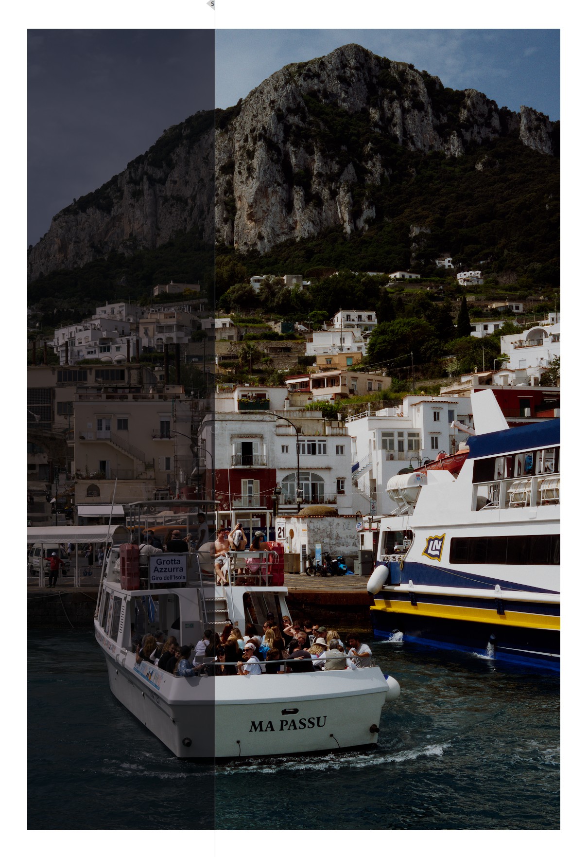

(100% crop)
Negative_Gold200.dtstyle (11.2 KB)
(edit - the gamut compression box in spektrafilm is disabled, because there is a color calibration tool further up the pipeline that does it too - but you can enable it and get less vivid blues)
2 Likes
I do not think it is negative values, I have them cliipped in the color calibration module right before spektrafilm via the option. Its just disco, dude 

This one is my favorite! Great stuff. Your styles and presets are so great that I didn’t even need to create my own. 
1 Like
When someone mentions disco
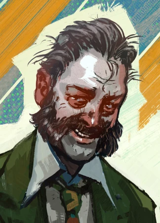
(I am not sure this reference will land on anyone in this forum, but it’s worth the try anyway)
1 Like