I think he was being ironic. You’ve got some sort of demon local contrast going on there, one that I can’t duplicate with just global tools…
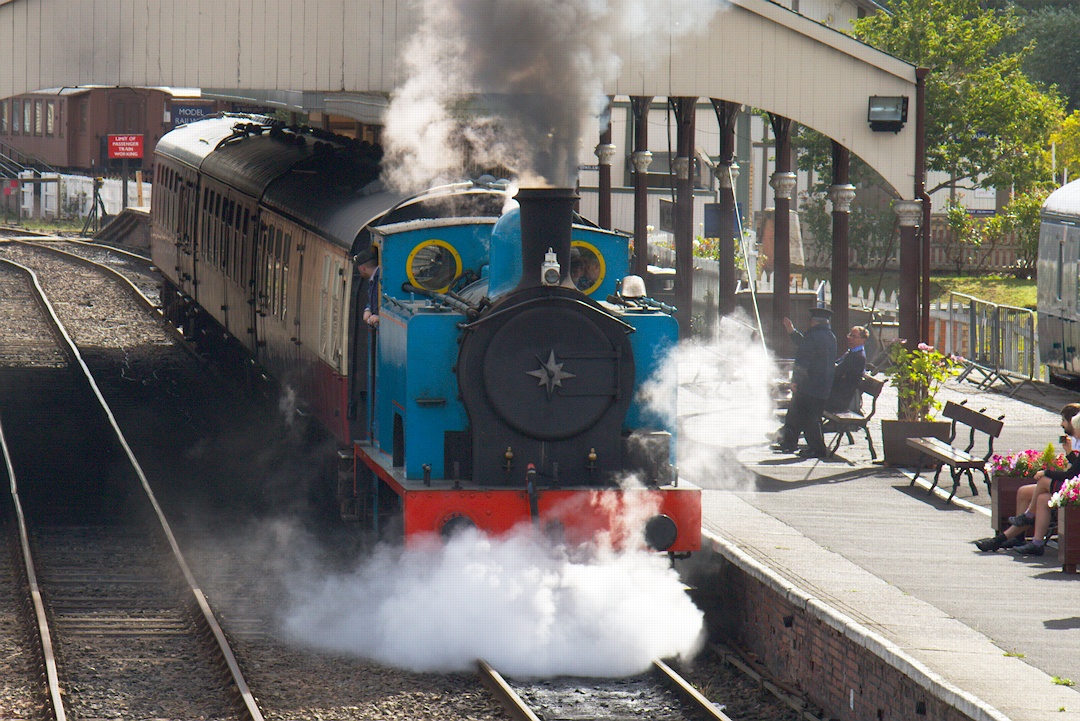
Ah, your posted rendition is IMG_0141, and the CR2 is 0140. I was peeping at the smoke and there’s detail coming through in your rendition I just couldn’t see in the raw…
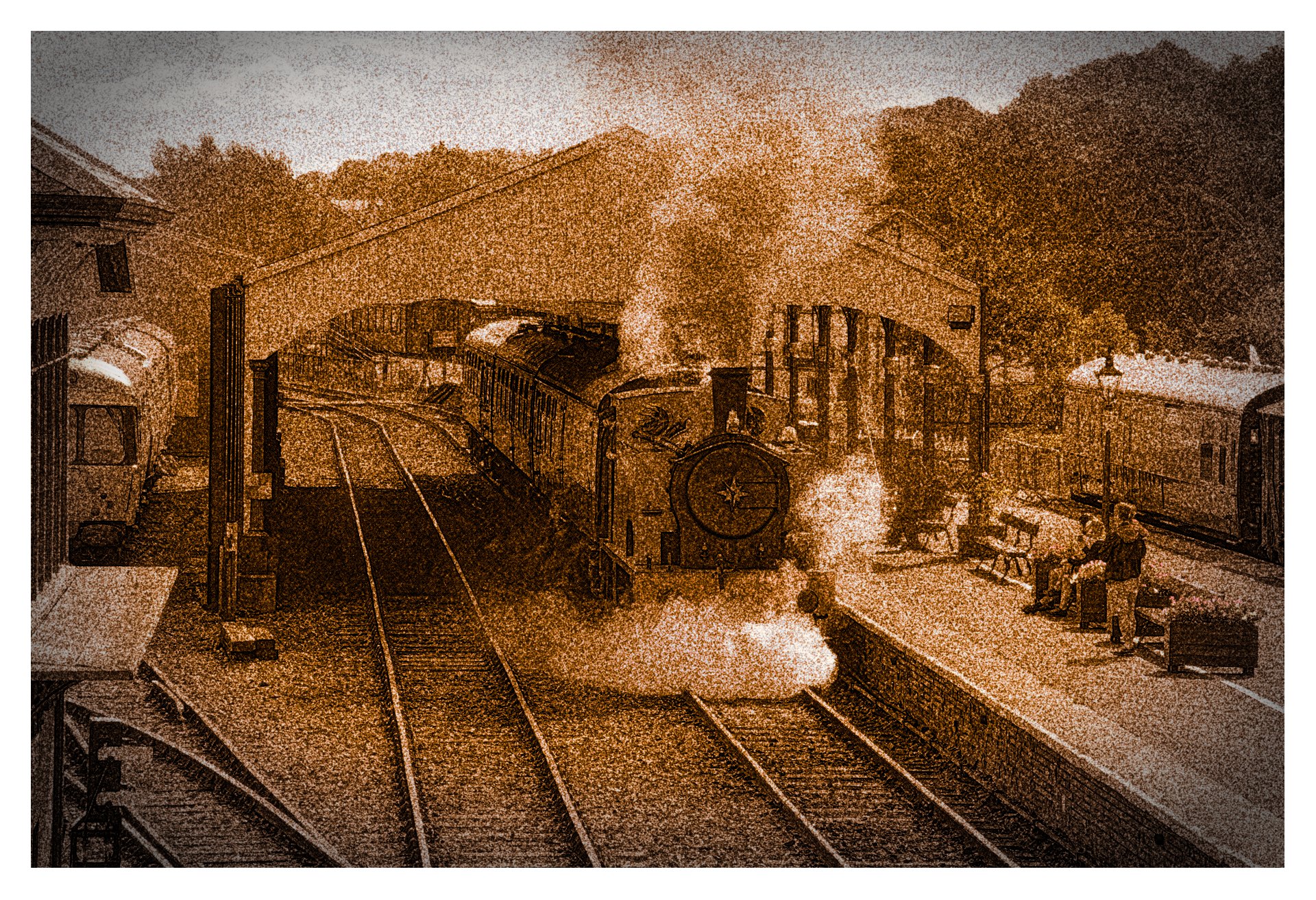
Here’s my rendition of 0140 in rawproc, using a double-logistic curve further shaped with a control-point curve, some HSL saturation, and a crop to bring into prominence the oh-so-interesting subject:
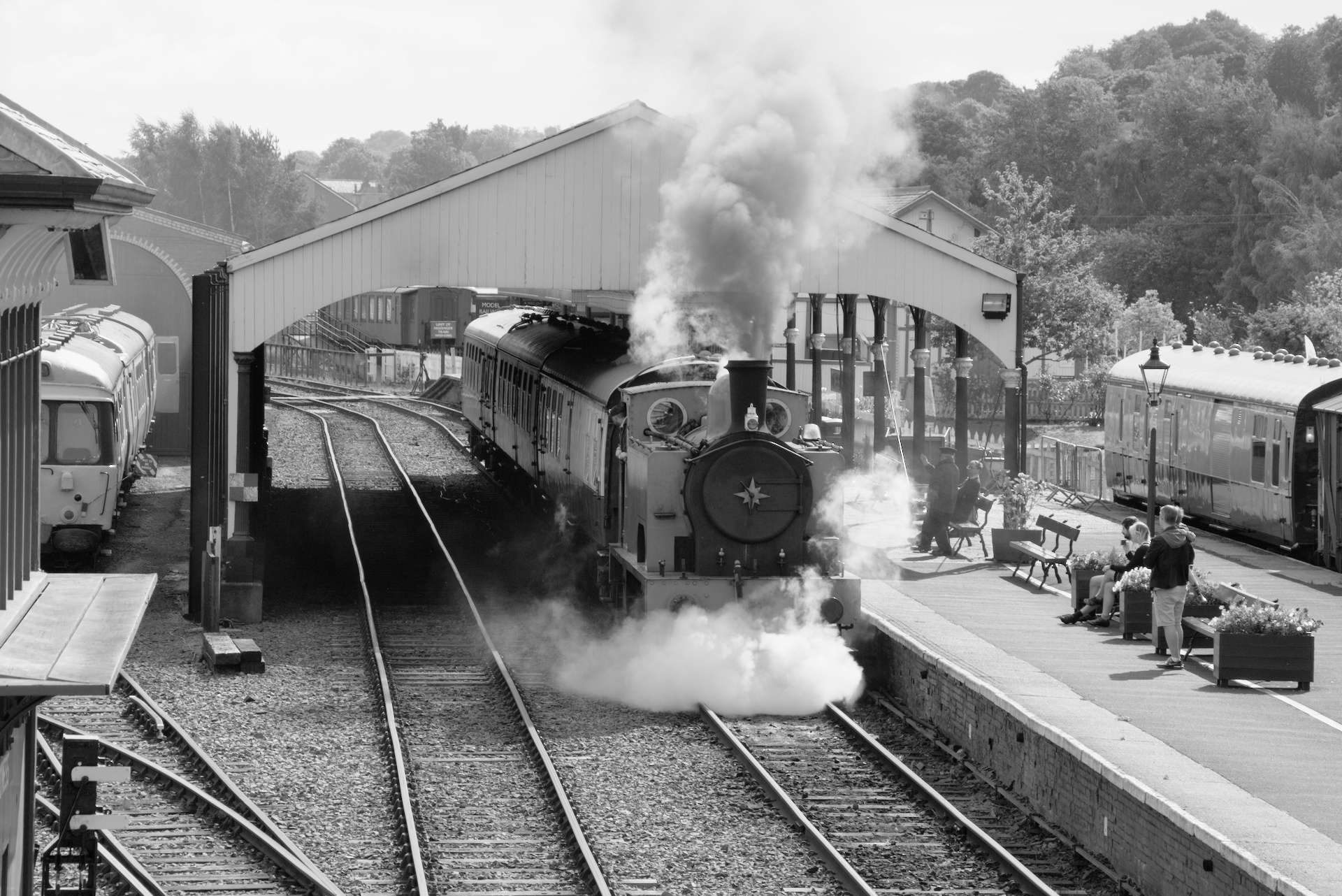
Well I am not sure that I have done a great job here, but I wanted to try a monochrome conversion in DT. Usually I do this sort of work in GIMP using curves to replicate the color contrast filters used by film photographers. I decided that the color zones module gave me suitable creative control for this sort of work. In my version you will notice that the round windows on the engine are very bright (maybe too bright) I achieved this by firstly desaturating the whole color range in the saturation tab of color zones. I then went to the lightness tab and brightened the yellows and darken the blues. I guess this replicates a yellow contrast filter used in film photography.
I feel I will explore monochrome conversions in DT a bit more now I have had this first attempt. Thanks for the opportunity.
I agree with paperdigits - the judge expressed his personal interpretation, but should he impose it on others?
If you process an image and are satisfied with the result, that is your own interpretation and just as valid as that of anyone else.
I couldn’t resist playing with this. Play Raw is part of my learning process. Done in GIMP as always.
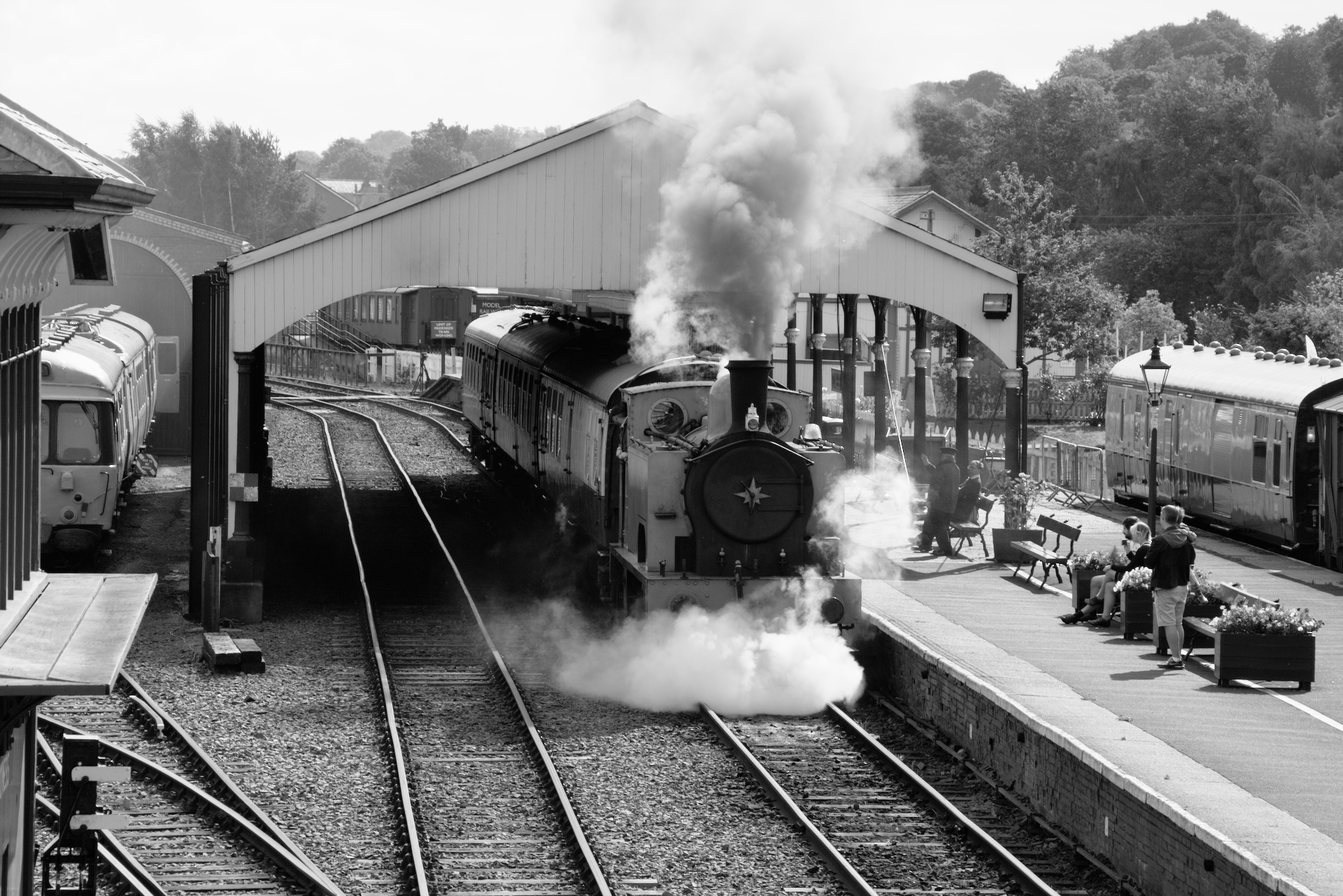
I desaturated the image, using curves I set the black and white points and applied a very slight “S” curve - mainly at the top end to whiten the steam.
I also like the colour version, because the only substantial areas of saturated colour focuses attention on the star of the show - the locomotive. The same crop to both images.
That’s what judges do; differentiate. If each entry were of equal value, then judging would be pointless. If you don’t want judgment, don’t ask for it.
Feedback is ALWAYS good; we are the worst judges of any situation, for we only have one narrow view into the scene…
But, IMHO if you know the mechanism of your medium, you can readily put the views of others into perspective, regarding what you’re trying to convey in your rendition. Don’t lose sight of that…
Thank you Brian for posting and making it possible to edit a real life Thomas tank engine
My version is with colours but with a little bit more focused crop. DT4.0.1
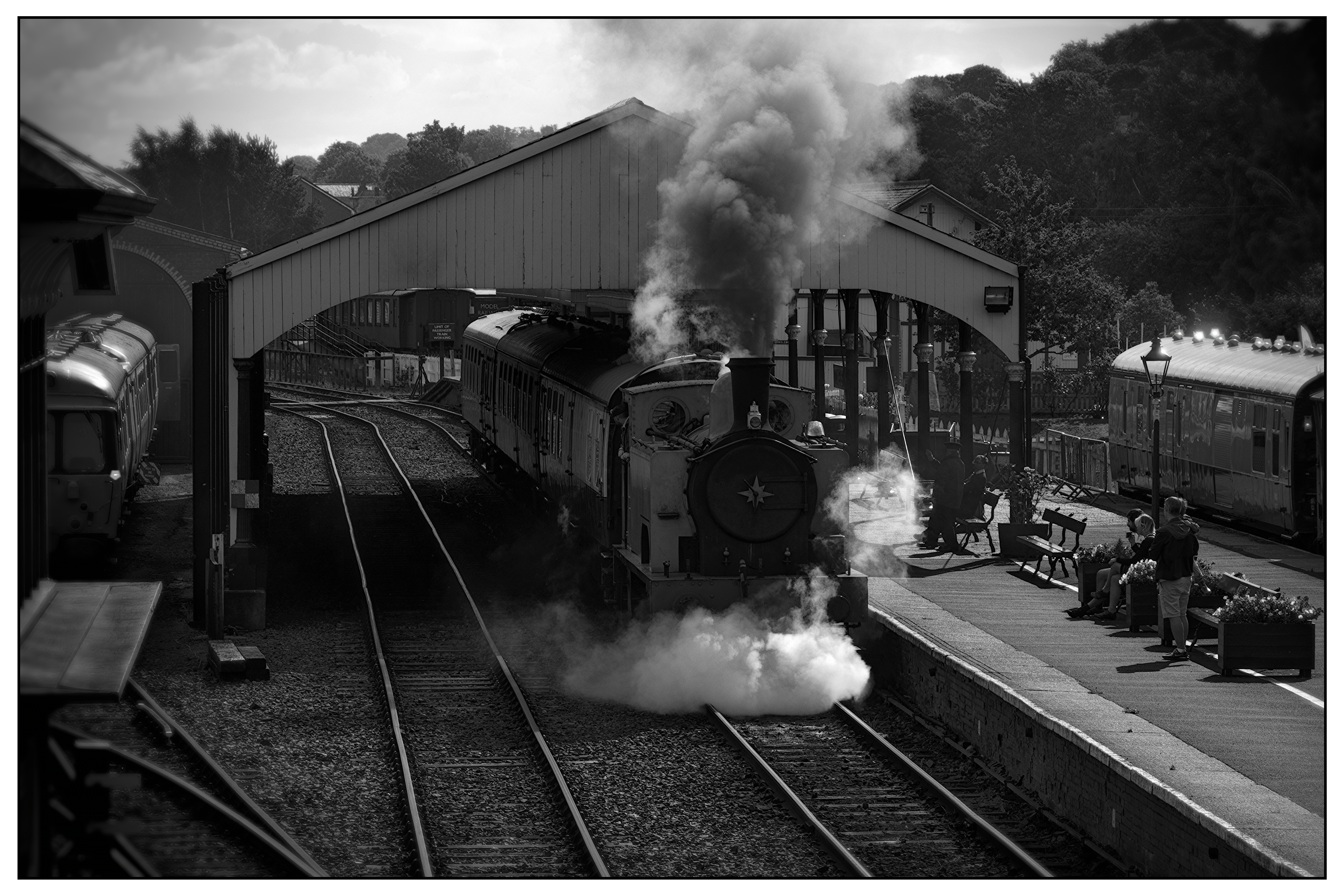
Ultimately as a judge we have to have a personal opinion. If I was to judge the original posted image I would have to say it looks unnatural. I thought it was trying to imitate an infrared look. It just looks surreal to me.
As a teacher of photography I do not impose my personal interpretations upon students but rather embrace their unique interpretation. I want to give them the skills to achieve what they want, not what I want. As a commercial photographer and portrait photographer I had a saying, “beauty is in the eye of the person with the wallet”. But as a judge I ultimately fall back on my personal opinion and that is why I have been asked to judge.
Have fun with your photography and ignore everyone’s opinion and listen to your own heart for what you like and enjoy.
Hi, thanks for sharing. I liked the overall composition so I didn’t crop. Old vehicles make photographs really look like a fragment of time. I added a bit of a retro Kodak Portra look.
did the judge talk about the image you just posted? Because there’s a lot of contrast. Also the image itself has a lot of contrast because it’s shot in harsh sunlight.
I guess the HDR look is deliberate and contain more detail than my interpretation. However, I’m not a fan of HDR as it usually looks false, largely a matter of personal taste.
Underexposed in the shadows.
It’s a bugbear with me as I cut my teeth on film negatives and black & white prints. It’s a conundrum of the times we live in. I still think in terms of printed images on paper which had a certain magic. Images on a computer screen seem to lack that quality which I can’t verbally describe. For me, there has always been an indescribable beauty in the black and white printed image which never left me and I always felt something was missing when I looked at a colour image. Even colour slide images projected on a screen lacked that certain something that a monochrome image had . Maybe that’s why I was such a fan of early Ansel Adams images.