And that’s precisely why I submit images to my photography clubs monthly competitions , to get feedback from judges to hopefully improve my images
2 Likes
Feedback is ALWAYS good; we are the worst judges of any situation, for we only have one narrow view into the scene…
But, IMHO if you know the mechanism of your medium, you can readily put the views of others into perspective, regarding what you’re trying to convey in your rendition. Don’t lose sight of that…
1 Like
DT 4.0.1
Nice image. Thanks for sharing.
Photo that should be approximately 188x (where x = [0…9]). 
20221014_IMG_0140.CR2.xmp (16,5 KB)
Ingredients:
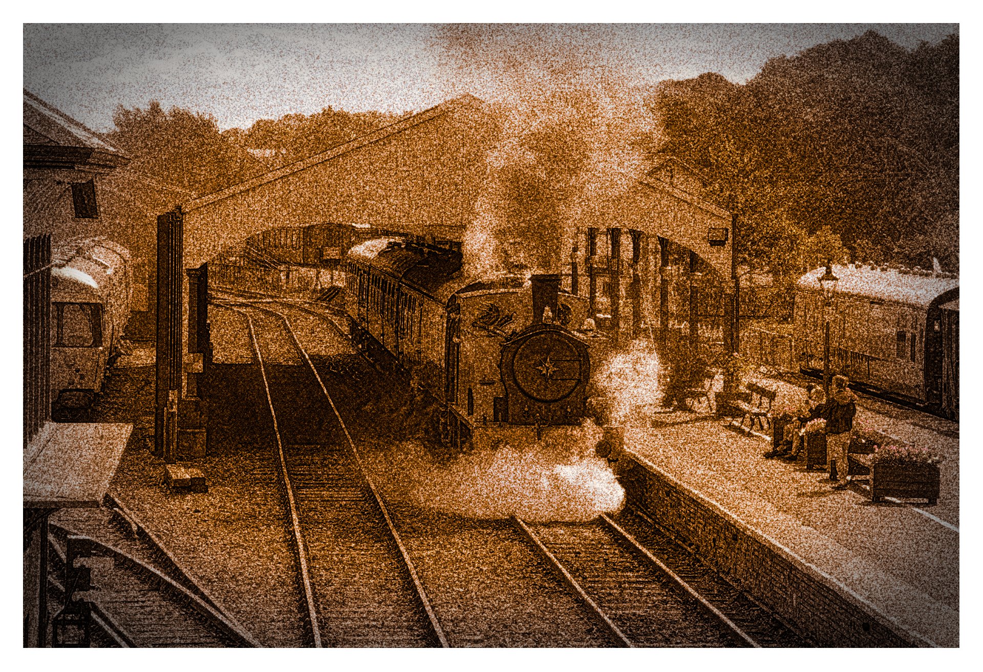
Tonal variations → authentic sepia preset.
2 grain modules at maximum.
Diffuse/sharp → preset Imitate line drawing (2 iterations)
and other ingredients.
If you want b/w, change tonal variations module to monochrome module and that’s it.
Cheers!
3 Likes
To everyone: enlarge this to the full width of your monitor. Wow!
To @arturoisilvia: yes, that little diff trick is superb!
Have fun,
Claes in Lund, Sweden
1 Like
Thank you Brian for posting and making it possible to edit a real life Thomas tank engine 
My version is with colours but with a little bit more focused crop. DT4.0.1

IMG_0140.CR2.xmp (17.9 KB)
4 Likes
Ultimately as a judge we have to have a personal opinion. If I was to judge the original posted image I would have to say it looks unnatural. I thought it was trying to imitate an infrared look. It just looks surreal to me.
As a teacher of photography I do not impose my personal interpretations upon students but rather embrace their unique interpretation. I want to give them the skills to achieve what they want, not what I want. As a commercial photographer and portrait photographer I had a saying, “beauty is in the eye of the person with the wallet”. But as a judge I ultimately fall back on my personal opinion and that is why I have been asked to judge.
Have fun with your photography and ignore everyone’s opinion and listen to your own heart for what you like and enjoy.
3 Likes
I think it was an ironic judgment as certainly he was not pleased with the rendering.
To approach this rendering, on contrary, I have to push the contrast, global and local.

2 Likes
Hi, thanks for sharing. I liked the overall composition so I didn’t crop. Old vehicles make photographs really look like a fragment of time. I added a bit of a retro Kodak Portra look.
dt 4.0.1

IMG_0140.CR2.xmp (13.0 KB)
3 Likes
did the judge talk about the image you just posted? Because there’s a lot of contrast. Also the image itself has a lot of contrast because it’s shot in harsh sunlight.
1 Like
Yes I agree. Not a lack of contrast…maybe too much in my opinion. Just forgive judges…they are only human after all.
I guess the HDR look is deliberate and contain more detail than my interpretation. However, I’m not a fan of HDR as it usually looks false, largely a matter of personal taste.

3 Likes
Thanks for posting. My try in darktable plus some sharpening in the Gimp.

IMG_0140.CR2.xmp (25.3 KB)
5 Likes
Looks good @bernyemm (fancy seeing you here!). Maybe a touch underexposed in the shadows though.
1 Like
Underexposed in the shadows.
It’s a bugbear with me as I cut my teeth on film negatives and black & white prints. It’s a conundrum of the times we live in. I still think in terms of printed images on paper which had a certain magic. Images on a computer screen seem to lack that quality which I can’t verbally describe. For me, there has always been an indescribable beauty in the black and white printed image which never left me and I always felt something was missing when I looked at a colour image. Even colour slide images projected on a screen lacked that certain something that a monochrome image had . Maybe that’s why I was such a fan of early Ansel Adams images.
Very nice interpretation.
There are labs who will make a digital print on gelatin silver paper. I’ve had. a few printed. They are really nice but pricey.
1 Like

If that lacks contrast, people saying so should check their eyes or their monitor!
Maybe the image is overly sharpened, but I think the contrast is nice.
Sander Knopper’s version may be a bit better, however.


