Thanks all, so I had a bit more time to try to study your art, thanks again everyone I learn a lot in this process! I’m not completely done, but for reference here is a comparison of the different methods with the advantage/drawbacks I can see:
As usual, an incredible edit… also in the number of used module, I’ll still need to spend a few hours to study it!! The contrast is maybe pushed a tiny bit too much, but this gives a really “pro” look, I love it. So to expend on the above analysis, I also see that with the exposure module, you have neither exposed the background, nor the faces, but you expose in between, so the faces are still a bit dark after the exposure,
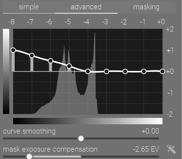
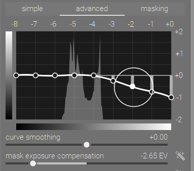
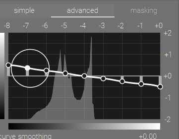
So here you exposed also in between, and just used two decreasing tone equalizers like this:
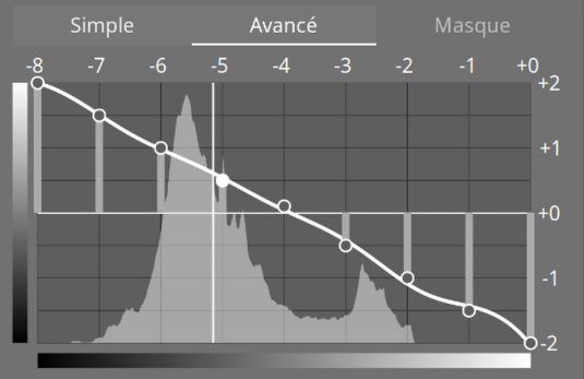
so we do see both background and faces, but you have similar issues to the one I experienced with faces with fairly low contrast like:

compared to the original

It may be possible to play with contrast equalizers/… to make this look good as well, I need to learn how to manage contrast!
I tried your edit, but I’m wondering if it loaded fine: I can see:
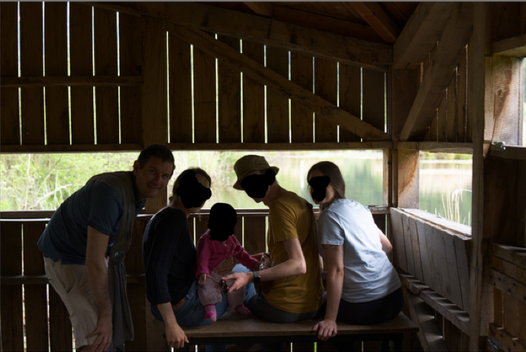
but it seems that faces are very dark (eg compared to your second edit where faces look much better) and in the list of applied module I just see one instance of color balance rgb (what is TE?). Am I missing something or was it the intended look? (darktable 5.4.1)
I really liked here the fact that the background is really visible and not too bright, but sadly when I apply this style on my actual image the contrast of the faces of my friend is really low which gives a really weird look (on my face that was not hidden it’s not very visible, so it’s not your fault here ^^ Funnily enough in yours you have no AgX/sigmoid/filmic… interesting! So here you exposed for the background, used two instances of tone equalizer to expose the faces, and local contrast/contrast equalizer to deal with the contrast + color balance rgb to push saturation a bit.
That’s a cool one, simpler than popanz’s in number of modules, and with a more “natural” style, but contrast is still decent, and both faces and the background appear clearly. Faces are maybe a bit underexposed and contrast could be pushed a bit more, but I like it a lot as well given the number of used modules! And I learned one thing: if you expose for the background and use contrast: -50% in color balance rgb, you can bring back light in the dark areas (here the faces ^^) and still get something decent! (well as you mention contrast is added back via AgX, so you need both modules to work together)
Anyway, I’ll continue to play and learn from your edits, thanks all again!