Shadows/highlight are not clipped and well preserved since I can recover them with low exposure:
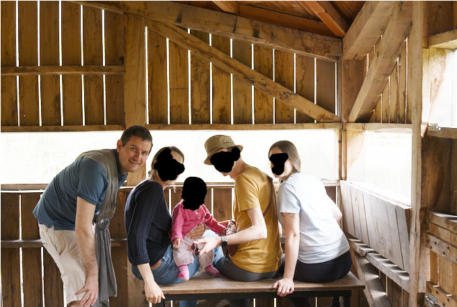
But I still struggle to show both the outside and the people, since either the outside is washed out, or the people are too dark. I tried to play:
with AgX settings (shoulder power seems to help, but I can’t go below 1 while it seems like I’d need to to continue the effect further)
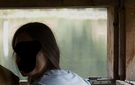
exposure mask, but I get ugly artefacts like this (a bit over-exagerated by setting feather to 0, but higher feather still look weird or just cancel the advantage of the exposure)
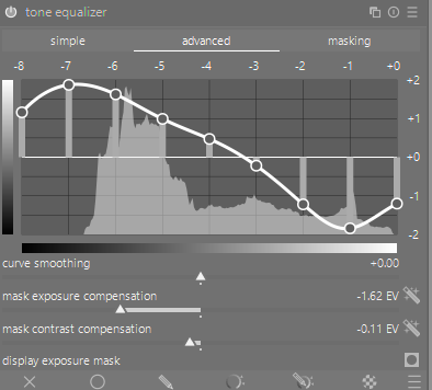
and I tried with many stacked instances (is it ok to stack like 6 or seven instances to have enough amplitude on the module?) of tone equalizer, but I completely lose the contrast on the face (sorry here some of them are heavily hidden) that look very unnatural. Any recommendation?
Sorry, I needed tiff because faces are edited so I can’t upload it here, but here is the 16-bit “raw” : srgb_edited.tiff - Nextcloud
A thought for experimentation: I sometimes find it is easier to brighten shadows rather then pulling down the lights. This is an incredibly complex scene to manage the wide dynamic range as the background also bleeds through the cracks between the planks.
Here’s my xmp using TE to lift the shadows and trying to fiddle TEs masking to avoid artifacts.
It is my opinion that you shouldn’t try and recover highlights and shadows to the extent that both the faces and the outside seem similarly bright. I think it looks pretty unnatural. I think it’s better just to have the outside overexposed a little. Even an HDR or AHDR-style image IMO would look weird. Bringing everything back to the midtone range is fighting against the light. It’s better to just let the highlights go or in the future, try to compose where the light is more the way you want it.
here’s another one inspired by @wpferguson mentioning reducing the contrast: used color balance RGB to pull down the contrast, adjusting the contrast gray fulcrum to taste and then adding contrast via AgX again. This has the benefit of not needing any masks and thus not having to worry about artifacting.
But I also have to agree with @JasonTheBirder : Your JPEG posted in the original post looks fine as a great capture of the moment anyway in which nobody but you will worry about it’s qualities as a landscape shot ;-).
Maybe you could post a raw taken for the purpose of a Playraw so people can demonstrate their methods of dealing with the issue.
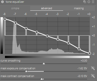
I find DT extremely capable of dealing with wide dynamic range of lighting as long as the highlights are not clipped in all three RGB channels. My first way of tackling the problem is to use the tone equalizer module to recover the shadow and the highlight details. I usually set the mask to guided filter in the mask tab, but you can experiment with the options and see which looks best.
Besides this the color balance RGB module can selectively brighten the shadows a bit more if required and the old school shadow and highlights module can also assist. I usually use all of these modules together in my method.
Thanks all for your answers! And great to see that many people I really admire in this forum took the challenge I don’t have my computer with me now so I can’t test your XML but I can’t wait to try them all!
While I usually don’t mind to put CC license on my photos, I was hesitant to put a generic CC license on it because there are people (hidden face) in this picture that may not want to be seen in artwork outside of this context (I’m sure they don’t mind to be here in this forum, but likely not used in other artistic pieces). So if you know a license (or if this text is enough) that allows photo to be used in teaching materials and for testing sotwares, but not reused in a different (possibly embarassing) composition, I’d hapilly license it this way and move it to play raw.
I could try but I can’t go to the same place again and I found this picture to have multiple interesting difficulties like the wood color, the space between the wood, the fact that the zone on the right is often creating artifacts etc so I was curious to see what you could do here.
A little maybe, but as a human you could very clearly see the background behind people instead of this dirty white hallow, so for me the current version is unatural and I’d like to recover the human perception of seing the background behind.
I’ll try with the guided filter option, but what do you do if you don’t have enough amplitude with a single use of the module (as I experienced)? I also find it hard to keep the modification “monotonous” as a too steep curve may bring pixels with low luminosity higher that pixels with higher luminosity, and it’s hard to detect when we broke the rule ^^’
Please don’t be too critical of this edit as I was just trying to demonstrate my approach of sharing the work between modules rather than a single module doing all the heavy lifting. Also each module would define what is a shadow and highlight differently reducing the risk of artefacts.
This was no critic, just explanation, why I offered only the xmp. Your rerasons are more than understandable and I bow to the respect, you bring to this people by protecting their privacy.
I used two instances of tone equalizer for your picture. Sometimes I use three to get where I want. One of them may have a mask to affect certain regions, colors or color intensities. Whatever you need.
If you’d like to play raw why do not you just take a picture through some window with intense sunlight outside and half or more closed curtains to darken the inside. See for it not to blow out the highlights outside and you’re ready to go!
There are a few like that already here on the forum…those with great recall might be able to quickly dig them up and rhere is a set that have been used over the years , one is inside a cabin with people having coffee looking out on the snow and one is a woman in a chair looking out over the water… Usually searching topics on dynamic range will fetch them…I think Boris did a church window example as well…
So I’m slowly processing all these very cool images, thanks all it helps a lot (and don’t get upset if I spend some time before analyzing yours).
I really like this punchy look, thanks! I tried to analyze it step by step to extract the most important part : my understanding is that most of the work to deal with the high dynamic image is done by the Shadows and highlights module (supposed to be kind of deprecated?) + the AgX module has some extreme values around the relative exposition of black and white (was this auto-detected ?). I never used it before but it seems very effective to bring back highlights without artefacts! I can even push bring the highlight a bit more in the shadows to recover them even more. Why is it more effective than tvne equalizer while doc mentions tone eq should be preferred over Shadows and figflights? It also seem that you play a lot with the contrasts (Diffusion & sharpness, Constrast equalizer, Sharpen + 2 local contrast instances!!), but I really struggle to understand when to do what. Any recommendation?
I’m also surprised by the fact that you have no module to deal with the white balance directly : is it just because in the tiff a basic color balance was already applied, and then you just used the color calibration module (R, V, B, Sat & Lum tabs) to apply them? Any reason you don’t use the CAT tab to fix the white balance ? Any insight how to use the other tabs instead (no idea why you would push one slider instead of another).
I’m also curious about the “color zones” module that you used twice + the color equalizer module. I thought that color equalizer should be used now instead of color zones, why do you use 2 extra instances of color zones ?
More generally, if you have the time, I’d love a bit more insight on how you processed this image and how you decided which module to use and how notably for the contrast-rellated ones! Thanks!
[I need to go now, but I’ll continue with others later! Thanks again!]
Yes I use autodetection, when the dynamic range is very high. Even though I tend to use it most of the times with a very high scaling.
You can push it quite far. But I wouldn’t do it. I agree in this aspect with @JasonTheBirder
For me contrasts are the salt in the soup. But be careful they are really like salt. To less of 'em makes the picture a bit flaw a touch to much can ruin the whole thing. Why do I use different modules for it and even multiple instance? Because they all have advantages and disadvantages. All of them bring the danger of halos and other artifacts. With the combination targeting different parts, I try to avoid this as good as possible.
I usually use the WB module for WB and not the colour calibration module. This I use just for some colour correction. Therefore, the bypass. With the rest you are right. There was already a fitting WB in the tiff. I think @s7habo has made a vid which is explaining the module nearer and better than I could do.
I don’t care what modules I SHOULD use, I use which I like the most. colour zones has some disadvantages yes, but it’s still far more flexible than colour equalizer. So I use colour equalizer as base and then use colour zones for the fine-tuning or the things colour equalizer simply can’t do. The second instance for example is pushing the just slightly saturated parts of the picture and turns the strong saturated a bit down.
I use most of the time the same modules. All with a base setting which work well for me. I just adjust them then in their intensity or seldomly switch of one if it is for some reason not fitting.

 I don’t have my computer with me now so I can’t test your XML but I can’t wait to try them all!