These aren’t functional issues but as evidenced by the fact that I’ve occasionally been momentarily ‘fooled’ by them maybe they could be considered. Not complaints, just food for thought. Also, I may be the only person who even pays attention to such things. ![]()
Inconsistency between gradient tool and gradient mask slider order
Gradient tool - order top to bottom is strength, angle, feather, centering:
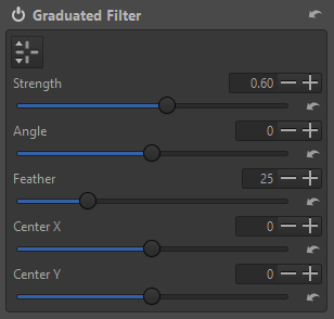
Gradient (shape) mask - order top to bottom is centering, strength, angle, feather:

IMO it would be logical to have the sliders in the same order in both places. They’re not 1:1 the same, but the shape mask is really just a slight extension of the gradient filter.
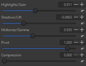
Highlights / Shadows / Midtones controls
Color/Tone Correction HSL factors mode layout:

To me it would be more logical to have the shadows at the bottom and the midtones in the center. After all, midtones are in the middle, by name. ![]() The same logic holds true for other places where H/S/M controls are used, for example:
The same logic holds true for other places where H/S/M controls are used, for example:
Again, none of this is a problem but IMO these kinds of refinements can help make a UI more usable.
Thanks.