From other discussions I know the opinion, that synthetic image files are of course no tool to learn good real world photo processing. But, when going through the very (VERY!) good Darktable videos of Aurelien Pierre and Boris Hajdukovic I was motivated to try both: The real world photos and some synthetic test images.
To my humble opinion and experience, test images can help in understanding not only the module effects, but also the physics and math behind light and human eye. I am not ready to create artificial raw image files (exr, dng …) and I think, that is not required for first learning. That is why I concentrate on png files. PNG files are lossless, simple to create and have a very small file size for synthetic graphics.
After calibrating my monitors and using Spydercheckr in Darktable for my camera, I was motivated to create an synthetic Spydercheckr sRGB PNG file. It is nice to compare this with the color calibrated photo in Darktable. I can post this PNG here, if somebody likes it.
One of my topics in training engineers at high school for basics of optics and electronics is the nonlinear digital coding of audio and image data. Most people do not really know, why nonlinear coding is used. It is NOT, because CRT-based television did need correction. It is, because nonlinear coding does result in bit savings. The human perception of sound and light is nonlinear. That is why 8 bit nonlinear coding instead of 11 bit linear coding is used and usually OK for speech and photo coding.
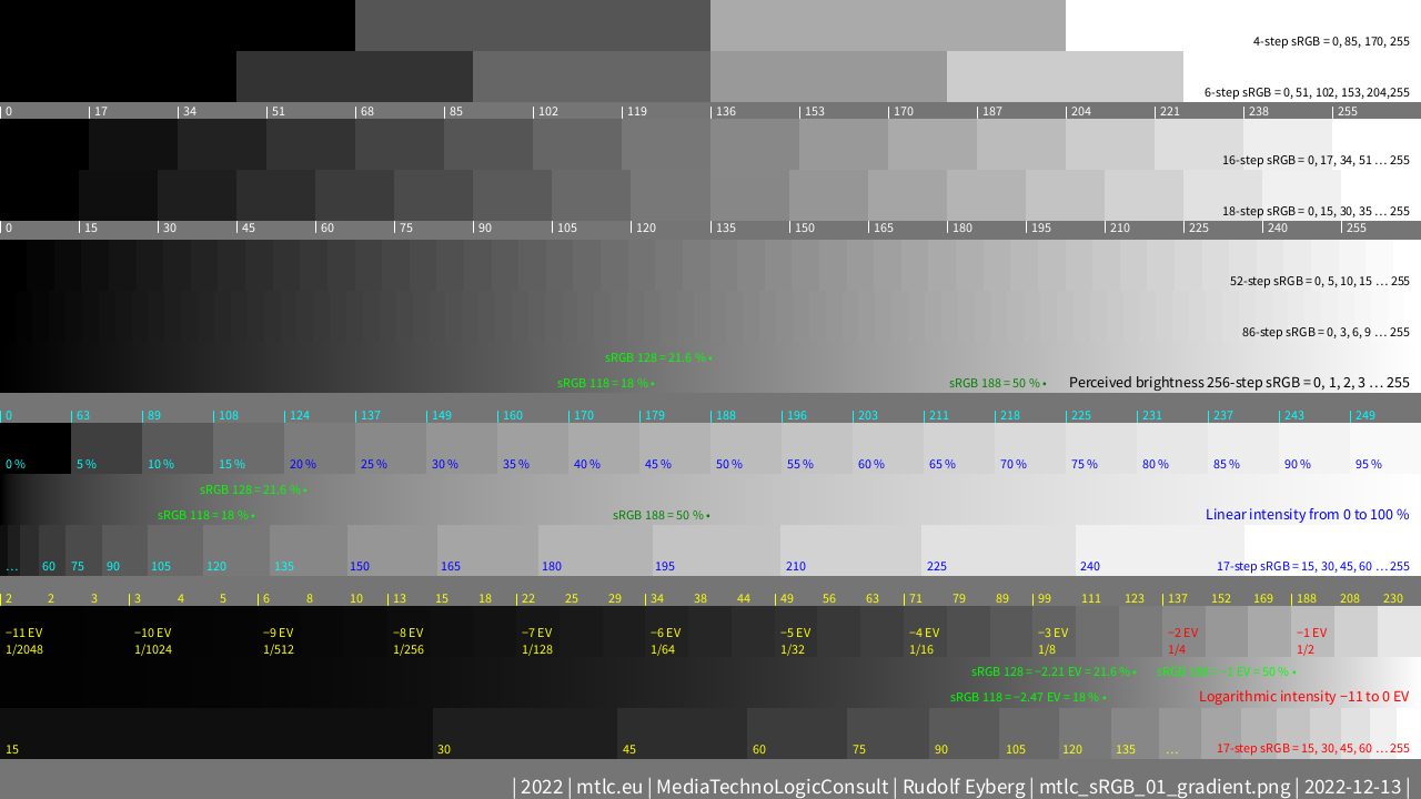
Please find in my next posting one chart, which does show the nonlinear 8 bit coding of sRGB (IEC 61966-2-1:1999 standard). In comparison to this human perceived sRGB brightness, the linear intensity of light and the 11 EV (exposure value) logarithmic scale is shown.
Here is my first test image (1920x1080 on demand).
Hopefully it is self explaining. If not, feel free to comment and propose improvements.
I use it heavily to learn about “filmic rgb” and additional modules to regain highlight (or/and shadow) contrast.
White/Black text: Nonlinear scale of perceived brightness.
Cyan/Blue text: Linear scale of light intensity.
Yellow/Red text: Logarithmic scale of exposure values.
Green text: 18 % (118), 21.6 % (128) and 50 % (188) gray (sRGB values).
BTW: The sRGB calculations for the test picture are done with the complete transfer functions and not with rough estimations like gamma 2.2. That means with the small linear region 12.92*P until 0.31308 % light intensity P and above this, the exponential region with 1.055*P^(1/2.4) − 0.055. And finally 18 % = −2.47 EV origins from the geometric average of 5 EV zones which is sqrt(1/32).
Thanks for sharing… These can be useful as well. The images contain a color chart so you can place pickers to monitor and there are a range of elements to test gamut and detail and noise…
Random camera chosen but most popular ones have test shots and raw image galleries
Not synthetic but also useful…
The tonal one share here by the OP is a nice visual aid too…
At the beginning I was frustrated with a lot of my photos due to the loss of highlight contrast and a loss of brightness/brilliance. For example a white shirt with nice detailed wrinkels turned into a dull homogeneous white surface. Similar loss of contrast can happen to a dark area (even) in the same image.
From Aurelien and Boris I learned the benefits and options (and limitations) with filmic RGB and other modules on real world photos and how to manage the wanted contrast. Either globally or regional or parametric in the image.
With defined artificial test images and the color picker of Darktable you can learn better about the transfer functions of modules. You can try for example to achieve the original sRGB colors of an test image by adjusting filmic RGB.
Or try to adjust original 6 white to black squares of the Spydercheckr with just “exposure” and “filmic rgb” module. This is a challenge on both real world and synthetic images, but possible! There is no real usage for such “neutral” settings, but it is good for learning.
The next self explaining, well known png image without too much posting words.
Color calibration with this in Darktable is fun and does lead to perfection!
(1920x1080 version on demand)
I think, it is important to understand the effect of “filmic rgb” and how to keep or increase the contrast in bright, middle and dark areas together with other modules.
Of course, it is a contradiction in terms if the contrast is supposed to be good or even increased everywhere. The high dynamic range and thus contrast of reality and camera cannot be transferred completely to a display with sRGB. That’s why “filmic rgb” is existing and that’s why the developer of a photo has to put his artistic hand on a photo file.
The following test image is, in my humble opinion and experience, a very good way to try out and understand the effects of filmic rgb and other modules. This, because there is contrast in all intensity areas and you can try to increase this contrast. Imagine that the bright area is white snow with details and the dark areas are shadows with details. Bringing out these contrast details is a challenge. If this can be done on the test image, and of course it can, then it can be done also on a real photo.
An almost neutral behavior is also possible with “filmic rgb”. See the following screenshot of a quite neutral setting. With this only a small difference between enabled/disabled “filmic rgb” are noticeable in the dark areas. This “neutral setting” is not necessarily practical, but it shows what does happen.