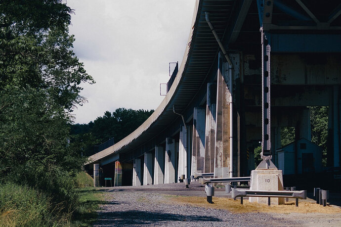
I like yours quite a bit actually, but I took mine in the kind of the complete opposite direction:
DSCF4682.RAF.xmp (32.2 KB)
There’s a bit of stigma surrounding so-called “teal and orange” colour grades thanks to Hollywood, but I’ve nearly always preferred the colour contrast on offer thanks to blue casts in the shadows to a “correction”.
And if I’m drawing attention to the bridge with colour, I don’t want too much information in the sky competing with it.
