oops, my misunderstanding, sorry.
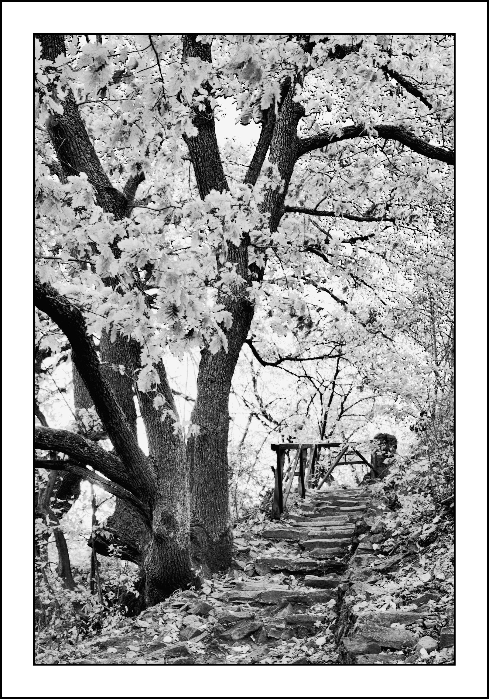
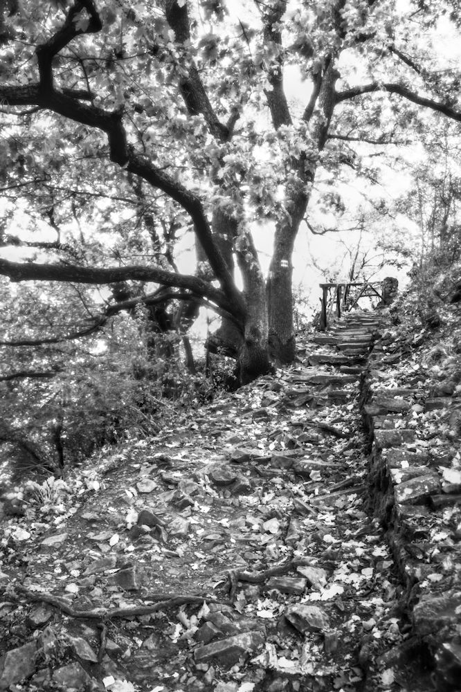
yeah, it’s interesting. Similar to mine in terms of how heavily you leaned into it. The comparison highlisgths the dilemma of whether to make foliage bright to create contrast with the branches, or dark, to create contrast with the sky in the background. I went for the former, more unconventional look, but looking at your pic, maybe I should reconsider.
Since your original request was to learn DorS, my first edit pretty much relied on that. But it seems that you now realize
You also state
I’m not sure about you, but I think many people, when using local contrast in dt, have a problem with the ‘details’ slider and get a bit carried away making things unnaturally sharp—is that part of the “overcooked” look you might be talking about, or are you specifically referring to over-contrasty with crushed darks and blown whites? Or both?
When you say,
whose “good taste” are you appealing to?
Personally, in B&W photography, I have no problem crushing some blacks and blowing out some highlights if it helps me realize my vision for the image. So-called “good taste” be damned. ![]()
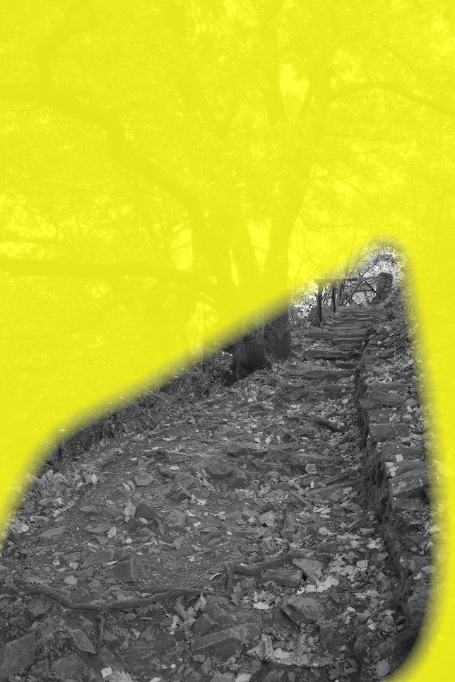
If this were my image, this is probably how I would post process it (I believe the edits are identical and just the crop is different—I personally find the steps and fence intriguing).
dt 5.3+556 nightly : IMG_4368.CR2.xmp (13.9 KB)
dt 5.3+556 nightly : IMG_4368_01.CR2.xmp (16.2 KB)
4 Likes
Fantastic. My favorite by a country mile (or lane).
2 Likes
I stuck with the idea of BW and did the conversion at the end of my edit. I used a preset I have created called texture, but this preset I directly copied form another user on this forum. They did the hardwork and I just reap the benefits. DT 5.3 with AgX module for tonemapping.
_DSF1722.RAF.xmp (8.1 KB)
1 Like
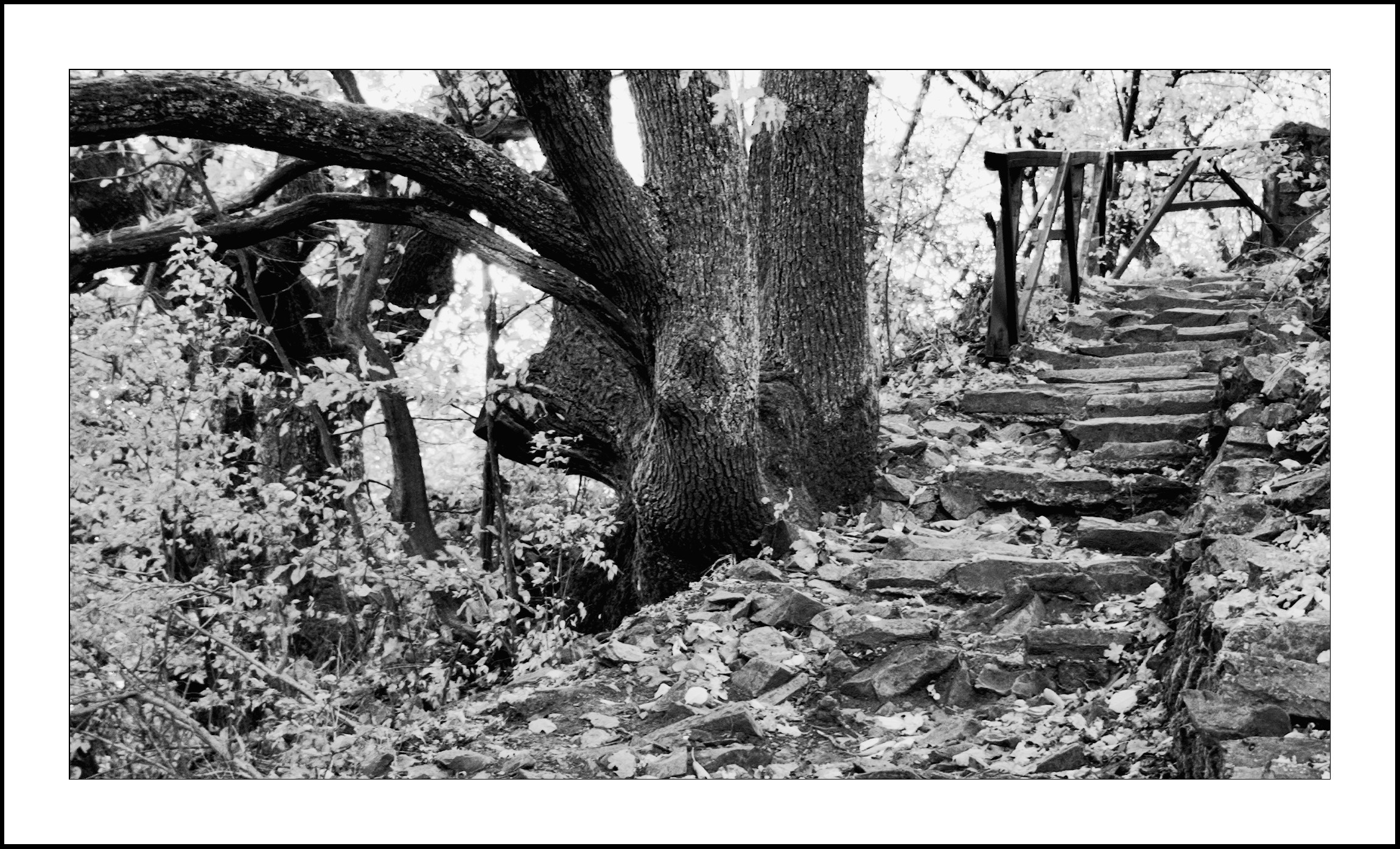
I had another play to add more contrast. I placed the color equalizer module before the CC module which I used for b/w conversion. I also added higher levels of local contrast.
_DSF1722.RAF.xmp (12.6 KB)
2 Likes
Going back to your original post. You are after contrast and there are a number of modules aimed at working contrast as sometimes implied in their names. Diffuse or sharpen seems to be concentrating on the sharpness and softness as the name implies. I doubt this is the best tool for what you want to achieve. Just my uninformed thoughts. I am happy to be corrected on this.
1 Like
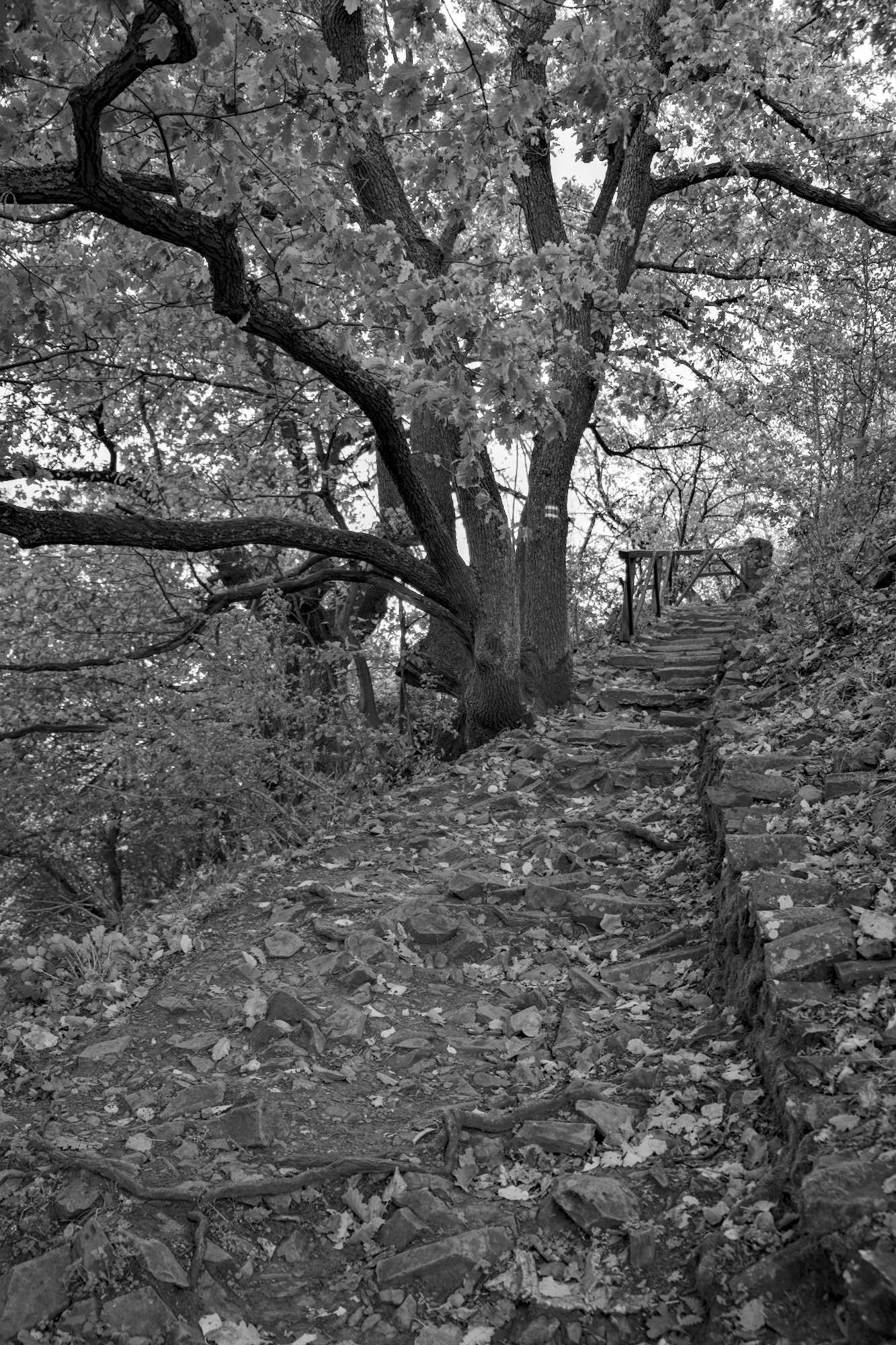
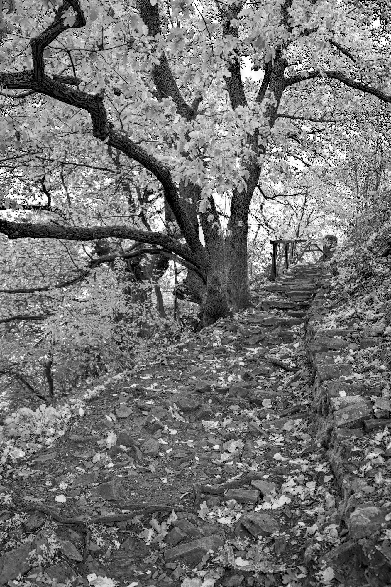
I like @europlatus’s and @EmerS’s edits the best. If you’re looking for that dramatic, strong contrast black & white look, you could also consider using sigmoid as I described here. In this case, you can then use the input G slider on the gray tab of color calibration to ensure the greens are the brightest part to make the leaves contrast with the rocks, trunk, etc.
I used a combination of contrast equalizer and diffuse or sharpen with the bloom preset and a drawn mask to only apply the effect outside the main area of focus:
Here’s the final result:
_DSF1722.RAF.xmp (13.0 KB)
3 Likes