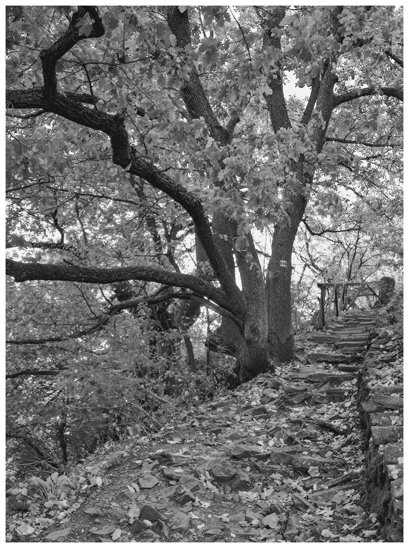
It’s time for me to take the leap from presets (with iterations increased) to full manual setup.
What I’m after is strong contrast and a bit enhanced sharpness. without amplifying visual noise, clutter, and without totally crushed blacks. Let’s say maxing out contrast within these constraints.
PLEASE explain your approach so that I have a chance to understand the concept.
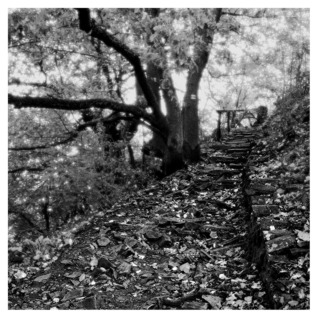
Best I was able to come up with is, after taking in what I was able to from @s7habo 's related video is below. Increased the contrast and sharpness, though less than I would’ve liked to because it already started looking overcooked, and then another instance masked on edges where I applied diffusion, to get rid of the clutter.
If you have something close to your taste the three sliders at the bottom can really tweak the output…the sharpness and edge sensitivity can be moved around together to impact the “contrast” look and the real key to the module can be the edge threshold…too far right blunts most of the adjustment and too far left will break the image…just small adjustments can either work to clean up artifacts or make the effect much more pronounced… I would experiment with those sliders to come up with a few candidate presets… I did experiment also I think with masking to exlude the very brightest and darkest pixels as sometimes the DorS can push those to a point of creating micro artifacts…
Those are a couple of tips that I use…as always I might just be an n of 1 for my comments to take it as just that…
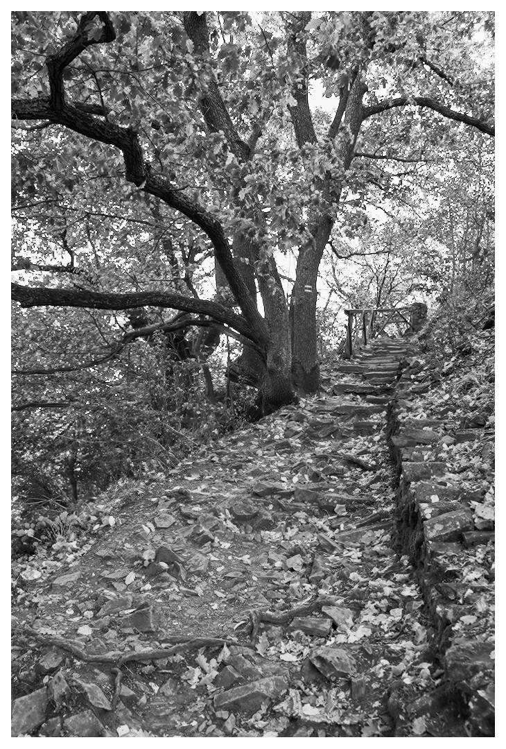
Sorry, I know you wanted Diffuse or Sharpen to be used, but I really don’t enjoy using that module, so here’s a version I did using Contrast Equalizer instead. I find that this module is really good for softening some parts of the image and sharpening others. D&S can do that too of course, but I find it much more difficult in that module.
This is your edit but with a preset that Boris used somewhere and I saved it called extra contrast…the point is though toggle HQP mode on and off and you will see quite a difference. If you were to export using high quality reprocessing your export esp when looking at it zoomed out at full screen but use the default preview then you will be perhaps notice the export doesnt line up as well… so for this module especially it seems that its really important to match HQP with HQR for your export and normal preview will match more so a setting of no for the HQR on export…
Actually you can see this with your edit as well if you toggle the mode…
I’m unfortunately as well no one who can teach you D&S. I hardly use it. Usually just for some slight sharpening. Sometimes for some Effects. For sharpening I use more or less just presets. And regarding effects, I use two or three own presets. How did I come to them? Well I have to admit I stumbled over them by accident when playing around. I never understood the logic of D&S, and it is a black box for me. Usually I avoid things I don’t understand, and that’s as well with D&S.
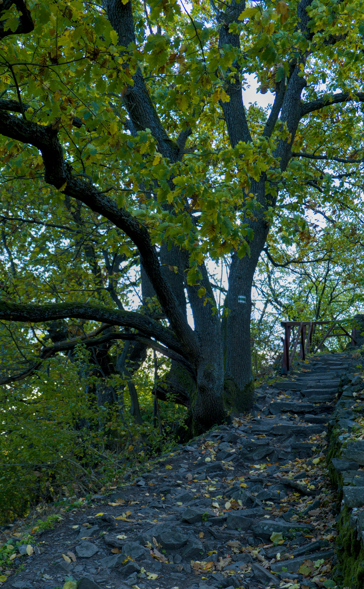
SO that’s my edit. I get contrast over the modules local contrast, AgX and a bit of contrast equalizer.
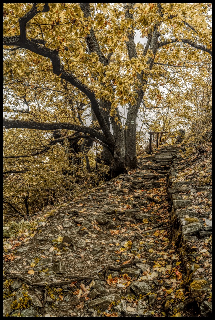
I did not allow myself to use Tone EQ, or dodge/burn with exposure. Both of these methods would be better suited to bring out contrasts in this image (imo). I used 1 instance of color balance rgb with for universal adjustements. I did allow myself 1 instance of color eq. I used 2 instances of chromatic aboration modules, but did not bother trying to fix the blown highlights.
Its hard to increase contrasts without bringing out clutter when the scene is, itself, cluttered. I leaned into it. Darks/blacks could be a touch lighter if its wanted by adjusting black point. When debluring/sharpening I use the details slider in parametric masks to keep from making it pop out on “flat” surfaces.
I split D&S local contrast adjustments (start from preset and alter to suit the image) between mids and lights+highlights. I did use 1 D&S instance in multiply blend mode to add a lot more punch.
Thanks for all the replies. I’ve been reading them and been thinking about this, coming to 2 possible conclusion:
A
Diffuse or Sharpen is not the right tool for the use case. If you put a technically superior tool unfit for the use case next to one that is, the latter will win out.
In this case that would be the contrast equalizer, where you can remove contrast from the finer details while adding some to mid and coarser areas.
B
Sometimes I have a problem restraining my local contrast use. I think regarding most aspects of postprocessing I can nicely keep my work within the bounds of good taste, not overcooking the pic, but with local contrast finding the right balance is harder for me.
Sorry. I realize now that I was not clear. I was saying I dont love my edit. It is dificult, for me, to only (mainly) use D&S. I think using other tools to rough in the contrasts, and then use D&S for finishing touches would probably work better.
That said, there are people who are way better at the D&S game, so I am sure someone will show how its totally possible.
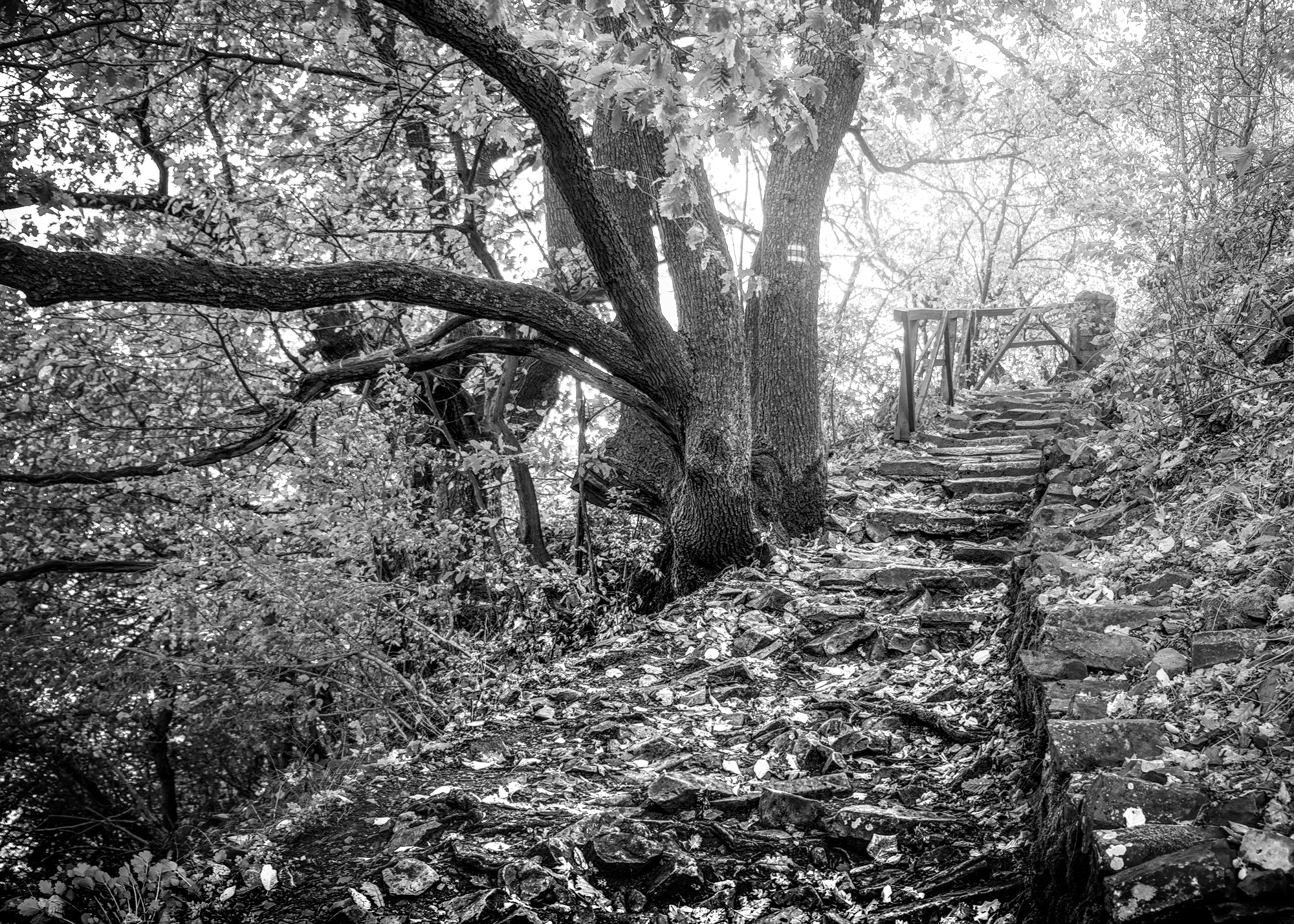
EDIT: If this was my image: Since I wasn’t lucky enough to have a strong subject at the “end” of the path, I would make the path itself the subject and try to add an air of mystery to the surroundings. So, crush blacks, bloom the highlights, and add a strong diffusion to everything around the path. Basically, allude to some “mystical” location which one is traveling through.
The following isnt exact, but it would be my starting point. I would live with it for a bit, then make tweeks as my natural “I wish this part were a little different” habits kicked in over time.
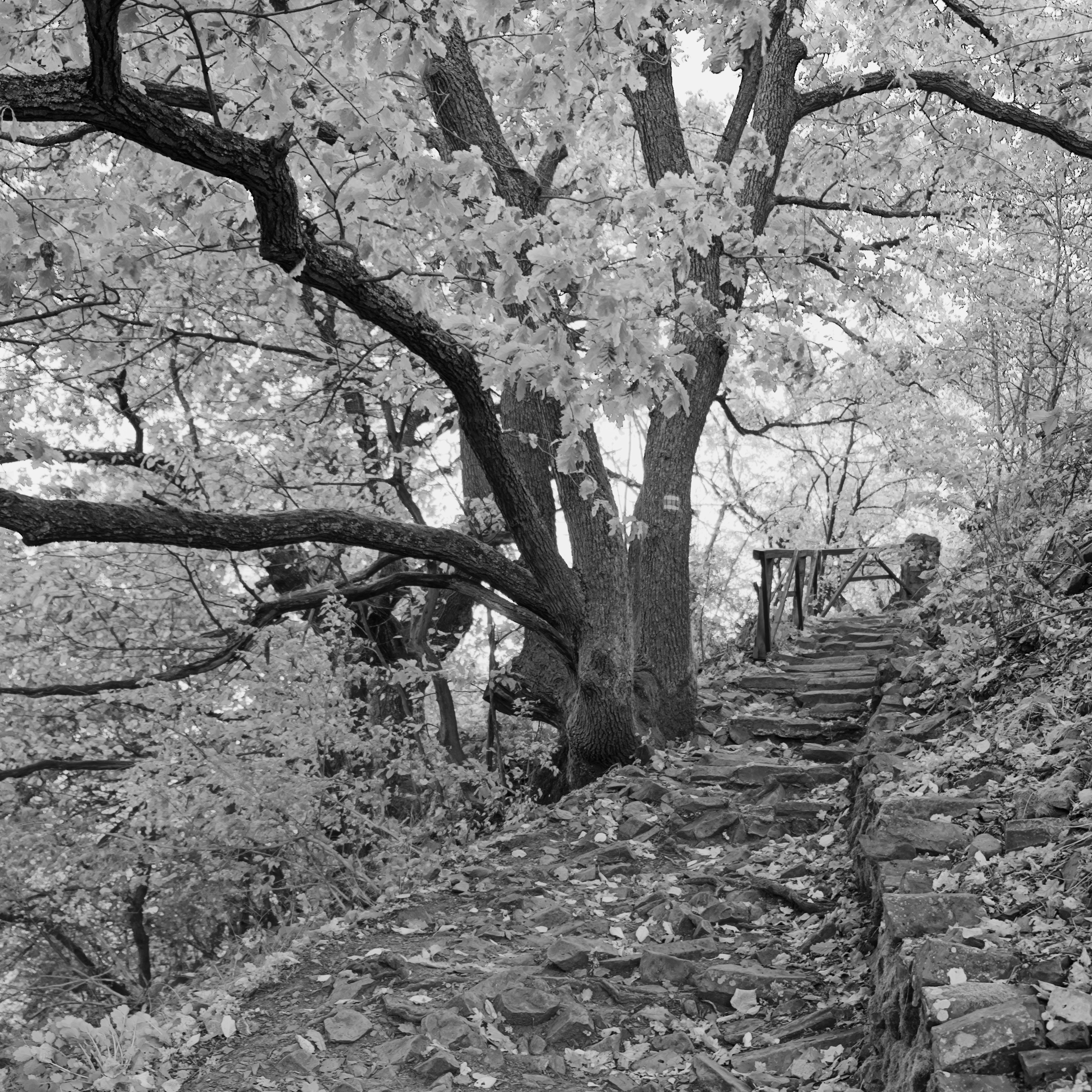
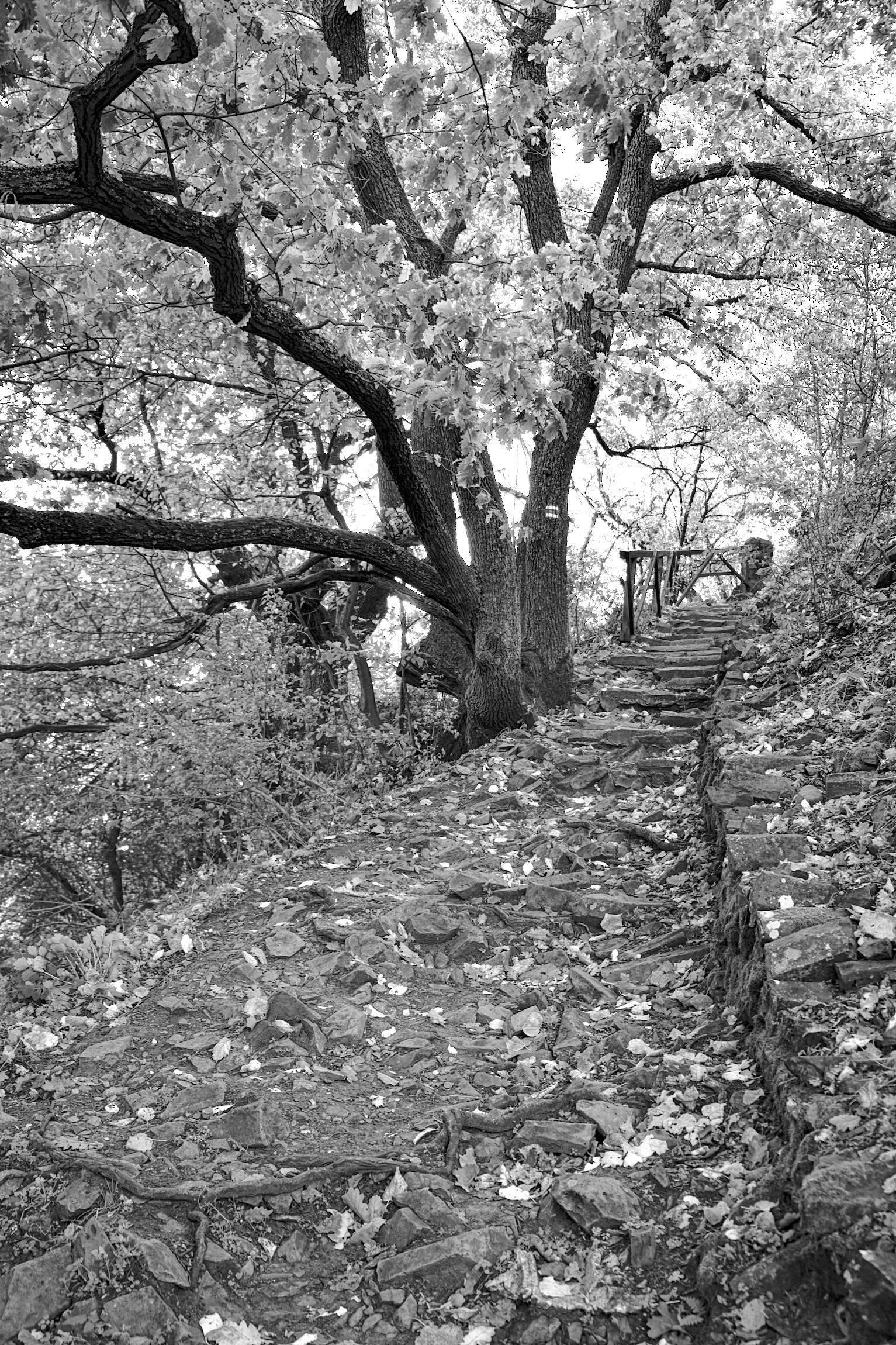
Thanks for sharing. It’s interesting how we all see the world differently, for me the main subject of the pic are the thicker branches of the tree, with the path being more of a contextual element
Yeah that sounds like my conclusion. By the sound of it it must be more or less the same thing as the contrast equalizer in dt. When was that feature released? I was a darktable user until roughly a yea and a half ago, but I can’t recall seeing it.
There may be a misunderstanding. RawTherapee’s Contrast By Detail Levels is based on Wavelet processing - not the same as messing with the histogram in darktable.
I worked in color, because that’s what I do. I agree that the tree trunk is the most interesting element. I tried both Contrast Equalizer and Diffuse & Sharpen. In this case, I felt like D&S gave me much better results.