Hi, Has anyone found the perfect values for teal and orange hues in Color>Color Toning>RGB Sliders
Long time ago I tried this and it works nice. You can translate it to RT I believe.
Thanks for sharing this. I wasn’t sure from your description, which values in the channel mixer I was meant to be changing. Would you be able to spell it out in a blindingly obvious way… Eg Red slider in blue channel - 0.5. Etc
Perhaps it’s just me…
Thanks!
Good morning @Kasyap.Sankara & @spidermonkey ,
Use duckduckgo and search for
rawtherapee teal orange
for much information about this.
Have fun!
Claes in Lund, Sweden
1 Like
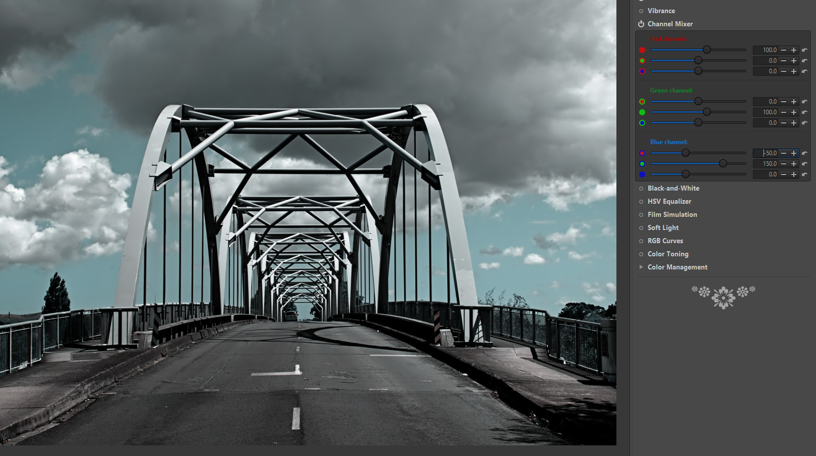
Something like that, play with it, just work on the blue channel.
That image isn’t ideal. Hope you get the idea.

a bit better…
I didn’t use RT much, seems there are no blend modes. I prefer it the darktable way, you push it more and then go back with opacity.
2 Likes

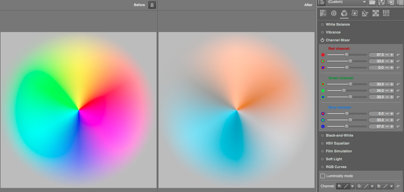
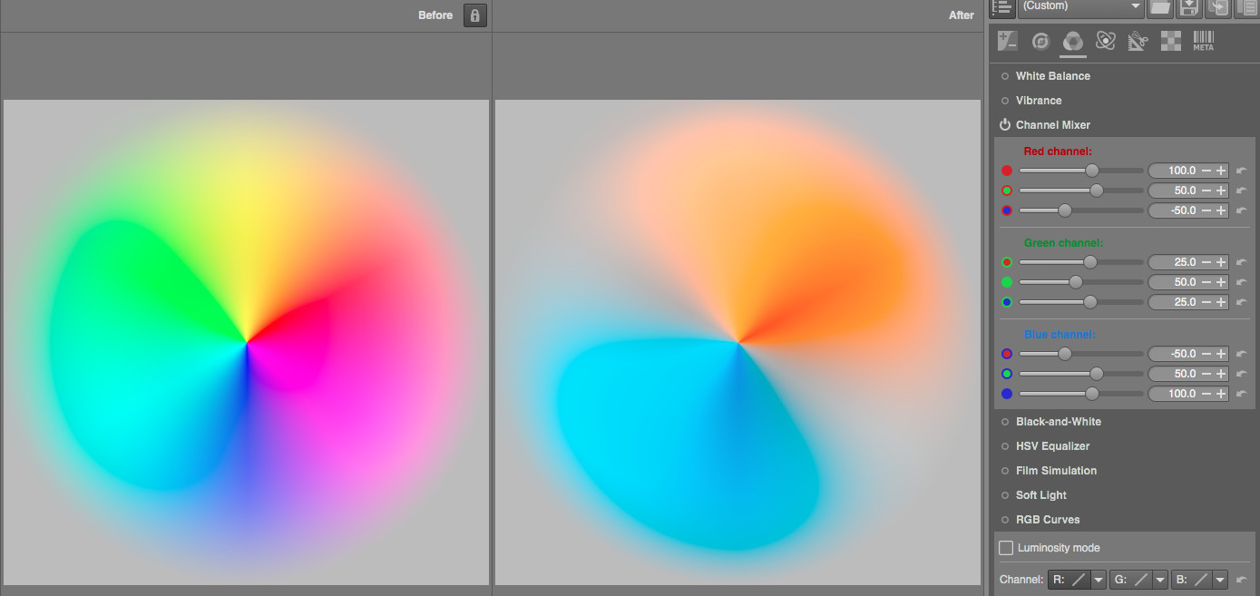
For the lazy ones among us, here are the loadable pp3 profiles based on the previous post. In the same order:
- teal.orange.hard.pp3 (172 Bytes)
- teal.orange.soft.pp3 (163 Bytes) )
- teal.orange.normal.pp3 (170 Bytes) )
Thanks @Soupy, those are nice starting points!
Here’s one that uses the Colour → Colour Toning → L*a*b blending method, in case you need to use the channel mixer for other stuff:
- teal.orange.colour.toning.pp3 (1.3 KB)
Without:

With:

But this is just a starting point, depending on the image you really do need to adjust it. Here’s an example of that.
Without:

With only the provided profile applied:

That looks obviously wrong and needs adjusting…
1 Like
Thanks for the great replies. I also want to add teal and orange to shadows and highlights separately. So i wanted to use this tool. So looking for specific values on the slider people here are using.
I haven’t had much success using that specific one to be honest (either of the 2 RGB ones, actually).
The profile I posted (the teal.orange.colour.toning.pp3 one) uses shadows, mid tones and highlights for both the colour and opacity curves, which is represented by the horizontal black to white bar at the bottom of the curve.
Using the opacity (bottom) curve is the best way to work the shadows/highlights after setting the 2 colours you want to use.
For example: My second “needs work” example can be much improved by moving the middle point down (1/2 of the way) and the left point up (halfway between bottom and dotted middle line).
I find that using curves gives you much more precision compared to 2 sliders with each 2 points. But that might just be me ![]()