Never ever have I used the word professional, nor described how they look. Professional is a state of business, not a clue about actual skills, expectations and motivations
This is a revelation to me: it explains why I have been struggling to master this craft in general - and the use of darktable as a specific embodiment of it - since the dawn of the digital camera *. I now see clearly, and with deep shame, that I have been playing this game like Liberace would have ‘presented’ the Tocatta and Fugue in D minor, rather than like Glenn Gould interpreting the Goldberg Variations. Time to look for a teacher…
(*) Yes, I have been advised that this date does precede that of darktable 1.0 by a decade or two.
In my former business (Information Technology), we defined “professional” as someone who works in the best interests of his clients, not his own.
Thank you!
So, regarding the ‘Wolf’: The body of a violin is a resonator which in a simple picture ‘should’ resonate with each note that one plays roughly equal. One canachieve this by having a low Q-factor resonator. Unfortunately low Q-factor means not only ‘broad’ frequency range in which it resonates but also ‘low peak intensity’. Why don’t you want a high Q-factor? It would mean that certain frequencies stand out as they would be much louder than others.
The Violin reality is much much more complex as the resonator probably has more than one eigenfrequency, each with it’s own Q-factor. A Wolf in this sense is one of those eigenfrequencies which really stands out because, for whatever reason, it’s Q-factor is higher than the others. Additionally it reacts to the note that you actually play (hurray for nonlinearities!), the Q-factor shifts when you hit a frequency close by, and this intermodulation shifts the final frequency. Augustin quite nicely explains that this Q-factor shift can be literally played with to deliver the note that one wants to hear. This requires skill, knowledge and practice.
The parameter space is the same as that of other Violins. So why are these violins not seen as ‘broken’? That high Q-factor nonlinearity, if you know how to play such violin, makes it not only louder but probably ‘richer’ in the sense that fighting for the right frequncy to come out of it, gives it that special kind of vibrato/playing style that the player must have in order to avoid sounding like shite.
Fun fact: a crack in a violin body oftentimes is audible as a ‘Wolf’. And yet the perfectly mint-condition super expensive violin from 1754 with a wolf is different because of it’s overall high Q-factor design (which probably was intended).
So where does all this lead this discussion (at least I hope that it does)? I’d say like this:
- The size of the parameter-space of a tool is not a good measure of tool quality.
- A few-parameters-tool, when the accessible parameters are chosen with intent, can have a more interesting result than a mere parameter-dump-tool. (It reduces the search-space from near infitnite size to vast-but-humanly-sensible)
- some unexpected tool behaviour, when chosen with intent, will require the operator to master the tool AND result in a variety of outcomes AND results in a higher quality outcome.
- once the operator has mastered the few-parameters-tool, achieving the desired outcome becomes muscle-memory, the tool becomes invisible (which is not the same as ‘easy to use’).
Adobe products-, LUT-packs-, Editing-‘Science’-majors, will happily use a shitty cheap violin that they somewhat learn to play and call themselves ‘violinist’…but that is not the whole story and maybe this forum is not catering to this audience. But maybe that’s just life and the shitty cheap violin is a good entry point to start creating stuff and eventually these people will realize that there is a whole other world out there to explore, technically, artisticly, philosophically.
Cheers! ![]()
My cello has a particularly strong wolf tone compared to other people’s cellos I’ve tried… my cello is also particularly powerfully resonant.
Ha! rawproc has such a non-intuitive few-parameters tool: duiker filmic.
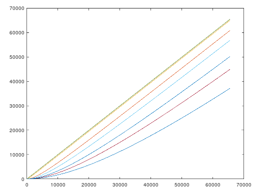
I’ve written about his before, but for context: The first notion of a thing called a “filmic curve” of which I know is the “Duiker filmic curve”, named for the originator who first presented it at a SigGraph convene. A four-term polynomial that, with certain parameters, produced a film-like tone curve with a discernable toe and gradual roll-off to saturation. The parameters, A,B,C, and D, were the coefficients of each of the four terms, and varying each has a rather non-intuitive effect on the curve shape. Darktable’s filmic operator is based on the same notion, but has a more intuitive (??) interface.
I implemented the straight Duiker filmic equation in rawproc, with simple float controls for A, B, C and D that let me roll through the numbers in various increments. It took me a while to develop a hand-eye connection for the parameter variations and their effect, and I still only have a notional sense of what are each parameters’ dynamics. But, I now can look at a linear RGB and know where to take it with that sense.
I haven’t messed with darktable’s filmic operator yet, but I can see how boxing the curve with a mid-gray then +/- EV bounds can be a more intuitive interface. But I like playing with that toe, and the B coefficient gives me direct control of it in rawproc’s implementation.
I still whip out the control point curve, either after filmic or instead of it, for some images. rawproc’s control point curve does not clip at either end, so I can make curves that act on the whole image, even the parts I’ve pushed past saturation. THAT is still the ultimate combination of control and intuition for tone manipulation, IMHO, just needs some better finesse at the low end.

Mine had a crack and I never mastered playing with the wolf tone. Away from that wolf it sounded great, warm and rich, although not particularly promiment/resonant. Mine probably just was broken.
Maybe I have to clarify a bit. I am not advocating for hiding parameters and thus make them inaccessible, or making an unintuitive interface. More like: give the user two/three controls which control 4 to 6 parameters in a reasonable fashion with room for some non-linear behavior or such at the ‘end of the slider’-control points.
Maybe like this: Could one replace ABCD with XYZ which behave a bit nicer, do more often what you want, quicker, while still having access to most of the ABCD functionality, by just excluding combinations of ABCD which would be bogus anyway? (Sounds a bit like regularization of parameterspace) Of course this is a non-trivial task AFTER a tool has been implemented.
This discussion made me think. Are there any excellent, like amazing, photographers that really excel at post? Is there any art in the postprocessing?
From the print days we have people like W. Eugene Smith that supposedly was a printing genius/obsessive (I don’t think I’ve seen an original print of his)
Personally I don’t think the photo art people qualify because its usually just cliché.
I guess the film world might have some. I’m very critical of much recent cinematography though. Its very often over done.
Filmulator has its own approach to the toe (shadow rolloff point) and highlight rolloff.
The shadow rolloff shifts the entire tone curve down and then approaches it slowly with an inverse function such that the slope at 0 is 0.

Then the highlight is rolled off separately.
On top of that is the film simulation’s tonemapping. But by default, there is no toe and only some highlight rolloff.
I think so, once you get to local edits you’re in the same sort of discretionary “dodge and burn” domain in which the printing masters of the film days operated.
Even in the fundamental tone and color transforms you can exercise a good bit of aesthetic; read the dcamprof/Lumariver docs for some insight in to the color part of that. Then, I think one would would have a better perspective upon the “look-in-a-box” paradigm of LUTs…
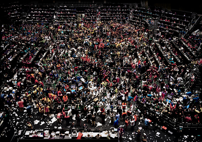
Yes It undoubtedly involves skill and when viewed abstractly it should have potential for art. The question is does it really? Andreas Gursky and the like obviously pp like mad as the photographs are collages but they are imperfect. At least the early work had obvious ‘bad photoshop’ in them. So the art is in the image created by digital manipulation but he’s no master at pp as discussed in this thread.
I’m sure he as people working for him now that excel at colour space conversions but I wonder.
Oh yes. In some (many?) cases, there is where the wizardry occurs…
Have fun!
Claes in Lund, Sweden
Pics or it didn’t happen! 
As Ansel Adams said (another OCD genius printer, trained as a pianist), the negative is like the score and the print is the interpretation. Art is using a medium to convey personal expression. Post-processing is an essential part of the image making, where you use technical means to finish the picture in order to match the look you have in your mind. Look + content are the support of your expression. No matter the degree of technicality of the tools at work, what makes it an art is that there is an expressive goal at the end.
Sorry if I was unclear but I meant digital processing. Analog photography has many renowned for their printing thats why I mentioned Eugene . Are there any true master photographers that use digital pp at the highest level?
Digital is merely the modern way of doing analog. Again, the change in technology changes nothing in the final goal. Only now, you can carry your darkroom in your backpack and deliver pictures in 10 min.
I don’t know true or false masters, I only know photographers I like for a bit before getting tired of their gimmicks, and many I don’t like at all.
I get maaaaaaad…
…this dude has sensitive device in his room like piano, PC and stuffs and uses the angle cut in the same room ![]()
Anyhow cool chap
The question was not rhetorical as I just realised that I can’t think of a photographer whose digital post processing I find impressive. Part of it is that the digital examples are relatively low resolution I’m limited by my own screen and I don’t scrutinize printed work for technical flaws in galleries. Perhaps I should but I think not.
Thing is that the photographers I most admire in terms of pure aesthetics, tone, colour etc. all shoot film (various larger formats). Scanning and preparing analogue film involves almost as much post processing as digital photography but it’s interesting non the less. It would have been nice to have a some reference work of the highest standard for the type of discussions we have here on pixls.


