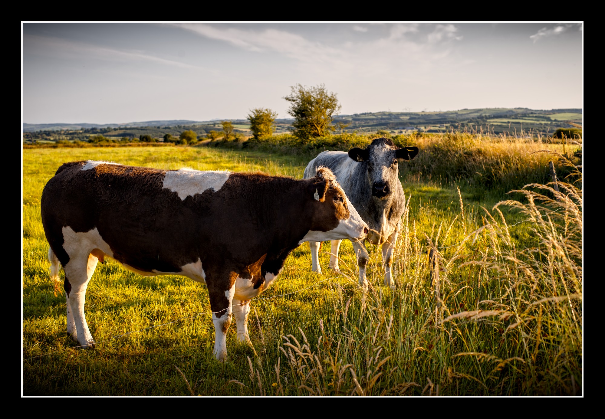
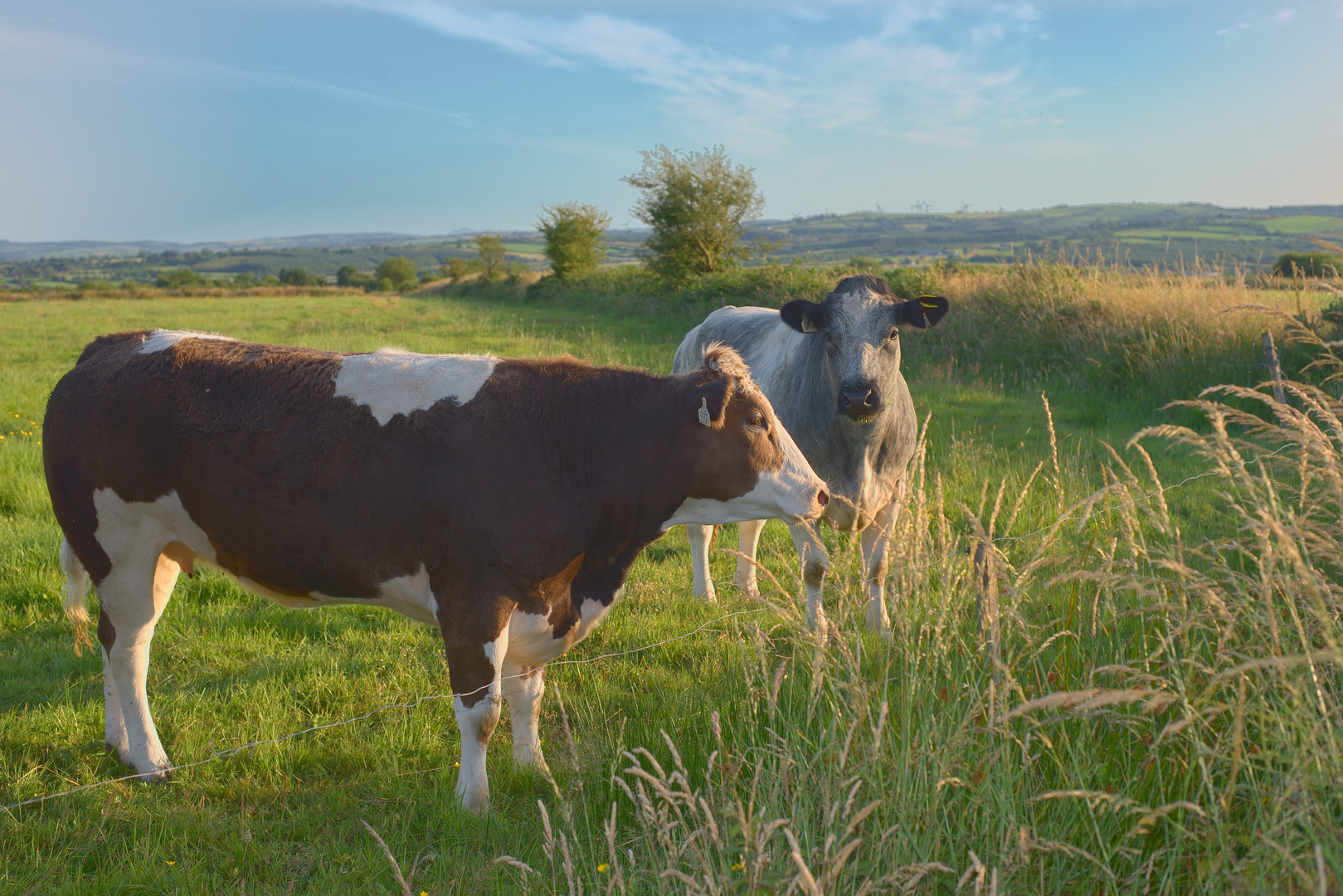
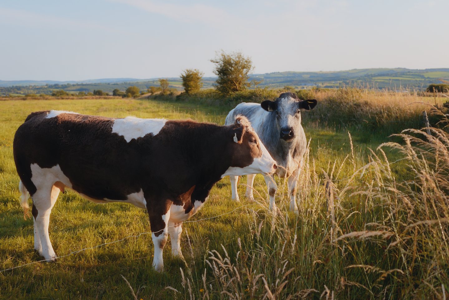
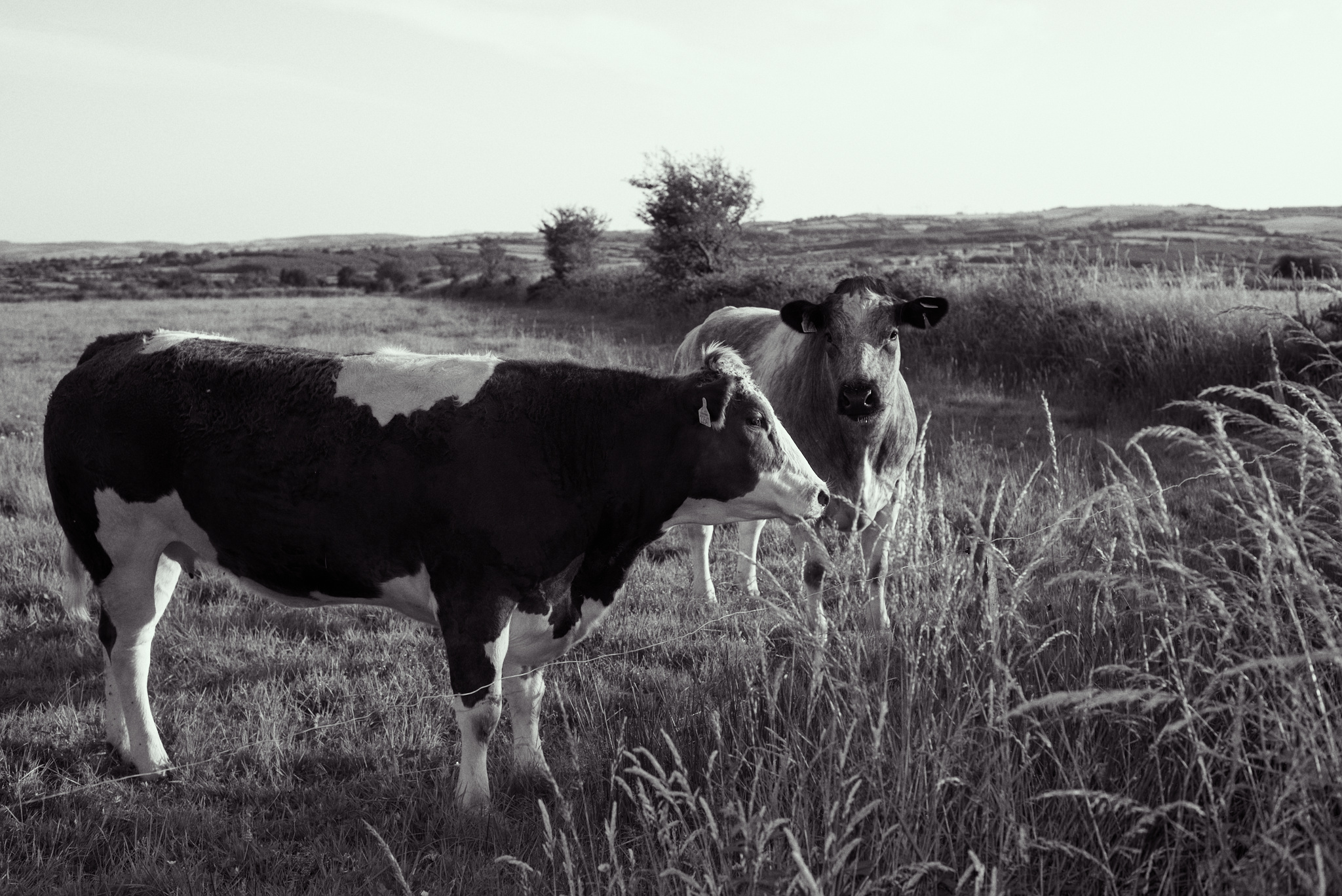
First upload to Play-Raw…hope I got it right!
This file is licensed Creative Commons, By-Attribution, Share-Alike.
DSC_2431.NEF (29.2 MB)
Bull2431Dark.png.out.pp3 (16.6 KB)
First upload to Play-Raw…hope I got it right!
This file is licensed Creative Commons, By-Attribution, Share-Alike.
DSC_2431.NEF (29.2 MB)
If you ask me, and this is only MY opinion you made elementary mistakes on this picture. This is not about your edit which is technically fine. This is not about the photo itself. Quite the other way round.
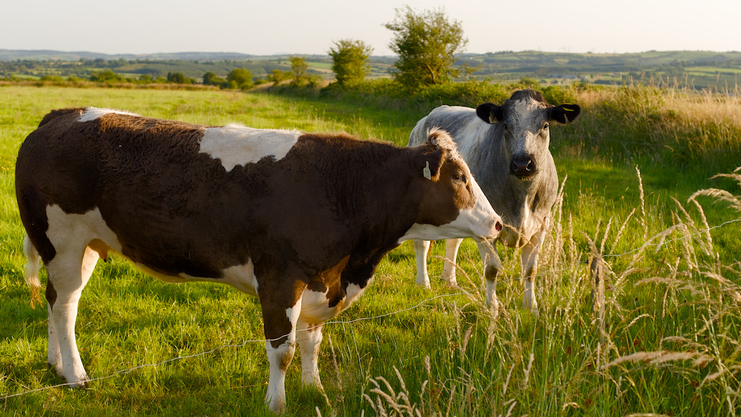
This is about decisions. You shot an outstanding photo and then decided to imho criple it. The photo was made in beautiful light and a nice scenery. Why have you decided to make a monochrome version with such a tight crop???

Sorry for this rant and please don’t take it personal, but when I saw that brillant shot with such a lovely warm light, it simply came over me. 
It really is nicely captured. Well exposed (there are maybe 3 clipped pixels), in focus, even the bug around the nose is clear.
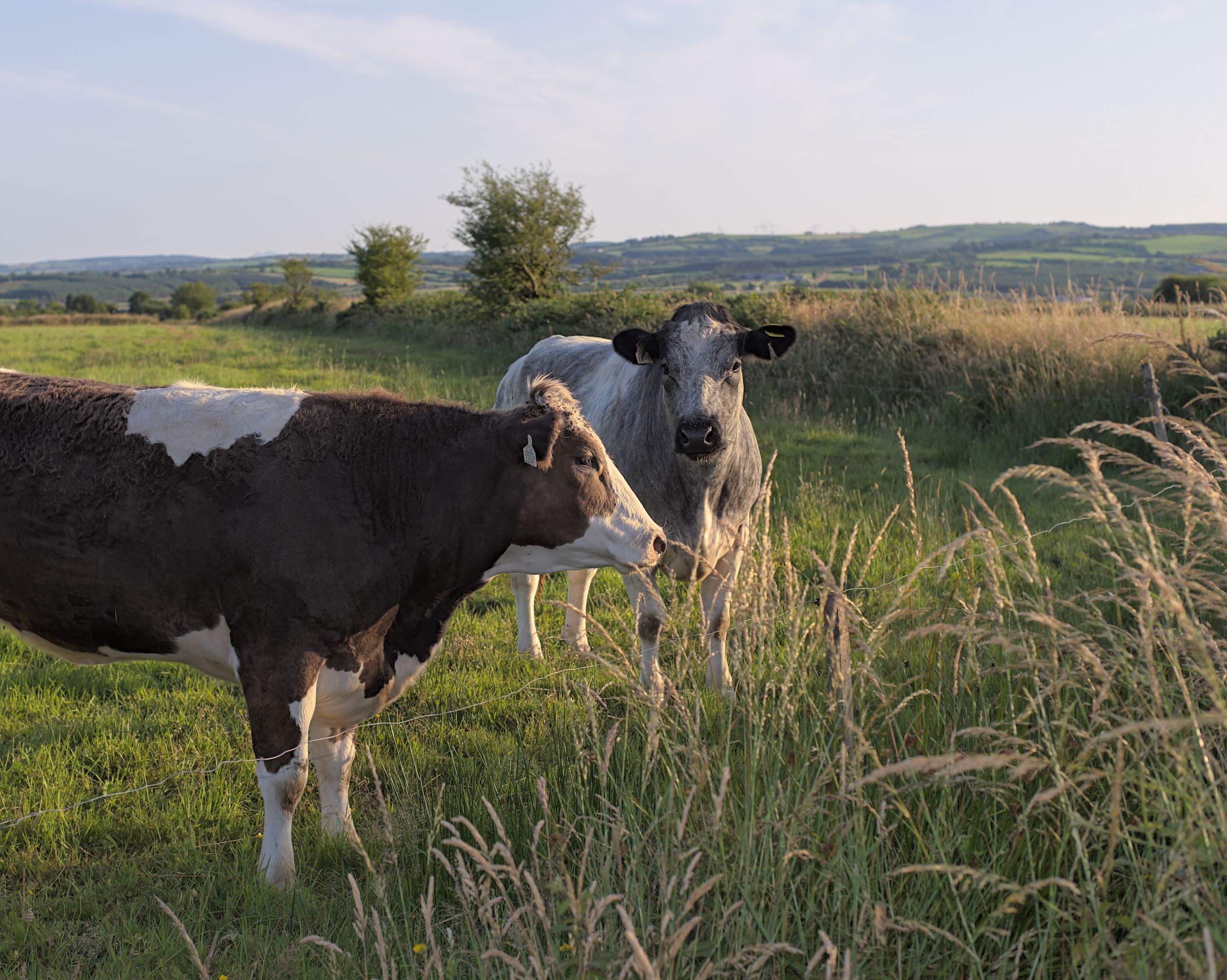
Edited with darktable. Small addition of ‘evening’ colour in the highlights (but not the sky).
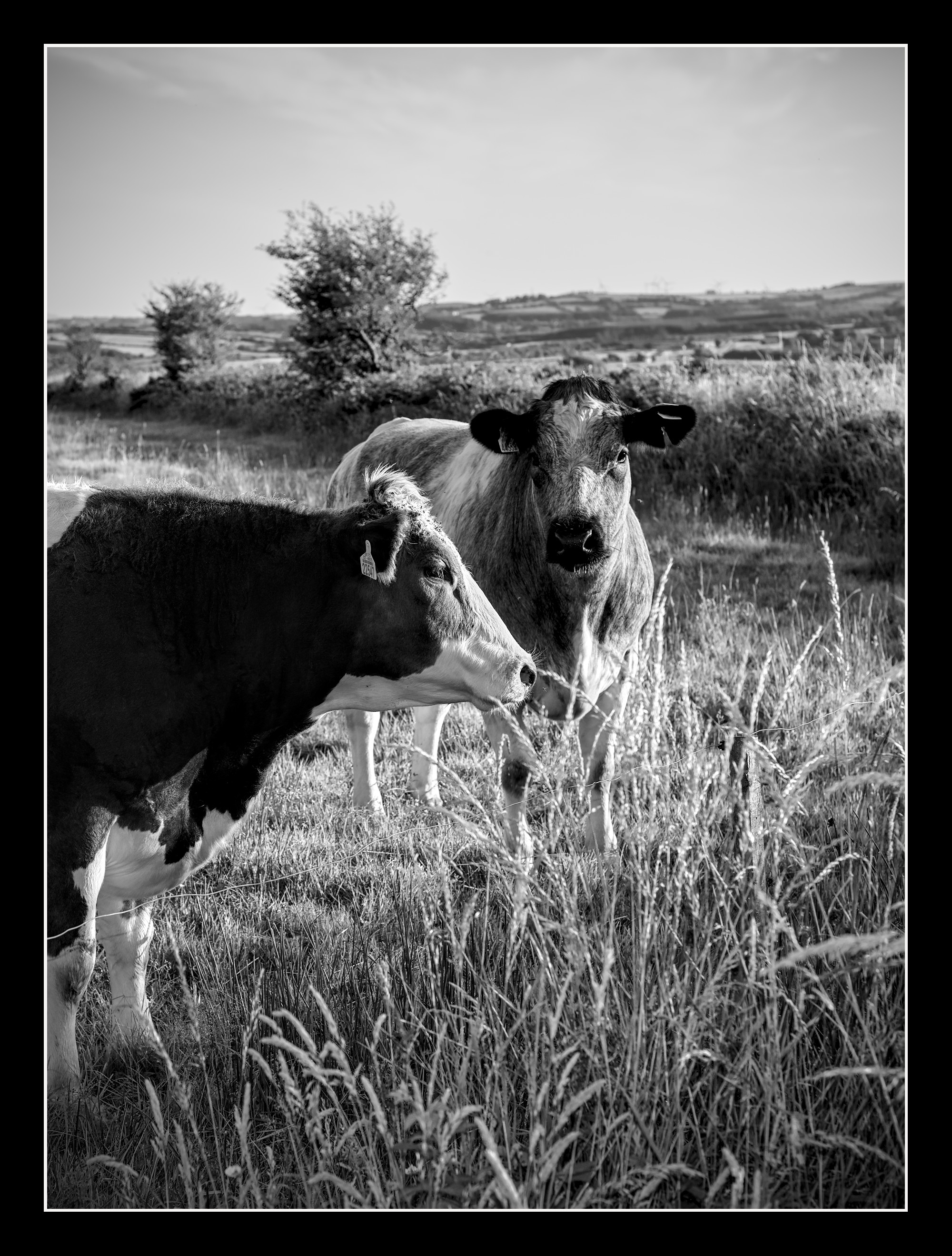
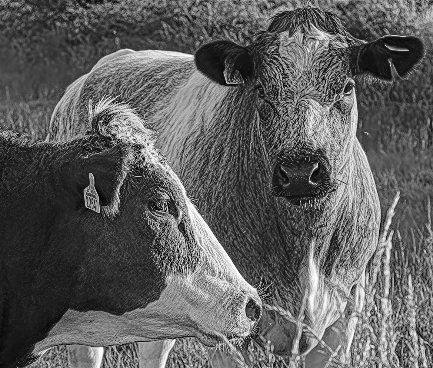
Just in case it has to be B/W and a bit tighter, I would go for something like this:
But I would definitely go for a coloured version.
Hi Uli
Your constructive criticism is most welcome…in fact its what I seek out the most.
Your representation is beautiful and framed so suitably. You did a better job of lighting the scene than the sun…well, it would have got there eventually but the subjects couldn’t hold a pose that long and I couldn’t wait.
Although the day was good, I see this scene and those about, every day of the year…and this ranks as a 5 out of 10.
The position of the subjects caught my attention and I wanted to get lower on the shot but any sudden moves onto or past the ditch and long grass would have ended the opportunity in a flash.
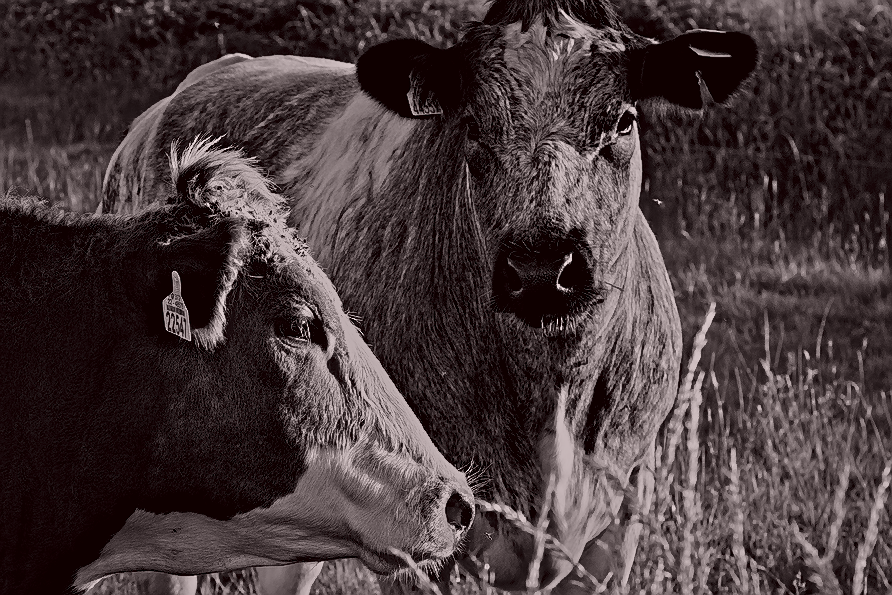
All my images are for laser engraving on grey slate and when I zoomed into that crop the anamalistic nature of the scene presented itself and I thought that any nice scenery would detract from it. Lasered in an abstract and Gritty way, the image may look interesting.
However! Your perspective on the overall scene probably looks exactly how the farmer and his wife would prefer it, and lasered on wood, not slate.
Its still very new…hit or miss for me, both with camera and rawtherapee but I’ll keep learning and adapting.
Thank you again
I’m an idiot  . I read the thread where you talked about the laser engravings. But missed tot get the link or put one and one together. Sorry about that.
So I think I have to put another view on our edits. I have no clue if the way I did my renders fits the needs of laser engravings. I think there will be different requirements compared to a normal photo.
And I think one is for sure: You have to go monochrome. 
DSC_2431.NEF.xmp (21,2 KB)
Thanks gw
Was the evening colour you applied done using a selective area mask…it works a treat.
Ps, I made sure the sun wasn’t in the shot…the rest is down to nikon, but I’m looking forward to Manual.
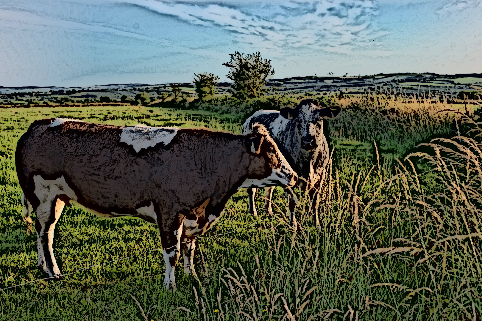
Excellent shot… here’s a RT edit and then a GIMP cartoon version just for fun!
Thanks! This was done with the ‘split toning’ module. I’ve put a gradient so it avoids the sky, but the rest is in the way the module works. I’ve set it to make a tiny change towards red in the shadows, there’s a little protection in the mid tones, and highlights get a golden tint.
I agree, Your first effort is much easier on the eye all round. The B/W and the pleasantness of the colour indicate well, the difficulty of my mission…Nice propositions in the B/W.
Thanks.
Very nice indeed and well suited to greyscale engraving because of the constant variation in texture and contrasts.
Was that done with one particular tool or a blend.
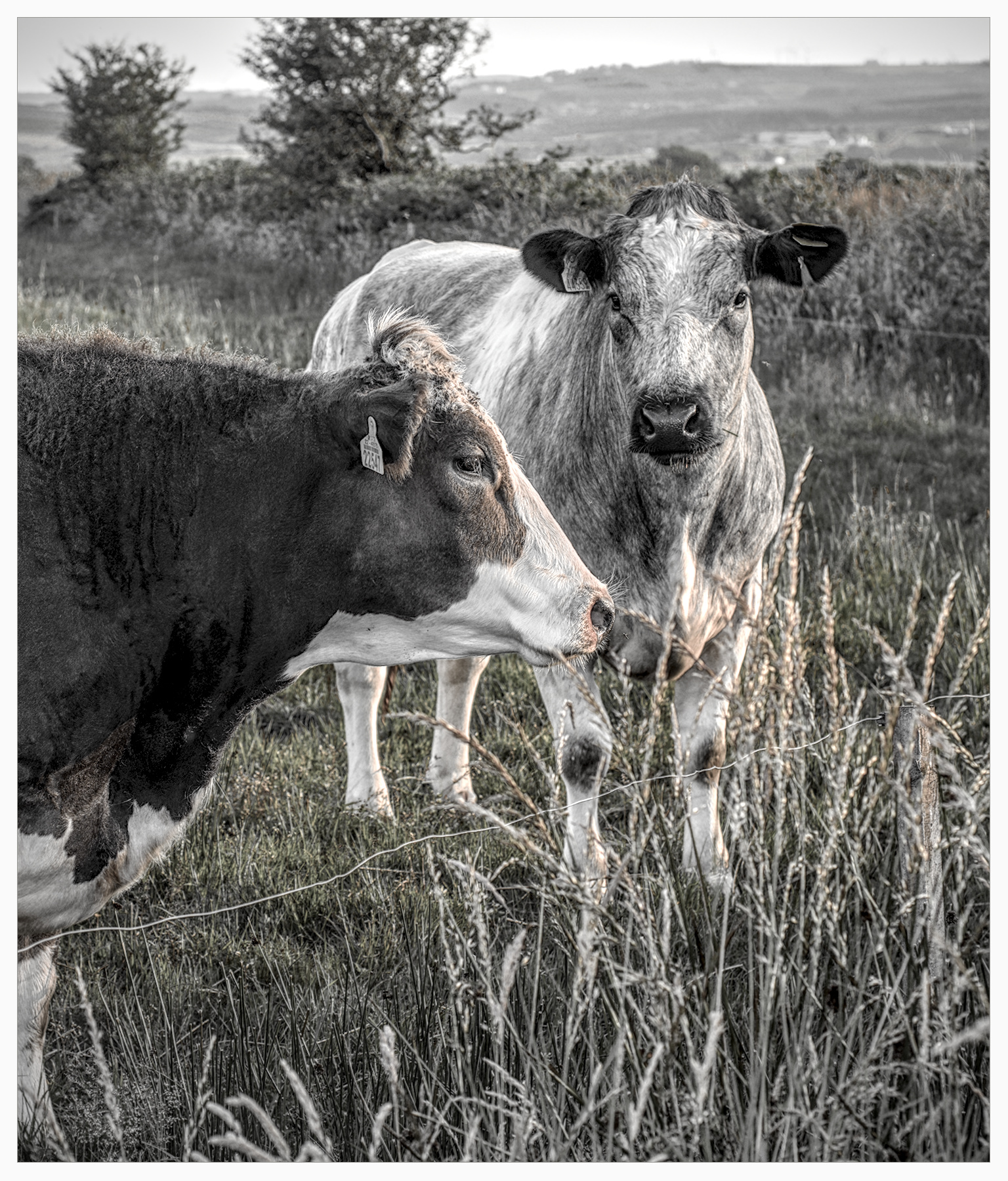
It’s just Darktable and some of its modules; perhaps the one that has worked the most magic has been agx.
Nice effect Lyle, thats very much what I would have liked to have thought…to do.
But I think I would crop in to make the pattern more obvious.
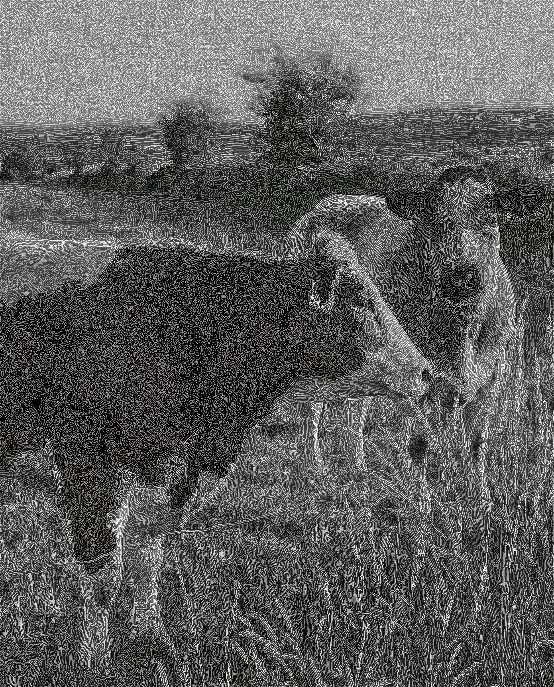
Is this of any help?
Solely darktable (DIffuse and sharpen for the effect).
DSC_2431.NEF.xmp (15,1 KB)
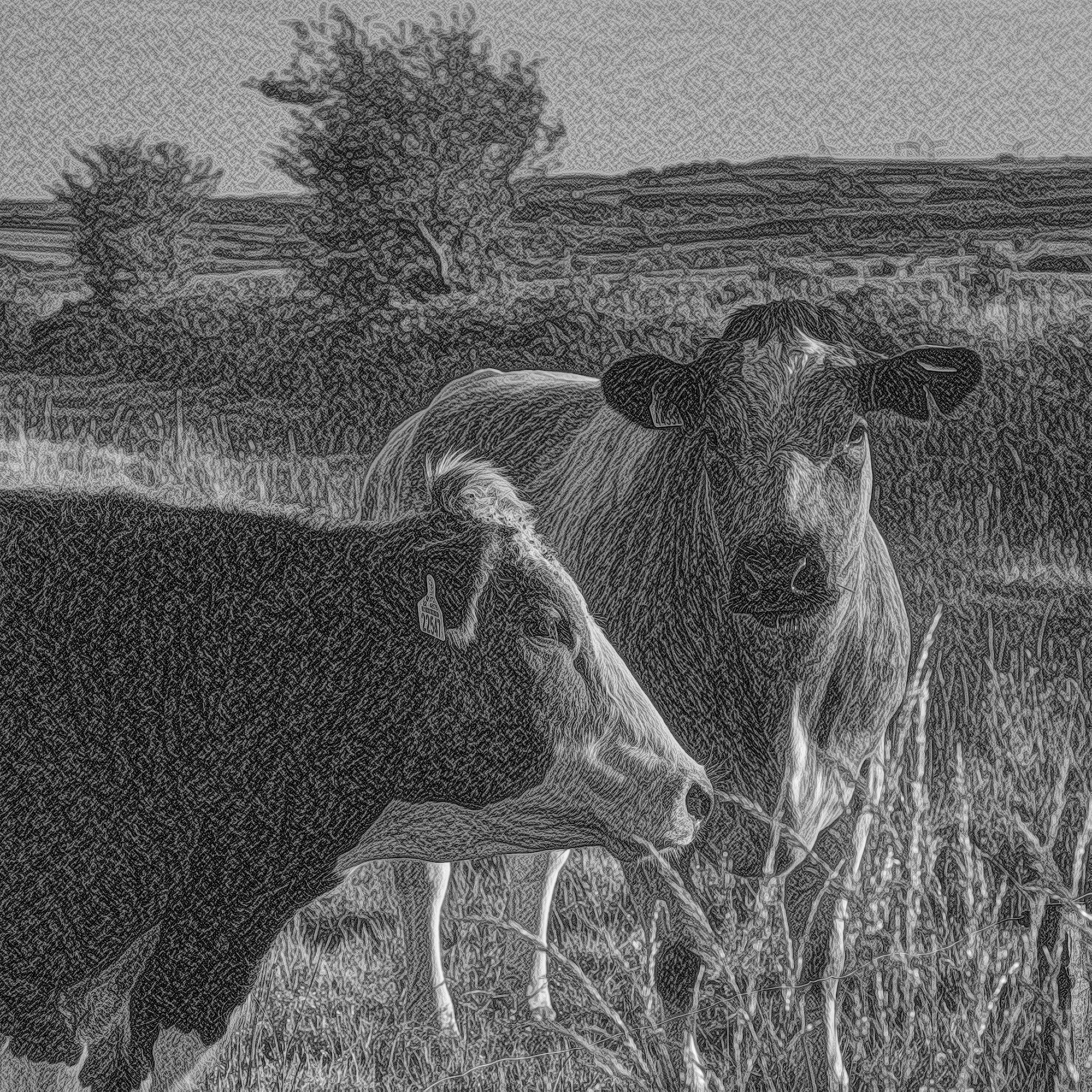
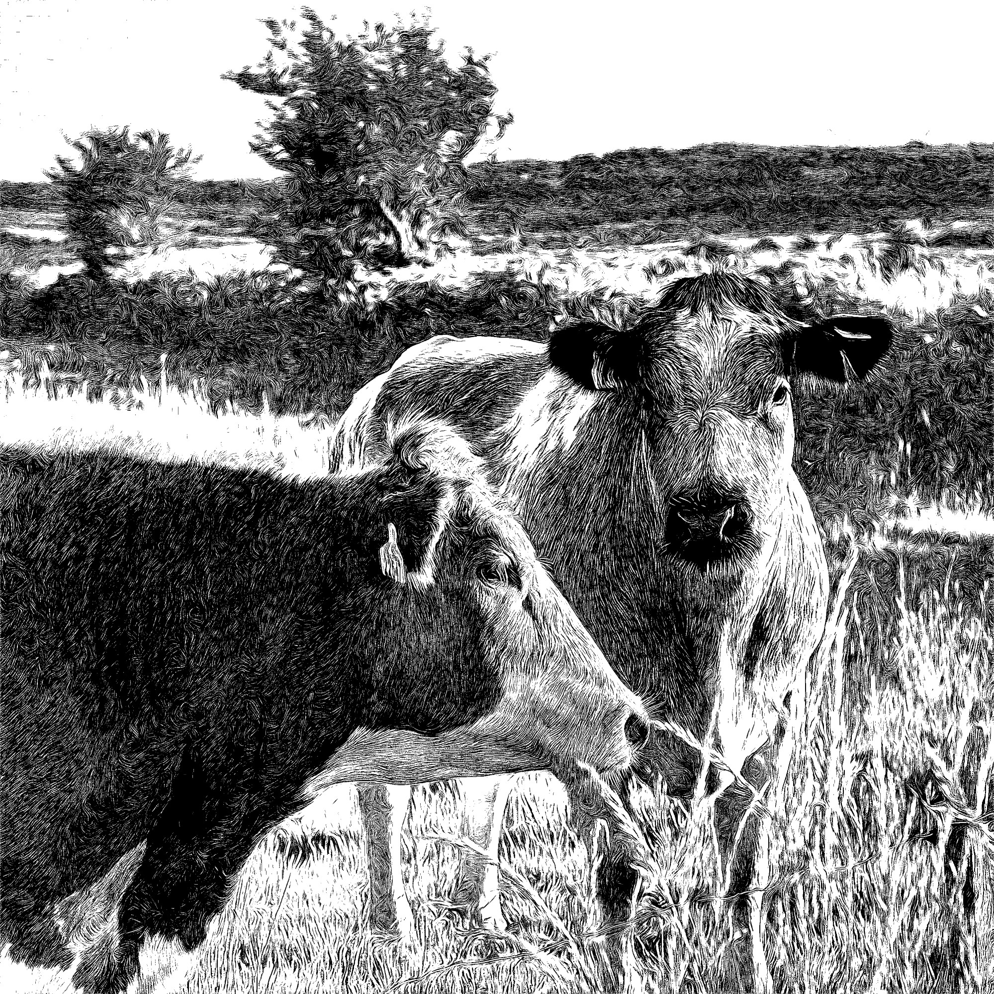
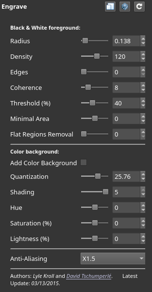
And this with dt and GMIC:
DorS attempt to put contrast in the fur. I like the texture I’m getting in the front bull’s white fur. I’m not sure what sort of contrast to go for at larger scales, but I used contrast equaliser for that aspect (like separating the nose from the surrounding areas).