Sorry, I forgot, I added it to the post.
Thank you very much
I regularly use Sigmoid with two instances of the local contrast module, one for highlights and one for lowlights.
I also use the contrast equalizer and the DS module
Sorry, I forgot, I added it to the post.
Thank you very much
I regularly use Sigmoid with two instances of the local contrast module, one for highlights and one for lowlights.
I also use the contrast equalizer and the DS module
It’s true that with the midi console, I tend to turn the buttons
Interesting, why two separate instances? What is the advantage?
I noticed that Sigmoid gives very nice contrast in the mid-tones, but easily loses details in the high and/or low lights. So I have two presets with parametric masks that allow me to adjust them separately.
Greetings from Brussels,
Christian
Now I understand. I thought you were using the sliders in the module separately.
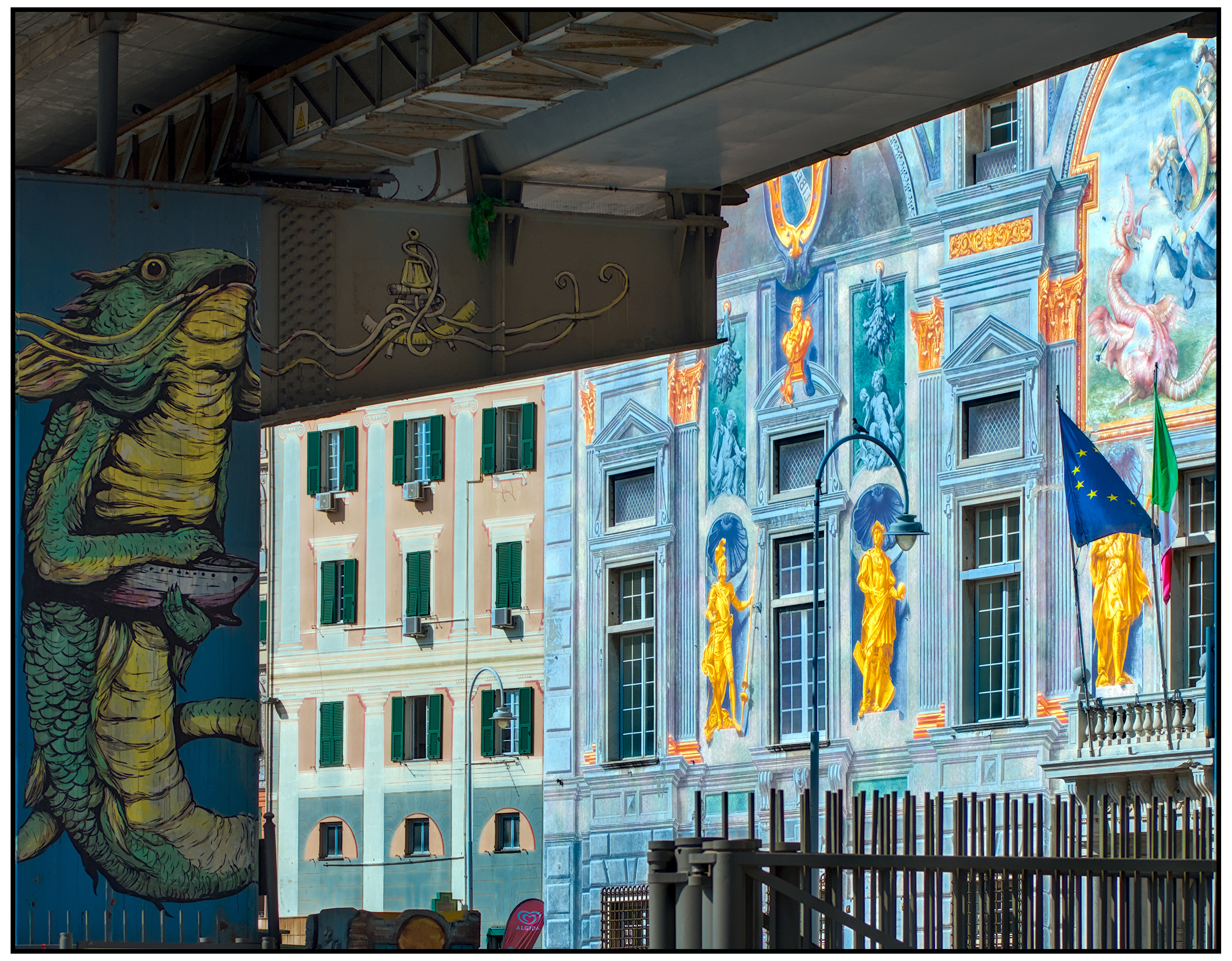
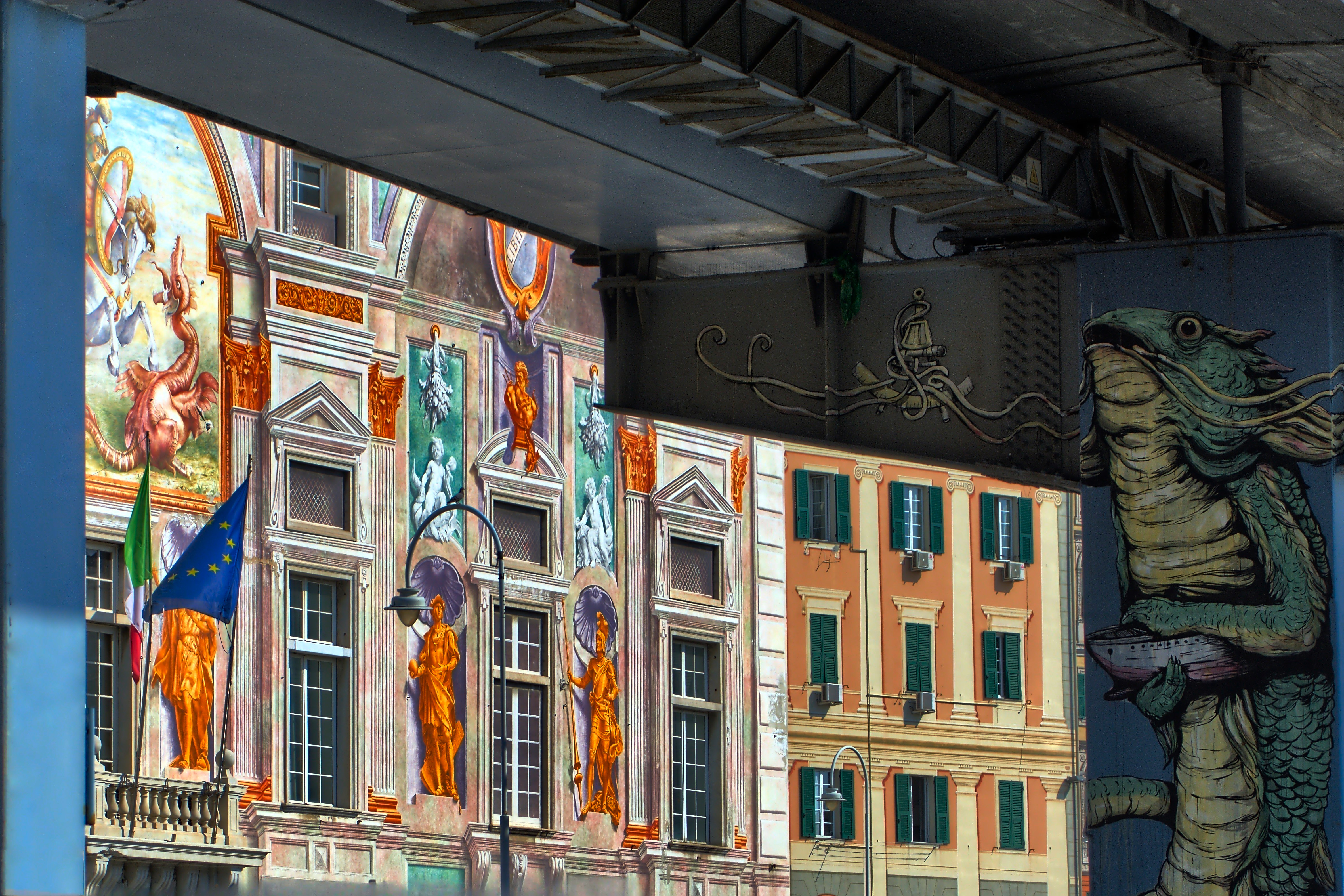
I like the way you recovered all the details of the fresco.
Original, playful, bizarre at least! ![]()
Thank you.
BTW, I hadn’t noticed before that there’s a St. George killing the Drake (that’s me) in the fresco…
Here are two from the jpg using gThumb curve, then adding Uniform+curve+saturation. In the original, I originally saw the overpass as the side of a building next to the muraled ones, which need masking.
Never used gThumb as an image editing tool. Thanks for the tip.
Not sure where this will appear. I think Jean-Marc_Dignejmdigne’s fresco and my second underpass might show the most detail, if combined.
gThumb
@anon42681393 For some reason gThumb is where I started going for psychedelic with curves.
It seems like an interface bug that replies to a reply go at the bottom of the page, and now I see a complaint about how I’m doing it.
Strict chronological order is how a forum works, that’s why its important to quote replies and use @'s to establish context @phobrain
@lightlover Looking at your elaboration I begin to doubt my initial choices. Perhaps there was really no need to ensure that the areas in light and the shaded areas had a similar exposure. I really like your version, I feel it mine, if you understand what I mean.
No shadows, no party.!
I think that if you open the shadows too much, the result is a flat Image. Maybe nice colors in isolation, but overall too flat. ![]()
I agree 100%.
And BTW, your edits are always interesting.