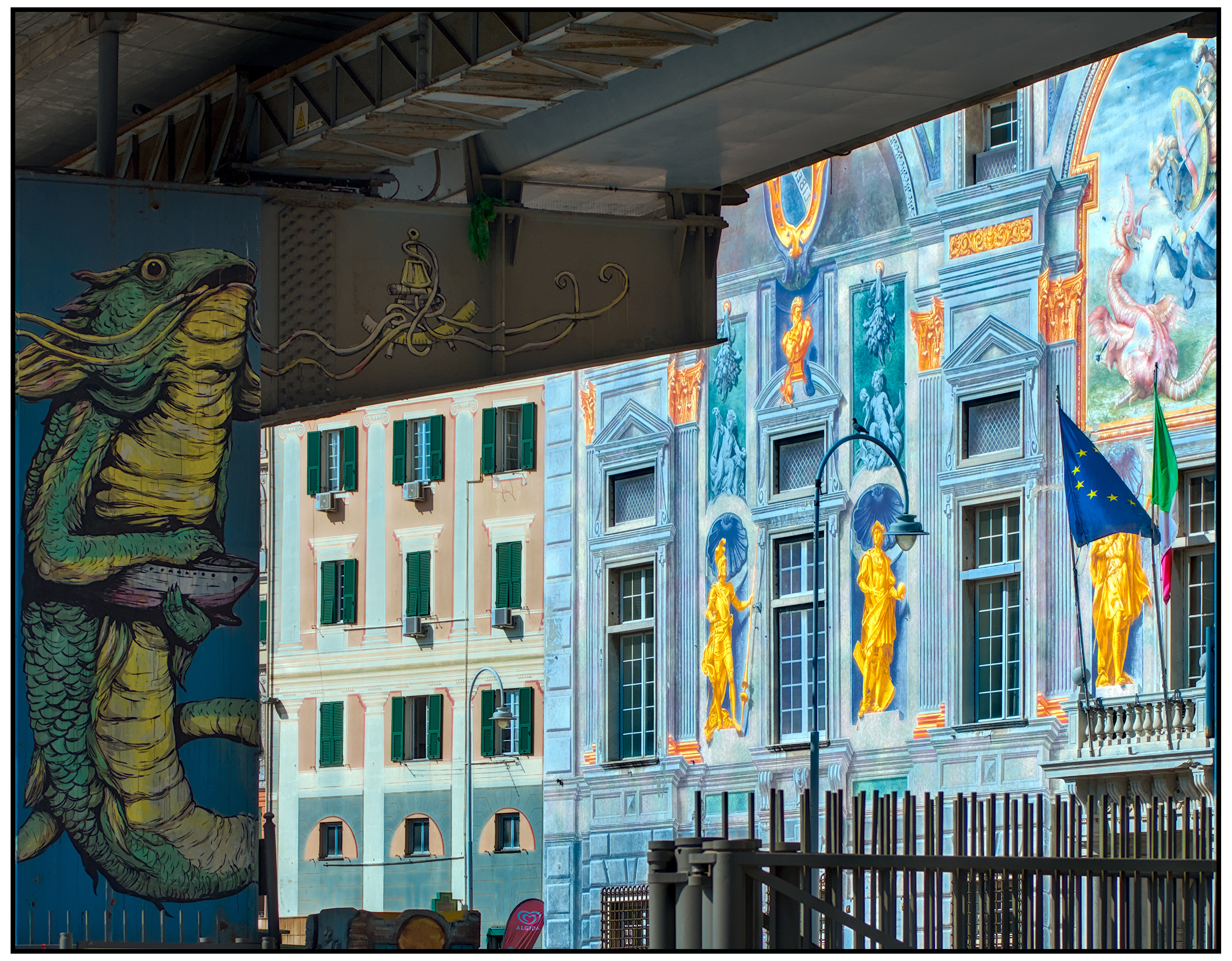
If you’ve ever been to Genoa, Italy, and walked along the streets with its historic buildings, with all their exaggerated colors, you may have realized that they are just facades. Unlike the historic buildings of other Italian cities which display a three-dimensional luxury made up of sculptures and stuccos in their facades, the Genoese residences are in 2D. Their alleged luxury is a low cost one, because it is made of bright colors and trompe l’oeil and almost zero volume. In the same way as the graffiti we find today on the walls of the suburbs of our cities.
Genoa, a seafaring city, which like all seafaring cities of the Mediterranean sea has the same bright colors as its fishing boats.
In Genoa, this love for boldly colored facades can also be found in the buildings of the last century. It is as if Genoa were a modern graffiti, distributed over history. Therefore, when you get in the viewfinder of the camera the graffiti facade of an ancient building juxtaposed with the modern graffiti of an underpass you cannot resist taking a picture, even if the former is illuminated by the burning light of the sun while the latter is immersed in a dark twilight.
What interesting graffiti. What a challenging image to work with. You have done a great job with your edit to bring out the detail and colour in both the sunlight and shadows. I recently rediscovered the fusion option in base curves and applied that to the problem here. I then had to play a lot to sort out the contrast and saturation to a stage I was happy. Thanks for the challenge. _DSC6863.NEF.xmp (19.4 KB)
I knew it was a challenging photo and I forgot to tell you in first place. I’ve read you rediscovered the fusion option in base curve (while I haven’t tried it myself). Thanks for your edit(s), and for the details you always post accompanying them; your explanations are always informative and instructive.
Thank you very much
I regularly use Sigmoid with two instances of the local contrast module, one for highlights and one for lowlights.
I also use the contrast equalizer and the DS module
I noticed that Sigmoid gives very nice contrast in the mid-tones, but easily loses details in the high and/or low lights. So I have two presets with parametric masks that allow me to adjust them separately.