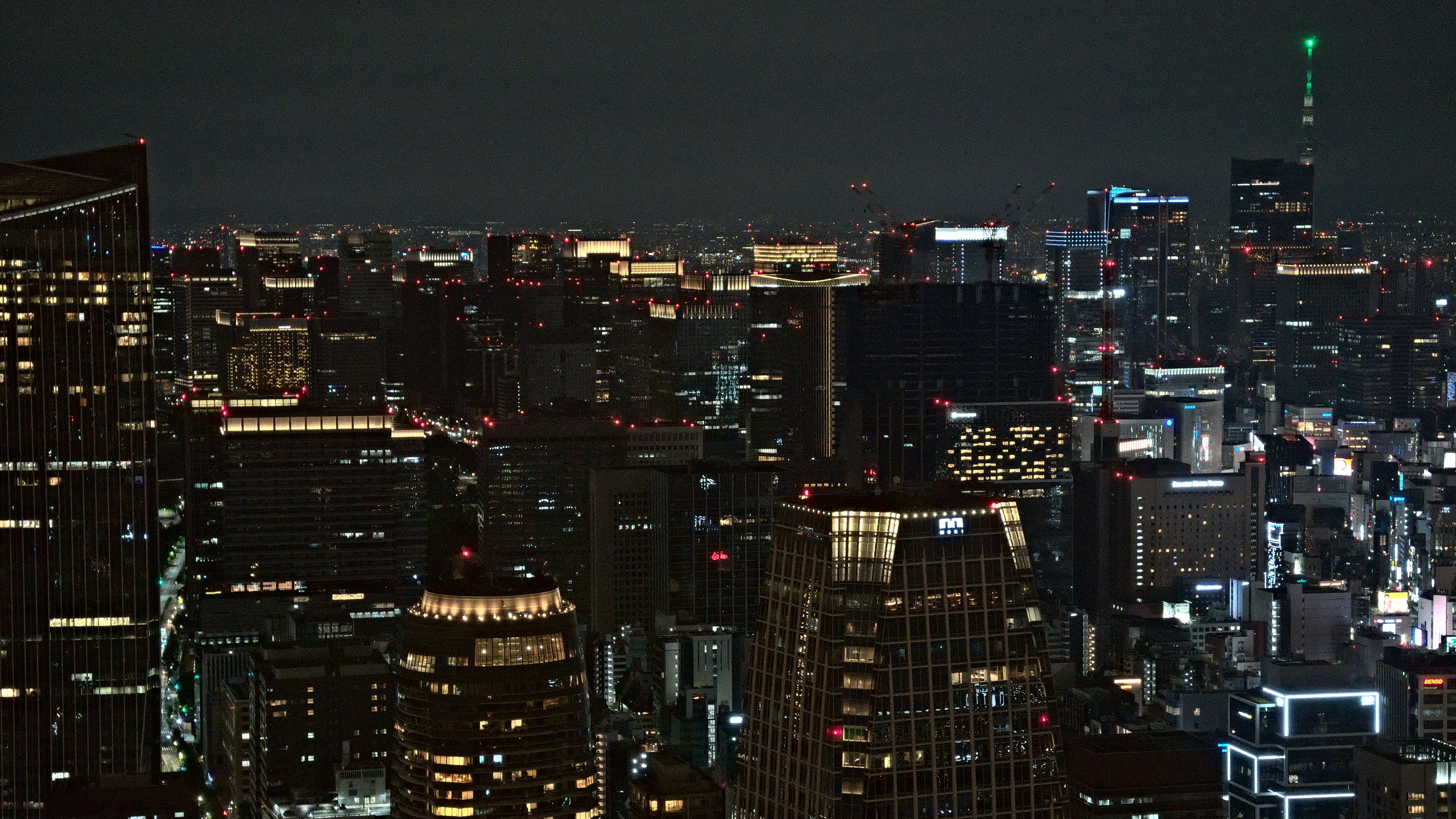
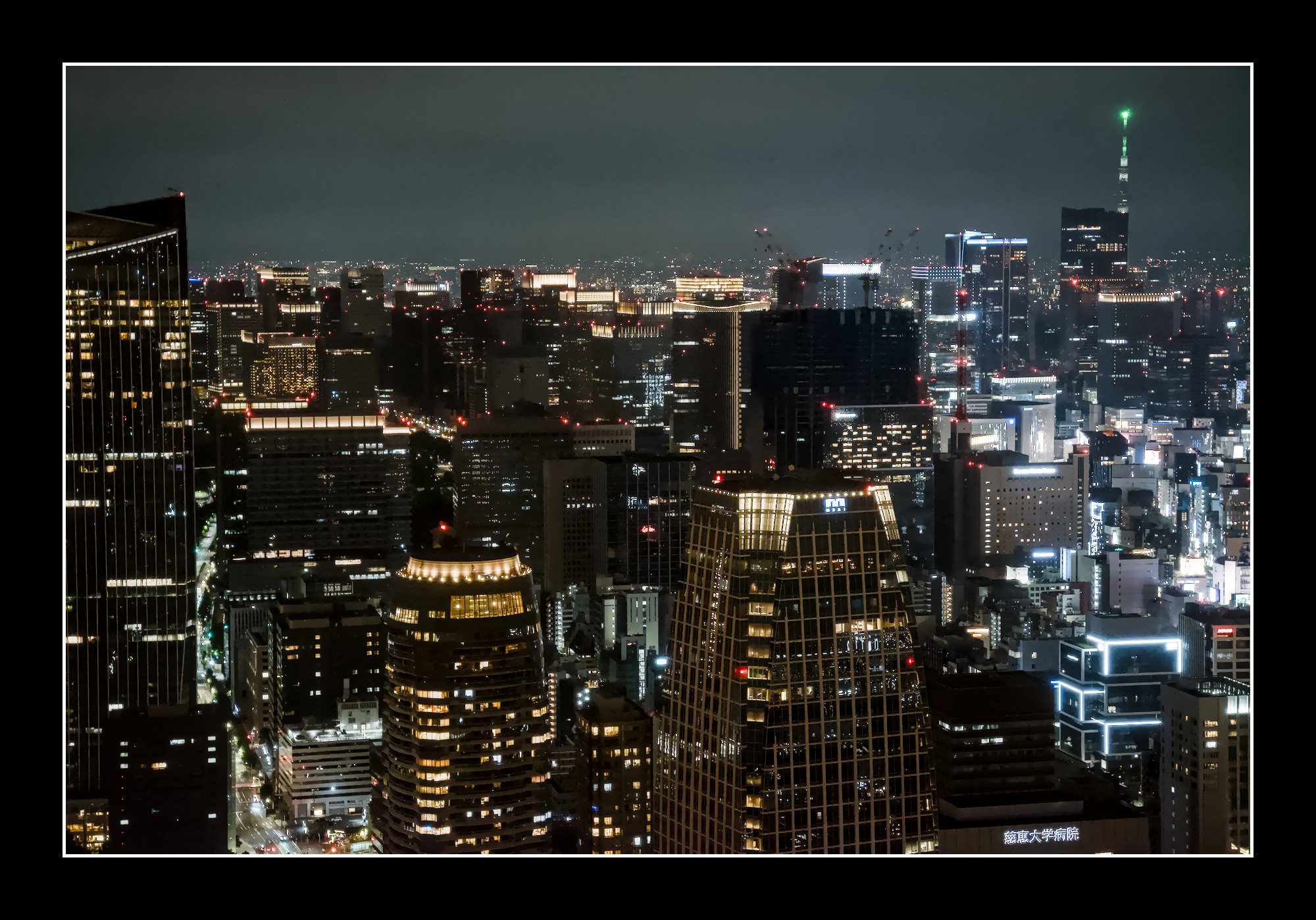
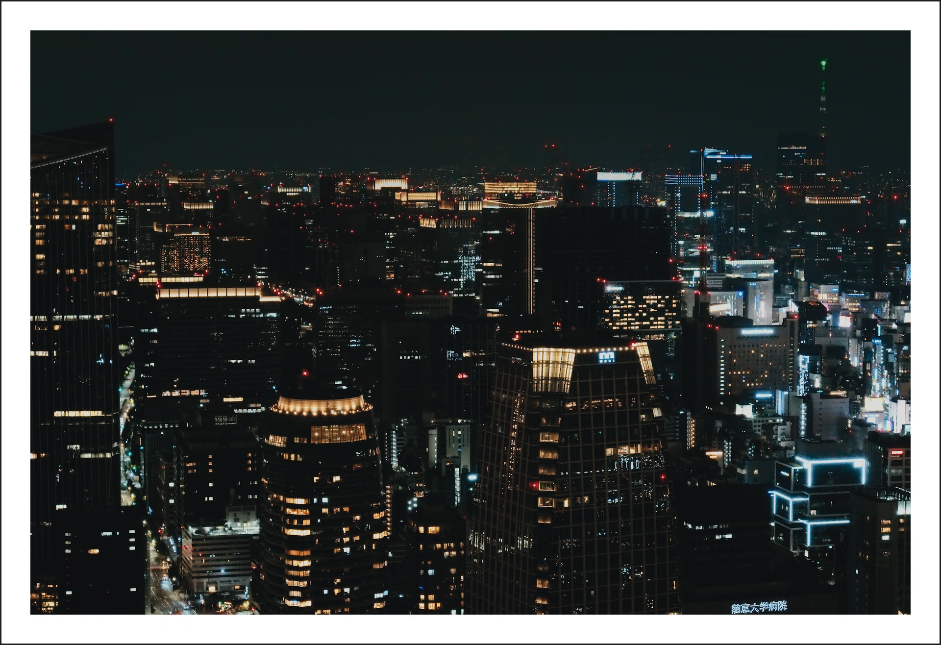
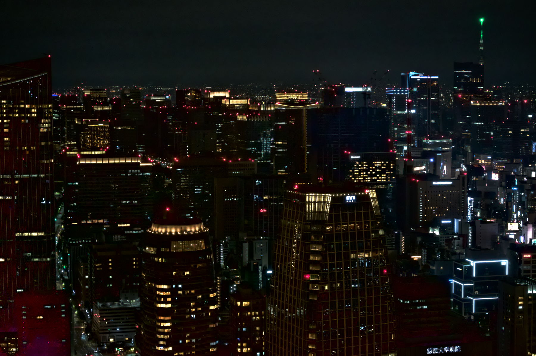
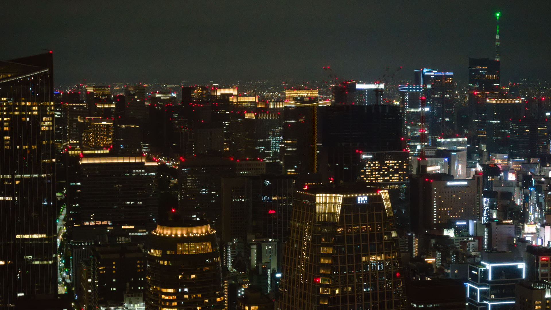
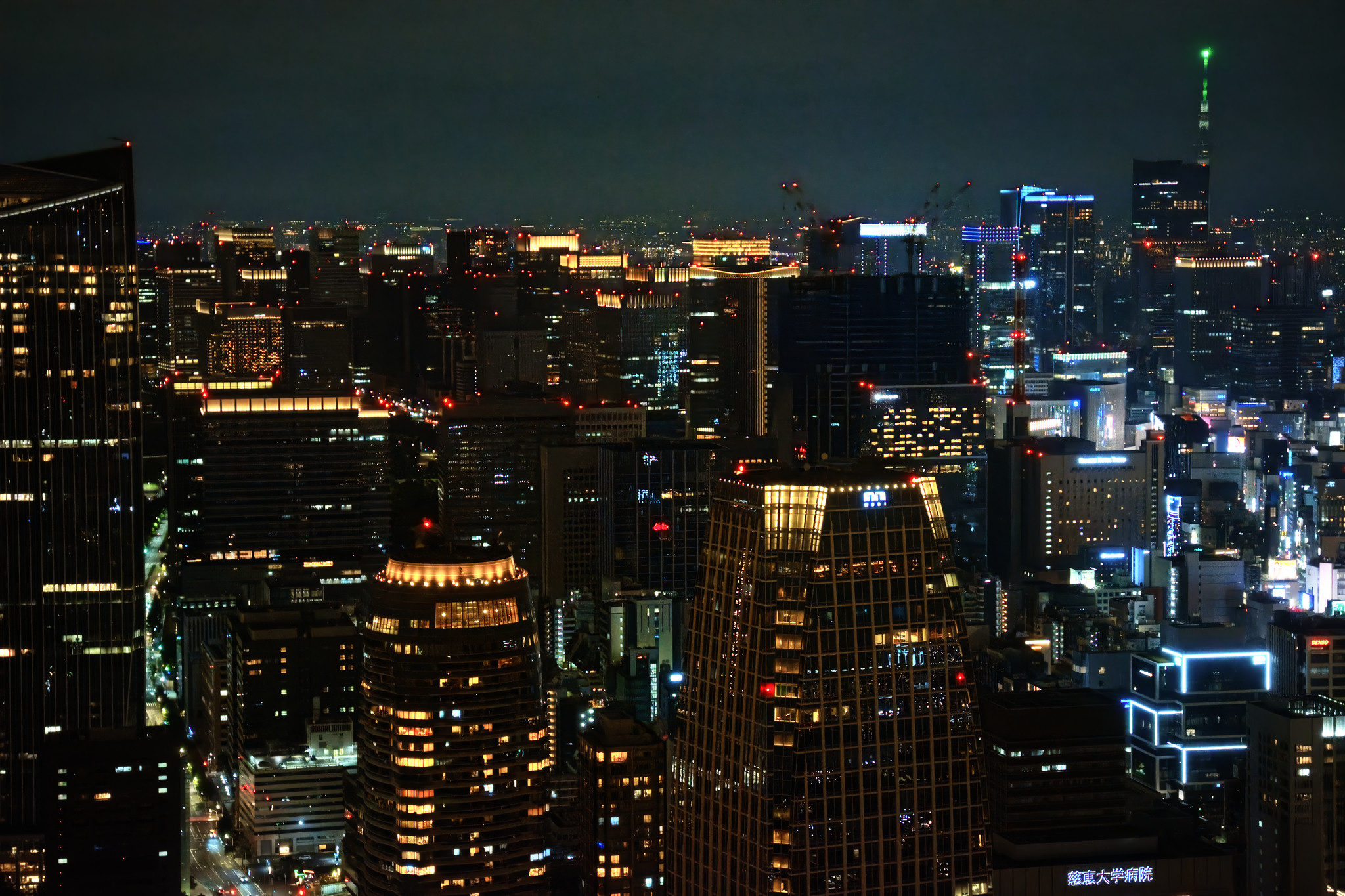
This is my first play raw post, so hopefully I’ve checked all the necessary boxes.
In any case, we loved the Tokyo Tower when we were in Japan in June-July. Touristy of course, but still very nice views and atmosphere. Photography is challenging here because the windows are mostly a bit dirty and there are lots and lots of reflections from the endless strings of lights, projected lights, LED candles, etc. all around the observation decks. All a bit kitschy, but still fun.
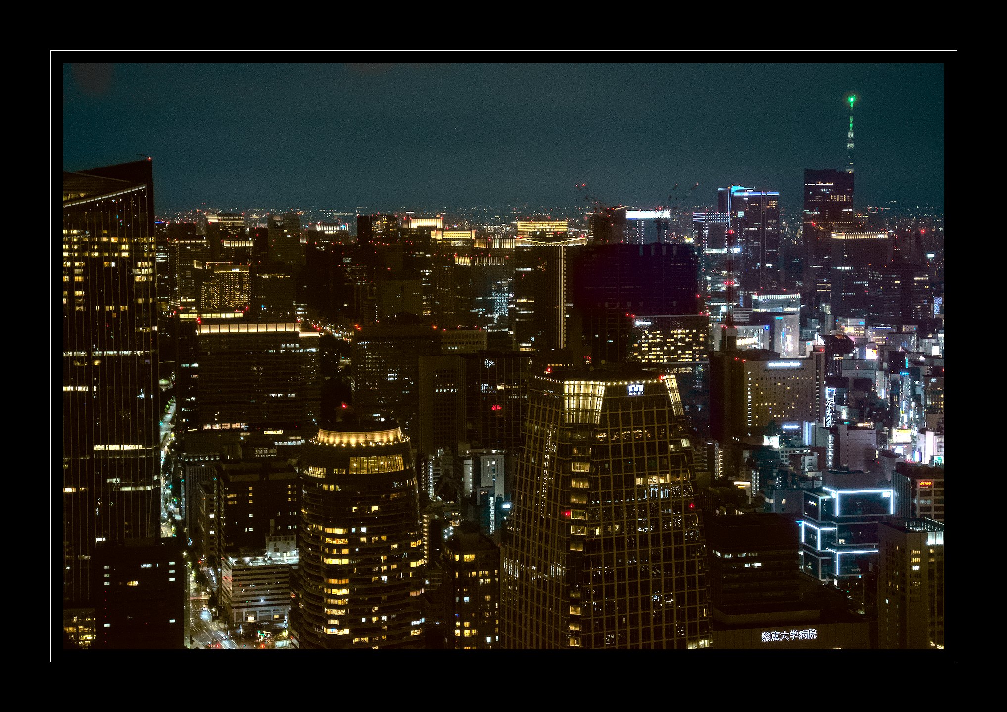
Anyway, in editing my haul from that evening, I was surprised to find more salvageable ones than I thought. This one is not really the best of them, but it is what I started on.
I have included my first crack at this. Sky still is too noisy, and will have to work on it. I didn’t want to pull the shadows down too much, because Tokyo sky is not really dark!
I am using a Mybase processing profile as suggested by Andy Astbury–chrominance noise reduction, defringe, dual demosaicing, etc.
I added a little local contrast, de-haze, a few adjustments in LAB. and some unsharp mask (will never be very sharp because of the glass).
Anyway, would be curious to see what others do with this.
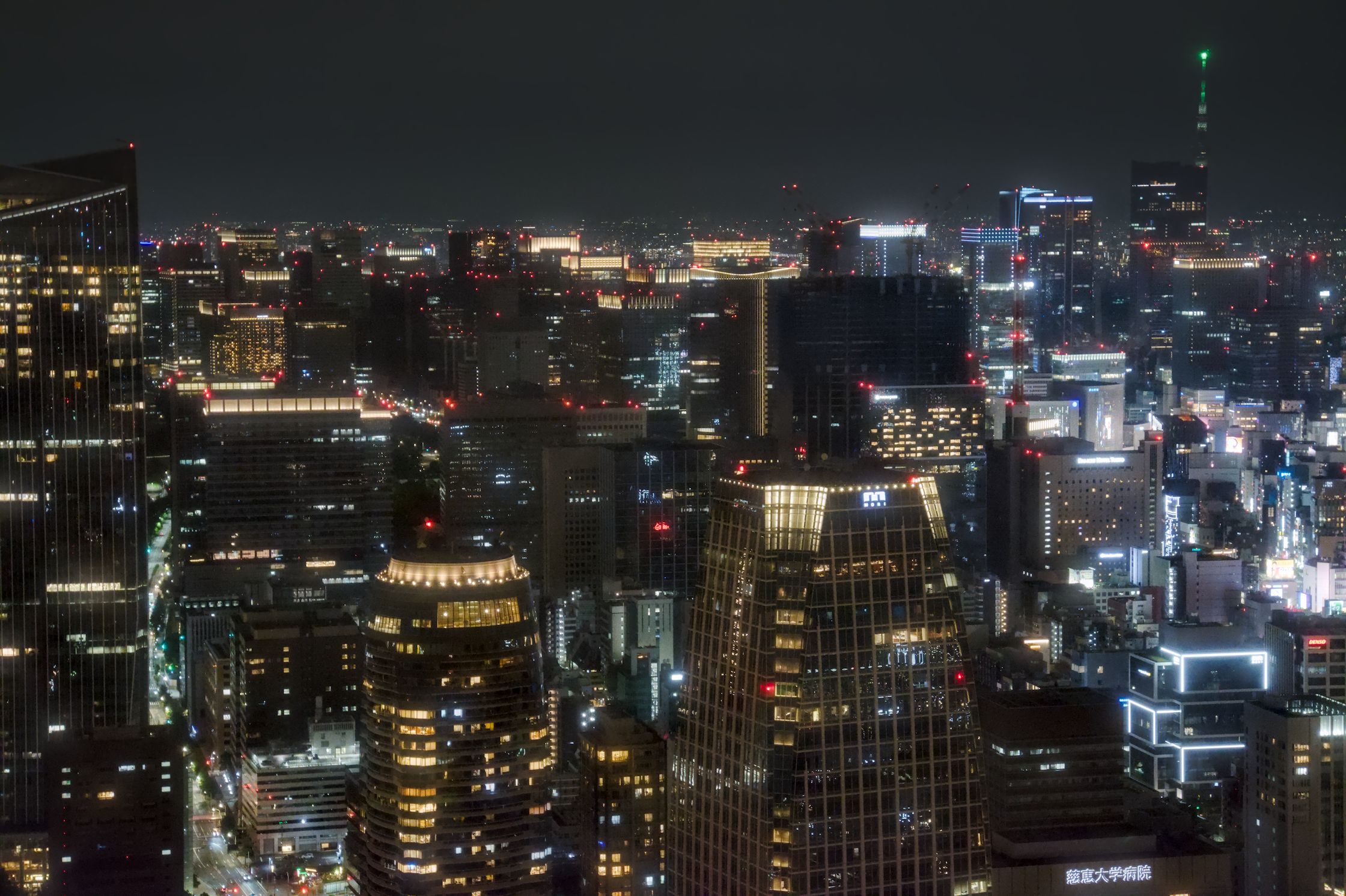
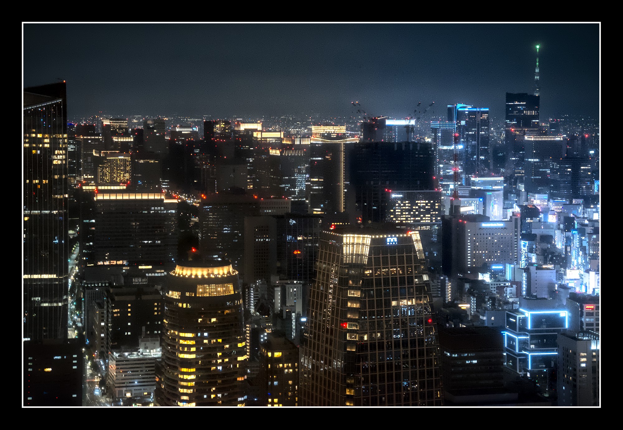
This is a DT 5.7 edit. Hopefully others will post RawTherapee edits for you. I was challenged by the noise in this image. I kept my shot brighter than yours to show more details as the human eye might have perceived it. _DSC6890.NEF.xmp (23.5 KB)
Thanks, good stuff! I do like the greater detail, sharpness, and reduced noise. My 16:9 crop is probably not ideal for this one, but was done for my 2560x1440 monitor (as a wallpaper). Yours looks better!
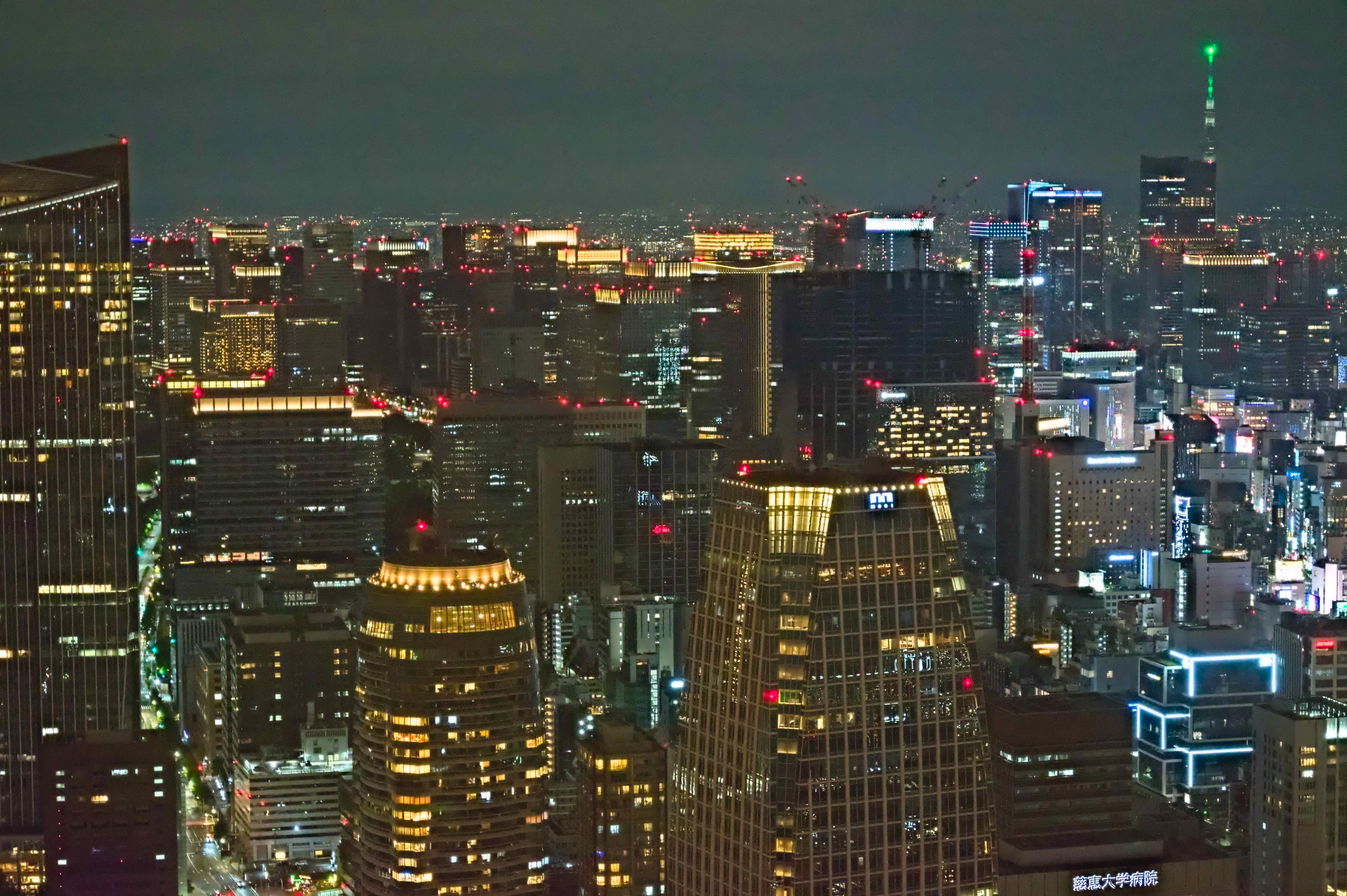
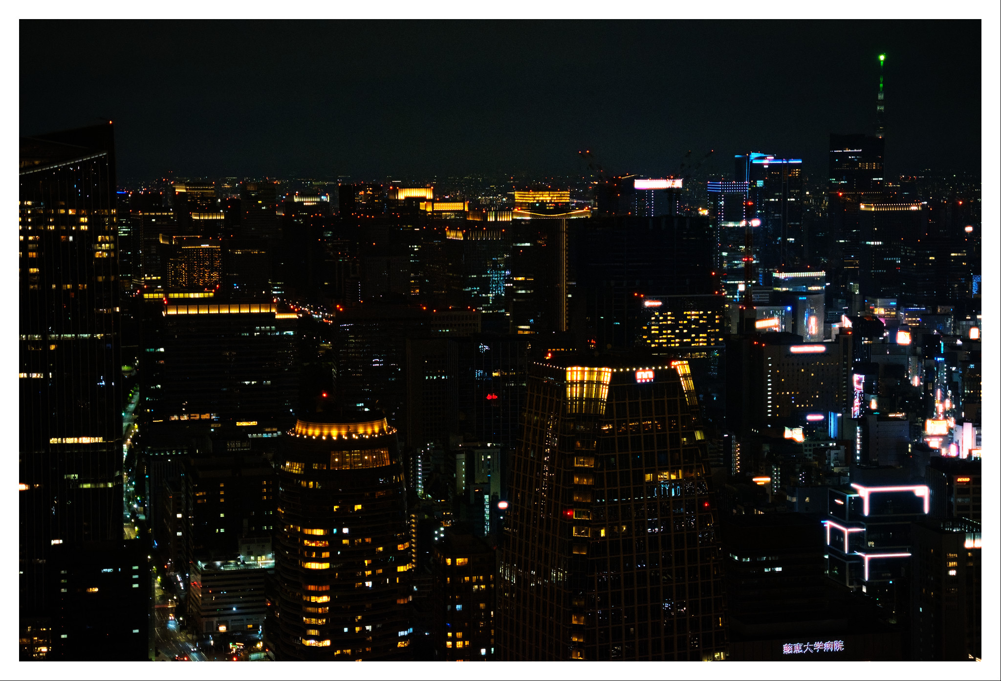
Darktable 5.6.2. Denoised the sky more, tried to balance the denoising on the buildings. Extra chroma denoise in shadows.
I’ve been trying out dual demosaic recently too but I’m not sold on it. It does help with the finest noise in this picture though.
Darkened the sky but I was having trouble separating the sky from the left building.
Used bloom for an extra emphasis on all the light sources
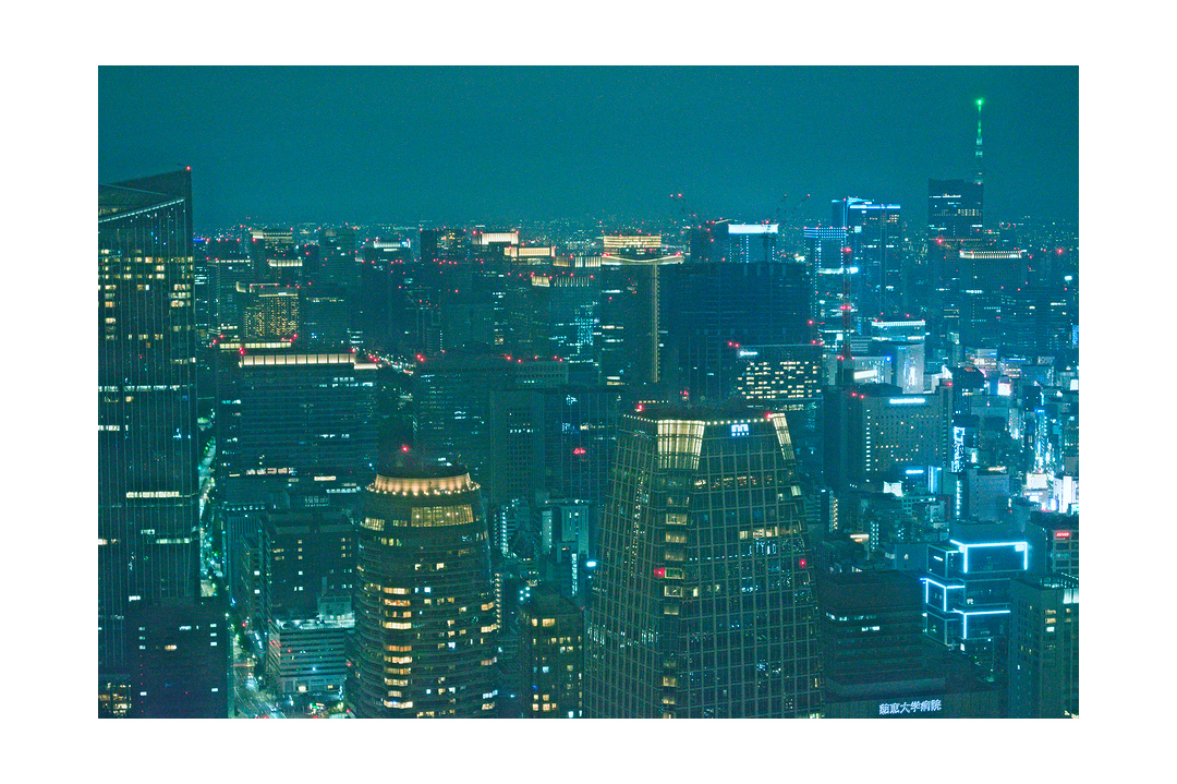
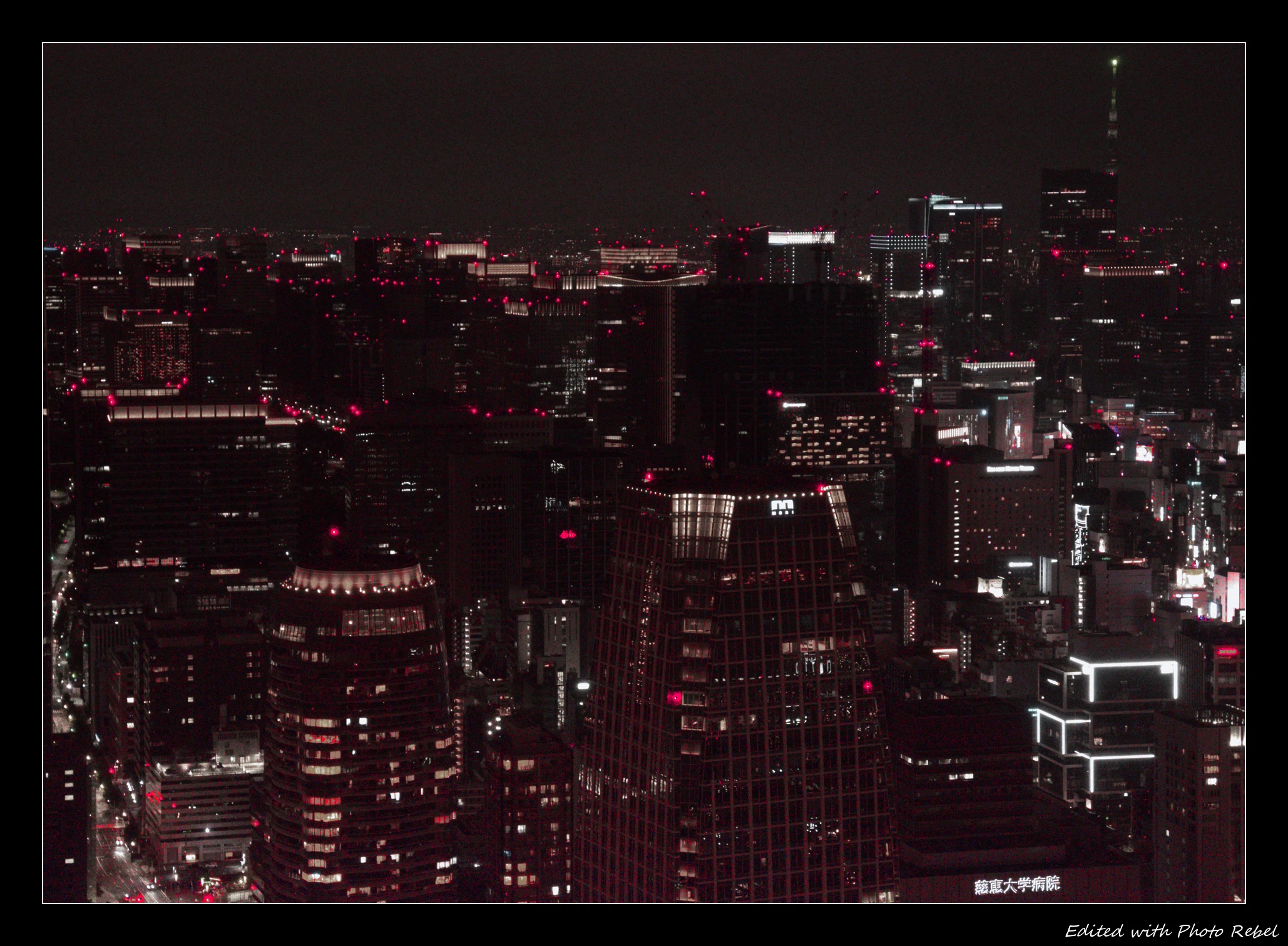
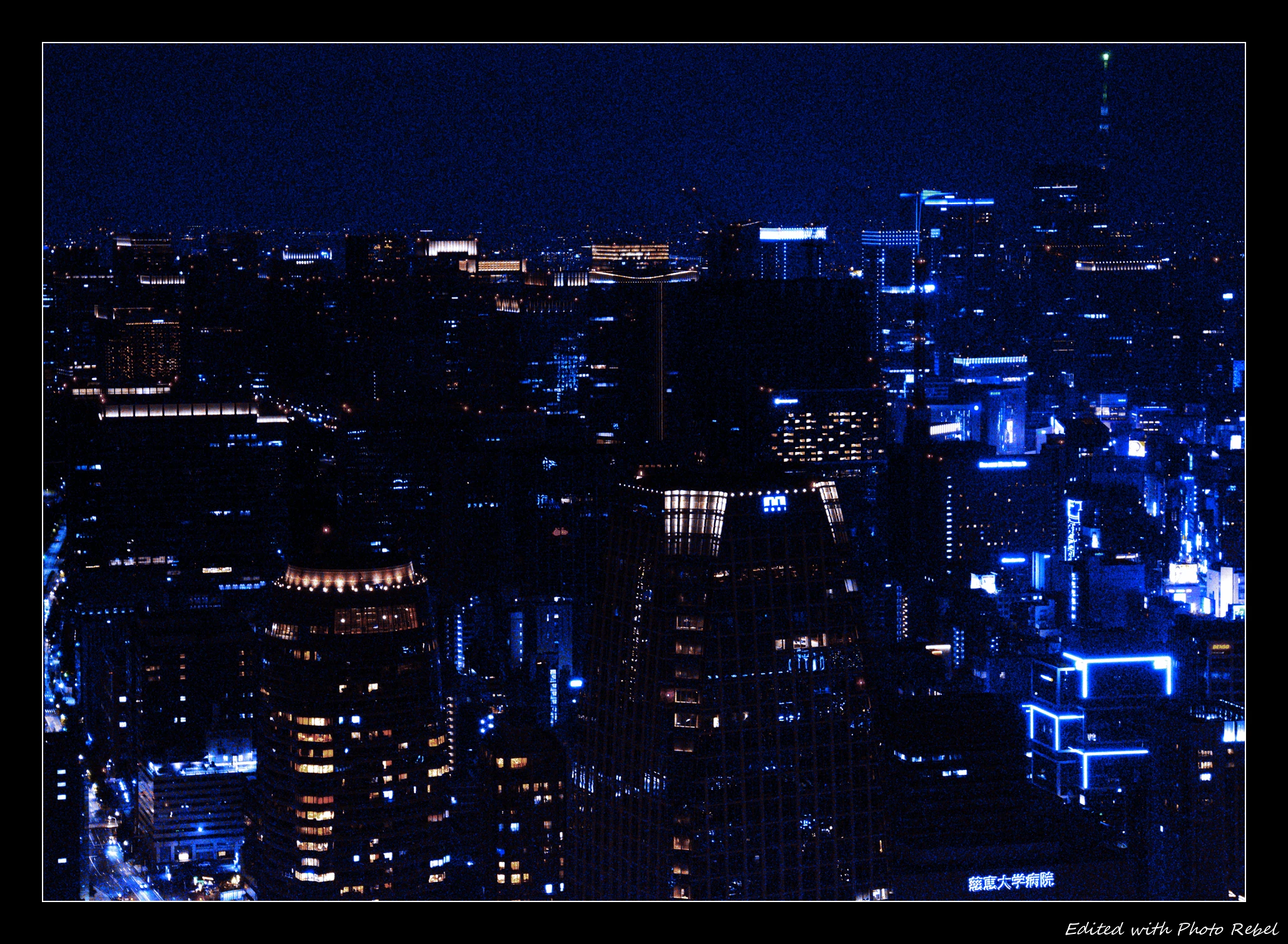
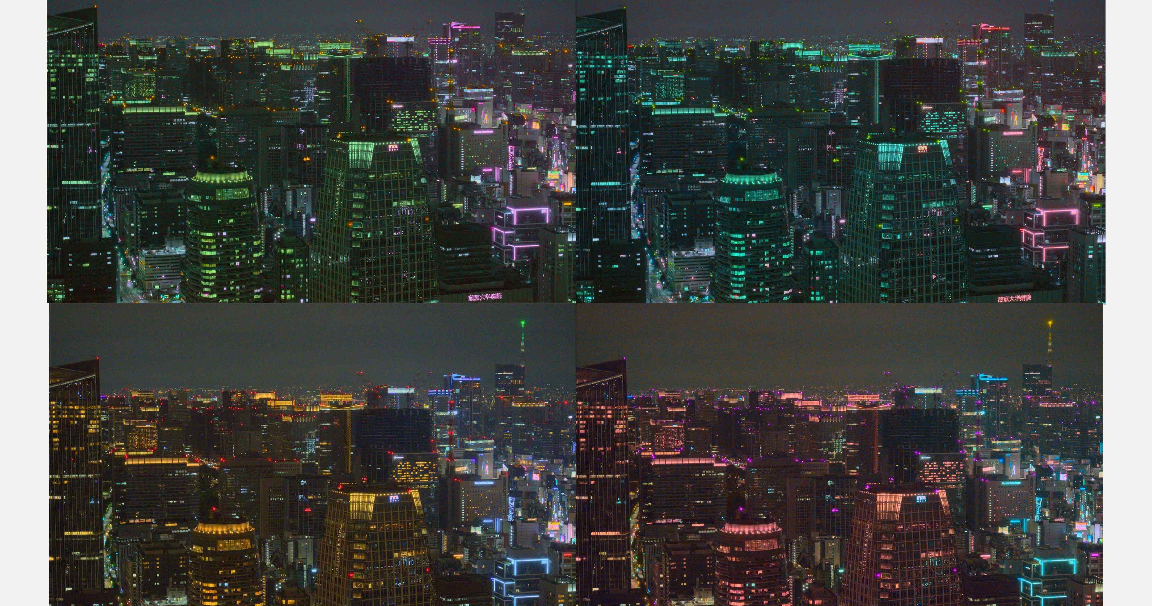
This photo has three main colors when inspected: kind of blue-green in the sky, to the right lots of purple and left_down lots of orange red. After general development I tried to enhance these colors a bit.
Those look great. Did you apply a selective edit?–the left 2/3 looks tilted toward the yellows, while the right third is much more bluish. Or, is this simply a straightforward split toning (i.e., of the entire image)?
I’m just experimenting with that software…I’ll zip the sidecars and add them tomorrow…To be honest I don’t recall exactly what I added…PC is off for the night . I’ll take a look tomorrow for you
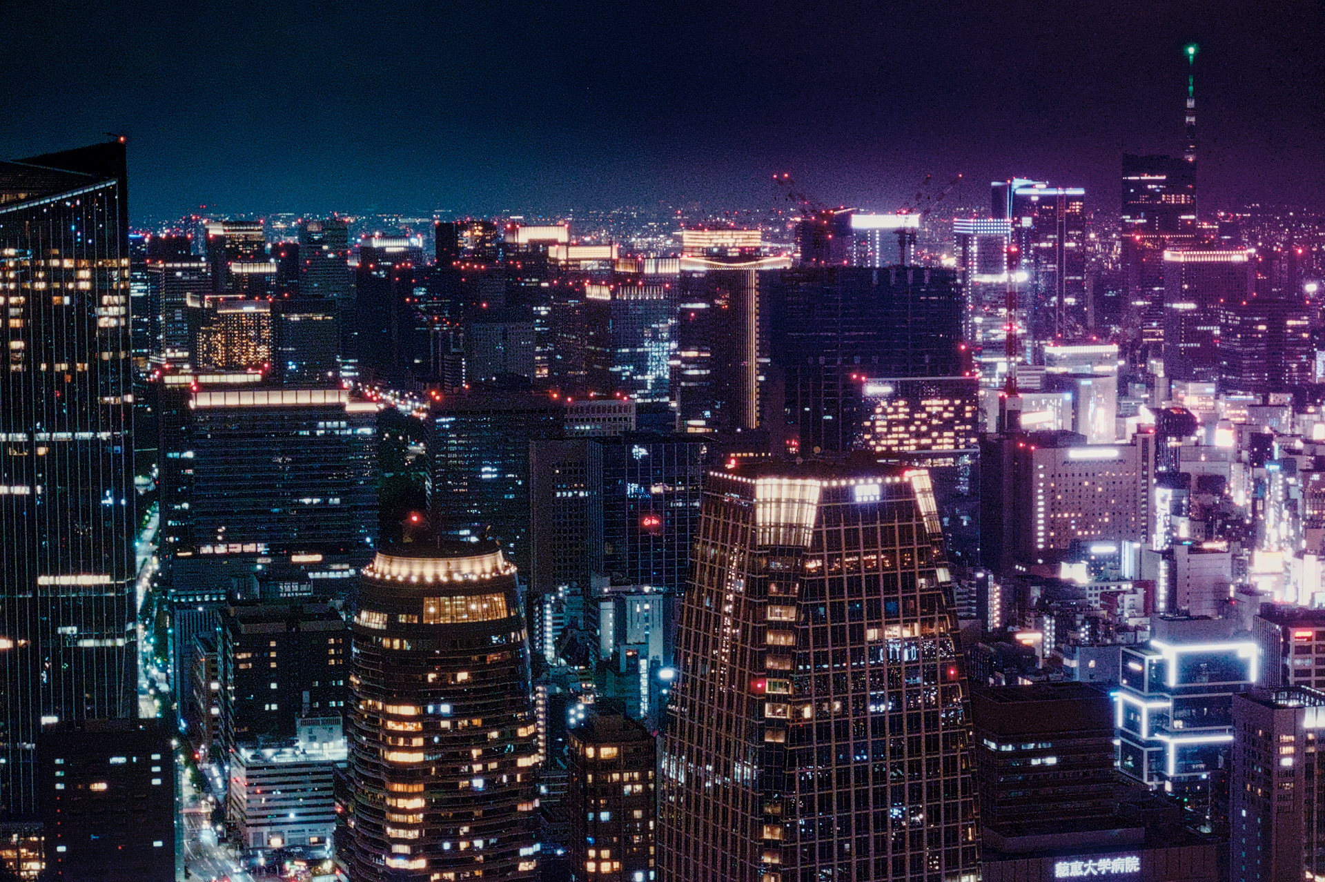
Couldn’t decide, but enjoyed a night time city scene to have a go at. RT5.13, then GIMP (albeit not very good with GIMP yet; learning GIMP is this winters project). Saying that… I’m still learning RT… actually I’m just still learning everything…