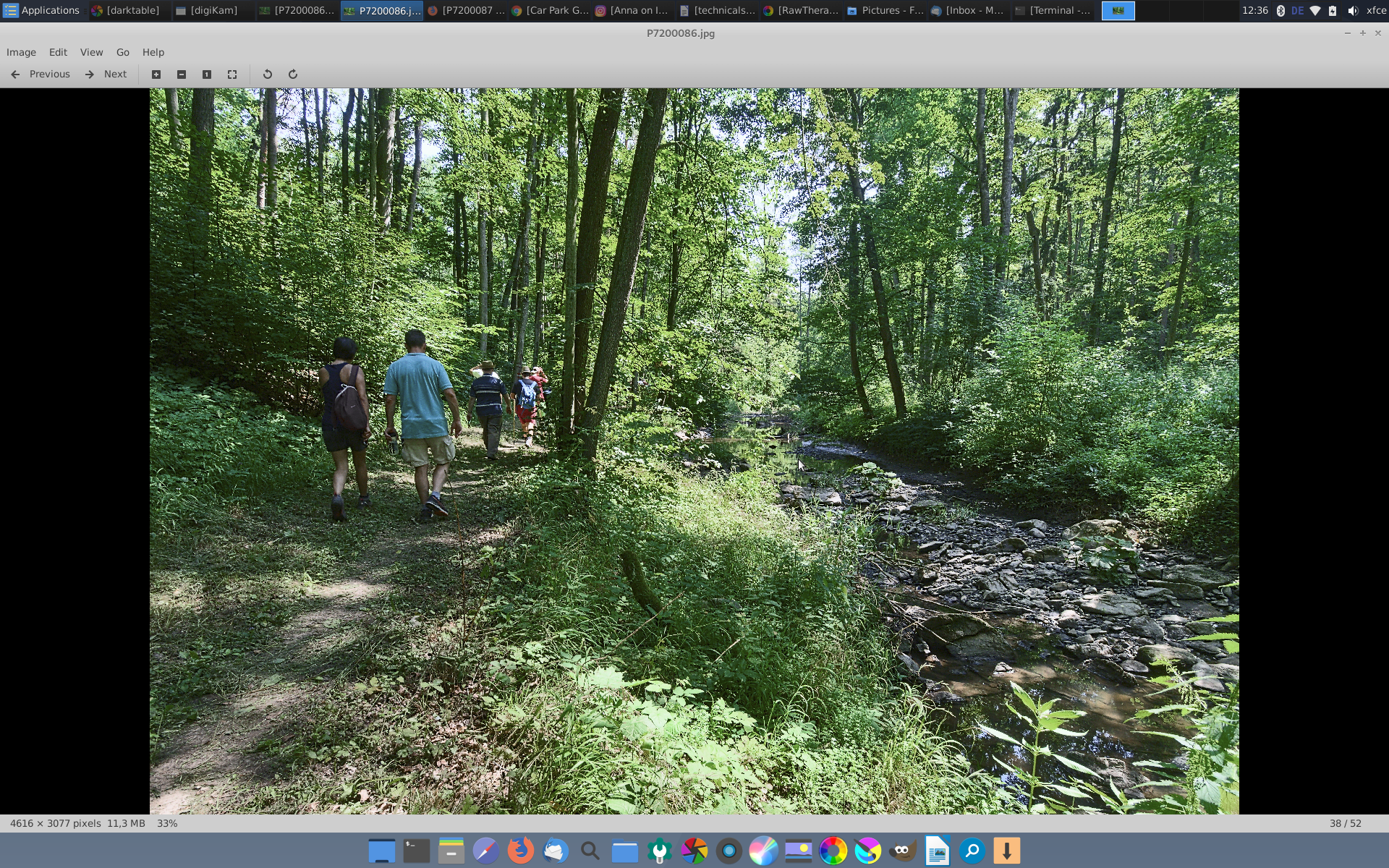
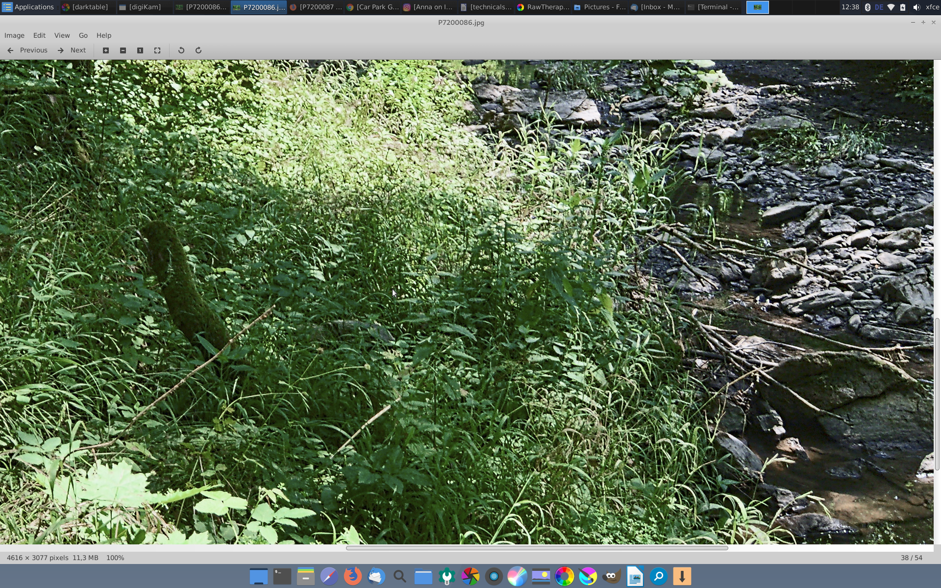
Hi, recently I edited some photos of the woods with lots of saturated greens. However, I have noticed that the saturation appears to be stronger if I view a photo at fit to view. When I export the photo to jpeg (sRGB) and view it with a (color managed) image viewer, the colors are less saturated. However, if I zoom to 100%, saturation is the same both in RT and the image viewer (in this case Eye of Mate).
I am using RT 5.6 Appimage on Debian 10 on a dual core Intel laptop with 16 GB RAM. Screen is a wide gamut BenQ, hardware calibrated and profiled. Profile was set with dispwin. Profile type is XYZ lut + matrix I think.
To me this looks like a bug but I am using RT since a while and I never noticed this until now.
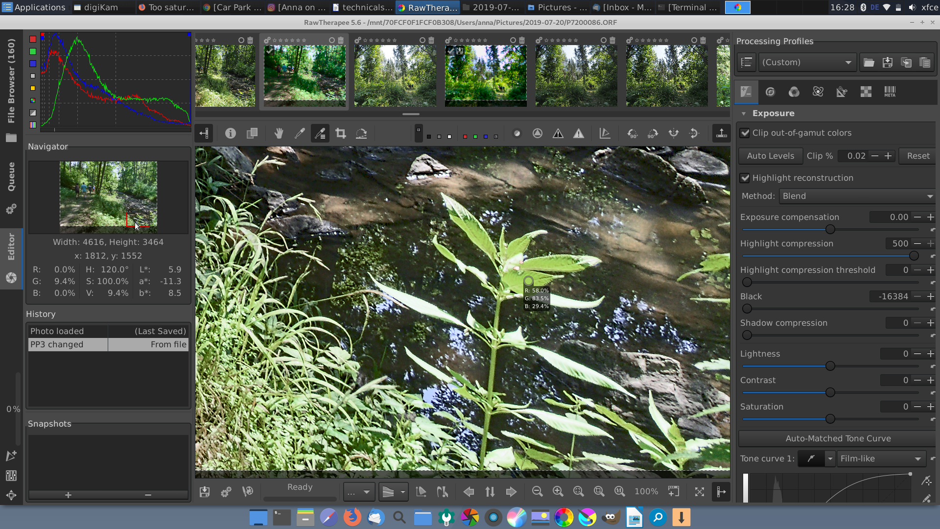
Also uploading some screenshots, the original RAW and the sidecar file so maybe someone can check or reproduce this.
Have you tried using the colour inspector? Do the colours change? If not then it is just an appearance phenomenon where proximity and rounding may affect our perception. Sometimes, I use a separate colour picker app on top of the canvas(?) to verify whether it is a colour management issue.
Maybe it has to do with how RT shows raw images? That is, the preview onscreen is not the real raw image, as explained in Rawpedia. Perhaps those saturated colors are not well resolved while zoomed out.
The colors measured by the pipette tool depends on the zoom factor: when zoomed out, the sampled area used to calculated the average RGB is larger than when zoomed in.
However for the visually perceived color difference, I have no idea.
EOM is definitely color managed though it does not like all profiles. I have opened the photo in several other color managed viewers and editors, it looks the same as in EOM.
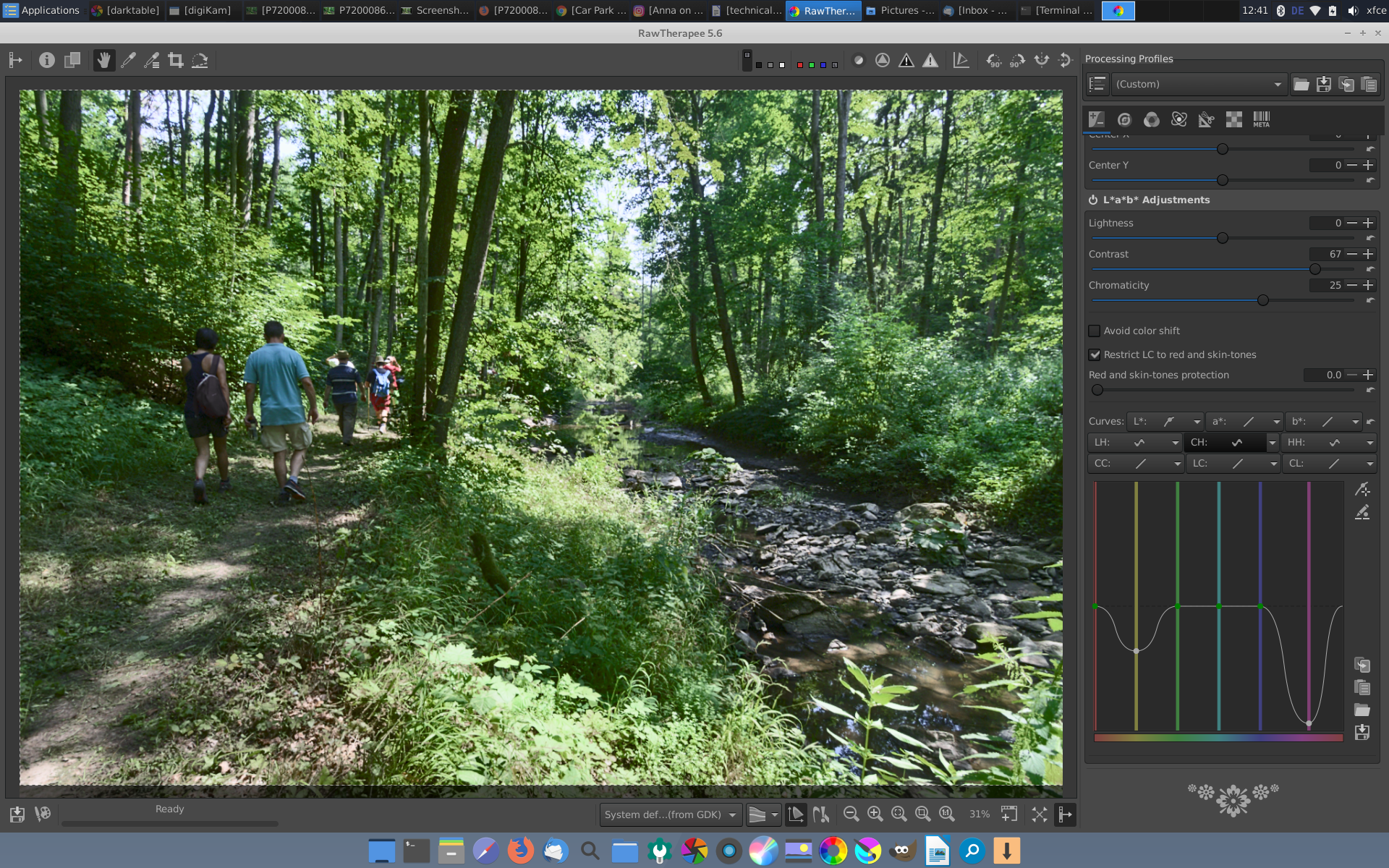
I made 2 sceenshots of your photo in RT: one with 200% zoom and one with 16% zoom
examining the RGB values for the same location in viewer This location is saturated at 200% zoom and is not at 16%.
I identify two possibilities:
some processings (denoising…) can only be viewed at 100% and above and could modify the RGB values. I would like this threshold be user defined.
In order to view the image at 16% in RT (generally under 100%), there is somewhere a resizing. This resizing could be rudimentary (e.g. linear) thus spoiling the view. A resizing in the viewer gives a very different image.
edit:
I am going to compare a screenshot from fit to screen RT window with generated jpg but I have a problem with screencapture color management
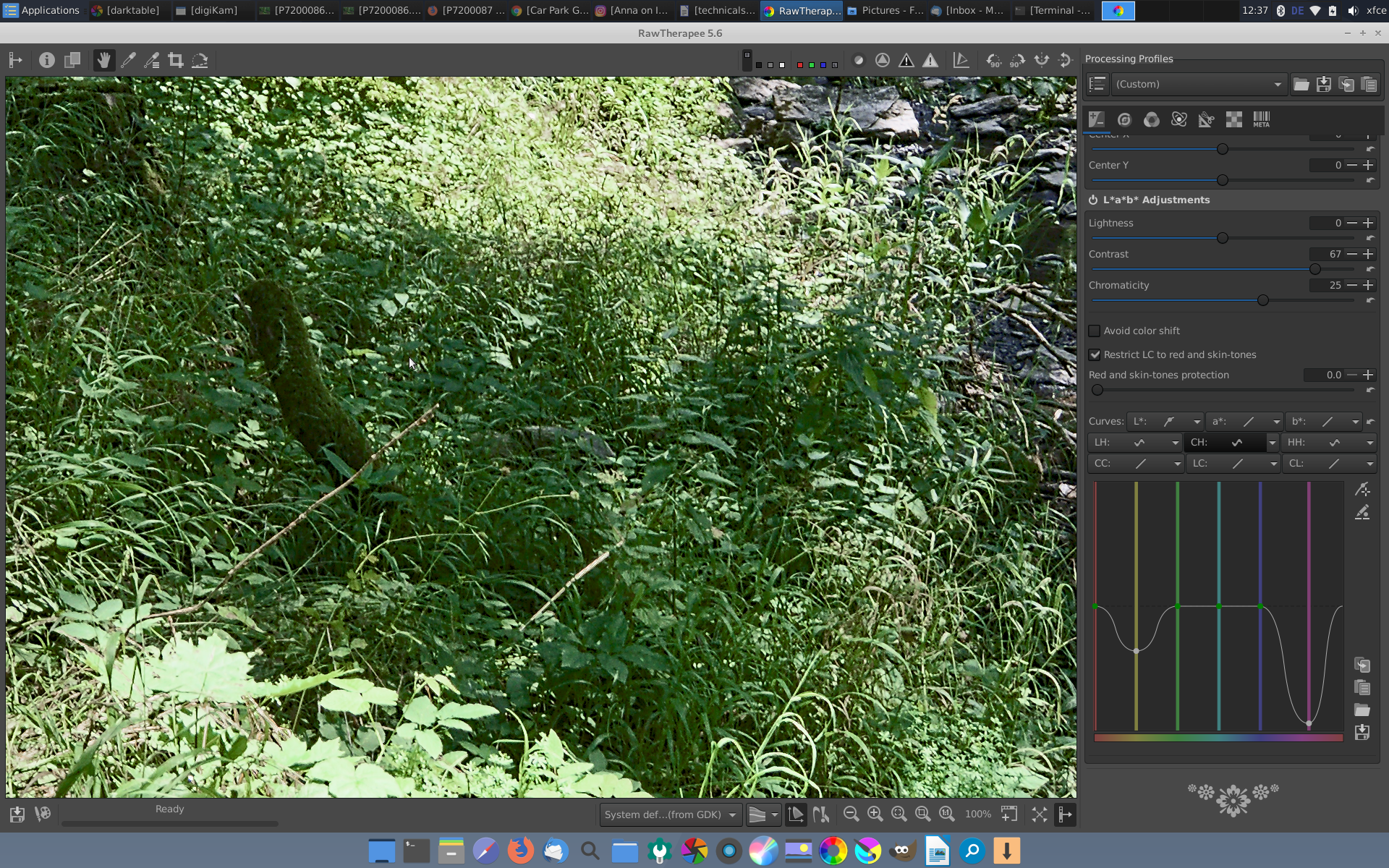
I am not sure if I understand the technical details, but I have checked this with several other photos and apparently the issue only exists with lots of very saturated greens.
Anyway, I want to stress that I am using RT regularly since about 18 months now and I have not noticed this until now. Well I am using RT with a wide gamut screen since a few months, afik it is above all the greens that are very different in larger color spaces. I guess I will do more tests with different profile types. Maybe it is the profile type that RT fit to view/screen does not like?
I’d investigate the monitor profile – some colour-managed applications don’t seem to like LUT+matrix monitor profiles, so I’d create a single curve MTX profile in DisplayCal and see if RT behaves better with that. You could run the DisplayCal tests in your colour-managed apps to investigate the issue with some reference files.
I am bringing this up again because I noticed that this bug was fixed in ART. Would be nice if it could be fixed in RT, too.
Once again: I think this only concerns wide gamut screens. Colors in the fit-to-screen-preview are too saturated.
I tried to find the commit among the ART commits but apparently I have no idea how to look for it. I tried all kinds of keywords like color managment preview etc. I think the bug was still present in ART in fall 2020.