
6 Likes
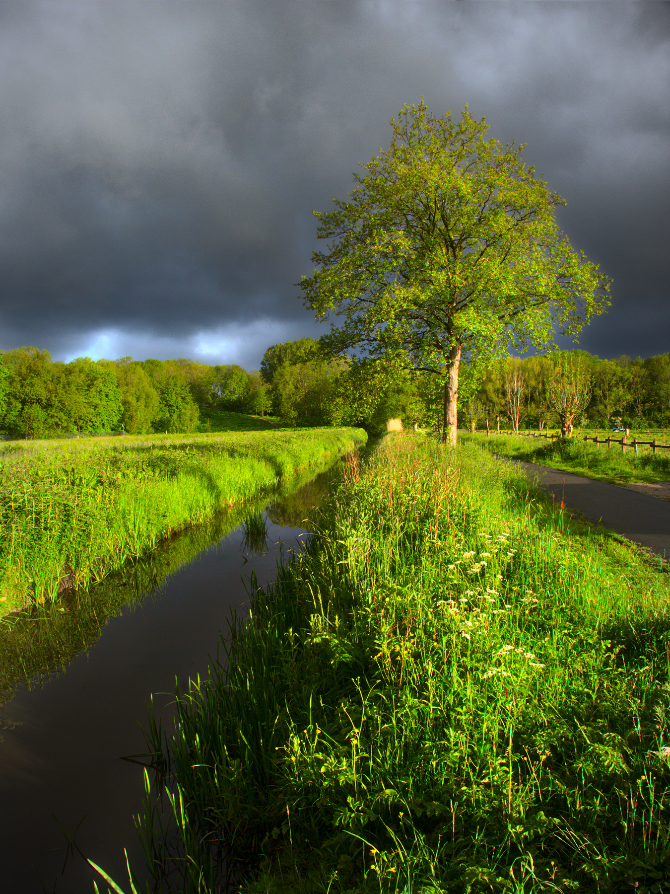
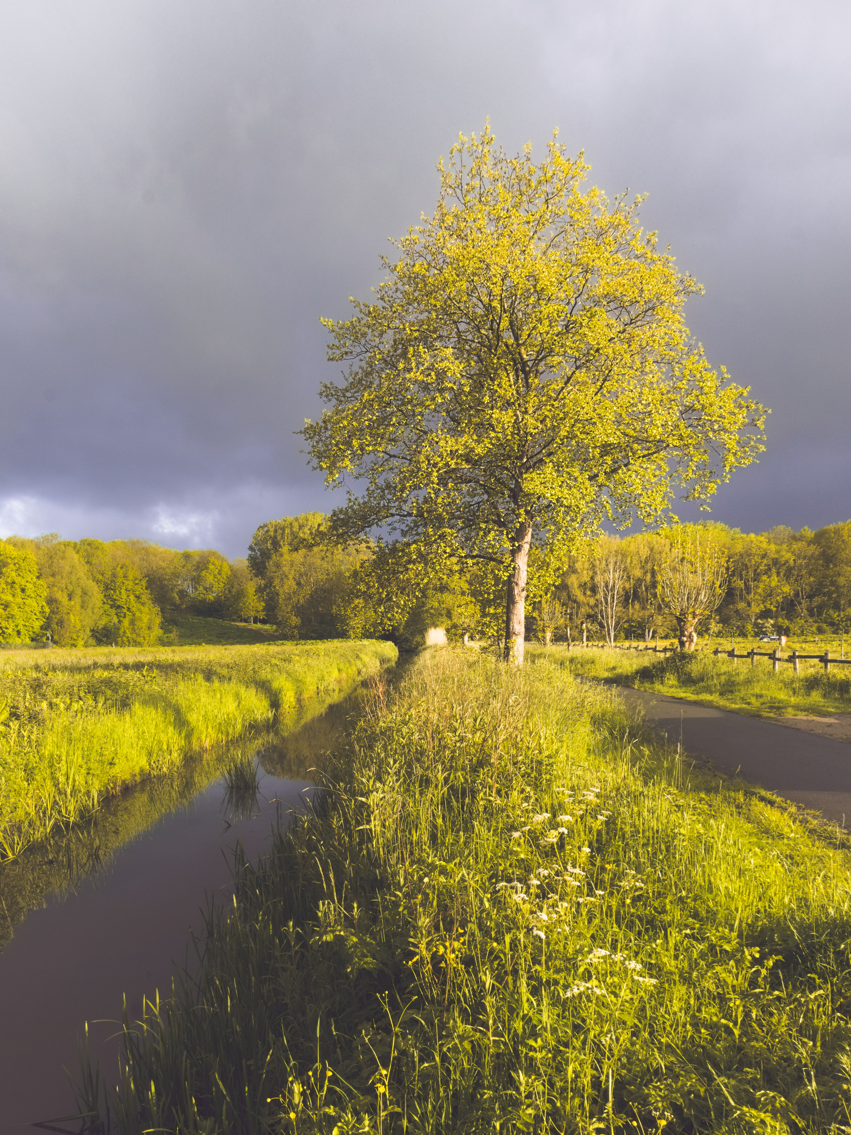
I was looking through them and I agree I esp notice it in the grass. In most edits it doesn’t look natural to me. I thought it was due to oversharpening. Its a tough image but the the warm sun and the green tones in most edits seem a bit off to me as well. I’ll have to see what I can come up with later…
Edit: this is a hard one to gauge the WB which will really affect all that green plant life. Playing with the sigmoid curve I ended up with this quick edit

1 Like
I’m getting the impression that the crisp and natural area between over-sharpened and “under-sharpened” is very small when using darktable, when compared to RawTherapee.
This issue, for as far that it can be called that, seems to be most prominent in (very) fine detailed areas.
I do believe that some sharpening changes/additions are on the horizon for darktable though. Then again; I also read, on darktable I believe, that sharpening is overrated. Not much context there, but it does seem to reflect a certain sentiment that seems to live among some of the (main) developers.
1 Like
tree.clouds.light.jpg.out.pp3 (19,6 KB)
5 Likes
4 Likes
I know, I know… I’m completely drifting away from reality but hey, you gotta experiment, right? 
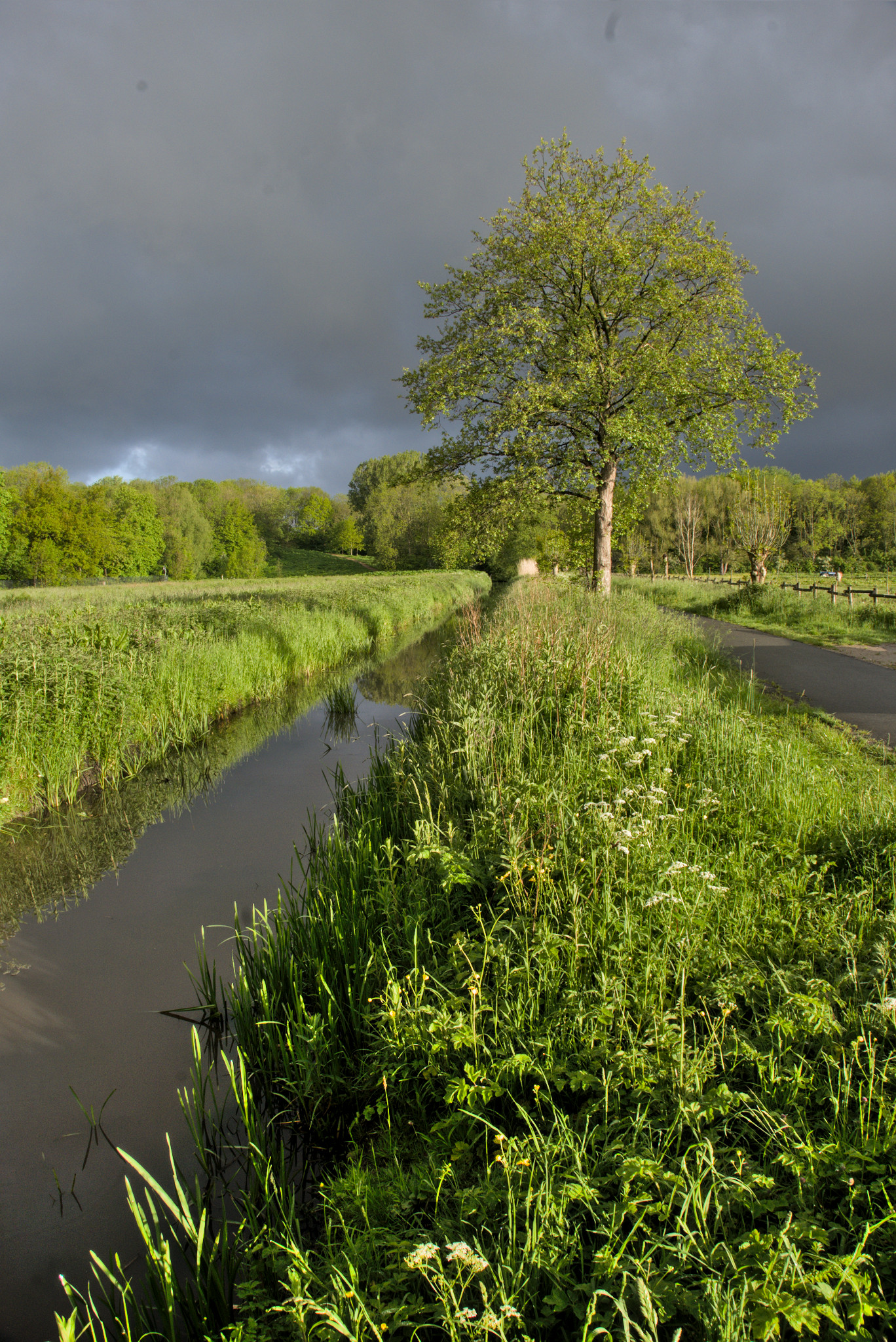
RT5.8 dev
tree.clouds.light.jpg.out.pp3 (29.0 KB)
2 Likes
Nice one @Jade_NL !
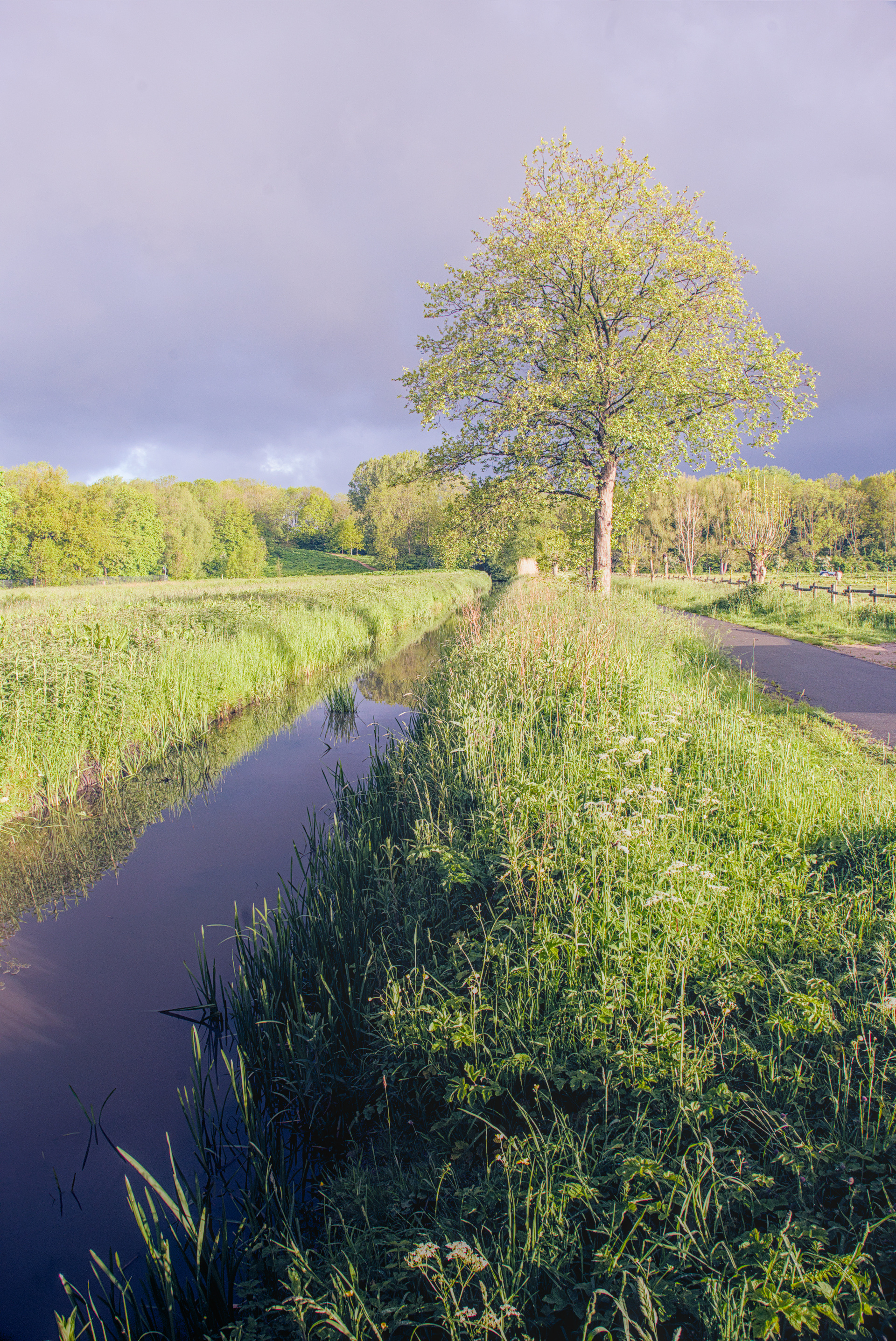
I’m playing a bit here with channel mixer in color calibration module 
tree.clouds.light_03.rw2.xmp (19,3 KB)
darktable 3.5.0~git2425.f3fc325d39-1
4 Likes
Yes, yes you do!
You might be in the correct place, this being play raw… ![]()
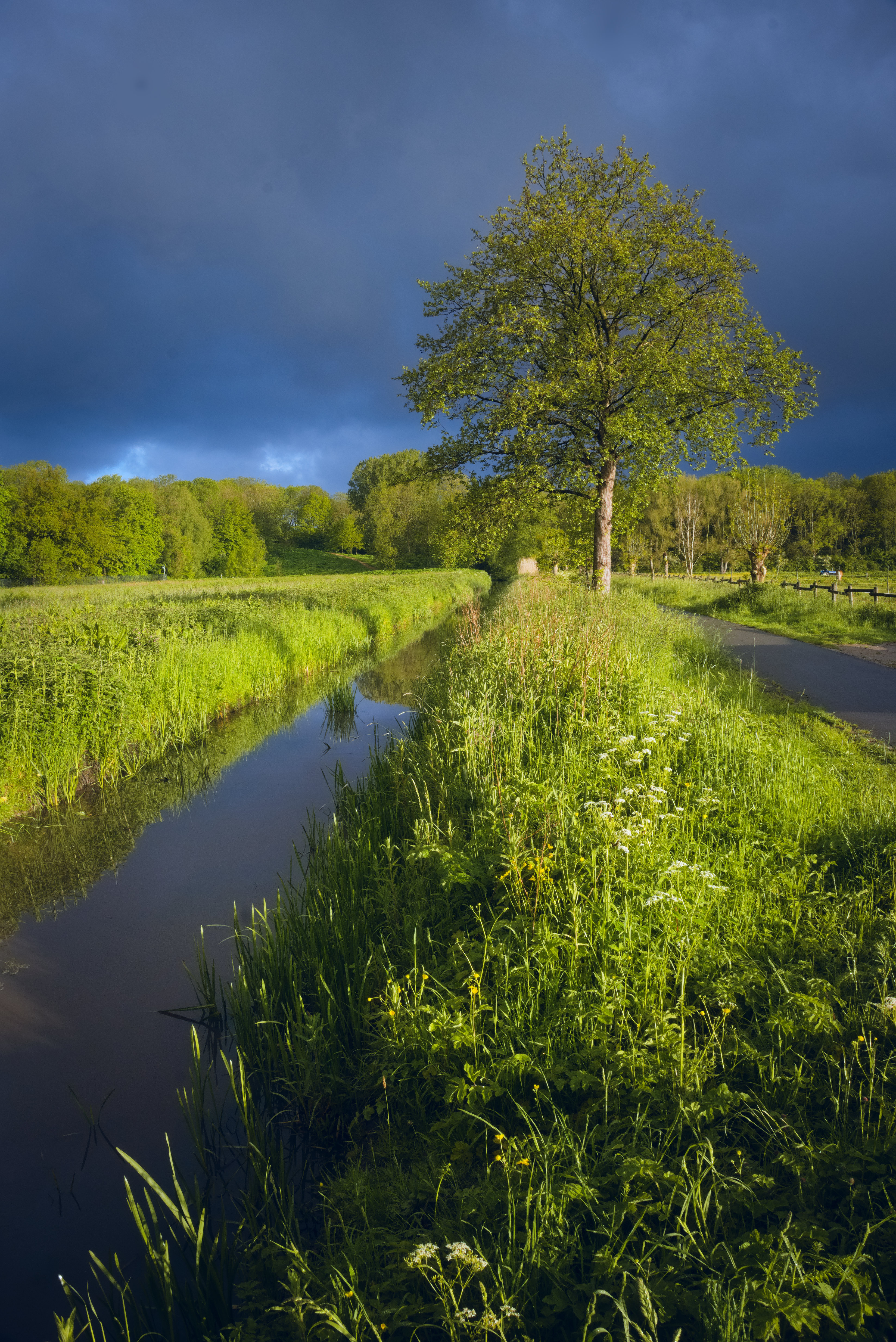
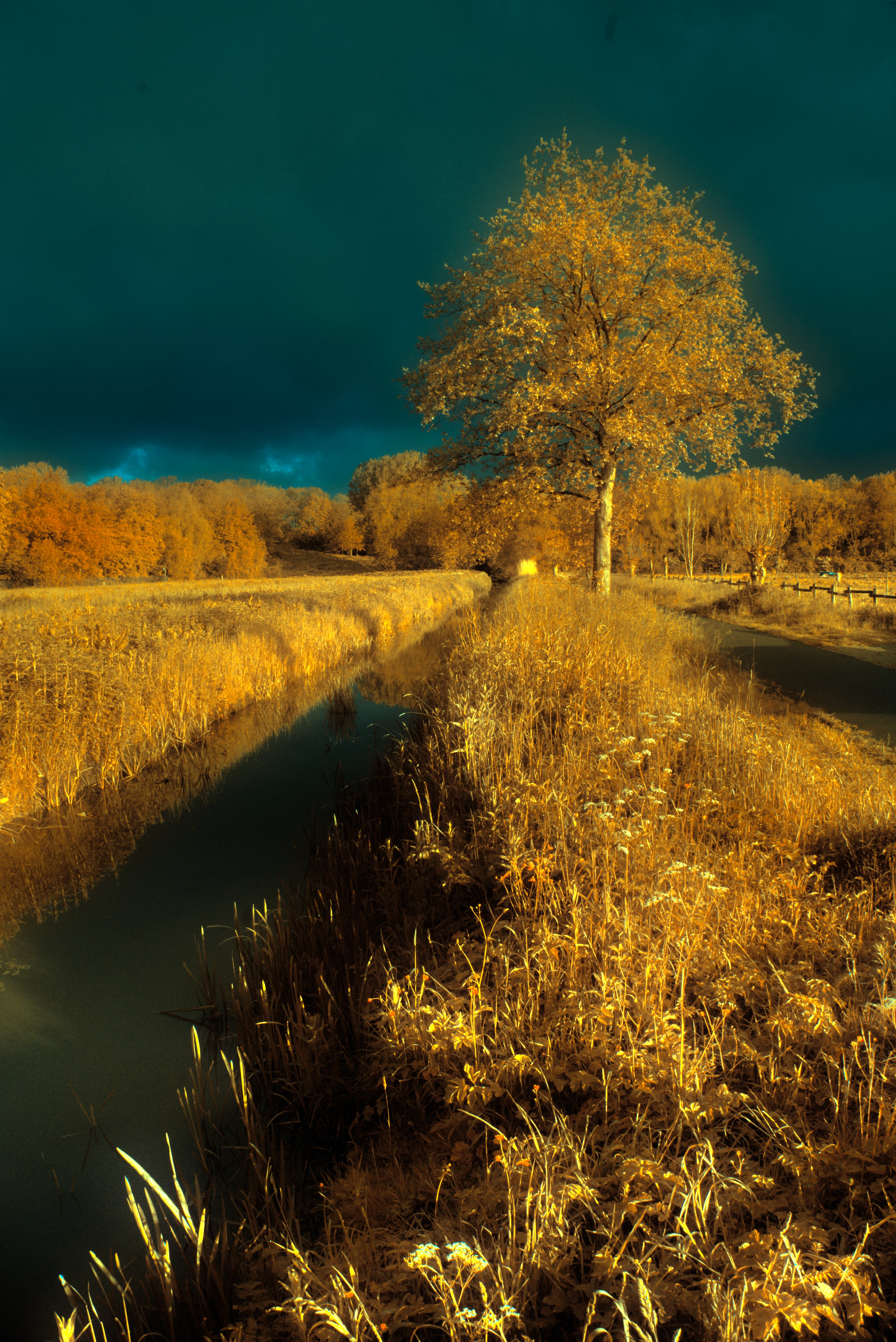
I like this one! It has that infrared feel, but then again it doesn’t.
1 Like
Really like the picture, Jacques. Several nice edits.
darktable-3.5.0+2399
tree.clouds.light_13.rw2.xmp (56.0 KB)

2 Likes
That’s a really nice edit with some nice nuances. Love the crop(!) although it does bother me somewhat that it isn’t exactly 1:1, but I’m sure that’s my neurotic compulsion speaking 
Thanks. I’ve always cropped to fit as I liked best, and for my own photos that I have had printed, I put a border around them in GIMP to bring them to a standard size. Makes them looked matted.
Looking at it as 1:1, I think I like it better.
Although I like 1:1, I also like a slightly wider image since 1:1 looks tall in the forum.
Here’s the 1:1. It accents the tree more. Some days I like this better; some days the other, but if it must be a standard size, I think this is best.
2 Likes
You are right about that. The tree is situated in a more pleasing spot in the 1:1, but If I switch back and forth between your 2 edits I do see the appeal of the first one. Nice edits either way though.
1 Like
I find the tree is a problem. Many edits end up with black branches which i think was the shadow but it gets distorted maybe by contrast or something but it ends up looking like an artifact to me.
I think I know what you mean: could you crop an example for us?
If that comment was for me I’ll see if I can find the best example or some anyway…

Some version of this shows up in most of the edits mine I did a while back as well…

I get it now. It isn’t just that the branches are darkened but the other halves are brightened, making an ugly unnatural outline. I don’t think my entry suffers from that because I essentially normalized the brightness and focused on colour contrast instead.
Yeah, It’s a slippery slope if you want to enhance the light. I was fighting with this as well and in the end settled for what it is now… ::