@Mica
In CSS, em units scales the font size of the currently selected element. rem units scale the font size of the current element using the font size of the document’s root element. If the size of the root element and the current element differ, then rem and em will give different results.
Of course, but this is a very general remark. Why should we have two different “units” if they had the same function. So it is obvious that they behave different. But the problem is a bit more complicated and appears if your objects which you want to give a style, have a highly hierarchical structure (which is the case at the dartable GUI). The article https://alligator.io/css/rem-vs-em-units/ exactly decribes what I mean and gives some excellent examples. My conclusion of this article is : It would be a very approriate solution to set
font-size= 1rem
instead of 1em at line 163 of darktable.css. If a user wants to downscale all elements by 10%, he (she) only has to set font-size= 0.9rem and 95% of the work is done. Only some small tweaks ( about 4 or 5) have to be done for some elements to get a good looking and well balanced style.
rem is just rarely used and it’s difficult to think and adapt to all users cases/wanted uses and specific DPI scale factor used on different OS. And good thing about CSS is it’s quite easily tweakable. So feel free to adjust it as you want. That’s the goal of CSS themes.
rem is quite recent (2013) regardless of others CSS units and W3C just say that on their webpage units : “Because they are so new, they don’t work everywhere yet. But, as of early 2015, several browsers support them.” (CSS: em, px, pt, cm, in…)
Anyway, I will test if it could be better to change that (and verify which Gtk versions correctly renders this quite recent unit. I spent quite a lot of hours tweaking and adjust CSS to finish Aurélien big work on the UI and correct a lot of UI glitches. What I learnt making this work is that changing a parameter could sometimes breaks other parts (sometimes not visible at first). And I have read some different fonts rendering between Gtk+ 3.22 and 3.24… So we have to be careful.
I totally agree ! And I really appreciate your work. What I said is just a proposal resulting from the experiences I made the last days. I just modified to 0.9em and the result was a UI totally messed up. I had some previous experience using CSS, but last time I used it is some years ago. So I had to (re)learn and remember a lot of things. My fear is that users with less pre-experience on CSS will be massive confused if they get a totally messed up UI by just changing one single parameter : what the f… is this !? … and will quickly give up. Therefore I shared my experiences here. Another article about the discussion on using rem or em, and the pros and cons, can be found on REM vs EM – The Great Debate | Zell Liew .
And thanks for sharing that. Most users will not change CSS and default CSS works great on many systems (seems that systems with Gtk+ 3.22 have some font glitches). So this problem is quite minor I think. Anyway, that doesn’t mean of course this can’t be improved. Maybe, use rem will help solve some glitches (or not).
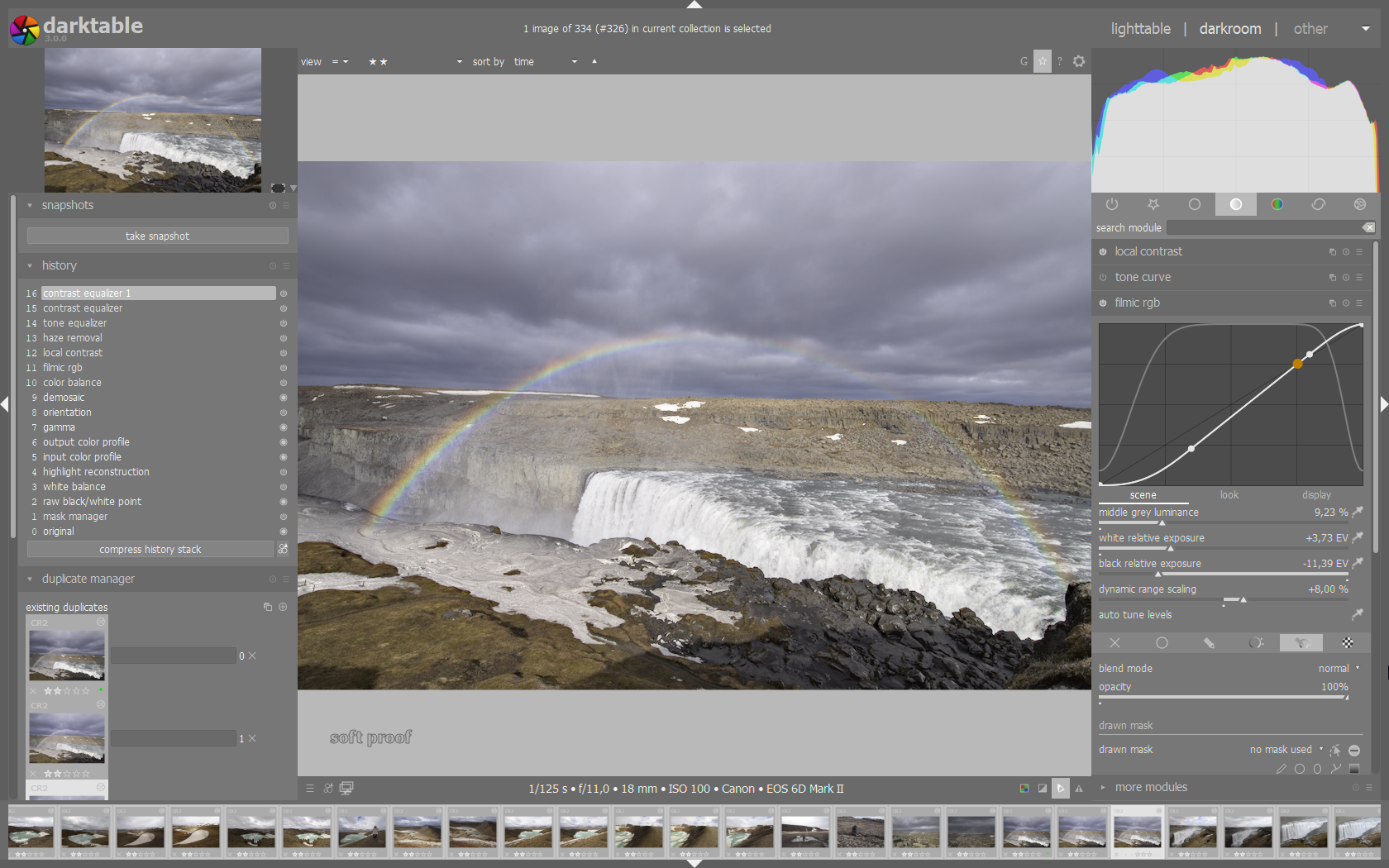
On my monitor the “darktable-elegant-grey” style shows reddish artefacts in small fonts e.g. within the filmic box (see the “middle grey luminance” text below):
As the standard darktable font works fine I copied “darktable-elegant-grey.css” and “darktable.css” to my personal themes- folder. I then renamed “darktable-elegant-grey.css” to “darktable-grey.css”. In “darktable-grey.css” I changed line 21:
This is probably the way your system is set to render fonts… The equivalent of clear type needs to be applied, but I don’t remember what it is called off the top of my head.
And that’s not as elegant as we make it. So it’s the way your OS render it that’s not good. Which following ones do you have ?
OS release ?
Gtk version used ?
If on Linux, which desktop environment ?
Default OS font and font size ?
And could you test by using darktable-elegant-grey.css (default one so your OLD line) and change on darktable.css theme line 163 from 1.0em to 1.0rem ? And post here what that renders ?
Don’t care about Gtk version if you are on Windows. I don’t use Windows so can’t help more here.
Thanks for testing change on line 163. I was quite sure that will not change anything but in case of…
I had a similar problem years ago (2013 I think) on an old windows xp system. There were settings (about settings -> screen settings -> advanced or similar) to tweak the way fonts are rendered and how anti aliasing should be applied (or not). I have a dim reminder that this improved the situation a bit, but the result was not satisfying. I remember that I had to install a third party tool (don’t remember the name, too long ago) which allowed further tweakings (for example the algorithm used for anti aliasing) and this helped more.
I moved to linux some month later (best decision of my life… ). So unfortunately I can’t tell you how to tweak this parameters in Windows 10. But I’m quite shure there are settings for this. Use a search engine to search for keywords like fonts rendering anti aliasing ClearType… You will get numerous results which can help you along.
Sorry, that’s not very precise, but as already stated before, I’m not using windows anymore.
Just a thing about those using darktable on KDE. I’ve just read that from the last KDE Plasma 5.18 LTS release : “GTK application fonts and icons now respect your Plasma settings for improved visual integration.”
That’s just confirm that KDE doesn’t render correctly fonts for Gtk apps (so darktable) on previous 5.18 release. So that should be better with that last release. Most of the times of what I see when helping KDE users to have better font rendering was to adjust anti-aliasing options (for some cases I see, it’s quite similar for Windows).
dt 3.1.0+1383
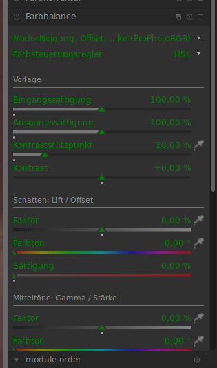
Several changes have been implemented in the sylesheets during the last weeks. I did some tweeks to make the components of the sidebars smaller. At one point I’m struggeling : I want to shrink the font-size of the labels of the bauhaus-sliders (shown in green in the screenshot).
I have found no way so far to do so. Which property has to be changed in the CSS stylesheet ? Or is it impossible to tweek this labels independent of the other parts of the sliders because they are hardcoded as part of the sliders ?
Thank you very much, #iop-plugin-ui was the component I was looking for. With font-size: 0.9em everything is well balanced now.
I heard about GTKInspector before, but I was not aware that it is already installed. I only had to activate it (enabling keybindings for DEBUG mode). Very useful tool to identify UI items and their hierarchie. Thanks again for this tip and your support.
If you haven’t spotted it the latest master has a new option in the ‘general’ section of the preferences dialog where you can key small CSS tweaks, allowing you to still use a core darktable theme without having to set up your own. That’s what I used to test the suggestion above.
Yes, I realized that the preferences section has been revised completely. And I did some tests with the new tab for the CSS tweaks. But my interventions go deeper, so I created my own styles darktable-small.css and darktable-elegant-grey-small in ~.config/darktable/themes based on the original files.
In the new preferences TAB is a button save theme tweaks. Where are the tweaks saved ? In darktablerc ?
No - it’s not complete so it shouldn’t be selectable as a theme. It’s applied in addition to the selected theme. Its main purpose is small tweaks (the sort of things that used to be items within the preferences window itself). For example I use it to decrease the margin around images in the lighttable view.
But tomorrow I could choose to switch to another theme and my own tweaks would not be lost.


 but ok for me.
 ). So unfortunately I can’t tell you how to tweak this parameters in Windows 10. But I’m quite shure there are settings for this. Use a search engine to search for keywords like