From darktable on github. UI Feature Request and other ideas. · Issue #8453 · darktable-org/darktable · GitHub
UI Feature Request and other ideas.
Here I left some ideas related to the UI. I downloaded the bootstrap icon set from https://icons.getbootstrap.com/ used some of them and modified others to look like the darktable icons but really I don’t know if bootstrap icons can be used in darktable.
The first and second screenshots are an idea to remove the top bar with the logo on the left and the names (lighttable, darkroom, etc) on the right. I created an icon set for each (lighttable, darkroom, etc) that can be always visible or not if left panel is collapsed.
As the logo was removed, I think the most reasonable is to put it in a new tab named (about) in the global preferences.
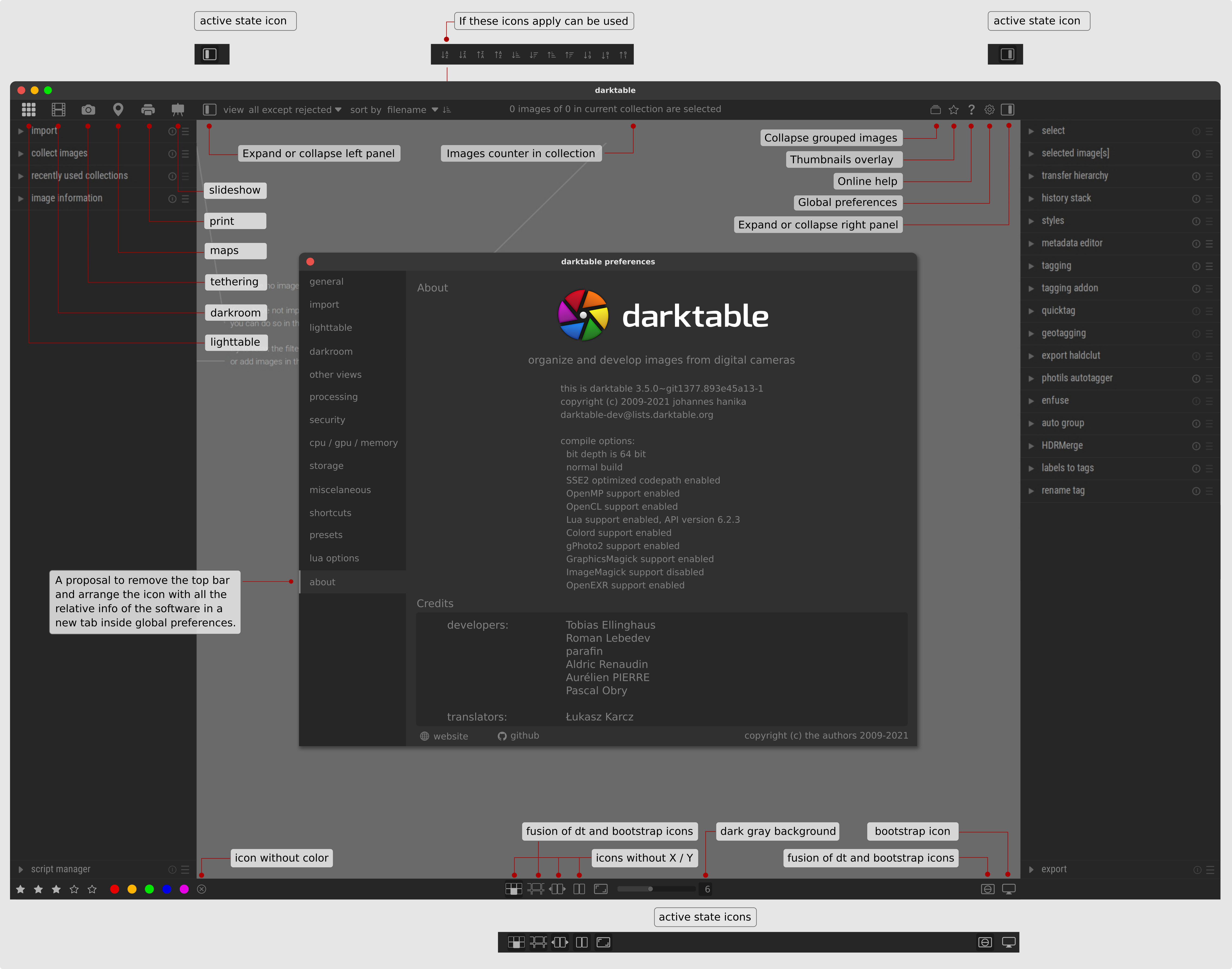
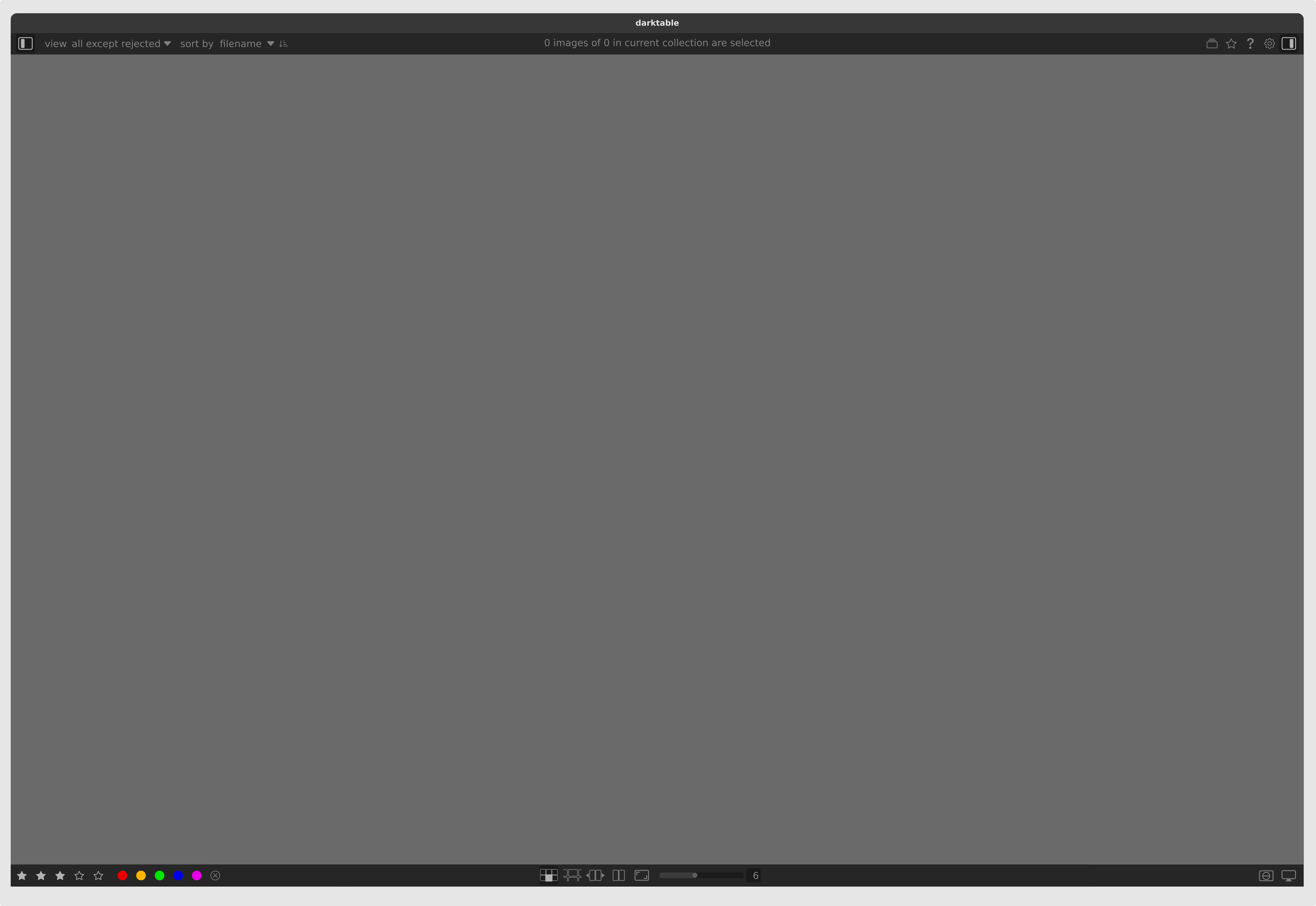
The same lighttable window with the panels collapsed.
The Quick compare is to have in the darkroom an icon that based on display or scene-referred, compare the last step applied to an image with the previous one. An A and B comparison like using the snapshots module, but without have to create any snapshot. In that case, users don’t have to create an snapshot every time to compare A and B, but can create snapshots in case they want to compare in depth different states.

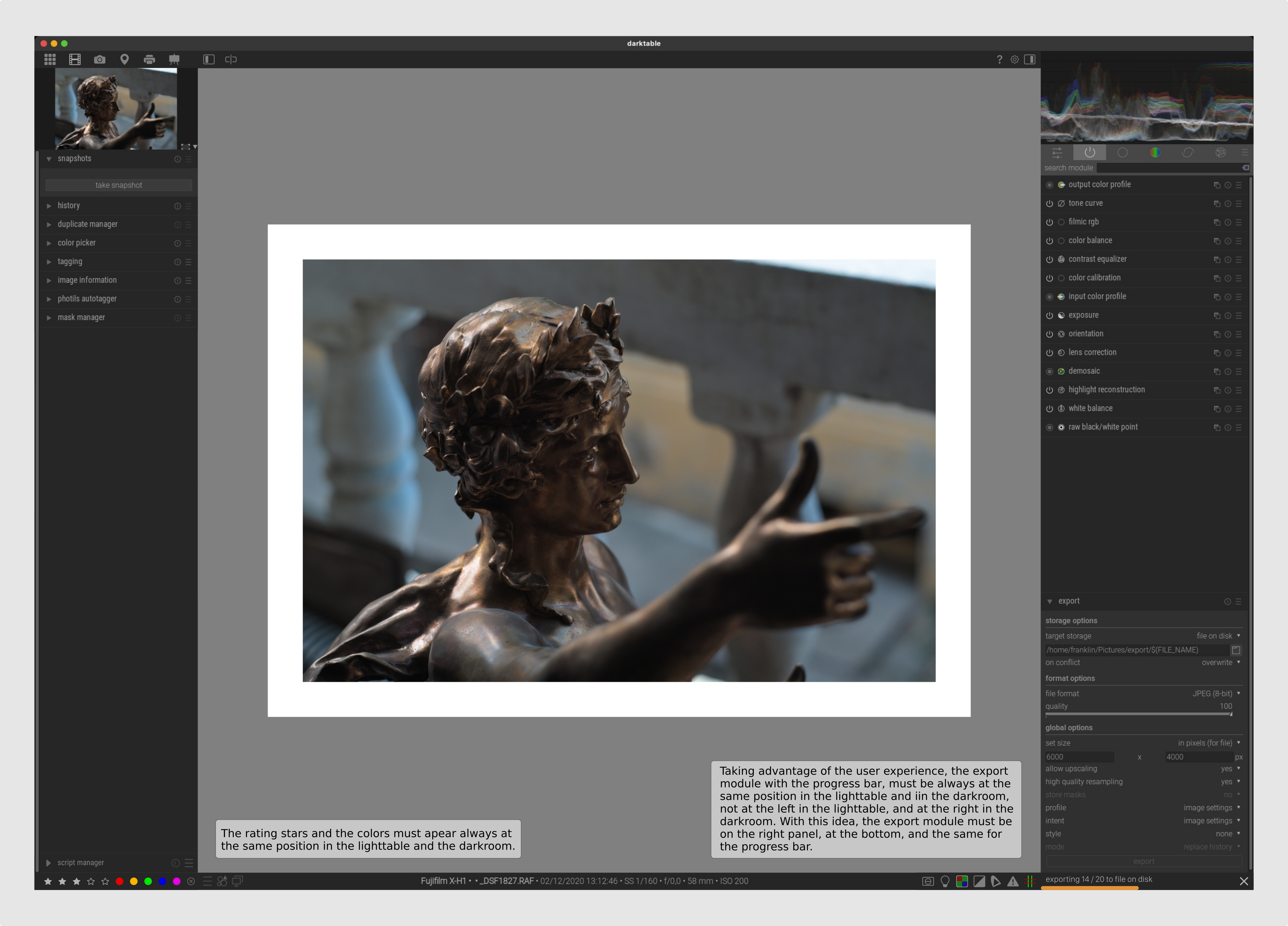
Taking advantage of the user experience, the export module with the progress bar, must be always at the same position in the lighttable and in the darkroom, not at the left in the lighttable, and at the right in the darkroom. With this idea, the export module must be on the right panel, at the bottom, and the same for the progress bar.
The same idea is for the star ratings and colors in both places, lighttable and darkroom, at the same position in darkroom too because is a visual indicator of the working image, users don’t have to go back to the lighttable to see the ratings or colors assigned to an image wile they are working in it.

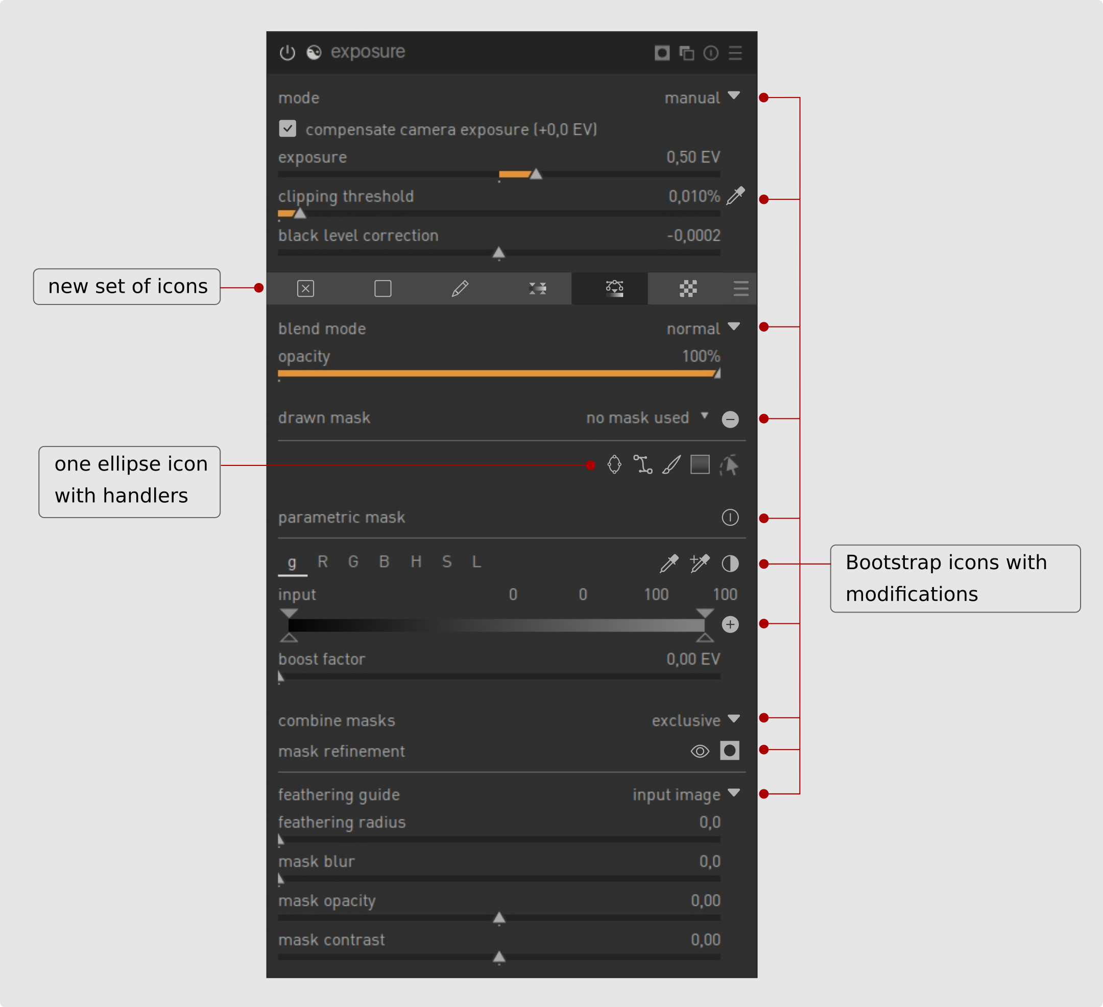
This is a representation of a module with a new set of icons based on bootstrap.
The mask manager is a good idea to get all the masks located in one place and have access to it at any time to link them with different modules. But in some cases it’s not so intuitive to work with.
I created a mock-up just as an idea of how it has to be the mask manager. Of course this is a premature version and involve a lot of parameters to have in mind. It’s a redesign of the mask manager, with active and inactive states, opacity changes, lock, show or hide masks, group and ungroup, and a lot more.
is a second attempt of the #8391 with some changes

Another proposal is the use of just one icon (circle or ellipse) to draw masks, with handlers around the shape.

I used some bootstrap icons an change some of them to look more like darktable ones.

All the screenshots are mock-ups, I left this for your appreciation and hoping for the best to this amazing software.
Thanks to s7habo.
