Thank you all so far. The red tint is debatable, of course.
I have processed this raw file some time last year using a commercial raw converter that I do not have access to anymore. Unfortunately, I cannot easily look up the settings needed within that processor, but I am pretty sure it did not take much more than moving a few sliders around and maybe do some split-toning, all of which were simple tasks such that I was done with the image in a few minutes. The frustrating part for me is that I am unable to get a similar result in darktable.
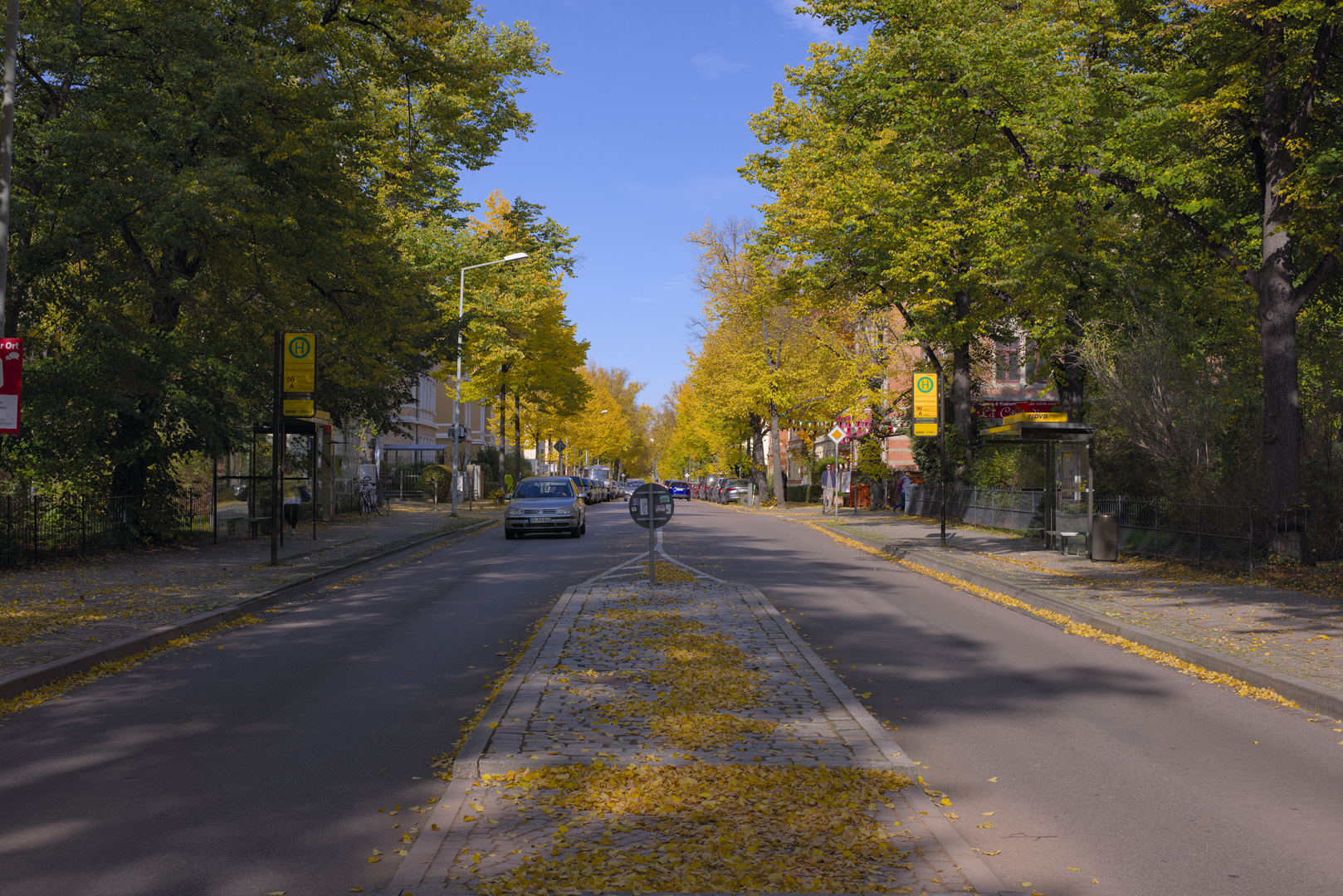
I tend to think that the orangish yellows in the right-of-way sign and in the bus stop signs are best in 5, and ok still in 2 (Based on what their colors look like in my memory.)
The converter that I had used was Capture One 11. The sharpness was mainly controlled (and increased) via the “structure” slider in the “clarity” module.
You can use the diffuse or sharpen module, which is part of the scene-referred workflow. Only downside, for now, is that it is part of 3.7, not the latest stable 3.6. You’ll have to wait until X-Mas id you want it and can’t build darktable yourself.
I find the difference in the H on the bus stop sign to be very intriguing.
I can see only traces of the white outlines in the other renderings; perhaps it’s visible because of Filmulator’s dynamic range compression plus the deconvolution sharpening?
I’m pretty sure there are not any more compression artifacts in my rendering, since I used TIFF as the intermediate between Filmulator and RT.
oh that’s a misunderstanding. I meant compression artefacts because I created the extracts from the jpg file you provided and didn’t check how much it was compressed. I’ll remove the remarks in my post.
Just to make sure there aren’t any misunderstandings:
My edit was done with RawTherapee.
My remark about using the diffuse or sharpen module, which is a darktable module, was in relation to your darktable remark.
I have played with that specific darktable module, though, and it is a rather powerful module which can do a lot more than just sharpening (dtdocs chapter).
My effort…compressed the highlight/shadows a bit tweaked the sign a bit and took a white balance from the smaller sign that was in the sun…the one with the white border…
EDIT After looking at the areas the OP cited lack of detail it seemed that the examples were reflecting washed out hightlights…so I took another run at it this time using filmic with a preset using the linear curve slope of 1 and latitude of 99% as documented in the manual. I used this sometimes when I don’t need filmic to do too much…
I have again gone the route of keeping strong shadows and not done any elaborate masking and the like…focus was the yellow sign and the leaves…
Darktable 3.7, ND800_0005626_anonymized_01.NEF.xmp (11.6 KB)
with filmic trick (thanks to the forum). DT results often have a greenish tint, corrected here. I see oversaturation here, maybe colorprofile problem, I’ll leave it for now.
No chance for requested sharpness/clarity. Maybe CaptureOne “lies” a little bit?
Very interesting picture for studying “color correctness”.
Happy editing!
You are lucky here to have that smaller sign with the white border being in the path of the light. In this case though you might actually not want a neutral wb but you can use it as a starting point. In a photo like this I would wb using CC on that white border and then change the drop down to custom. Then using the chroma slider remove some of the correction to bring back just enough color cast to give the light the right feeling. Adding chroma makes the correction stronger if DT doesn’t add enough but usually I find it can be a bit neutral or cold in a photo in bright sunlight so reducing the correction slightly can bring back some nice lighting… I actually have used this with skin as well. Sometimes the skin has a cast created by the lighting. I will use the picker on the skin which neutralizes it and then I will take the chroma down bringing back the skin color to taste without as much cast. Sometimes this leave the global lighting just right esp if you don’t have a good neutral element in the photo…it may not be a technically correct approach but it gives a nice result to my taste…


 I have to inspect your sidefile.

