I have been tinkering for almost two years very lazily on my new website design. The old site(s) are still a horrible mess, with bad desktop oriented layouts, wordpress and whatnot.
A course at university on web analytics was an opportunity to gather some feedback so I sat down and stopped the tinkering. The site is designed with privacy in mind and without that course I would have never put any analytics to work.
So you get:
No cookies
No Javascript
Only html and css
I get:
User behaviour inside a session
But no user tracking over time – can’t even recognize myself, which is awesome
Very rough IP-based geo-location
Some clue what pages might be more interesting
By clicking the link below you add data to my Matomo instance, help me write a seminar report and maybe even improve my site.
Any feedback about the layout or the content helps, too.
Thank you for your candor.
PS: For the curious, the site is statically created by a single makefile (~200 lines) which traverses a source tree with markdown files, images, some html snippets, css and font files. Images are all mine, edited with darktable, rawtherapee, aftershotpro, gthumb and imagemagick.
Looks great to me. Very simple, clean layout but stylish as well, although the quality of the imagery has a lot to do with that I reckon.
I notice it’s quite slow to load images, although my connection is slow too. It just seems slower then most sites, at the moment. I assume the fundamental slowness is at my end - just mention it in case it’s of any interest.
In awe of the build procedure… makes my Wordpress site seem horribly bloated and clunky…
Viewing on current Firefox on Win11 btw.
Edit: Disregard the slowness report… everything is slow. It’s just my end.
Except the server … I really like how my hosting provider handles their stuff …
Btw, you should not see my wordpress site, it is not only clunky but also massively outdated and does all kinds of unruly things on mobile devices.
That’s a good idea. Shouldn’t be too hard now that I have figured out a stable way to cat|tail|head the ordering file. I already put in the bottom nav after the first tests, realising that you always had to go back unless you are a multi-tabber by nature – that’s why I missed it in the first place.
Not having categories on the (main) site is on purpose. For specialized topics with more pages I plan to use subdomains, streamlining the experience for those that want to get lost.
Only criticism, I found myself asking what is the purpose, who is the audience? In info you have, “This site is statically generated by a single makefile. Currently there is no public repo of the code.” Which would interest no one other than IT dudes. If they are the intended audience, all good, but if the intended audience is potential clients for your photography, or even just friends and family to view your work, I would scrap that line and replace it with something more purposeful.
You nailed it. After more than 25 years as a professional photographer I am currently getting my bachelor degree in Software Design and switching paid profession with semi-paid hobby and vice versa.
So you are absolutely right, the text on the info page needs the be improved.
which is not static but the least intrusive method I could find short of reading the server data itself. Using Matomo was one of the (possible) prerequisites on the university course and logfiles were “not to be used”.
Good catch. I have so many plugins in Firefox that I forget about them. It is a local artifact then — sorry for the noise.
I have never heard of Matomo but it looks interesting. Personally, I never looked at analytics for my own website so after I a while I stopped collecting them.
No noise, just regular debugging. Thanks for the feedback. =)
Yes, Matomo is one of the nicer self-hostable apps out there.
And about the stats: same here. I know that website traffic and user behaviour is rather irrelevant even for my business. And when the site goes live on the main domain it will not contain any Analytics except for the server logfiles. The hosting provider puts them into some graphs which are easier to read but they are still very crude compared to what modern analytics tools can do - if the user / browser does not filter them.
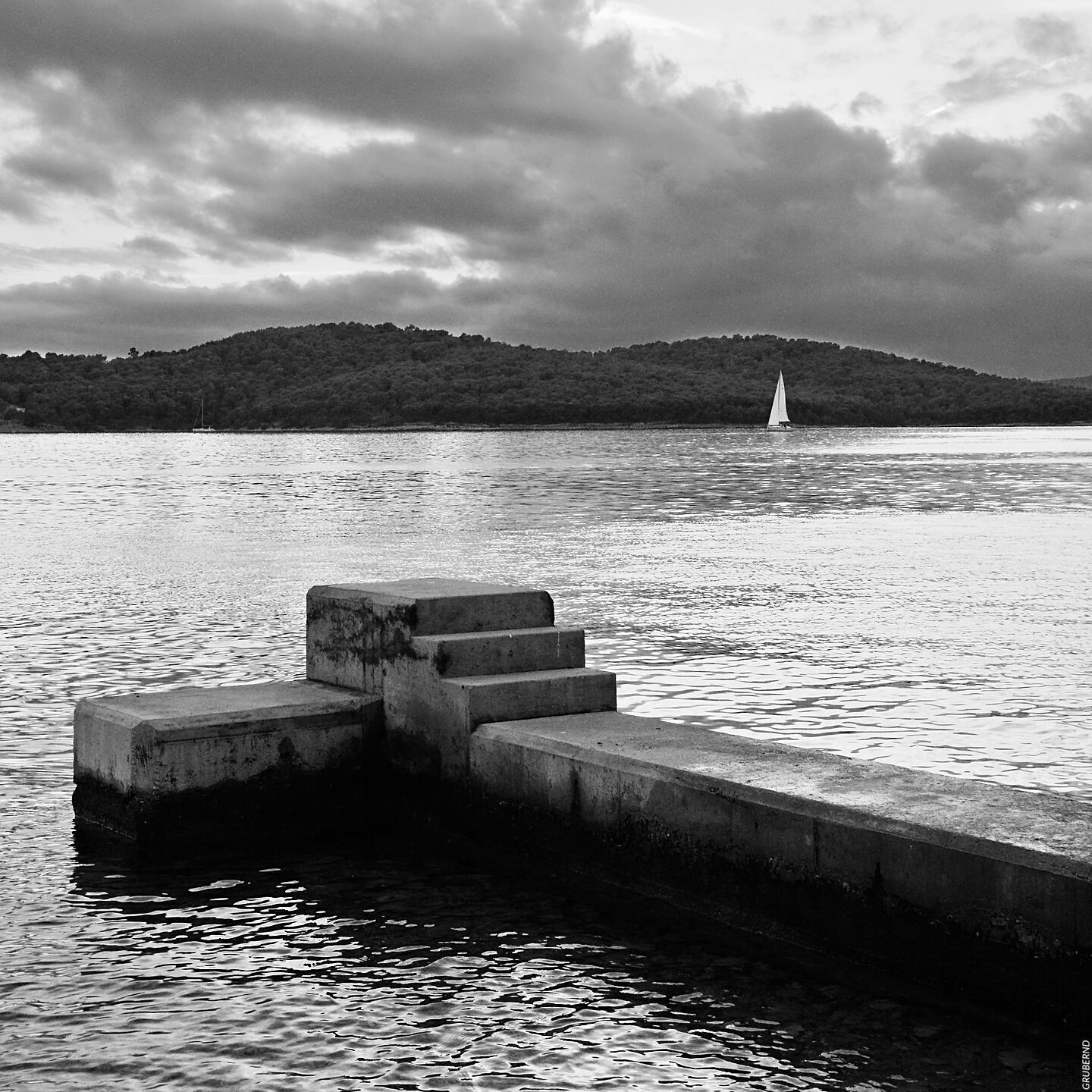
One thing though, the photos on the main page lack contrast, so my first impression was mediocre. But I was glad to see that the photos in the portfolios do have contrast – very good even.
Is that an artistic choice perhaps? I would change that…
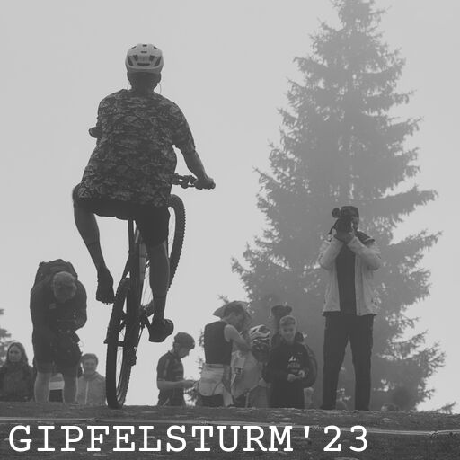
I noticed that for example https://experiment.grubernd.at/thm/gipfelsturm23.jpg is 512x512 in size, but CSS is used to reduce the size, so more data is transmitted than strictly needed?
This rule was used (on a 4K screen, actual width is 3840 px):
@media only screen and (min-width: 960px) {
body {
    max-width: 960px;
    }
img {
    padding: 2px;
    width: 960px;
    }
nav img {
    width: 236px;
    }
On that 3840x screen you should see the image bigger and also more thumbs per row.
There is a css rule for that.
And yes, images are one size only because I’d rather show better images than anything else. It’s much more efficient and looks nicer to send an image with large pixel count with lower jpg quality and let the browser downscale on site than do it the other way round.
The overhead of working with multiple files, reloading when the screen size changes etc has diminishing returns in terms of more efficient transport.
The info panel has some complex visual interactions between the vertical GRUBERND text, the KONTAKT text (english language page otherwise?) and the large centered INFO text. You could argue that it helps separate the “menu” from the galleries but visually/typographically it’s something to give some though.
What will you do then your number of albums aren’t multiples of four? Accept the incomplete grid, delete a gallery or wait this you have four new galleries?
The thumbsize is on purpose, see explanation above. If you take a closer look you will see that all metadata has been removed which yields much more space savings.
/* extend to 6 thumbs per row for large screens */
@media only screen and (min-width: 3600px) {
body {
    max-width: 1440px;
    }
… that should work unless you don’t use the whole screen for the browser.
I’ve now tried Edge and Brave (both are Chromium-based, though), and they display 4 thumbs in a row, and the ‘full’ images at the same width as Firefox and plain Chrome.
Yep, those first two thumbs are typographically … different?
The INFO page itself is still highly unbalanced - but I haven’t found a decent image with a 3:1 or 4:1 ratio to put between thumbs and text.
The “Gipfelsturm” images were processed with darktable/sigmoid.
The 4x4 grid was chosen for the test site to make sure all thumbs are visible at once. When using the site there will be more thumbs. And the grid will most likely be incomplete most of the time - given that there is also the big-screen rule that extends the grid to 6 thumbs per row.


