To expand a little on why PCS L*a*b* is like this, it is because it is interchangable with the XYZ PCS values. If the L*a*b* used the device white point, then conversion to/from XYZ would be much more complicated because the white point value would have to tag along with the data, and it would loose its usefulness in conveying absolute color values.
[ Besides which, L*a*b* uses a “wrong” Von Kries chromatic adaptation. Doing the white point adaptation to D50 in the profile creation makes it possible to avoids this issue. ]
Yes, I’m looking at something that can handle HDR better, problem is that most of the current CAM are fitted on LUTCHI dataset which is not broad enough for all use cases, especially not HDR.
Absolutely, I had fairly good success with CIECAM02 for that purpose.
Well the CAM02UCS and CAM16UCS are actually not that bad, although of very high interest for me are (indeed) Dolby ICTCP and JzAzBz. Coincidentally at next CIC will be presented A Colour Appearance Model based on Jzazbz Colour Space.
Speaking just for myself, I’ve been under the impression that CIECAM02 really is a more perceptually uniform space than Lab, and that therefore even in an ICC profile color-managed image editor such as GIMP, JCh would be more perceptually uniform than LCh.
But based on comments from @gwgill and @KelSolaar it seems I was just mistaken on this point, and that an improvement over LCh in terms of perceptual uniformity is still something that’s being worked on. So yeah! No reason for me to keep worrying about trying to code up JCh for GIMP!
@briend - can you send me a pm with some screenshots of the differences you are seeing on your monitors between GIMP 2.8 and GIMP 2.10, along with a screenshot of the relevant color-management settings?
Regarding Krita, I did notice a slight difference between GIMP-2.10 and Krita-4.0 colors, not sure if this was just when using a LUT monitor profile or not. But I haven’t yet been inspired enough to actually try to track down the reason.
All right, time for me to interfere There is a book by Michael Wilcox entitled Blue and Yellow Don’t Make Green, which makes things easier || more difficult to grasp…
What misleading name for a book ;-). So, most of the time Yellow and Blue do make green. It doesn’t explicitly say this, but it sounds like if you mix an “Orange Yellow” with a “Violet Blue” you won’t get a green. Sounds fair.
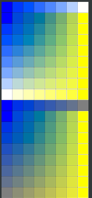
So, we have this “Blue turning Violet” problem. . . and it spans seemingly every color model under the sun (maybe not IPT and JzAzBz?). Well, except the hokey spectral model I cooked up: if I desaturate sRGB blue using good old fashioned white or grey paint, it doesn’t turn violet, and it still makes intuitive greens:
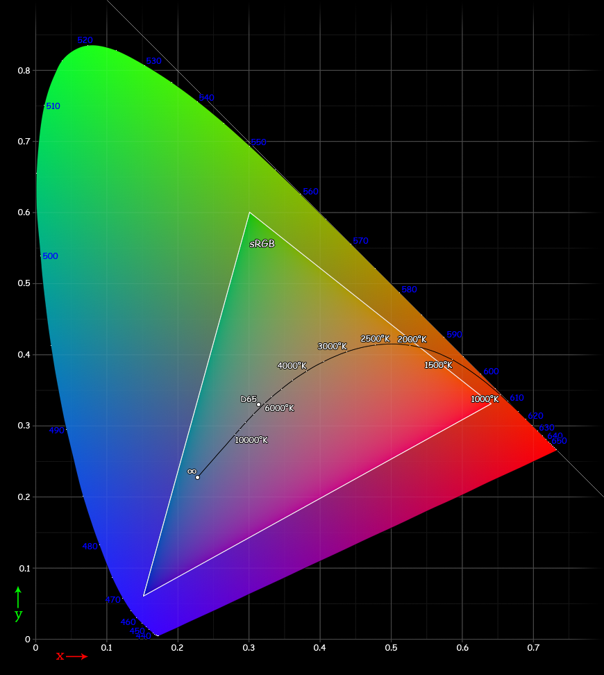
And open it in GIMP, and use the measure tool to mark the line from the indicated “D65” white point to the corner of the sRGB triangle where the blue primary is located, and then extend the line far enough to intersect the edge of the horseshoe, it crosses at approximately wavelength 463nm.
Is this “drawing of a line from the white point through the primary” a legitimate way to get an approximate nearest wavelength of a color space primary on the spectral locus?
Anyway, this page:
puts wavelength 463 as either blue or indigo or violet - the spread of wavelengths for each color name in the chart is rather wide. Sigh.
Well, we don’t actually expect that! But @briend has been experimenting with code that is intended to generate color blending that emulates subtractive blending. See comment #58 above. Not that this long thread hasn’t meandered all over the place, but that’s the context of the question in the subject line of this thread .
Sounds. . . reasonable? :-). But, of course, any kind of pure spectral blue color isn’t going to mix w/ any kind of yellow to create green. The whole subtractive model relies on both colors being somewhat desaturated and containing a broad spectrum of wavelengths.
Yes, but that doesn’t mean it’s wrong to say things like “This blue pigment has a hue angle that falls at the same hue angle as the spectral color at wavelength 463”. If you look at MacEvoy’s comments, it’s interesting that in “Point 6” he says
Points 5 through 7 of the wheel are also confusing to learn because the apparent hue of a paint depends on its lightness and/or chroma: magenta paints appear to redden with increased chroma, and blue violet paints appear to shift toward purple.
So I guess it isn’t just in the digital darkroom that colors close to blue-violet act strangely.
The whole idea of a hue linear model is based around physical swatches of colour. That is, if you take your direct angles between white point and a particular chromaticity, the psychophysical result shifts.
This is the whole point of the models. It is modelled in math according to our existing models. Ground truthed against physical colour swatch experiments.
On the xyY plot, if you were to create a line between a given chromaticity towards the outer edges of the spectral locus, say REC.709 blue for example, and the white point D65, and traverse that line, the psychophysical response will not appear a “pure” desaturation. Rather, it will skew towards purple. Same for red tones turning yellow.
That is, there is a psychophysical response mismatch between the hard colour science chromaticity and the colour appearance created in our perceptual systems.
What is it about my statement that “it isn’t just in the digital darkroom that colors close to blue-violet act strangely” that made you feel compelled to say “what are you on about” and then exclaim “egads”?
Think about the problem in LCh down around violet-blue that resulted in Lindbloom making his uniform perceptual Lab profile. Violet-blue is an odd color no matter if it’s considered as RGB or as actual paint pigments that one might try to mix with other paint pigments.
It was a statement in that the whole of the discussion around blues to violets and reds to yellows starts with the non-digital representations. In fact, a vast majority of hue linearity research returns to the physical Munsell swatches, for example.
The idea that it is something “isn’t just in the digital darkroom” implies that it started there. It didn’t. It started in the physical world of psychophysical responses.
My apologies to you and also to anyone else who might think that my comment that “violet-blue is an odd color no matter whether in the digital darkroom or out there in the real world mixing real paints” is so dumb a thing to say as to deserve comments like “what are you on about” and “egads”.
That’s sort of like setting up a straw man so you can knock it down, yes?
My comment wasn’t meant as anything other than “well, that’s another odd thing about violet-blue”. I wasn’t implying any sort of directionality and I somewhat doubt whether anyone reading this long thread was misled to think otherwise.
The long conversation I’ve been having with @briend about mixing yellow and blue has led to a lot of “color exploration”, a nice opportunity to think about colors and how they interact both in the digital darkroom and when using real pigments. I even bought a somewhat better set of oil pastels just to do some more color exploration. And yes, this stuff does seem odd, unexpected, with violet-blue playing a major role in the “well, isn’t that odd”.
Who gave you the high ground to decide when it’s OK and when it’s not OK to think something is odd?
We have whole books and major sections of the handprint website that talk about the unexpected behavior of paint pigments when mixing green from blue and yellow. This sort of behavior of colors surprises people.
We have other color oddities such as darkening and desaturating bright yellow makes the perceived color go to brown or olive green, depending on the exact hue of yellow we start with. What about the fact that sometimes lightening a black pigment will actually make green. This sort of behavior of colors surprises people at least the first time they encounter it.
We have @briend’s amazing painting of a man wearing blue pants, when there isn’t a speck of blue in the painting, and in fact the entire palette is confined to a range of oranges. This surprises people. It surprised me so much that I used GIMP’s LCh functions to rotate the hues in his painting all the way around the hue ring, and those pants always looked not just “sort of” the complement of the dominant hues, but decidedly the complement of the dominant hue.
Color perception is full of things that surprise people when they first encounter this or that odd thing. Odd. Stuff nobody would think of as “actually the case” until they had a reason to pay attention to whatever “it” might be.
If color perception in general and in specific situations is such a “not odd” thing, how is it that we are still working on models for describing color perception? We don’t even have a really good model for perceptually uniform colors. Oh, and violet-blue is a significant part of the problem.
At least to me, so many things about color and color perception seem odd, unexpected on first encounter. I hope this never changes - color and color perception are wonderful, amazing, awesome parts of how we perceive the world.