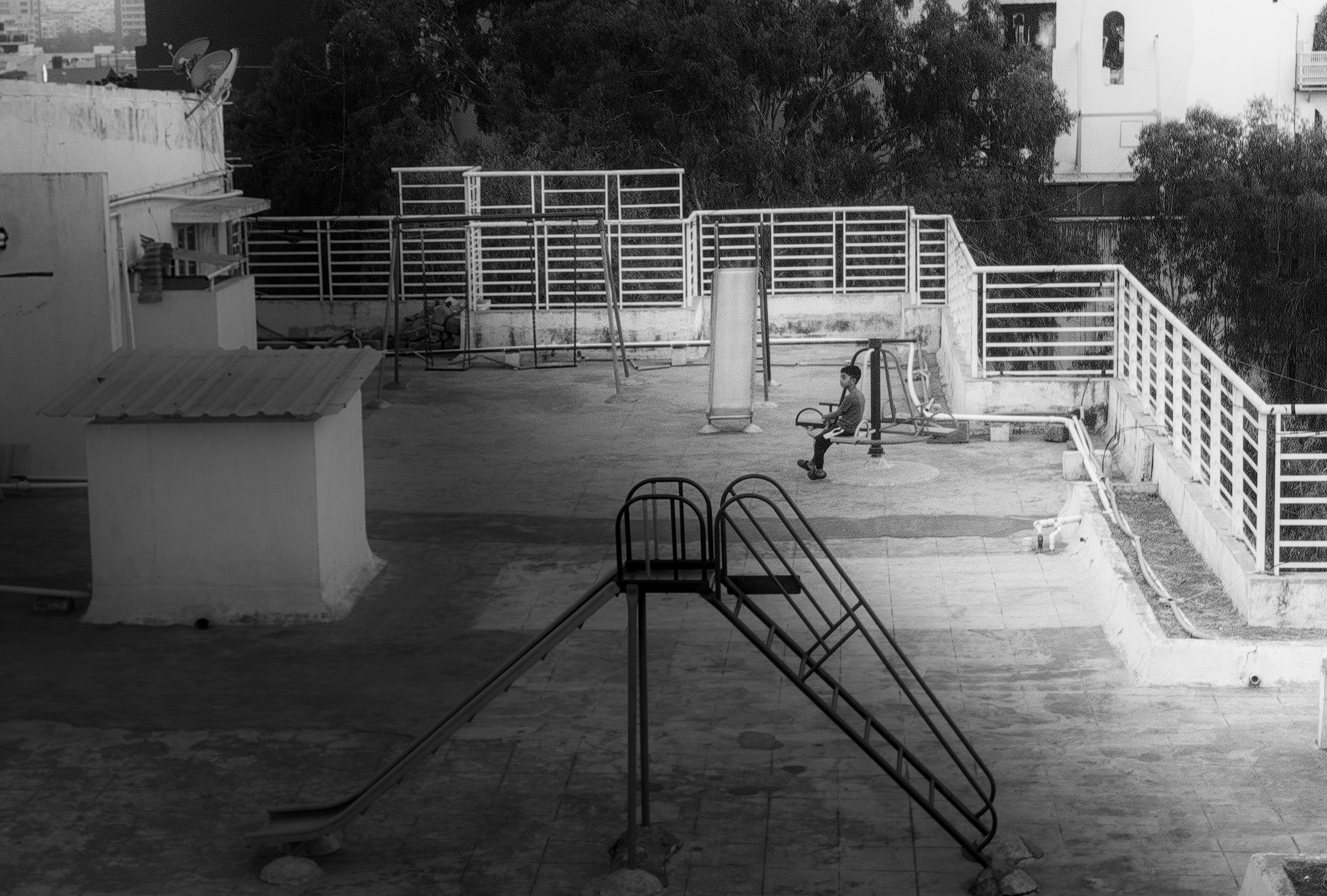
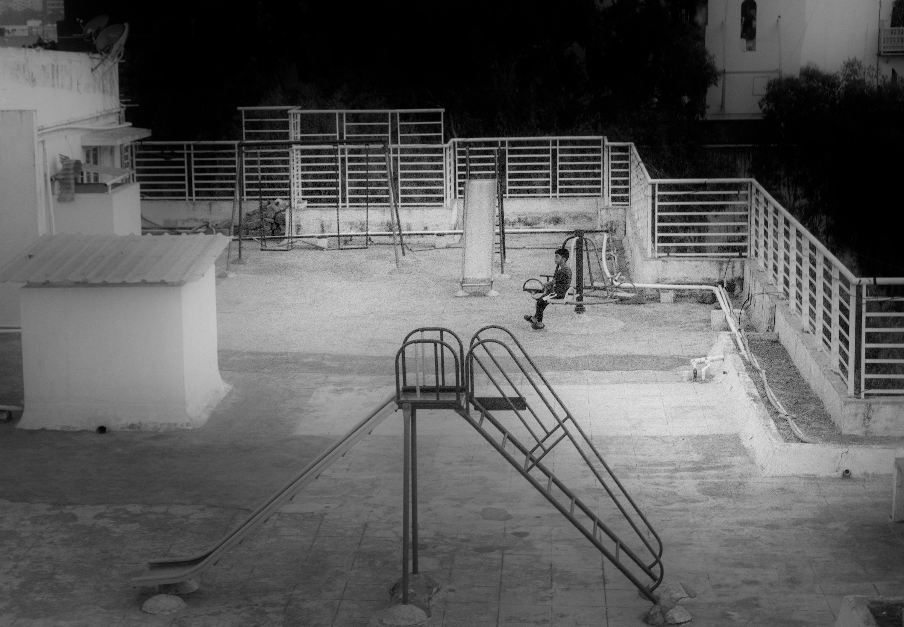
Specifically, I need critique and feedback about these, along with your general thoughts about the photos:
- Do these look glaringly wrong or fake? Am I doing it too much?
- How do you assess when you are being aggressive with the editing?
Specifically, I need critique and feedback about these, along with your general thoughts about the photos:
Yes, I would say so. Generally, I don’t adjust exposure by more than 0.5-ish EV manually in masked areas.
Mark 1 eyeballs.
Hey Tamas, thanks for the feedback. What do you mean mark 1 eyeballs? I am sorry I didn’t get you.
I’d suggest don’t worry too much what others think, go for what you like - unless you’re looking to sell your work. “Sell” in the broadest sense.
These images would sit happily in an arty setting I think.
The railings are intriguing. It’s obviously a kids play area, it looks like there’s quite a drop beyond, and yet the railings couldn’t be easier to climb!
Sorry, informal way of saying that I just look at the images.
There are lots of ways to emphasize the subject, my preferred order is
You can either add these to the subject, or remove from everything else (eg the corners), using a mask. By combining multiple approaches, each can be kept subtle.
Can be good to not look at them for a day or more or less and then come back to them and see how they look to you. You sometimes get acclimatised to, say, saturation and walking way for a bit and coming back may make that more obvious
Will try that for sure! What did you think of the photos?
Yes, as in, I do follow my instinct while editing, but some edits, you just are sure about, some you are in two minds. Hence you would need like a fresh pair of eyes.
Yes you’re right about the drop, I want to emphasize the desolation of the play area.
As to the images/edits themselves, I prefer the background of the top one and the foreground of the bottom one. In the top one, there is a strange shadow (maybe it was a real shadow) on the left. The bottom one may be too contrasty, especially on the fence at the back.
I only have my phone to view them. Maybe ask yourself what you think is the subject of the photo? Photography is often more about taking things away and simplifying to make your subject clear to the viewer rather than getting lots of things in. If there are lots of different potential subjects in the frame, it can make it confusing for the viewer to know what to focus attention on or what you’re trying to “point at”. There’s nothing wrong with that per se but it’s good to nail down how to make your images clear before maybe trying something that is going to stretch the viewer to the point that they lose interest as it just looks like nothing in particular.
In this example, I guess the figure is the subject and it has some feeling of being solitary, maybe even danger as it’s a child (?). The fact that we’re observing from a distance also puts the viewer in an uncomfortable position as a voyeur, perhaps, which might be what you want to convey or might be not what you want at all.
Hey Tim, thanks for the feedback. No, the shadow was my attempt to guide the focus towards the subject (the child). In the second one, I felt that the contrast, this almost darkening of trees, elevated the subject a bit. But good to know what you felt!
It is hard to tell without knowing what the original photo looks like. However, I have a few observations:
05. Ideally, it would be a combination of the two; i.e., a vignette of some sort.My take: No need for the dramatics unless that is your style. The viewer will see the child no matter what because there are no other people in the scene. You may however de-emphasize things that distract such as the slide at the front, particularly the darker parts. I would lighten that up so it has less contrast with the tiled ground.
I like the photo. In both images, my eyes are immediately drawn to the solitary figure, isolated in a world of geometrical shapes, an artificial world created by adults. The boy seems lonely, staring into space, and wistful.
The sharpest focus seems to be on the foreground slide, so that draws my eye somewhat away from the boy.
First image: I don’t like the shadow bottom-left. It seems heavy handed, and isn’t needed.
Second image: the trees have darkened so far that they are not trees but looming shadows, threatening to invade the boy and his space. If we realize they are trees, then we see nature threatening this man-made environment. You have cropped the left, removing some detail from the vertical surface at the left side, slightly above the boy’s eye-line. So this image gives the impression that the play area is bounded, and limited to what we see in the image. By contrast, in the first image, the detail is there and “bleeds” off the image to the left, so the impression is that the play area continues to the left, unbounded.
Hello Sai_Deepak,
In my opinion, the 1st image works better because it directs the viewer’s eye to the boy. I also think feedback from others matters, since photography isn’t just about self-validation—it’s about how the image communicates to viewers.
I’d also like to share something Vincent Versace, a photographer, wrote in his books: the eye naturally goes to what stands out most—the brightest area, the highest contrast, the sharpest detail, or the strongest color.
Cheers,
Arnaldo