Last week my dear friend Ines and I went shooting and the following photos are the result. Ines is very much into (modern) architecture. I am usually not really an architecture photographer, I like nature much better, I think that most things that people create (i.e. “culture”) are flawed. Ines suggested that we shoot a quarter of Vienna that is called Citygate. It is a very new residential area and there is also quite a large shopping mall. Most people that live there are people who recently moved to Vienna, form abroad, form Eastern Europe, Asia, South America, and of course there are also some Muslims but probably very few black people from Africa. But I think there are few German speaking Austrian people. At this point people that live there are neither rich nor poor, most of them are probably not unemployed. So “normal” people. This part of the city is quite far form the center, in “Transdanubien”, i.e. on the other side of the Danube. I live in Vienna since more that 30 years and this was the very first time in my life that I visited this area.
Anyway, as I already mentioned, my friend Ines loves architecture photography, in fact she loves everything that is artificial and modern, e.g. she has artificial nails. So she is completely different than I, nevertheless she is very cool and super nice. She suggested the shooting and I agreed to participate because I wanted to hang out with her, I did not really expect to actually enjoy it and actually get inspired, but I did. We were shooting for about 30 minutes, the weather was very hot, and after 30 minutes we had to stop because a storm came and it began to rain. But right before the storm there were those really fantastic clouds.
I am a bit proud of this series because it is different form what I usually shoot. I think this is something new. I had been shooting wildlife and macro such as butterflies and squirrels for a long time. Of course one can always achieve more (technical) perfection in that kind of photography, but at the moment I am a bit bored of butterflies and squirrels. My butterflies usually get lots of favs on 500px etc but actually I am surprized about that because for me they are a bit boring. Of course, shooting butterflies is still better than shooting nothing. Since a little more than one year I have been shooting more landscapes which is also relatively new to me, and that is ok, too, not so boring. But in order to shoot landscapes one needs to travel.
Anyway, as far as this series in concerned, the main artistic issue is composition. It is about compositional tension, dynamism, harmony and geometry. It is something like a compositional study or experiment. Of course, the photos are basically abstract. But the editing is probably also interesting. I edited them in darktable, but I think I do not remember how exactly I edited them. Of course I had to darken the sky for which I sometimes used the graduated filter. Obviously I increased saturation and contrast. For making the clouds look more dramatic, I used the local contrast (laplacian) module (with a mask). Then the problem was that parts of the cloudy sky were overexposed. I tried to fix that with masks as well. Sounds simple, nothing extraordinary really. Nevertheless each photo was quite a complex edit with about 10 instances and it took some time to edit them, so not just a “quick fix”. There were also fragments of other buildings that I had to remove. And of course the photos were cropped and rotated a bit.


This is probably the most static composition of the series, in a way similar to the first photo.
But this one is probably the most dynamic composition. I think it feels like the buildig was about to fall down onto the viewer but then it isn't afterall because of an invisible force that is holding it. I think this is inspired by Malevich's floating shapes. I believe this last one would look better if the buildig was shorter.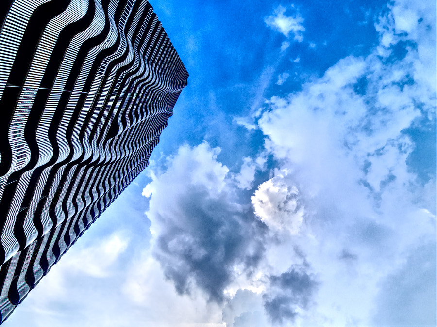
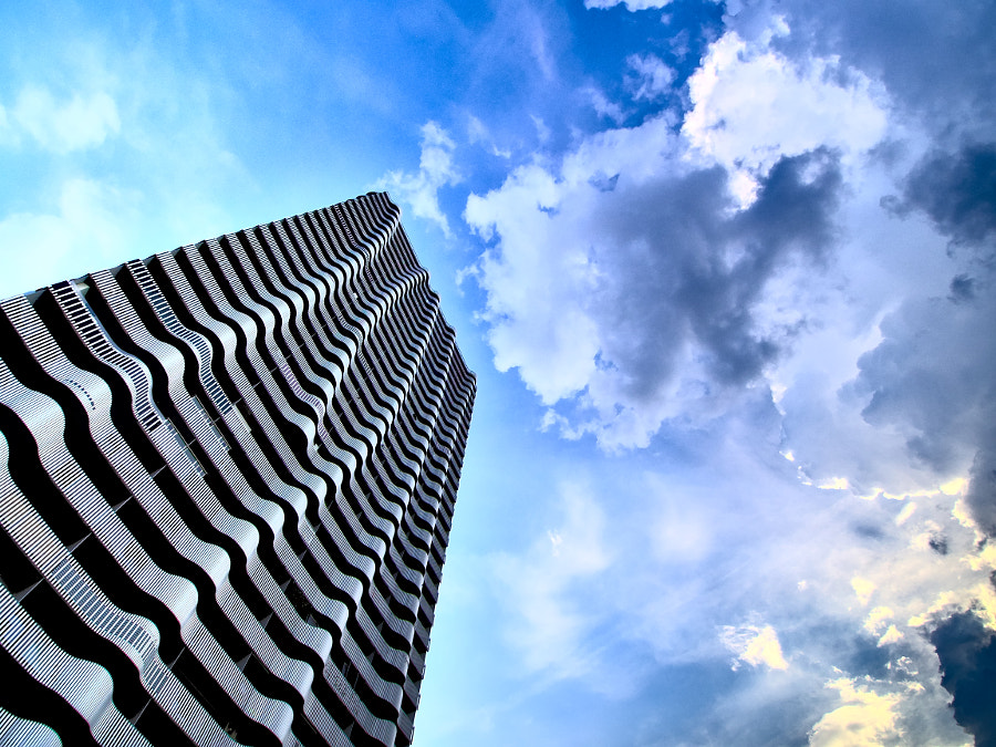
None of these compositions is really perfect from my point of view. In most cases that dark cloud is too close to the building. But I could not move around the clouds in the sky like I wanted 
Please tell me what you think about this series. Don’t hesitate to be critical. I am posting them here because I am hoping to get more feedback than just like or not. Do you have a favorite version? Any thoughts that come to your mind when you see them? Can you think of improvements? E.g. would you rotate or crop them differently?
You might also think: too modern, too dynamic, too much contrast in the sky, too much saturation, too much editing, too much of the good, like a very strong alcoholic drink. But I think I like them at the moment. Maybe I won’t in a month or a year.
I hope this will initiate an interesting discussion.

