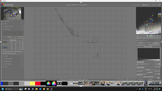
I love the color balance rgb module and the creative power it gives me. I HAVE read the user guide for the module and thought I understood what was written, but the reality is in practice I don’t know which of the the three options of vibrance, chroma or saturation I should be choosing. I am sure I am not alone on this and feel it would be interesting to hear some insight from others on the forum.
Check out this site… it has all the info you need and lots of demonstrations…
http://www.huevaluechroma.com/082.php
Chroma…
I think it’s again one of those situations where you use the one best suited for what you want to achieve.
As you can adjust both chroma and saturation, I’d expect both to be valid adjustments, without one being better in all situations (I suspect that the author of the module wouldn’t have included saturation if he thought it was never useful).
For “small” variations in chroma/saturation, you can almost compensate chroma with saturation (almost, there are some subtle differences). Be aware of scale differences on the sliders while experimenting.
Vibrance might be a bit different, as it is supposed to affect areas of low chroma/saturation more than areas of high chroma/saturation, and you can actually see that:
- set vibrance to +50%, global chroma to -50% and flip the module on and off
- repeat with vibrance set to -50% and chroma to +50%…
I always think of them like this:
- Saturation: Colours get darker with higher values. Negative values fade towards white (great for pastel colours)
- Chroma: Colours get more intense with higher values but tonal value doesn’t change. Negative values fade towards grey
- Vibrance: Higher values boost colours with less saturation (I tend to avoid this now as I don’t usually want uniform saturation. I like some colours to be less saturated)
This is a very simplistic take and maybe not 100% accurate, but it helps me in my decisions. In practice, I don’t see a ton of difference between chroma and saturation. If you set both of them to -100%, for example, there are only subtle differences.
Works for me. Non-scientific and easy to understand.
Thanks for the responses. We are so lucky to have all three options in DT. I just have to experiment with the options and begin to learn which works best for which type of image. It seems to vary between subject matter and maybe exposure settings or at least shadows and the highlights.
I would say that from my observations vibrance seems to “protect” the skin tones somewhat while lifting the colorfulness of the other colors in the image making vibrance a possible choice for portraits. Also for some images the chroma slider has minimal effect even at large settings and for other images the chroma slider is a sledge hammer with huge changes occurring at low values. Saturation seems a very suitable slider for landscapes to lift the colorfulness nicely.
I read the links and have watched AP’s videos before.
I must say it is really nice being able to rename the snapshots when playing with these settings. It is also great how you can use the snapshot to restore the history to that point of the editing. These nice features may have snuck in under the radar for some of us. I am using V4.7 so I am not sure if this option is in V4.6.
Might be the way the image is masked if you are talking about tonal range sliders, ie not the global ones… generally the mask should be fine in RGB CB but it might not be… if you slide the mask grey fulcrum all the way to the left you essentially mask out shadows and mids…

So
Mids
Highlights
Now tweak the sliders and see the impact… Shadows and Mids have essentially no impact but the highlights will…
Its likely just the same with your images and where the ranges end up falling as to why it might seem more impactful in one instance and maybe more the next time…
At least it would be worth exploring…
@priort thanks Todd. I was only playing with the global slider for each to look at the difference, but didn’t make that clear. But when I use these sliders I often use them selectively for shadows, midtones or highlights depending on the image.
I notice this particularly in highlights with some sigmoid settings… I presume it’s related to out of gamut values but haven’t really looked into it.


