Agreed. Brilliant edit @s7habo . Pls could you explain the DorS and how you knew to use this. I think you’ve used Bloom. And then blended with Harmonic Mean, which I would never have thought to try!
1 Like
With the same insight in how our vision works, as you point to, I haven’t even ever tried …
Yes, I consider our vision to be one grand illusion, and “reality” to be a) something on the level of quantum physics or beyond, b) a concept in our mind, c) the sum of our subjective experiences and expectations/predictions. As has been remarked before here, neither cameras nor our visual system capture any objective reality. Reality does exist, though, it’s just not well represented inside our brains.
Yeah, I intended to link in my post to a painting by David Briggs I once saw on his excellent and very informative site “The Dimension of Colors”, where the same white color in one spot depicted very intense light directly from the sun, and in another spot, not too far away, depicted some more ordinary white reflective surface, because the surroundings/context of the two spots were different. Regrettably, I couldn’t find it again.
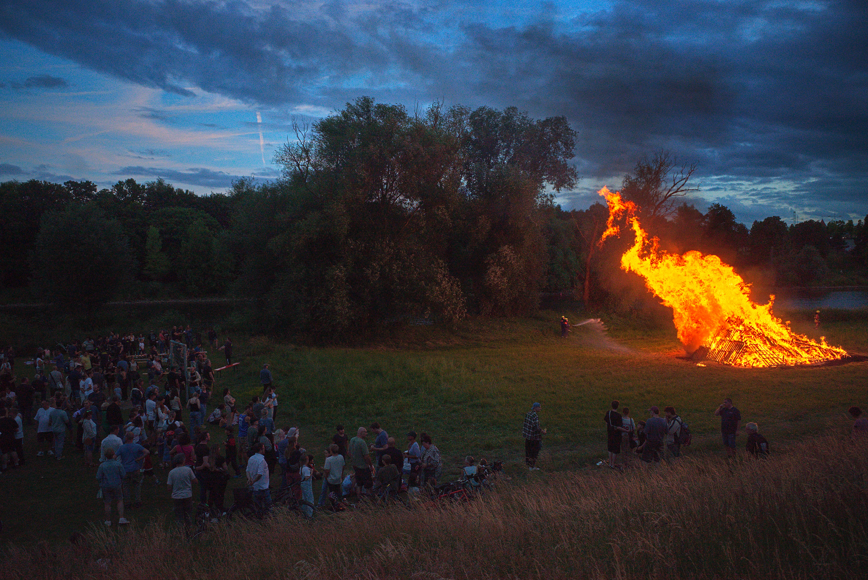
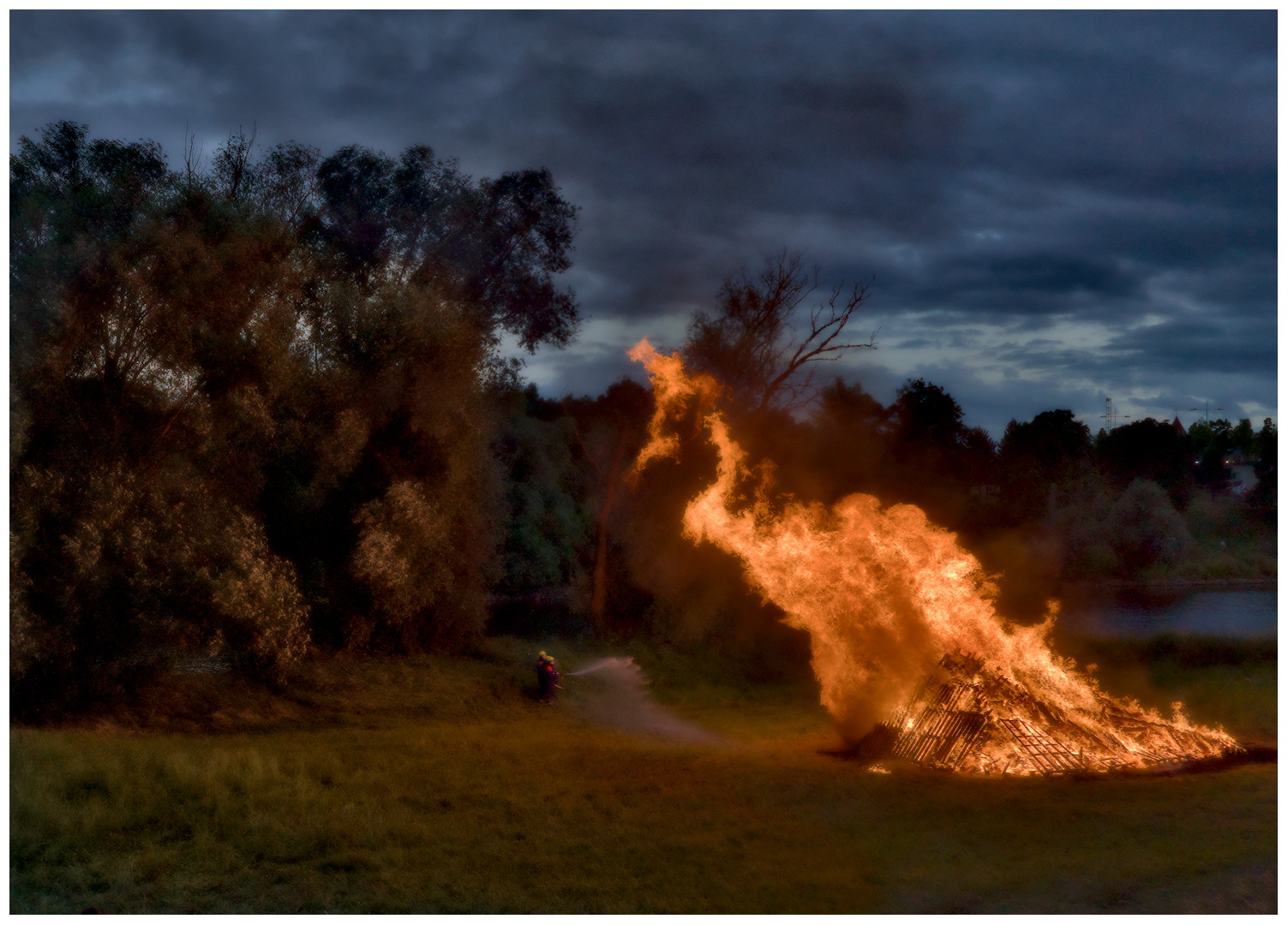
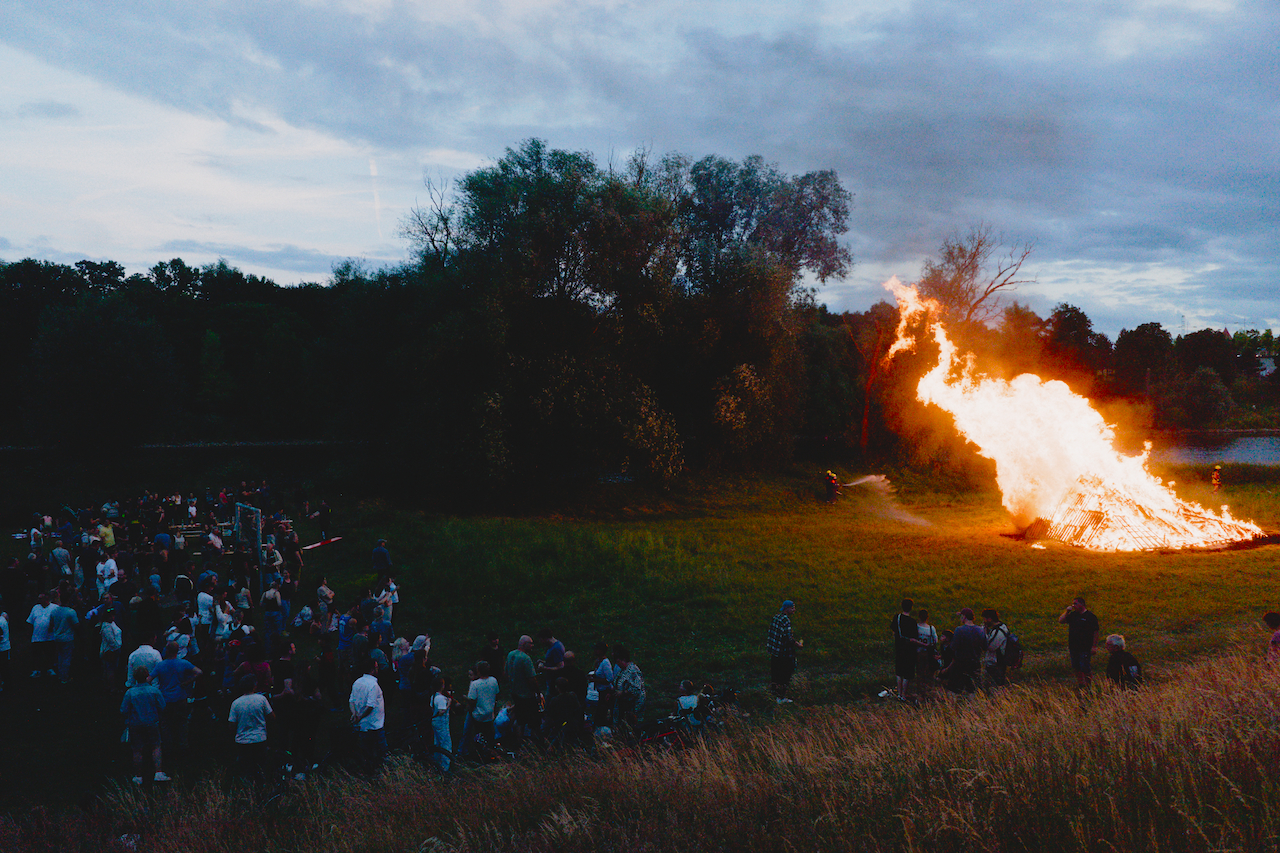
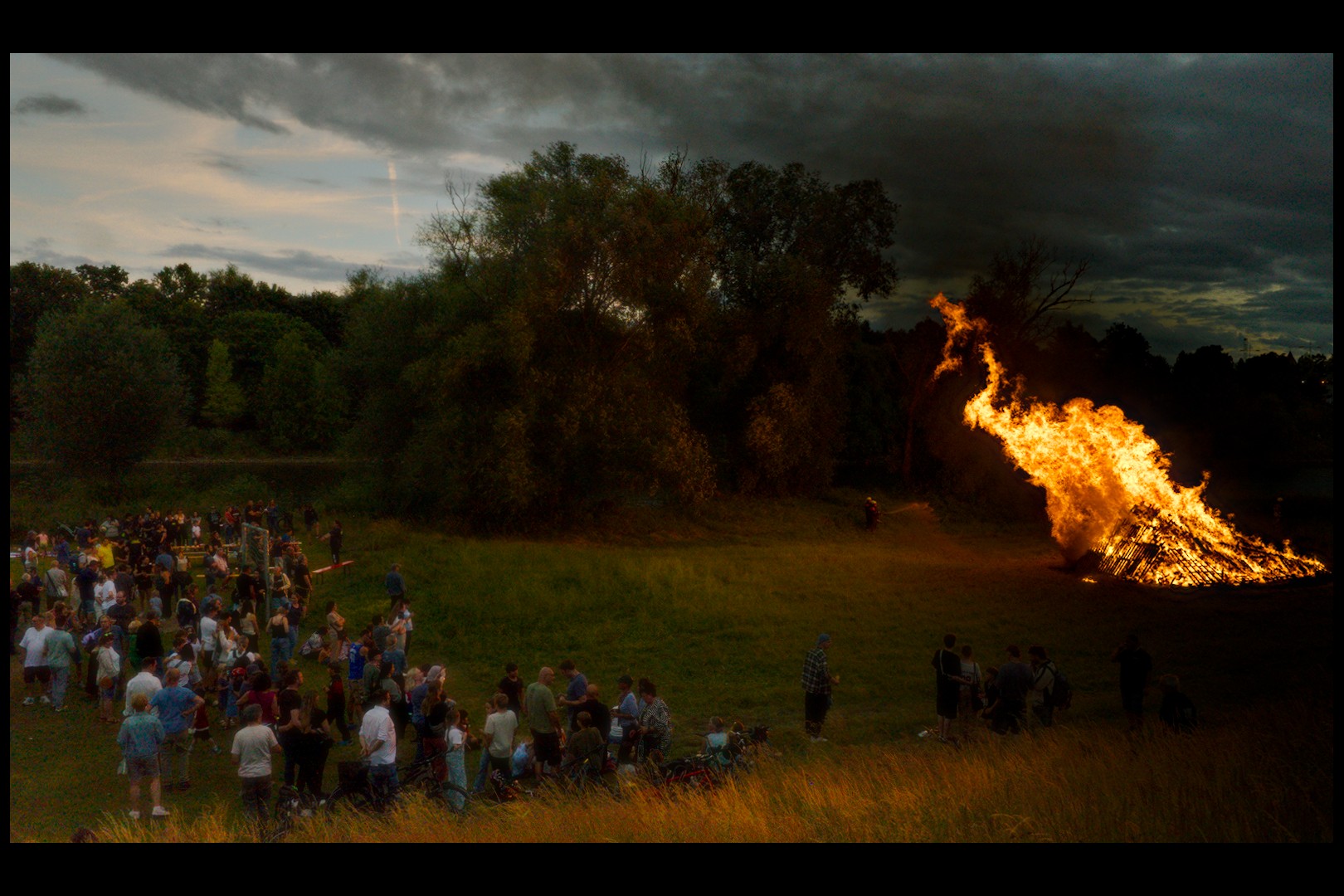
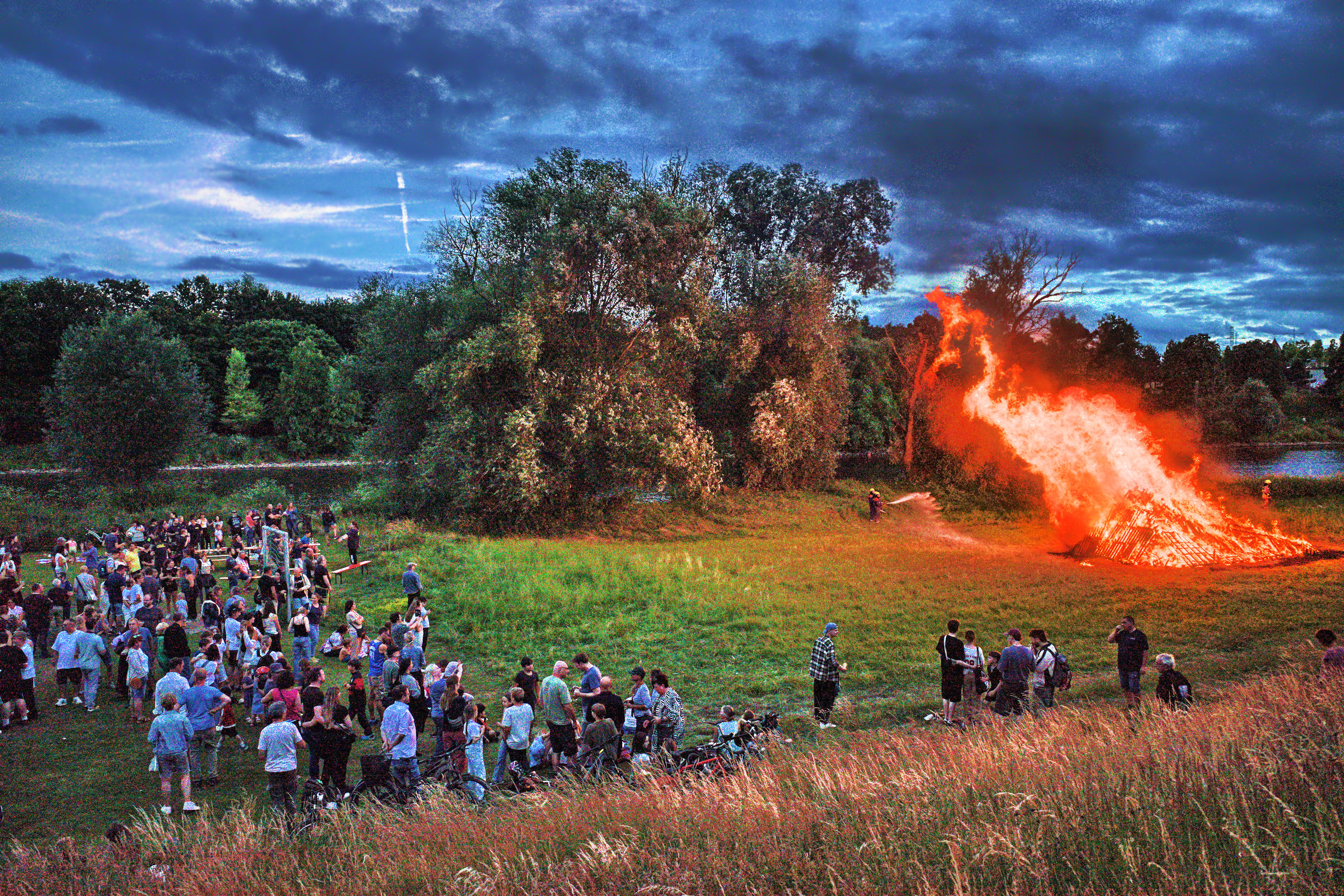
Your version of the image, Boris, appears to me as a very good balance between the experience of very strong light from the bonfire and what level of surrounding darkness/light I would expect to perceive as a condition for such experience – corresponding to that Bastian’s experience from capture actually was on another place on that same balancing scale:
I tend to feel that your version has a certain painterly resemblance to it. (Think I need to consider why that is so.)
2 Likes
Through diffusion, the darker details around the heat source are additionally brightened with the color of the heat source, reinforcing the impression of “glow.”
Here you can clearly see how the local contrasts almost completely disappear:
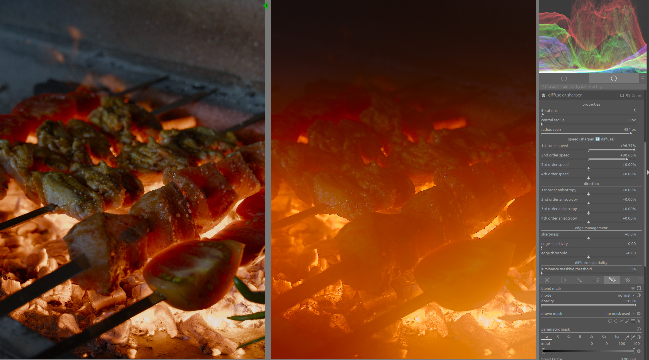
Harmonic mean ensures that the texture of the area is preserved, reducing the softening caused by diffusion:
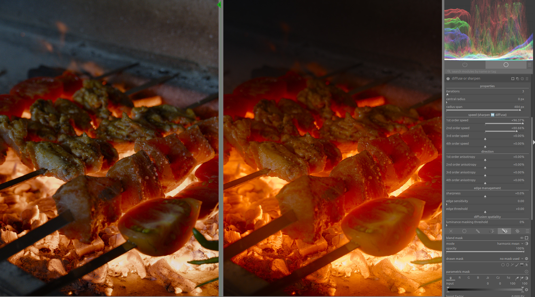
You can clearly see how the reduced brightness variance between the heat source and its immediate surroundings in the example on the right enhances the impression of heat intensity.
Many photos with sunsets lose their impression of intensity when one tries too hard to enhance the local contrasts in the sunset area.
25 Likes
Thanks for sharing, that is a great visual for that blend mode. I have seen only a very few references to using it over the years and I don’t think I ever saw such a great visual. I had read the definintions for arithmatic, geometric and harmonic but it really didn’t translate into a visual effect for me so thanks for this… Its now much more clear how you could use this…
3 Likes
Nice. What does it look like with another instance with the normal blend mode at 20%-or-so opacity?
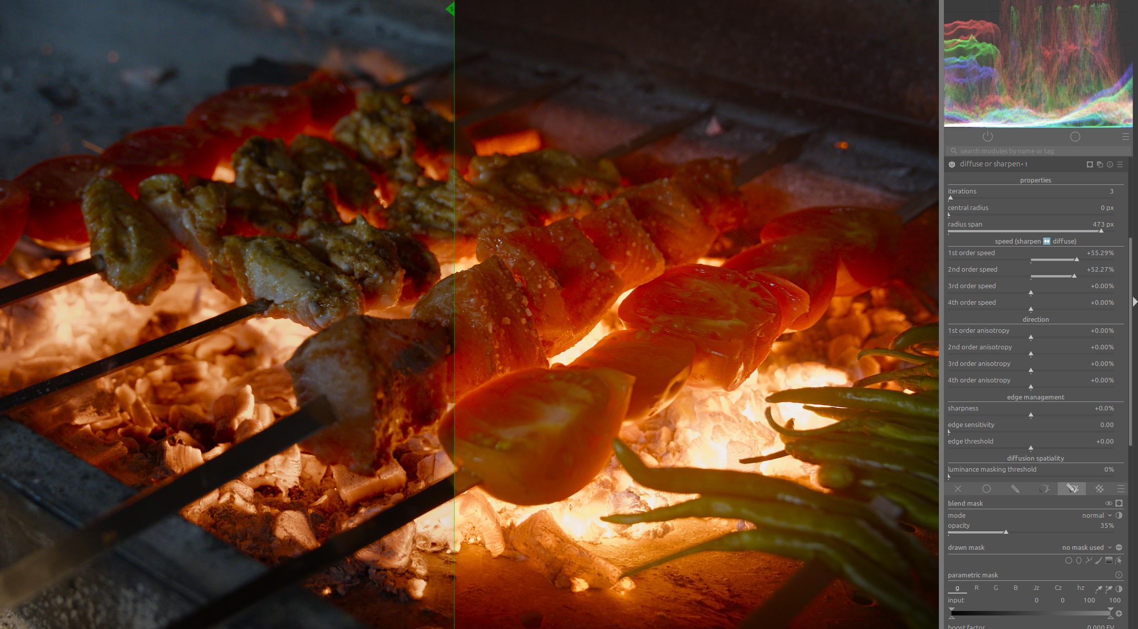
This can be used to enhance the effect even further.
However, it then acts like a diffusion filter.
Under certain circumstances, this can also be a nice effect:
5 Likes
@gdae1984 welcome back! Please consider making a smaller image with some jpeg compression in tbr future. Its a nice render. Can you please share the sidecar?
12 Likes
Just an attempt at managing the dynamic range a bit (I’d usually also go for a darker edit of this scene, but it’s a fun experiment). I’m colorblind, so I struggle with judging the colors of the fire, but I hope it doesn’t look too strange.
R0003463.DNG.xmp (11.8 KB)
Rough approach:
- Exposure via picker or by eye
- AgX:
- Set relative exposures by eye until the fire and the shadows roughly look like what I want (picker would also work well enough, I think)
- Set pivot on fire to bring out more of the details within it
- Reduce global contrast to make rest of the scene lighter
- Reduce toe power to make rest of the scene lighter
- Reduce red and green attenuation a bit so that the fire de-saturates less before AgX
- Local contrast: Tune highlights and shadows until the fire looks like I want and adjust midtone range and detail for the rest of the scene
- Color balance RGB: Add a bit of global chroma and shadow chroma for the grass
5 Likes
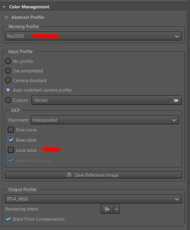
OK) I used RT. The clue is to choose the best working profile. Also I turned off “look table” of DCP. There is a huge testing ground)
R0003463.DNG.pp3 (16.1 KB)
2 Likes
3 Likes
1 Like
3 Likes
Nice view hiding in the foreground.
DSCF1994.RAF.xmp (18.7 KB)
Just a side question. I wanted to crank up the contrast in the shadows region with a masked color balance rgb module. When adjusting the highlights, the the changes leak into the unmasked area. Why?
DSCF1994.RAF – 02.xmp (19.7 KB)
For the original topic - in the visualization industry it makes a rendering a lot more believeable to mimic any kind of unperfection of the lens or the human eye, maybe thats one of the reasons it is being improved so rapidly in blender.
1 Like
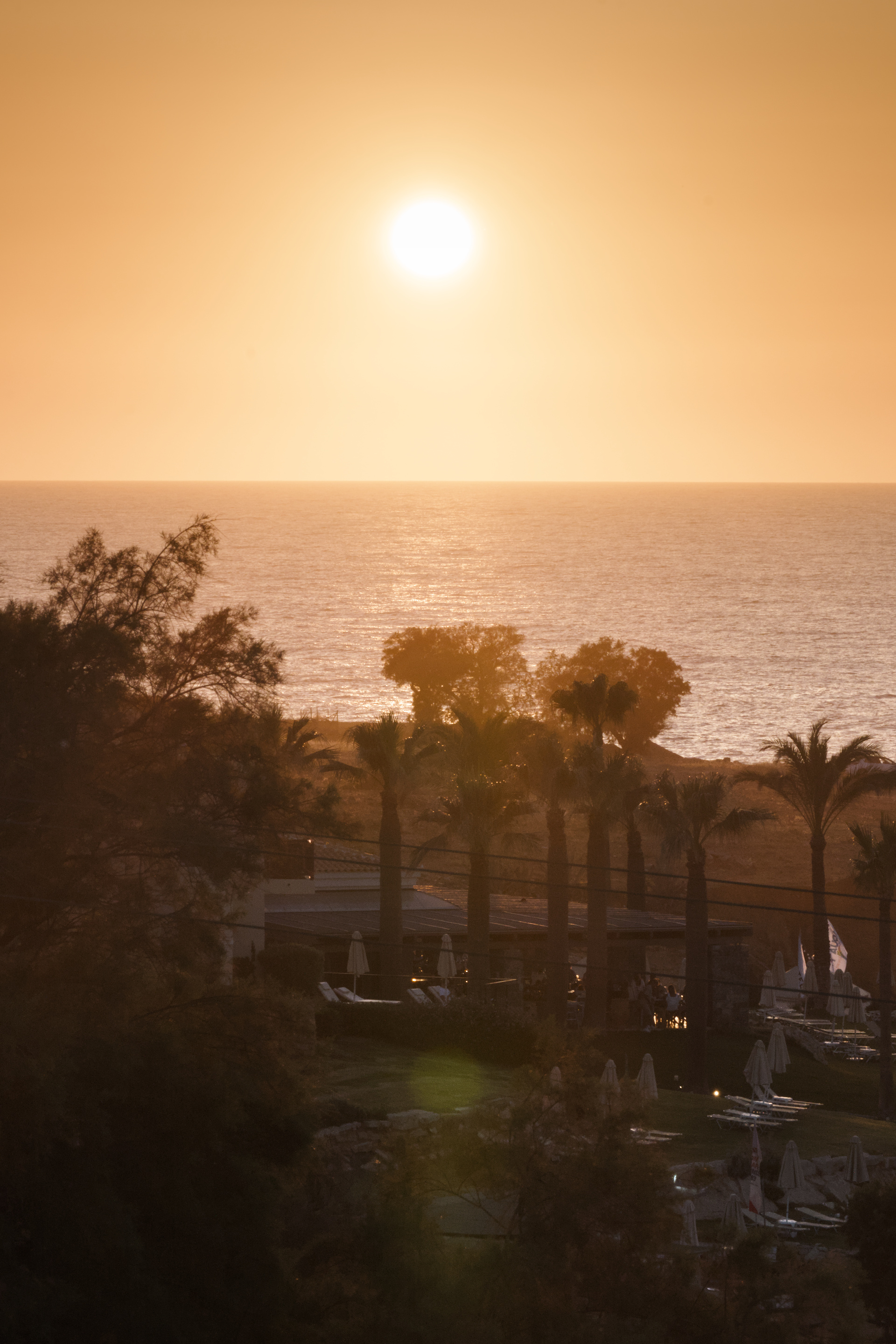
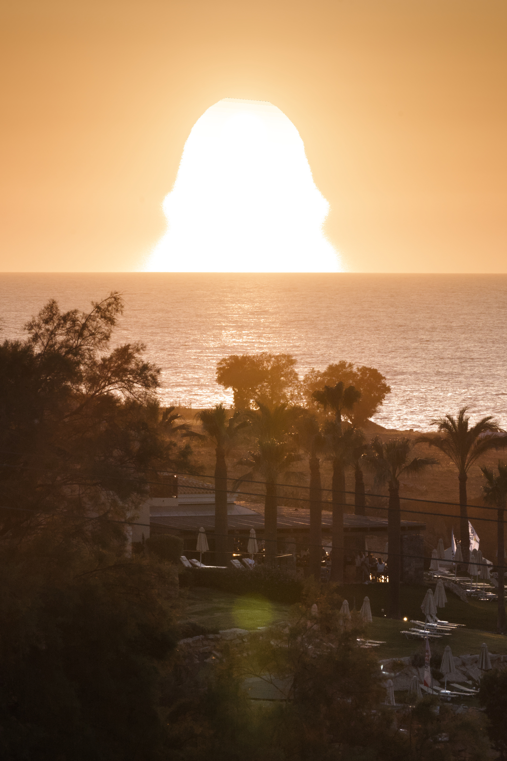
The gradient is just brighter below the sun than it is above, I think.
On that picture, another observation: is it just me, or does that sun look brighter than the white background of the forum? I think that’s the “simulated Abney” in action. (And possibly the Purkinje Effect?)
1 Like
I wonder how HDR changes things. Some phones are already capable of 4k nits peak and even just watching good HDR video on my TV can physically hurt my eyes if they are adjusted to a dark room with the pupils dilated.
As bit depth increases we won’t need tone mapping at all and just let the eye/brain do the work?
I wonder how far it will go since the eye is slow to adapt to brightness changes, cutting from indoors to outdoors in video could pose problems. Maybe in the future we’ll all watch movies with an eyepatch like a pirate
2 Likes
The fire looks like a pea hen. lol
Was going to push to make the bird really stand out but too tired and lazy so just cheated with Lucis (and a few G’MIC tricks) followed with some sky cleanup. Not pretty or to anyone’s taste; just wanted to see if I could turn twilight to late afternoon. ![]()
1 Like
that’s exactly as stated in the initial post: it’s all about taking humans perception into account when processing the raw information. It’s just software that needs to mimic those effects.
1 Like
AFAIK most HDR today only goes to 600 or 1000 nits. Anything more than that is probably too bright for comfort anyway. But as you say, they might be enough to trigger Abney and Hunt/Stevens. (It’s much more about brightness than bit-depth, though)
At least Hunt/Stevens (contrast loss at low light) is compensated for by the gain maps embedded in HDR media, I think (right?).
We already use cinema-standard gamma 2.6 in dark rooms, video-standard gamma 2.4 in dim rooms, and desktop-standard gamma 2.2 in lit environments. These explicitly (!) compensate for Hunt/Stevens. As we go brighter, we need to reduce gamma ever further. Obviously, a 30K nits sun-brightness display would not need gamma at all (gamma 1.0).
Quick aside: in my experience, gamma is very ill-understood by the wider photographic community. I’ve seen several folks editing in a dark room with desktop-gamma, and wondering why their photos come out way too contrasty and oversaturated. But most online resources on the matter are incredibly misguided, yet deeply entrenched: I’d get slaughtered for my previous paragraph in most forums. Yet in the video world, what I said is perfectly ordinary.
4 Likes