In all our discussions about tone mapping, I’ve been puzzled by our struggles to imitate human perception. Why should we need to simulate the Abney Effect in our images, if the effect will be applied by our visual system anyway?
But I had a realization recently, that I’d like to run by you gentle folks on this fine Sunday: we probably simulate the psychovisual effects of extreme brightness to trick our brains into a perception of extreme brightness, even though our screens and prints are not actually capable of rendering that brightness.
We render a 30.000 nit sunshine scene onto our 300 nit screens or 100 nit prints. So we counter the loss of contrast and saturation perception in dim light due to the Hunt and Stevens Effect with an artificial increase of contrast and saturation. That much makes sense.
But the maximum brightness of our screen is still capped at 300-or-so nits (and much less so for saturated colors), so no Abney Effect will be triggered. However, if we simulate the Abney Effect by introducing the appropriate color shifts, our brain takes this as a cue that these highlights must be really much brighter than 300 nits, else why would they burn out our retinas like that!
This also explains why highlight rendering is so fickle. Even a slight error in the hue twists destroys the illusion, and plunges us into an uncanny valley of sorts: We all remember the Salmon Wars and the Notorious Six.
And thus we perceive a lightsabre rendered with a white core and a red shine as “blinding bright red light”, even though it is neither bright nor red, and a real red highlight (lasers, brake lights) does not actually look white to the naked eye.
PS: Feel free to play_raw this thread under the terms of the CC-BY-NC-SA license.
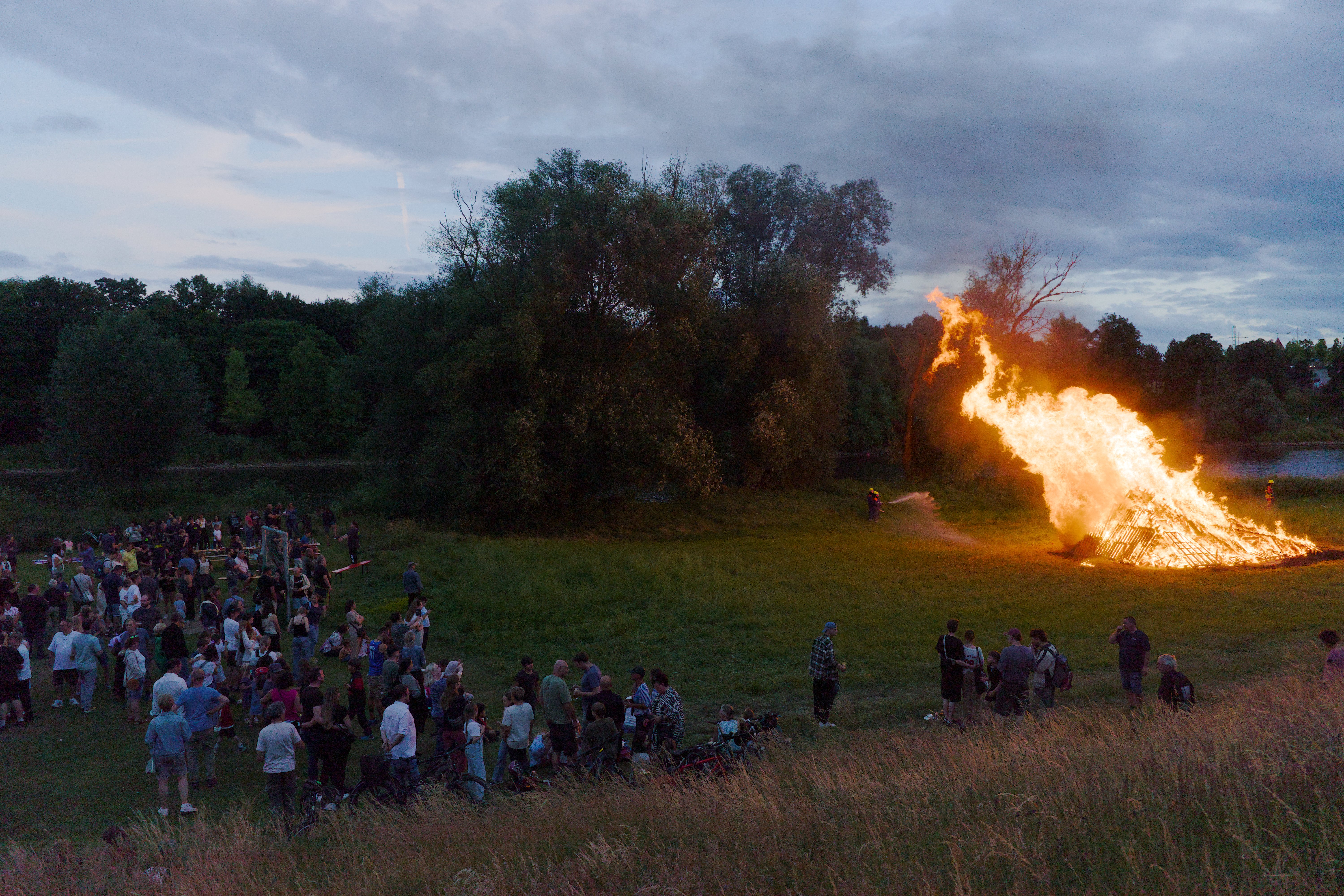
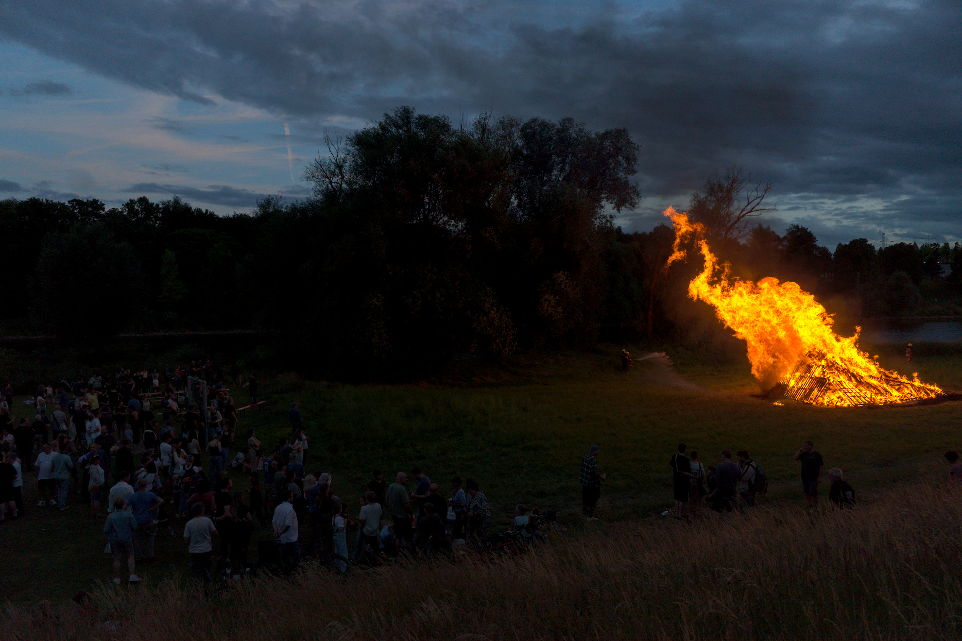
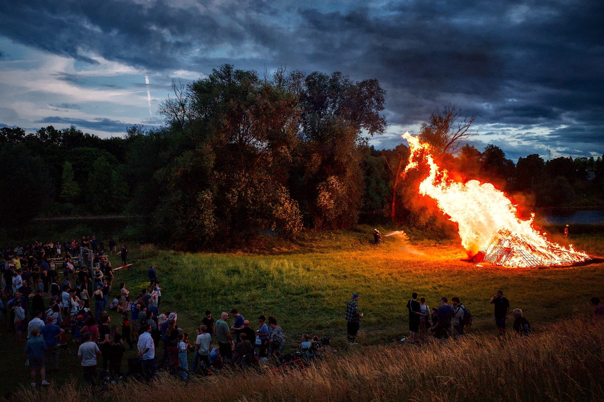
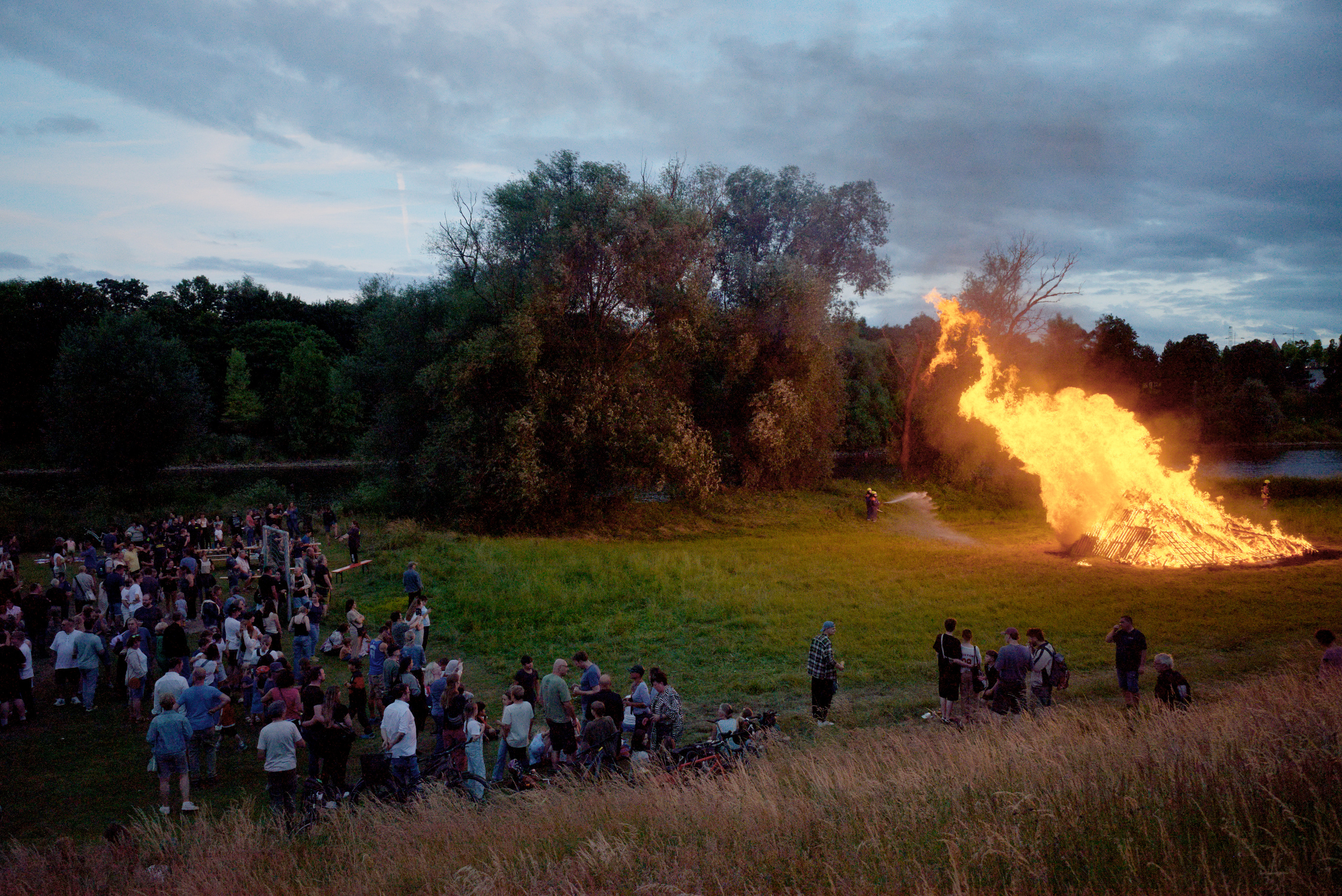
Is it just me, or the flame looks like a peacock
Like… the neck, the bill, the eye and the crown, even the body proportions are somewhat right. It’s a phoenix-peacock combination, I guess.
The question of “seeing what appears to be” versus “seeing what is” is very interesting. But color experts and color scientists have already weighed in… Regarding the photograph you provided, I’d just like to say two things:
Fidelity to the moment: the time 22:21 indicates the general lighting of the scene, and the brightness of the bonfire indicates the local lighting of the surroundings.
Perception of the fire’s color. None of the options offered by the processing software are good. So I decided to discard it. Your Ricoh is a great camera, and the engineers who built it know what they’re doing with the color of your photographs.
Are you really sure about this?
Except that there are too many old cars around where the brake lights has lost much of its pigmenting and look more white than I find OK, I will in general think of break lights as being much too weak, even in darkness, to tell me whether my color perception bleaches out and shifts toward white for really strong light. As for red lasers I have, luckily, never seen them while radiating directly onto my retina.
Anyhow, I think you in some of your postings lately, this included, has put a necessary focus on the brain’s phenomenal ability to interpret/create images in our head – less dictated by (sensing of) physical realities than what some discussions seem to take into account.
Our brain is not a one-way processor of simple stimuli, but an extremely complex system of associations, presumptions, predictions and feedback – this includes our vision system which make up a substantial chunk of the brain.
Nope, I’m not. Actually, I’m not sure about any if this. And I oversimplified. Sorry about that.
What I actually think is going on is that a bright stimulus will oversaturate dark-adapted cones very quickly. For a short while, our eyes will probably sense something “white”.
Thus, the brain will actually receive something not unlike the white-core, colorful shine, that we use to render the scene. This is probably why that particular rendering technique works!
But from personal experience, the result does not look white usually. I think I perceive this as “bright red” instead. Still, the fact that the rendering works, and from what I know about sensory cell behavior, it seems likely that the “white core, red shine” is actually what the eye produces.
At least for a short while, until it adapts.
(As for the brake light analogy, my perception might be colored by being mostly a cyclist, and living in Europe. As far as I know, brake light regulations are different here (Edit: brake lights are less bright apparently. Shows what I know). Brake lights can be intensely bright on a bike sometimes. But your point is still correct, brake lights were perhaps a bad example. Also note that modern brake lights are often monochromatic LEDs, which in general wreak havok with color perception, and will probably not saturate to white even if they were bright enough.)
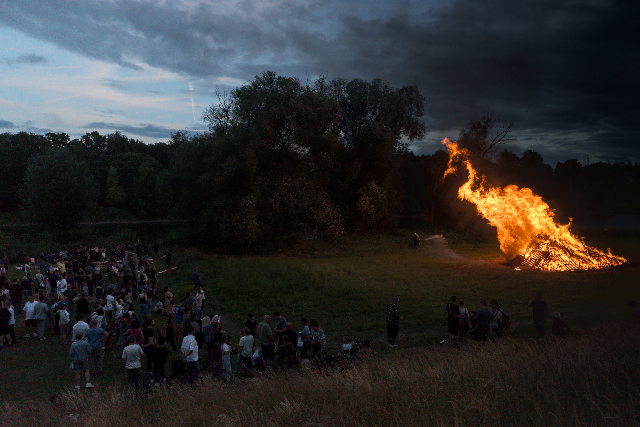
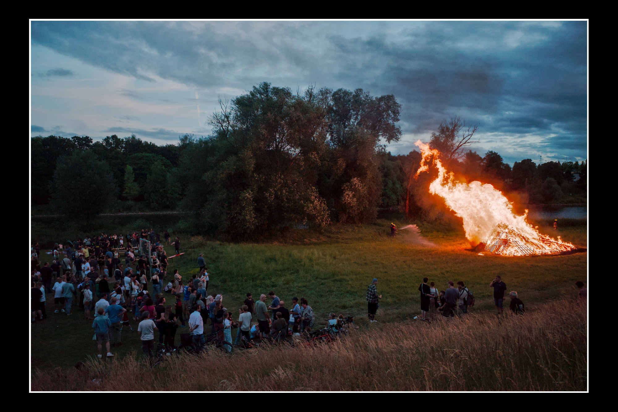
I didn’t get far with the tone mappers, a bit worrying really!
I tried Tone Curve after -3ev exposure.
I think this image is one where it would be really useful to have RGB Curves working properly.
I agree! Faking these effects seems to be working super well to portray a situation of high intensity! Adding bloom (non perfect eye optics) would be the other less utilized (in darktable) leg to stand on to give the look of intense light. I also think the adoption part is super important because of course the brake light is not “white” when we look at it, the eyes adapt then. If I adjust the exposure of my shot for the highlights then they wont go towards white, they will be colorful, duh!
And my attempt on the provided image using the in development “local contrast rgb”, some masked exposure and sigmoid at 50% preserve color.
The perserve color slider is magical for a picture like this btw!
Here is 0% and 100% respectively, both not very good if you ask me! All other settings are the same otherwise.
This image of yours is in many ways quite impressive with beautiful colors.
I can almost feel the heat of the bonfire radiating onto the skin of my face.
I do ponder, though, looking at the apparent intensity of the flames, (which I by the way think are somewhat too intense too far out in the outer part of the flames), would I ever see the rest of the scene as the picture depicts it?
Wouldn’t rather the people disappear more into the dark if I saw such intense light? Or on the other hand would the flames look so intense if the sky was as light as it appear?
If I let my eye wander more slowly around the scene, focusing on the various areas with time to adapt, each part may possibly look like they are depicted. But as a whole overview of the scene - is it too much “HDR”?
This balance between parts and the whole is something I find very challenging when processing images with large DR.
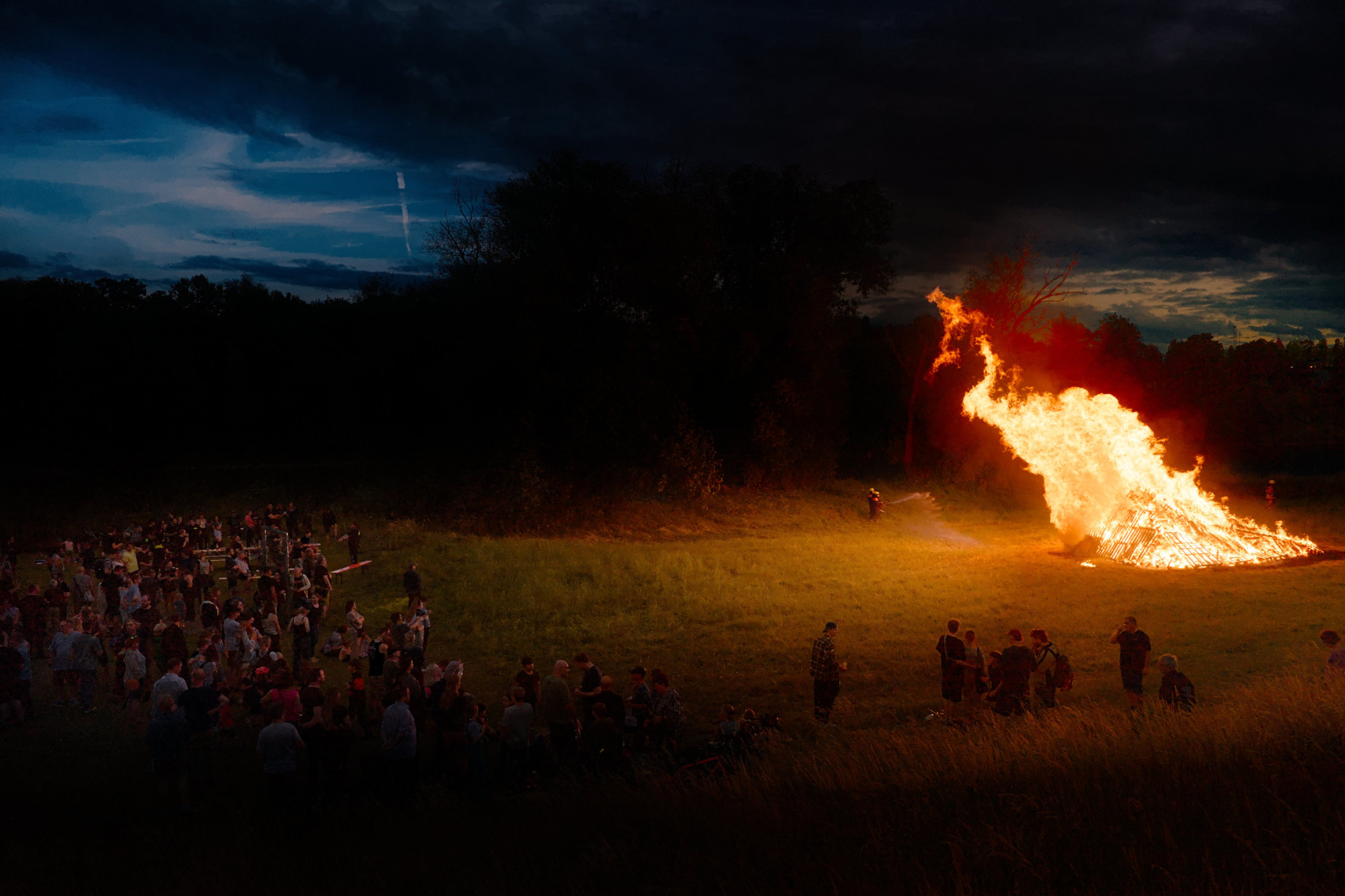
For what it’s worth, I remember it was still relatively light when the bonfire was lit. Most of our renders emphasize the contrast between the brightness of the fire and the darkness of the crowd. But when I stood there, it was still bright enough to comfortably read, and the fire didn’t seem overbearingly bright either. It registered more as heat than brightness.
So in that sense the more HDR-ish renders are closer to how I remember the scene. Which is funny, because that directly contradicts the camera’s record. (Of course the play_raw is not about realism, don’t take this as criticism)
This is my edit in AgX and it is very sensitive to which AgX preset I chose to use. I used a custom preset I made for my Canon R7 but Kofa’s preset called sigmoid smooth works okay on this image. The preserve hue slider influences the color of the flame a lot too. But this is my interpretation of the scene. R0003463.DNG.xmp (12.3 KB)
A bit more detailed:
I have given up for a long time the goal to depicture a scene how it really looked. And that for mainly two reasons:
It is most of the times not possible. A camera sensor simply works completely different than the human vision. A sensor captures everything it sees with the same “settings”. The eye doesn’t. It looks around and capture very small areas, which are afterwards processed in your brain, to give you a picture of a quite large area. While the eye is capturing the different areas, it always adepts to what it sees, not only by opening and closing the iris, but as well by adjusting the sharpness.
I want to capture more than I see. Taking a photo, I don’t only want to depicture what I see, but as well what I feel at that moment. For me and my photography my main goal is to transport the emotion of the moment - without altering the picture to something artificial unreal. So the result should always be believable and transport the emotion I really had. One reason, why I usually don’t retouch people or other unwanted things out from my pictures.
Editing foreign pictures makes the second point a bit pointless. Anyway I have my experience, which I rely on. So there is still some emotions which I can put in an edit, by remembering similar situations in the past.
I would go even a step further and posit that we don’t actually see with our eyes “at all”. The eyes merely provide input to a mental world model, and the world model is what we perceive. Thus we don’t perceive things that clearly should be I our field of vision, or perceive things that aren’t.
Much like we don’t perceive the white highlights of the flame as white.
I even believe that engaging with photography will sooner or later lead to these questions of perception being asked again, if one manages to move away from the assumption that photography is a pure representation of reality.
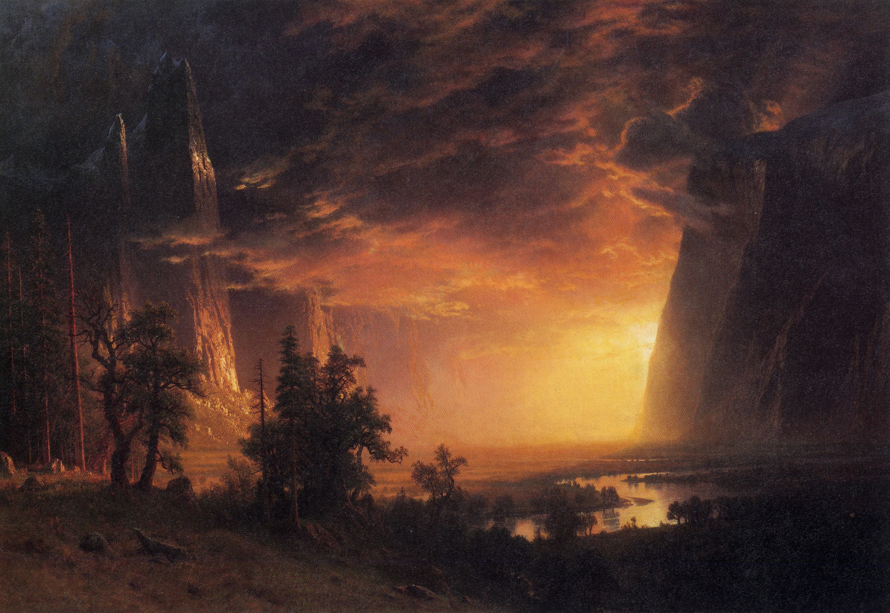
Then one can learn a lot from the old master painters about how to specifically control perception and which elements influence our perception of color and brightness.
If you take this into account, then—in my opinion—it is less important how the scene actually looked, but rather what you want to present.
The way I see this scene, the central element of this photo is the blazing fire, like a small spectacle around which people have gathered, and that should be emphasized. All other elements, such as the blue sky, can serve as a frame to further enhance the main motif: