If the 19th century photographer P. H. Emerson was still around he would probably be posting in this thread arguing with everyone. He was opposed to soft and manipulated pictorialist photos and also to photos that were razor sharp all over. He argued that the subject in the center of the photo should always be sharp and it should become gradually softer towards the edges, which was thought to be similar to how the human eye worked. He chose lenses specifically for this effect. A few years later he changed his opinion and recanted everything…
2 Likes
Yeah, I mean, daguerrotypes can be razor sharp…
So is your problem sharpening as a whole, or just bad sharpening?
It’s like complaining about HDR as if it were all shitty-HDR without mentioning all the HDR tonemapping that is subtle and well-executed.
I would formulate the problem differently: show me one sharpening method that doesn’t look like shit where sharpening is actually needed. Opacity < 80% and 100% zoom don’t count.
1 Like
I think it’d be more enlightening if you showed us an example illustrating what you mean by “actually needed” and where the best sharpening you’re capable of still “looks like shit”. An image is worth a 1000 words.
Back in the original post, you asked:
Do you not care about sharpness at all anymore?
Or has your own technique and equipment reached a level where you don’t feel the need to add sharpening in post?
There’s a distinction there. I personally don’t need added sharpening on my own images because my lenses are easily good enough even with cropping. If a photo is soft from motion blur or defocus and that harms the image I want to depict, then I don’t consider it a keeper.
But if you use a phone, sharpening is simultaneously mandatory (because the raws are ultra soft) and hideous (because the raws are ultra soft). You’re absolutely right that sharpening does look like shit when it’s actually needed.
(this is why I don’t use phone cameras for anything more serious than basically illustration)
1 Like
Are we looking at the same coin from two different sides?
I would love a sharpener that corrected for my misfocusing. With my full-frame camera and manual lenses and moving subjects, my focus is rarely perfect. I would love software to correct that. But I doubt it exists, and may not be possible without “looking like shit”.
Likewise correcting for camera shake.
But I do use sharpening for other purposes that I mention above, in order to improve the image, by my (subjective) criteria. I wouldn’t say the sharpening is “actually needed” in a technical sense, but it is needed for aesthetics.
1 Like
Thank you, that’s a breath of fresh air. For the past 12 months I have been trying to enlarge old images for print and on sale. They are over a century old. I think I have tried almost everything and to be honest, after all the manipulation, they don’t look that good, they look as though I am trying to make old images look like they were taken yesterday. The sharpening just enhances the pixelated images in all the wrong places. From now on, after removing obvious marks, I will sell them for what they are, old images using old photography methods. As a side note I paint and as a painter the values, light and shadows are far more important than a sharp image. Art is usually viewed at a distance. Thanks again.
2 Likes
Me [innocently]: Boring?
Have fun!
Claes in Lund, Sweden
1 Like
Any generalisations about paintings are bound to fail. It’s happened before with the suggestion that clouds in paintings are rendered without detail! Now the idea that perceived sharpness somehow isn’t part of the history of painting…

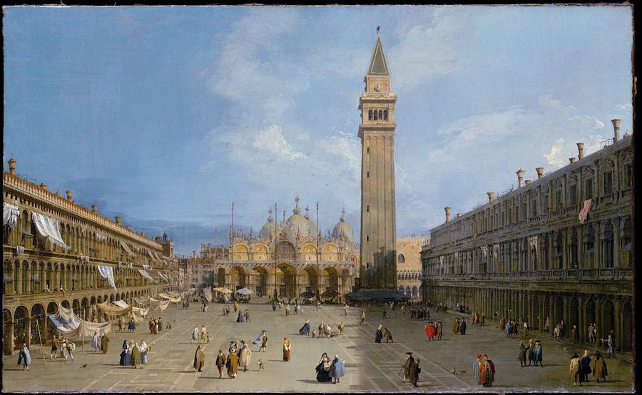
1735 Canaletto, The Feast Day of St Roch
I think I’ve mentioned Canaletto before, so I just use him as an example, there are numerous others. The above painting has exaggerated percieved sharpness. Naturally you’re not getting 1200dpi detail as there are limits to the human hand. Instead percieved sharpness is achieved in ways that resemble sharpening algorithms. The impression of sharpness in the above painting is a creative decision.
The above painting is about 2m long and they were often mounted high on the walls at that time. Despite the likely distance to the viewer Canaletto has huge amounts of detail and very strong percieved sharpness.
edit: Another one with slightly different look relying less on strong shadows.
Canaletto, ‘Basilica San Marco and Campo San Basso’, c. 1722
Another different look but with high unrealistic perceived sharpness.
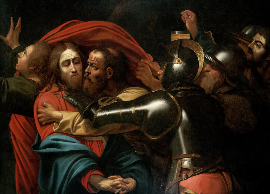
The Taking of Christ, 1602 Caravaggio
12 Likes
Fully agree. I would add that noise reduction is similarly abused, and I almost always avoid it (except for very high ISO images, and then reducing mostly chroma noise), preferring noise-grain to the plastic-digital-smooth look.
6 Likes
It seems to me that things in our reality convey sharpness as an intrinsic attribute while others don’t.
Examples:
L’Institut du Monde Arab:

Rodin’s Le penseur

(Above I didn’t try to show good photos, just to show the things)
Sharpness seems to be a core element of most of the Arabic tapestries (including their architectural representation in the form of the IMA building - btw, a clever use of the aperture device!), but it doesn’t add nothing to other things, like Rodin’s sculpture.
When I look at some of the landscapes I try to record, sharpness plays some role, undeniably.
But when I look at kids playing at the beach, it’s not sharpness what matters, but movement, colors, tones.
No conclusion, just some random thoughts.
4 Likes
“sharp” or “sharpness” is not a common word for art historians to describe a quality of painting, IMO. I have worked for more than a decade on 15th and 16th century Netherlandish painting which is far better example of “sharp” painting but never used the words in my academic writings.
I would use “detailed” to describe the Canaletto for an art historical discussion.
1 Like
The word was chosen because of the topic and the examples because the enhancement of edges etc have similarities with over sharpened photos. The Caravaggio above is perceived as sharp but lacking in detail (mostly). With photography you can’t recreate detail in post but you can enhance the perceived sharpness. These paintings were chosen with than in mind.
I was considering taking Dutch examples but off the top of my head they seem more actually detailed and don’t really come across as overly sharp at least the ones I’ve seen (some time ago now) but as you say sometimes incredible detailed. There should be some great exampes from the early span you mention that do look over sharpened. Do you have any good examples to share?
First of all, to discuss on the Feast day of Canaletto, I recommend you to see the image provided by the National Gallery whose quality is far better.
I’m not sure that the Canaletto is so “edge enhanced”. You think so probably because the painter used a sharp instrument to draw outlines of architectures. But seeing rough brushstrokes here and there, one may say that the painting is rather blurry and edges are not well defined
I don’t think that the arguments referring to paintings from old masters can be so fruitful off the top of your/my head.
1 Like
Great suggestion, others interested can see the painting here Canaletto | Venice: The Feast Day of Saint Roch | NG937 | National Gallery, London
That’s exactly what I mean with enhanced edges. As is clear when zooming in the above file he’s using linework to overstate some of the edges. Oversharpening of photos will often lead to edges coming close to lines. Linework and outlines are a way of ‘enhancing’ edges in paintings and also what happens when you over sharpen a photo.
Same goes for the faces. An oversharpened photo of a crowd will result in black eye blobs and blocks of clearly defined colour. It starts to look like a vector based image. Oversharpening looks like Canaletto plus halo ![]()
To go extreme Cezanne apples look a bit like a very blurry photo of apples that someone tried to sharpen back into existance. The contrasty outlining and blurry mids are what you get when sharpening.
I made a quick example from this wikipedia image by Sven Teschke. I’ve applied copious unsharp mask on a very blurry base.
Note the blocky shadows and featureless inbetween. Cezannes are amazing and have brushstrokes etc but the way the edges are enhanced look a bit like unsharp mask!


1 Like
I couldn’t help fiddling with another version. Again sharpened to death from a less blurry starting point. The outlining is more obvious here.

1 Like
Thank you for the detailed explanation.
So you think that enhancing edge can be artistic decision in editing cityscape/architecture photo as in Canaletto’s paintings, right?
It certainly can. We know that people do these things. I don’t think I’ve ever seen a good example of it though. It tends to look shite. One day, perhaps, I’ll see something amazing that is oversharpened but I’m not holding out.
The argument was different. Simply that unrealistic or enhanced “sharpness” has indeed been part of art history. That history is probably also why some images look like they do today. Not that the people doing it necessarily knows the lineage of their imagemaking.
Another thing is that one may wonder if the outlining (oversharpening) tendencies in much art is related to human perception in some way. Particularly considering how most childred draw their first images.
2 Likes