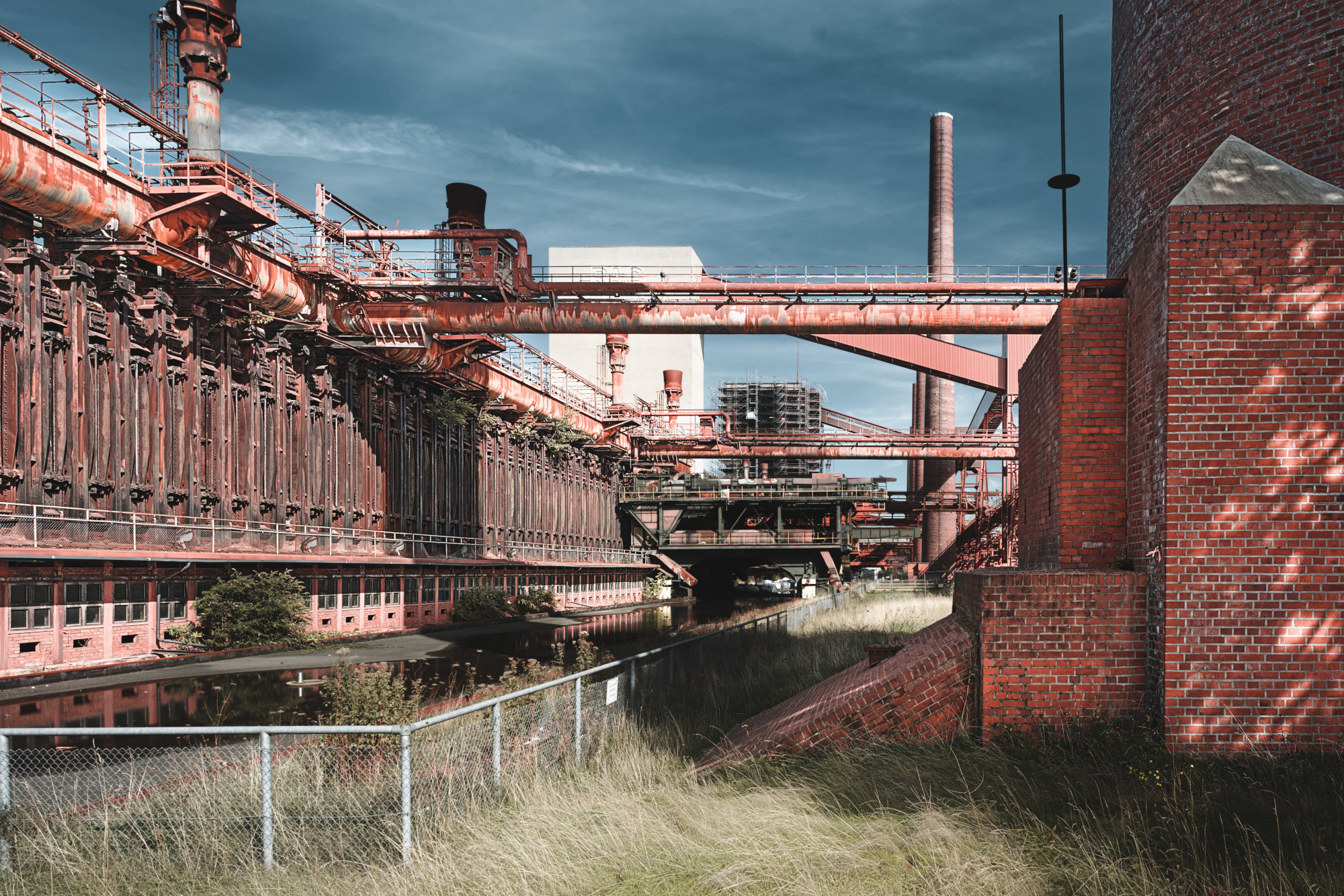
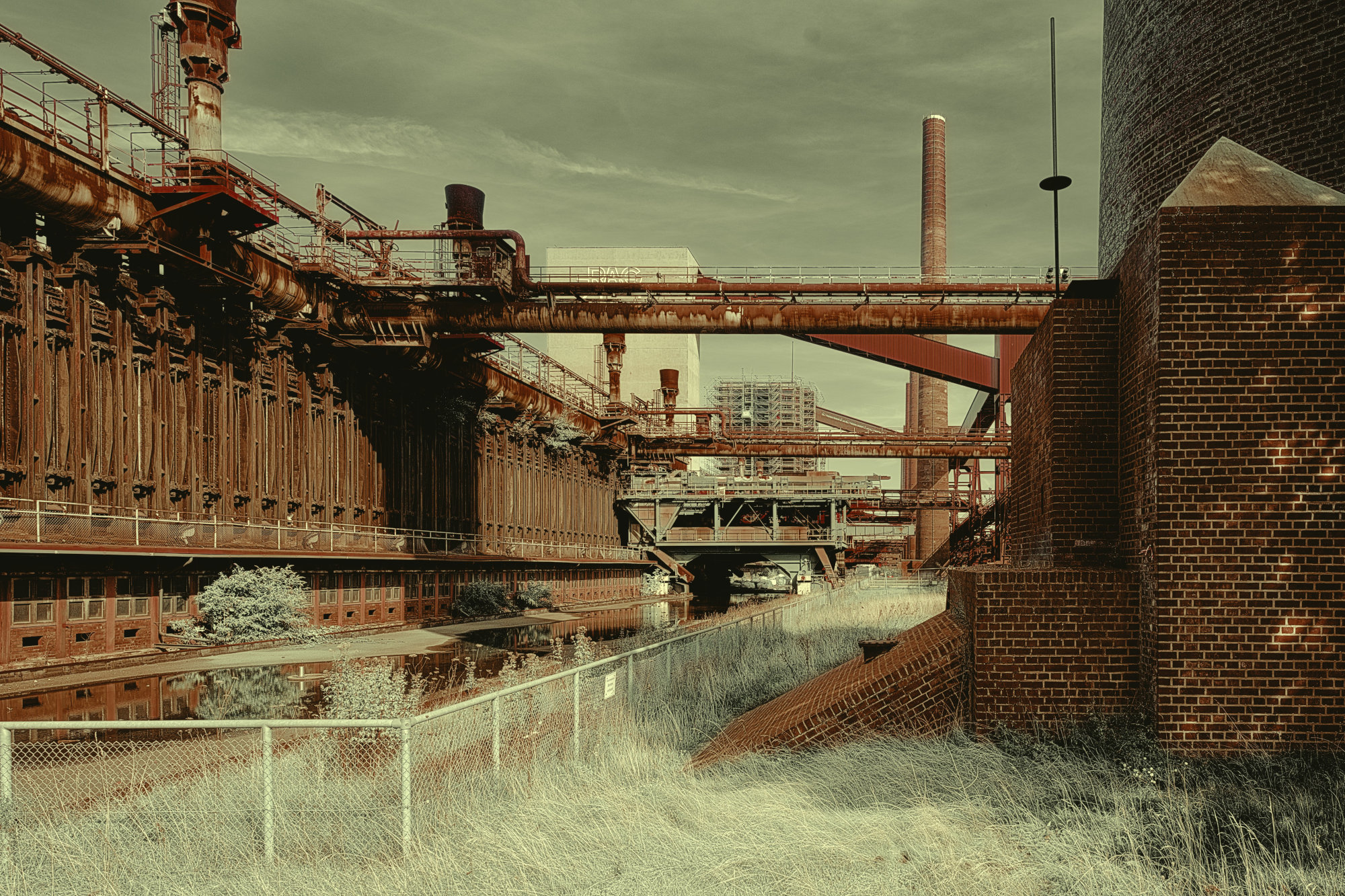
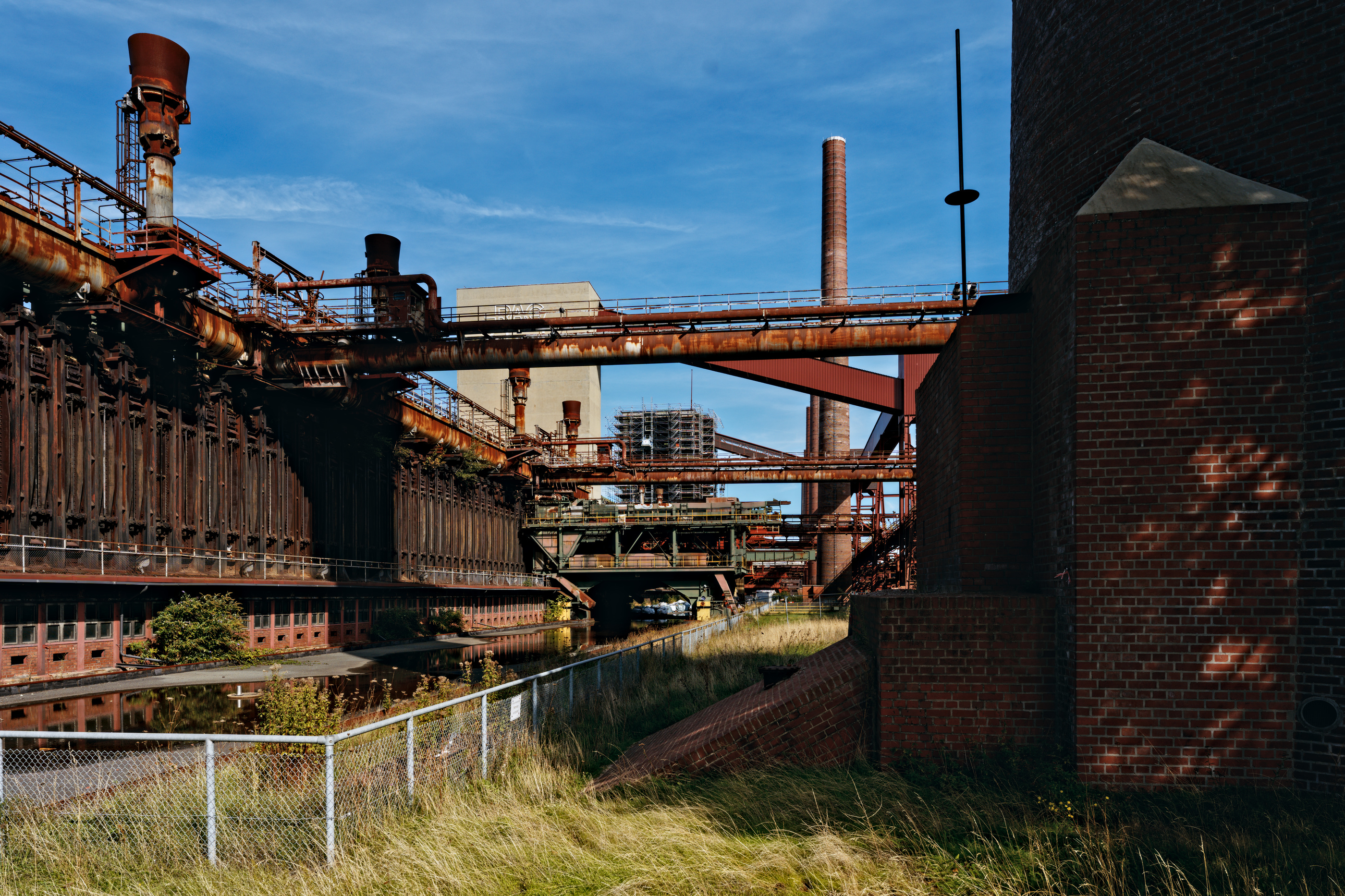
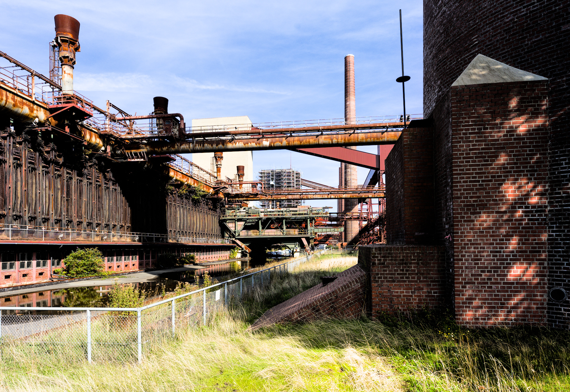
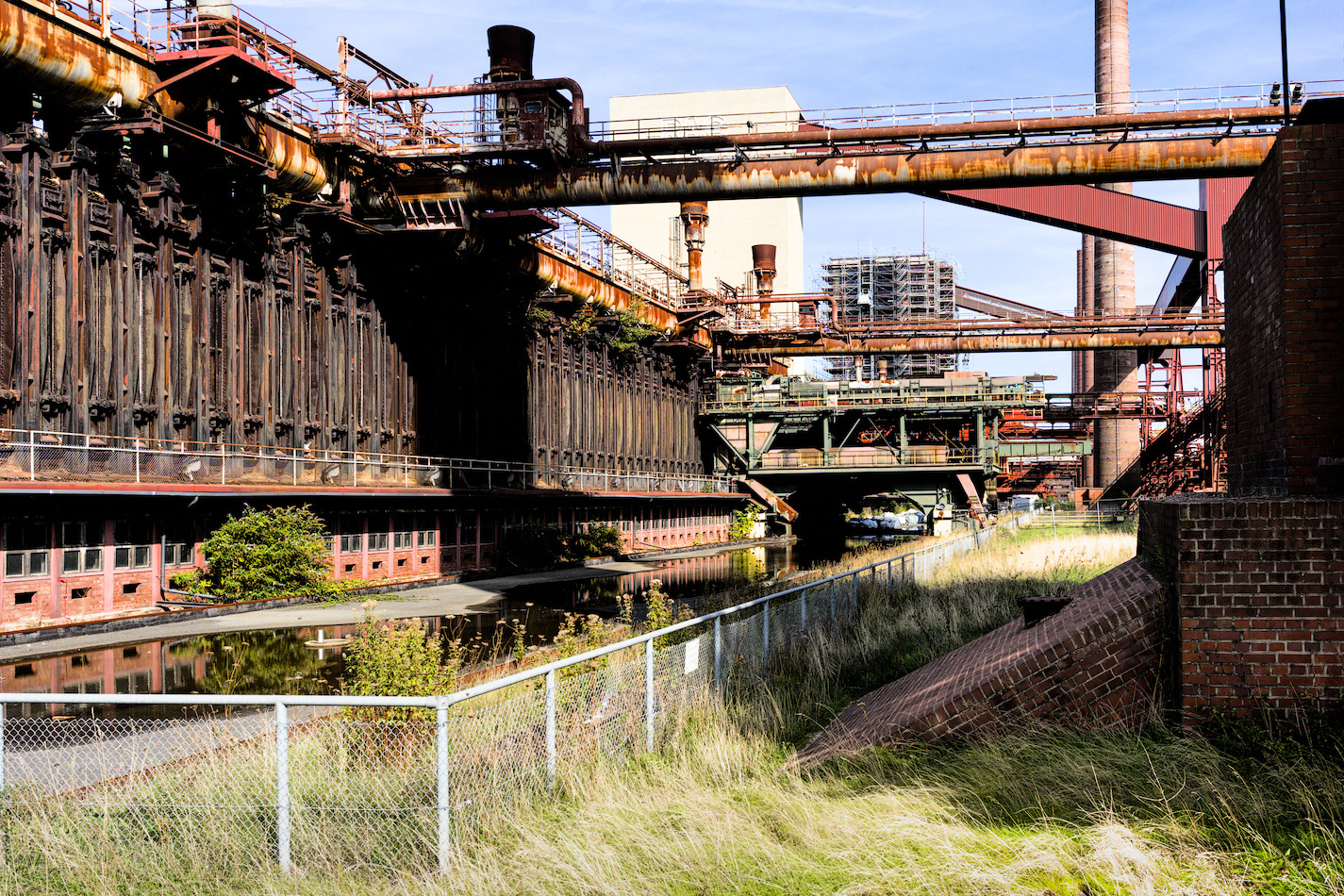
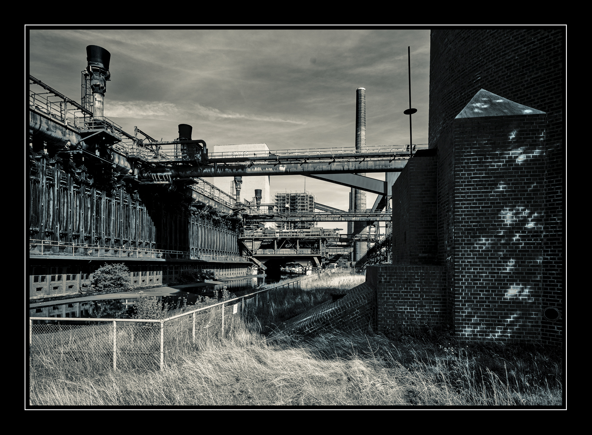
I tried to keep the overall mood of your image because I really like both the colors and the contrasts, but with less local contrast in the grass and the sky:
Really nice rendition!
One thing: If it shall simulate nighttime I have one point to criticize - All cats are grey at night, so in that case you should think about reducing saturation a bit to get a more realistic look.
If it is just a creative render to your liking, forget this point.
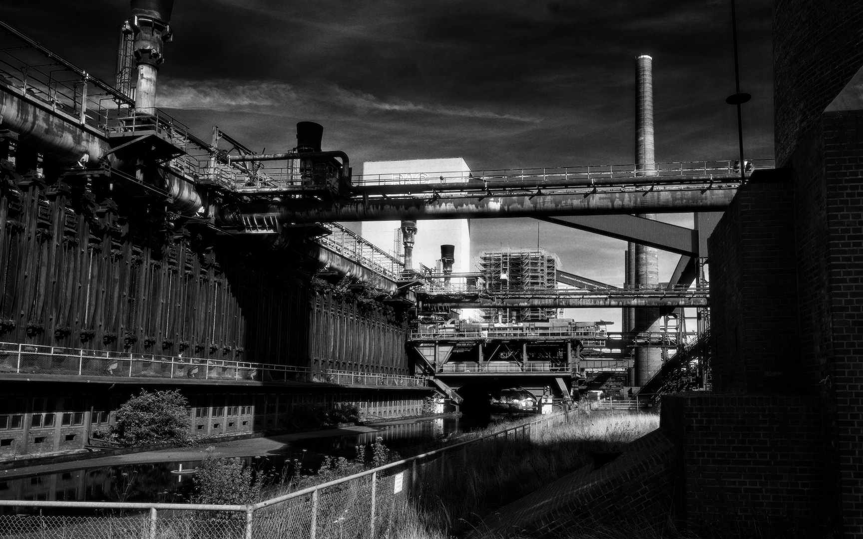
No, it was a combination of a real heavy b&w version I had in mind with completely overdone colors. I wanted the strong reds and blues to pop and with a bit of luck I got the orange/yellow highlights. Played a little bit with lightpainting to emphasize some lines and points.
It was more the fun of going ‘wild’ and overstepping my usual limits to see how it played out.
I think there are several styles quite suitable for your ‘industrial heritage series’. It really is all about the mood you wish to create. Think you did a real good job.
It’s some color processing stuff I’ve been tinkering with for a while. It started out as a tool to understand some minor image quirks I was seeing in RawTherapee’s Color Appearance module. What I found was that they are baked into the CAM02/16 models and are not really correctable, so I used the code I had already put together as a jumping-off point to explore other things. It’s a purely experimental module, there’s no predetermined objective other than to try to learn something.
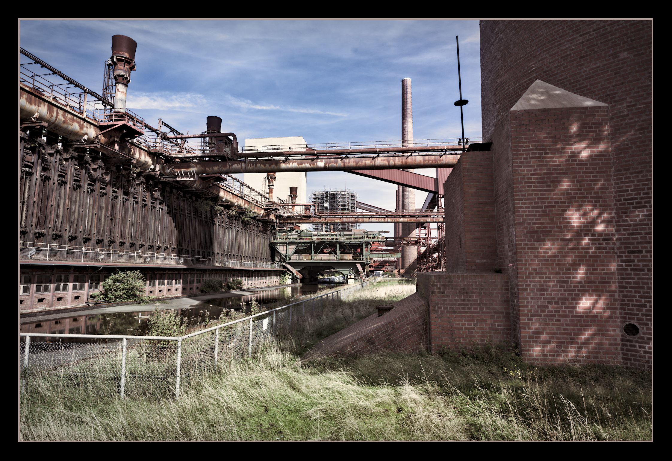
Darktable provides this info, and you seem to have gotten the same crop as everyone else, so it’s probably unused sensor area on the camera?
432px is like 1/12 which seems like a lot though
Thanks for pointing me towards the right direction. The black bands actually were the ‘Inset Crop’ of LibRaw, ignored by the wrapper library I am using for C#. Very few cameras are using that. I had to fork the library, which is a bit of a pain… But the issue is fixed.