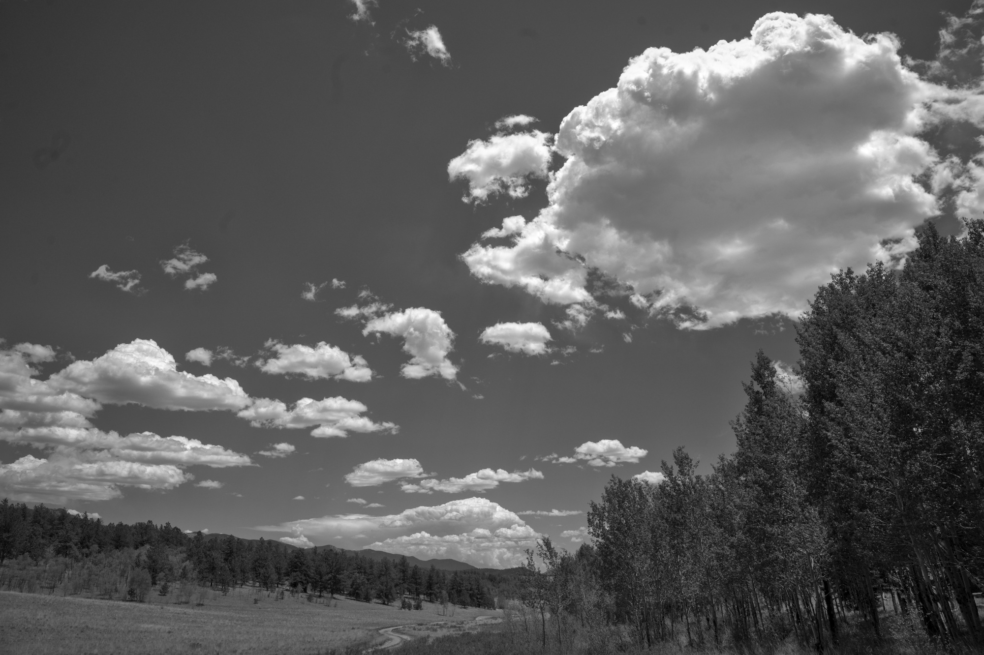
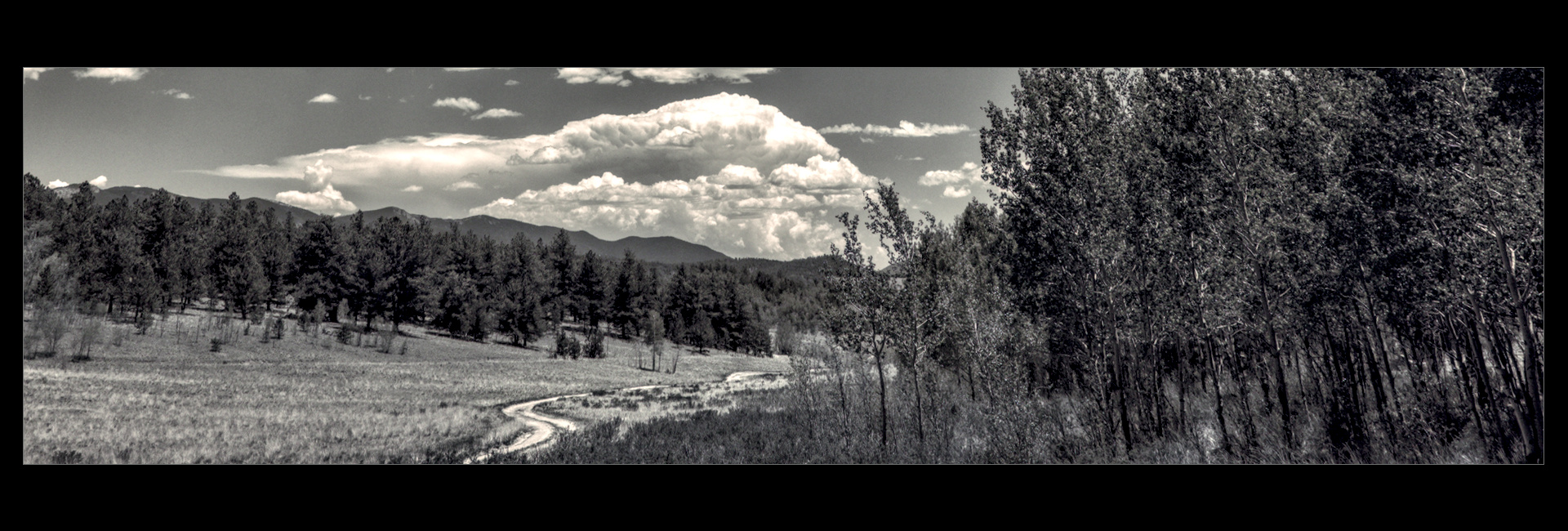
Okay, this is not your typical playraw; put away your color balance tools…
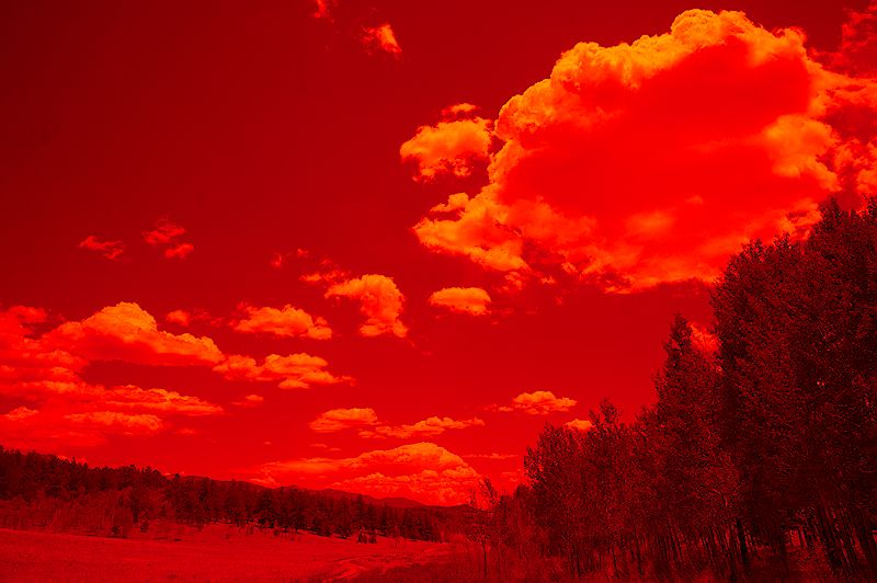
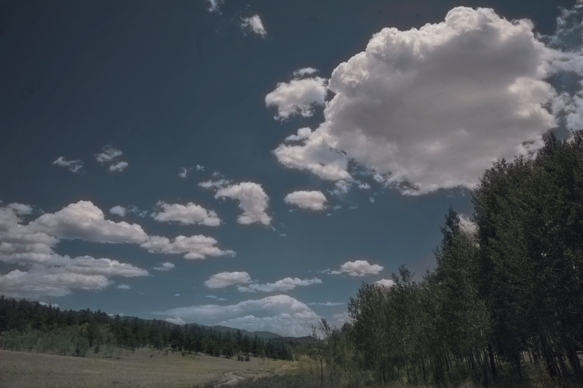
I posted a render in the “charge your batteries…” thread, a monochrome of a cloudscape. I got that capture through a Tiffen #25 filter, red-as-red-can-be, in an attempt to emulate what we did in the '70s shooting film landscapes. The red filter drives blue sky to near-black, punching the clouds into unreal prominence. So, this raw is decidedly non-nominal, renders like this without specific attention:
Tone curve work is what’s needed to really punch the clouds, but my global tools drive the forest to oblivion. I also didn’t mess with the grayscale operation for this one; on another, I tried just using the red channel, but the filter has already done that damage so no joy.
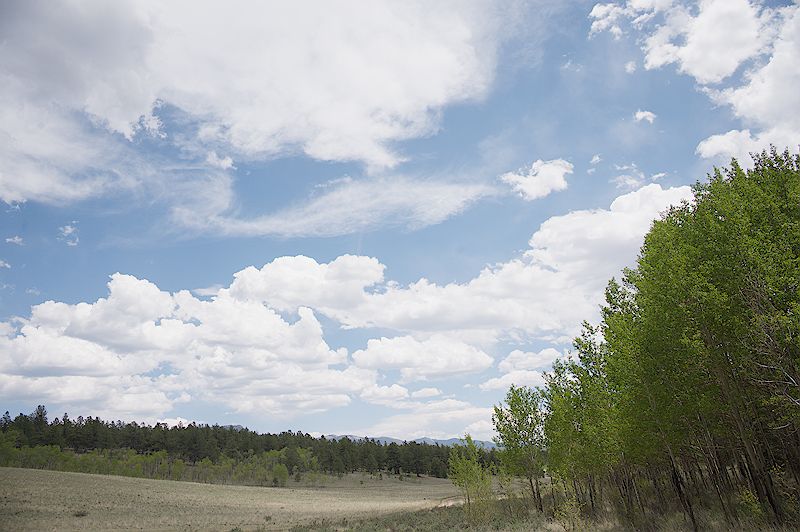
Here’s the raw file, mess with it as you see fit. I am particularly interested in monochrome renders, but I also enjoy regarding the warped ways in which some of you think…
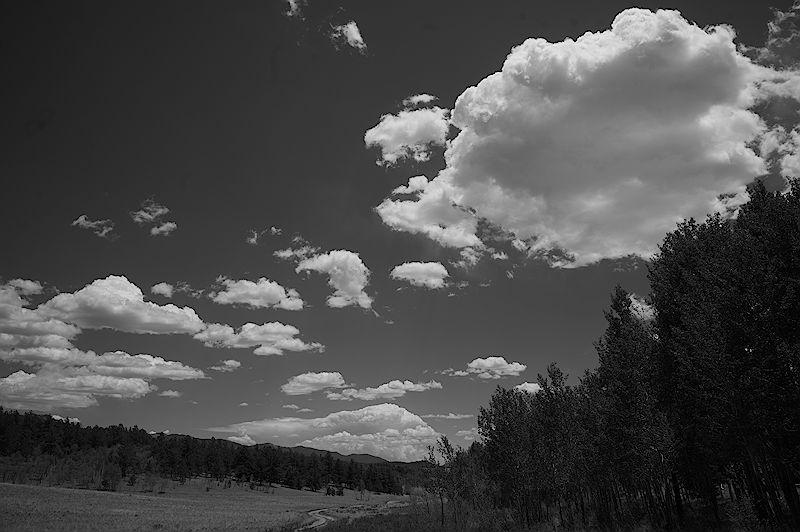
I focused more on getting non-clouds to avoid bus rides to oblivion, than really pushing the cloud/sky contrasts. All in all, I feel like I overworked it. I might come back and tweak things after my eyes have a break.
Honestly I really should rework the sky because I need the practice. I have only just recently got a handle on clouds in color, but there I can rely upon color/variation to provide the contrast and volume without having to rely solely on tonality to do the work.
Finding the balance between tonality, local contrast, and…fluffiness in monochrome still eludes me.
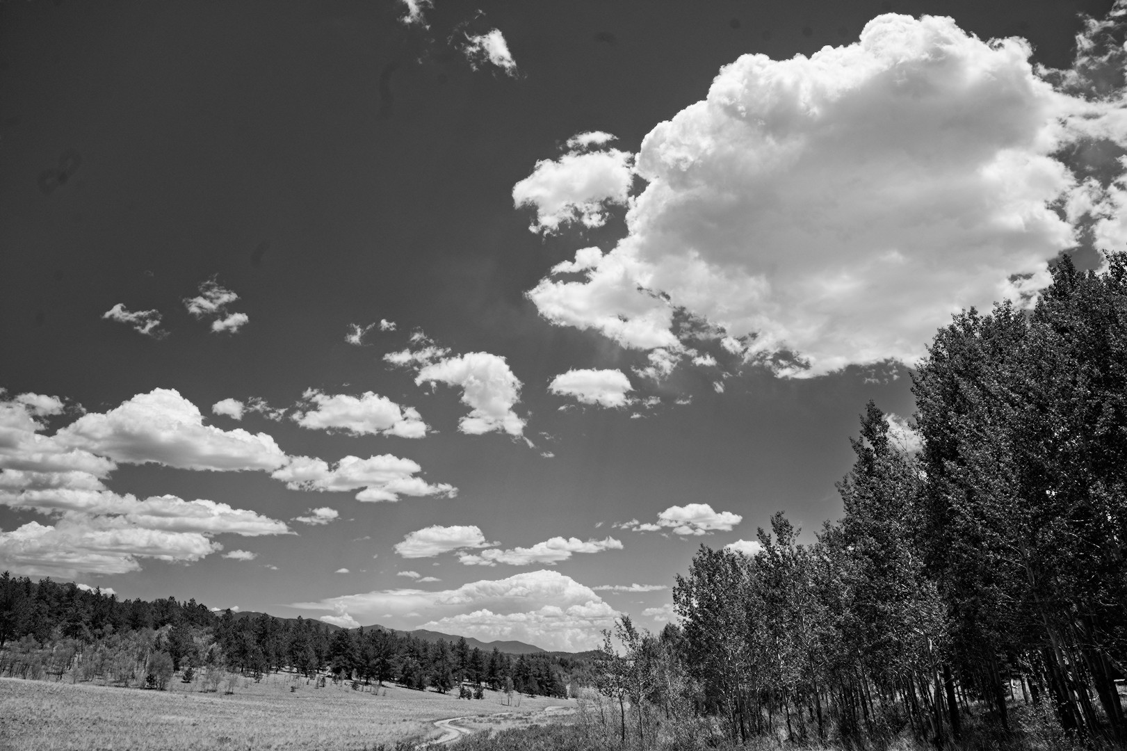
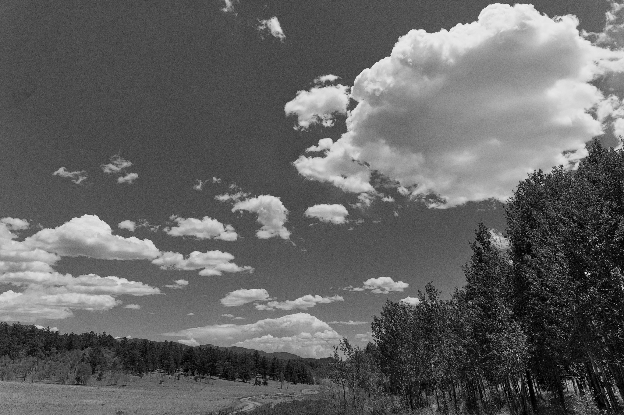
Here’s a try with RT 5.12, inspired by the tonality that @AtaraxicShrug brought out, just to see if I could come close. Added some spot removal, noise reduction, and rotation as well. Not quite there tonally as I’d like, but…there you go.
Cripes, I neglected to go through the image for spots; my sensor needs cleaning.
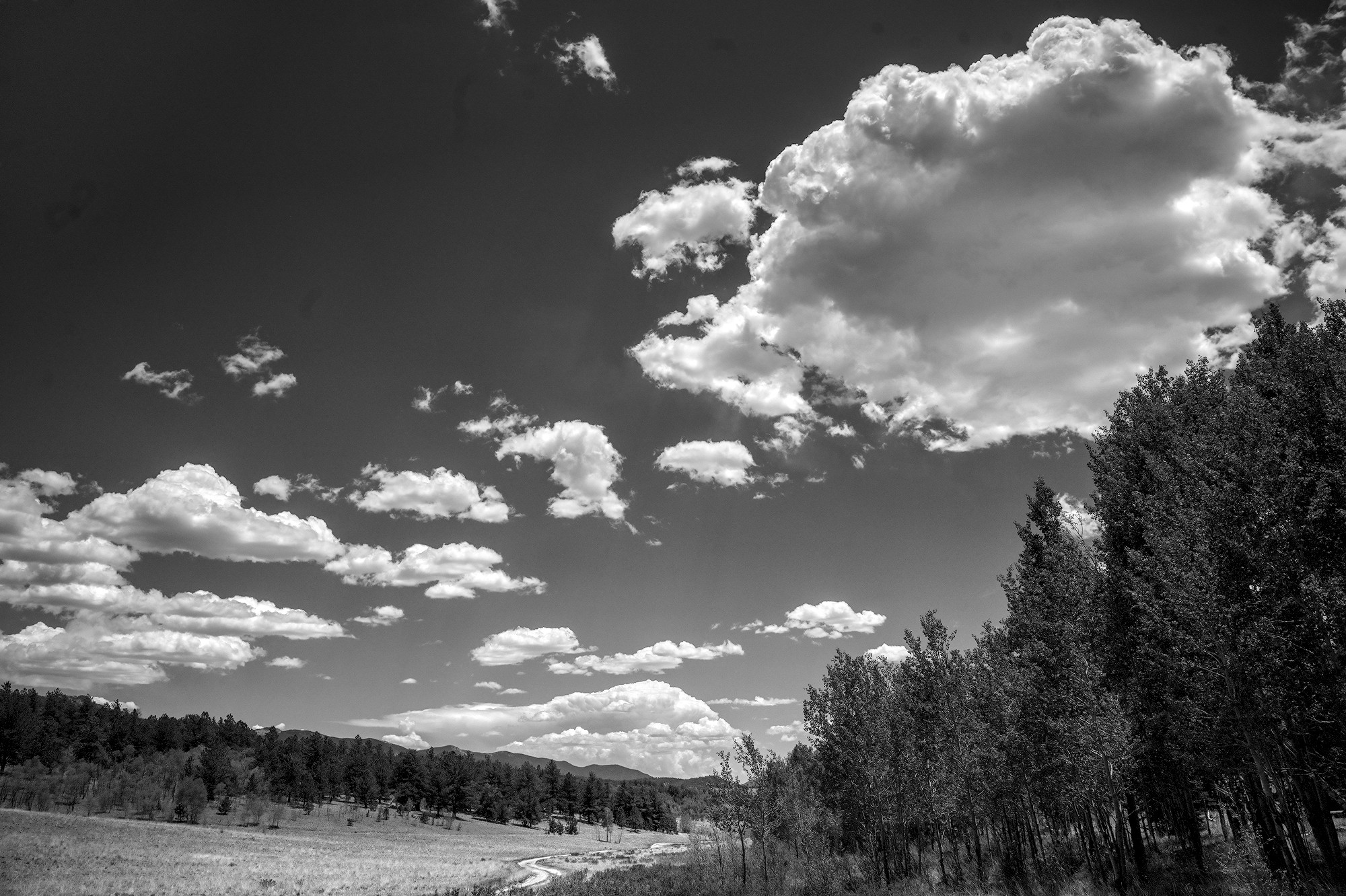
That’s where I’d want the ground to be, but I’m looking to pull the blue sky down to near black. Just saved a 16-bit TIFF for trying out GIMP luminosity masks, something I’ve been meaning to learn. Got @patdavid’s tutorial open…
With a digital camera since it records separate red, green and blue channels you can obtain superior results by shooting a normal color image and just do creative monochrome conversions based upon the channels. GIMP is my preferred software for this. In one layer I would have applied an orange filter effect for the sky, which is very similar to red but has less noise in a digital image. I then would have applied a yellow/green filter effect for the foliage in the foreground. I would have used a painted mask to blend these two monochrome conversions into a single image.
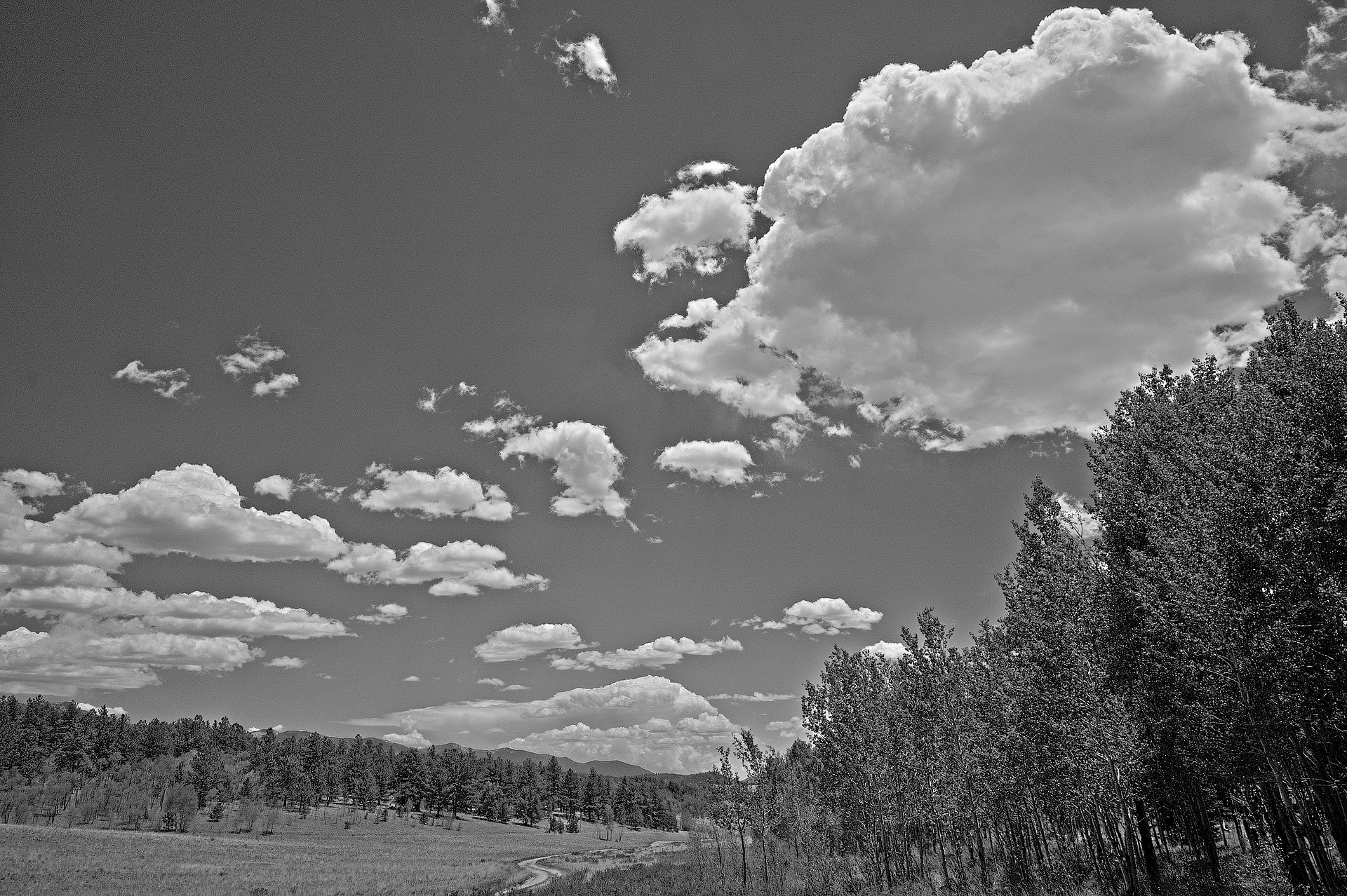
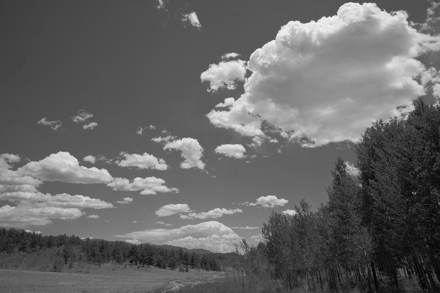
I didn’t use some complex masking. I used the gradient module and liftet the middle lower part of the picture (the meadow) with a drawn mask.
Foreground selection in GIMP works fine and stable on my side as long as you are not trying to make your mask extends to the edge of the picture. If I need to select up to the edge, I raise the canvas size.
Hi
Too lazy to edit but @Popanz is closest to what I had in mind - dark foreground trees, bright flat ground, dark background trees, bright clouds, dark sky.
good capture
Sunday morning at the dining room table with coffee, gets me thinking…
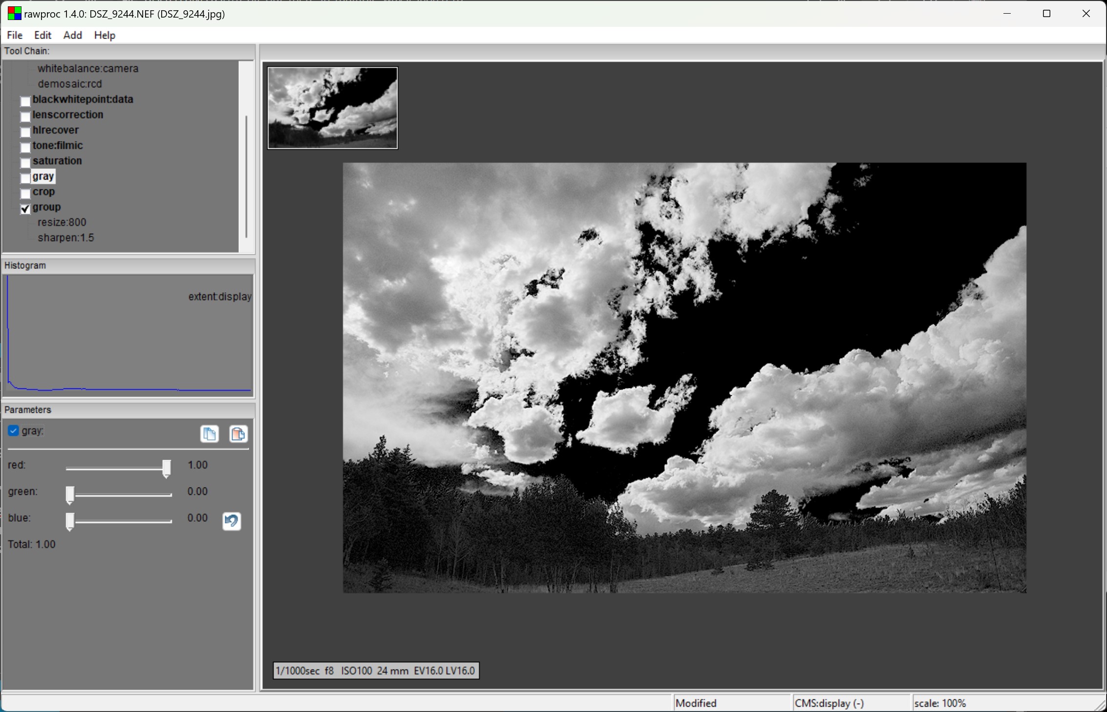
I’ve played a bit in the past with ludicrous color manipulation for grayscaling, since well, the colors lose their intrinsic meaning and I’m just interested in luminance. I took a full-color capture, amped up the nasty HSL saturation, then grayscaled it with just the red channel. First, the nasty saturation, rawproc screenshots so you can see the processing:
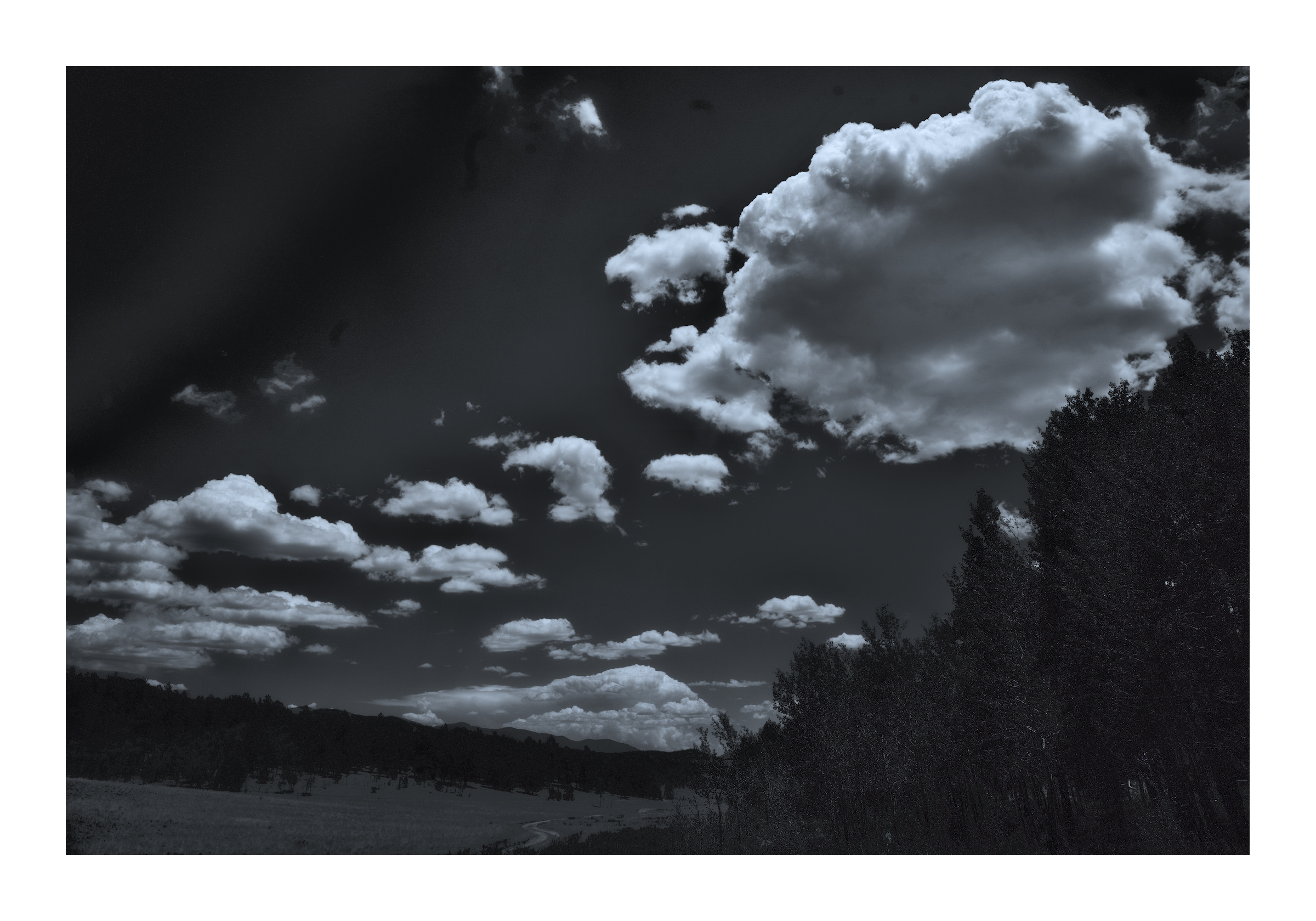
So, make blue as blue can be, then drive it to black in the monochrome render. This starts to approximate what my friend Bob Zitlau was getting with his Pentax, Plus-X, and red filter. Rather extreme, and I think that contrast woulld work better with a scene containing structures, particularly wooden ones.
Interesting…I did try it and even went in to the color balance module, but only to try some process tips I picked up from a video I saw recently.
Still can’t quite explain what I did but I used a multiply blend in the exposure module and may have done the same in the color balance. Ultimately I got to a black and white without adjusting color saturation (only purity), but completely botched the upper left hand corner.