AgX auto tune levels help

20251202_0019.CR3 (24.7 MB)

This file is licensed Creative Commons, By-Attribution, Share-Alike.

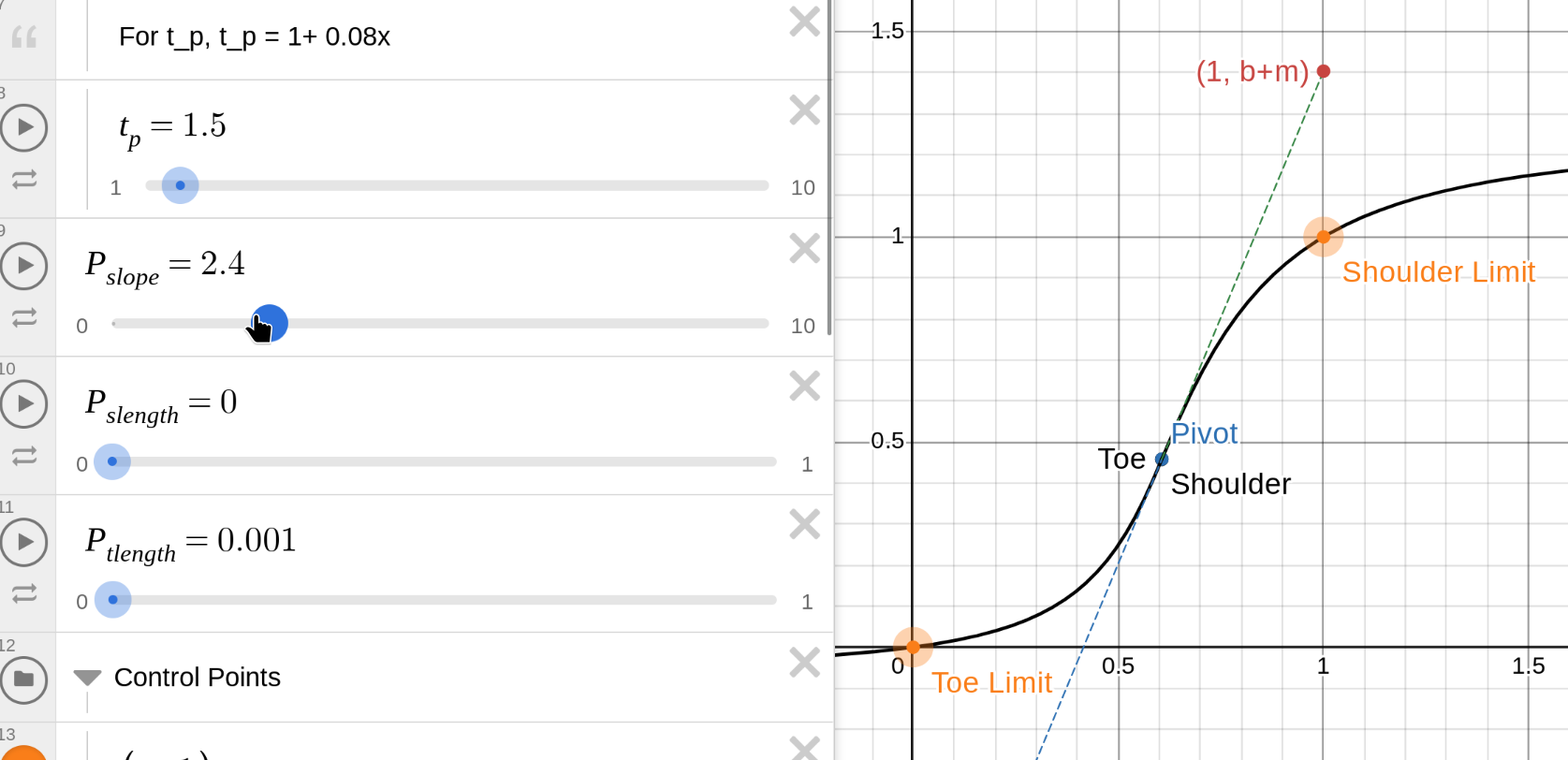
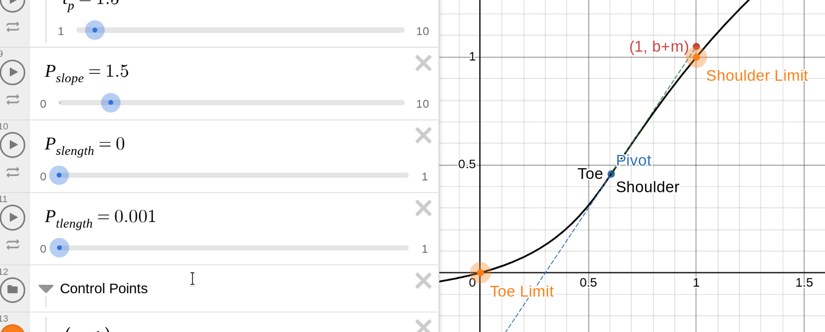
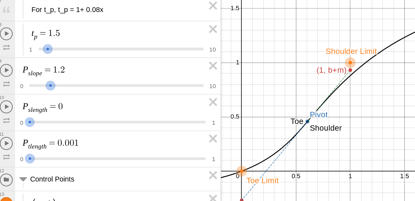
Something I have noticed with many of my insect photos is that the AgX auto-tune levels create the error where the curve is no longer an S-curve. Some of this may have been covered in kofa’s topics but there’s a lot of posts in those…

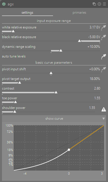
What I’m not sure about is the best / proper way to rectify this, or if it’s even a valid starting point. There’s a few options and maybe more I’m not thinking about:

  1. Increase the white relative exposure. However this reduces contrast in the highlights and can look nasty.
  2. Increase the dynamic range scaling. This seems fine and I don’t have to push it up more to get to a non-error state, but getting the curve looking like an S and not a flat liner requires pushing it up more.
  3. Reduce the pivot input shift. Again it doesn’t take much to get it to a non-error state, but it starts making everything bright.
  4. Some combo of all of the above and more
  5. Just ignore the auto tune levels and manually tweak the levels.

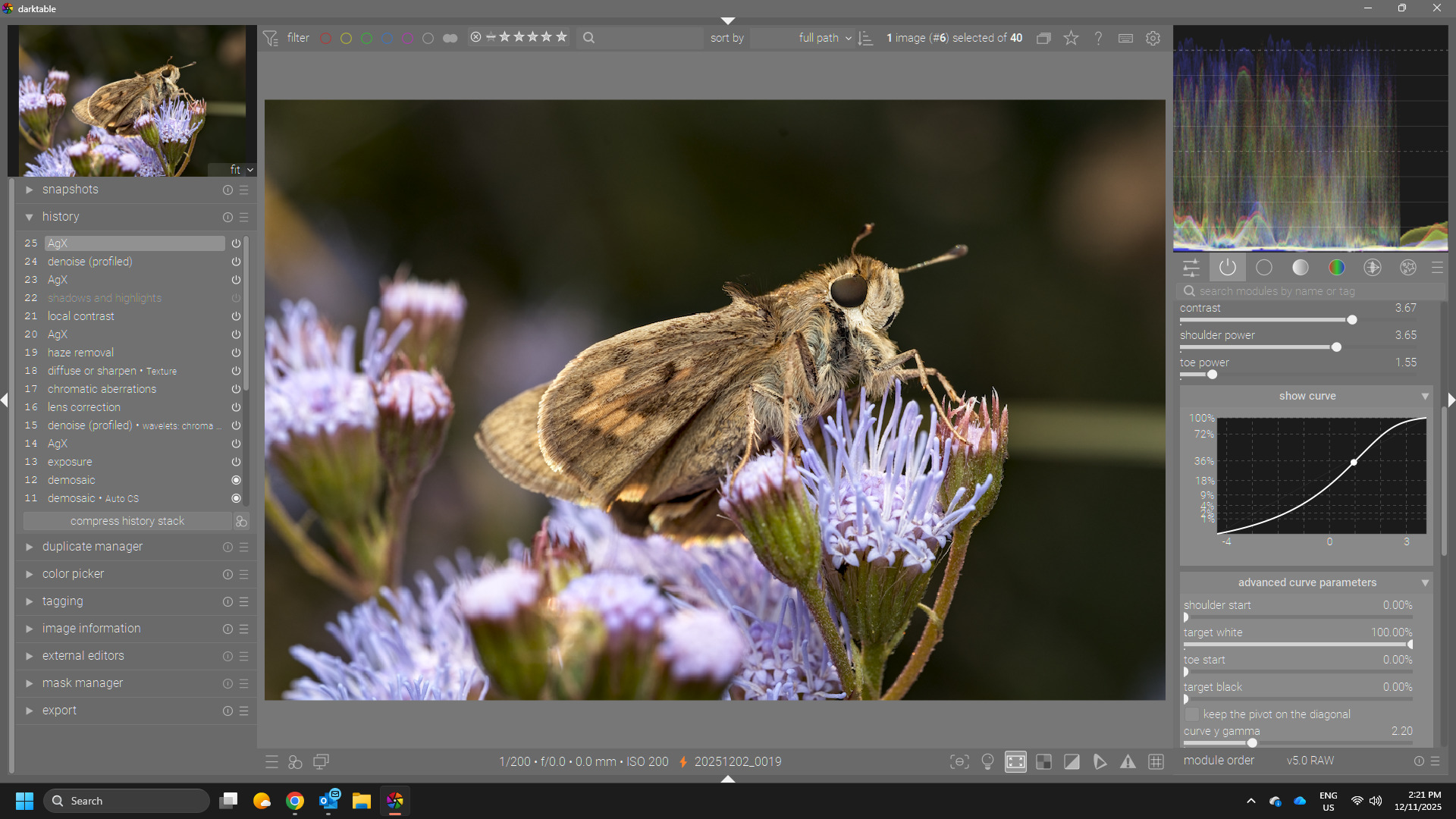
To be honest, most of the time I have ignored most of these controls and simply have brought up the shoulder power to bring back some contrast in the highlights that can be flattened by my flash.

Here’s a version I did with relatively minimal tinkering of the AgX module. Reduced white relative exposure, increased dynamic range, and increased should power mostly.


20251202_0019.CR3.xmp (20.3 KB)

2 Likes

That’s not an error, simply a notification, that the shoulder and/or toe power won’t work (dragging the corresponding slider has no effect). If the image looks OK, you don’t need to do anything. Sometimes a shoulder with increasing contrast (as opposed to the decreasing contrast of the S-curve) looks great.

The tooltip provides suggestions to ‘fix’ the issue if you want to.

3 Likes

Are you following his basic recipe…I see kofa is posting now …if you use the input and output picker and adjust them on your point of highest desired contrast…also work those with the contrast slider it will usually restore the curve…

2 Likes

:man_facepalming:

Didn’t even think to hover over it for a tooltip. Thanks!

Using the input shift picker on this image doesn’t resolve the curve but the other options described in the tooltip make sense.

Still open to seeing how others might handle it even though I feel like a bonhead now :slight_smile:

You can check this graph: Power(P) Sigmoid | Desmos

The slope is P_slope. In this example, you can see that the slope (the dashed line) is plenty to take you from the beginning of the shoulder / toe to 1 / 0:

So, the toe and should can gently lose slope, you get an S-curve.

As you reduce the slope, the dashed line will not rise so fast:

And if the slope is too low, neither the straight blue line, nor the S-curve would reach white = 1:

darktable prevents this by curving the end of the line upwards (for the shoulder), so you can still get white, which usually looks better than bland greys.

The solution is to move the pivot away from the right edge, so dy = dx * slope is enough to go from pivot_y to 1.
Or, to increase the slope, so on the same dx, it can rise more.
Or, to move the pivot upwards, so dy does not have to be so much.

You can adjust the distance between the pivot and the left edge by:

  • ‘moving the left edge’, so to speak: increasing the white relative exposure. The curve may reach 1, but you may not have image data that could be mapped to 1 (there is nothing bright enough in the original image). You could boost that before, by increasing exposure, or using tone equalizer to boost highlights, or color balance rgb to increase highlights brilliance.
  • moving the pivot to the left (decreasing the pivot relative exposure). This also alters where your contrast is.

You can increase the slope: only one way to do it, by increasing the contrast.

You can move the pivot upwards:

  • increase pivot output – this brightens the image
  • adjust the gamma to move the pivot upwards, keeping the output brightness unchanged, but changing overall contrast distribution somewhat

Or you can move the top edge downwards, closer to the pivot, by decreasing the target white output, but then your image will not have whites (unless you boost it afterwards, e.g. using curves or local contrast).

2 Likes

I end up with this…

But it could take many forms as there is so much you can tweak…

I adjusted the exposure first
THen in AgX I use the dual autopicker for black and white…I never touch the DNR slider as the small offset is a sort of overexposure protection out fo the gate you could also set it to zero…I often do.

THen I use the second picker for the input and output sliders below in teh next part of the module. I drew a box up around the head area…then adjusted the output and constrast to taste… in this image I also tweaked shoulder power but it would not be necessary depending on the look you want… I then will fine tune with the look settings…I tweaked brightness and lift…

Then added a few standard modules…no masking or local editing attempted…

My version could easily be made lighter or darker and some local edits on the background or other areas could be added to make it a lot better…

So basic recipe for me and I think something similar was suggested at one point by kofa…

Set b and w and then set the input/output using a region of the image where you want to set peak contrast…then I will tweak the output and contrast sliders to taste…for me this is usually it…then I will fine tune with the look if I think it helps…
20251202_0019.CR3.xmp (13.8 KB)

Here is with the blender punchy preset…

Two clicks in Agx, auto for bw and auto for input/output…just left them at what they landed on and then added the basic supporting modules

20251202_0019_01.CR3.xmp (11.1 KB)

5 Likes

@kofa I often get this warning. I would really appreciate some suggestions from you. When this happens I often presume that the white relative exposure has overshot to the left and pull it back towards the right to get rid of the warning. I am wondering if this is a sensible approach or if you have a better suggestion.

Also on some images I might return to the exposure module and change the exposure setting. Then when I return to AgX and use auto tune I don’t get the warning.

Terry, as I said, it’s not an error. If you want to have control over shoulder (or toe) contrast, you can fix it in one of the ways I described here and in the tooltip.

Ok I think I get it now. The “white relative exposure” and “shoulder power” are sort of doing the same thing: increasing contrast in the highlights by affecting the upper bound of the curve and the shoulder of the curve.

In practice, not thinking too much about the curve or how AgX works:
white relative exposure = big changes to contrast in the highlights, can push things to the extreme
shoulder power = small changes to contrast in the highlights, has an upper limit

don’t care too much on warnings or strange curves. It’s just the result, that counts.
Just if the intended result isn’t as expected, then it makes sense to check the curve or warnings to get an idea of the root cause for it.

1 Like

Suggestion for after the release: Quite a few people seem to interpret the yellow exclamation of the curve losing its S-shape as an error one needs to fix whereas you @kofa intend it to be an information. Maybe switching to a grey (i) might be a sensible UI change?

1 Like

That doesn’t make sense. Users have to learn how to use the tools. If it’s highlighted, then it’s a clear hint on a possible root cause - if you don’t see the expected result in the image.
A different coloring doesn’t change anything because it also needs to be explained - and the explanation is exactly the same…

To me in most softwares a “yellow warning” - I have to make it go away. This isn’t rational or useful in some cases but is engrained into my UX-intuition. From this thread I feel like maybe others might have a similar inclination. But that doesn’t mean a change needs to me made, you do have a point as well.

1 Like

then you‘d better not trust your learned habits when using darktable :wink: if you want to have a benefit of using darktable instead of Lightroom e.g. then you need to learn about the darktable way to control the raw processing pipeline …
There’s quite simple rule: if you can’t see issues in the image, then there aren’t any in the parameters of the tools you’re using.
Keep in mind: you’re editing raw images, not curves.

1 Like

For me a warning seems appropriate as it’s often the explanation as to why the contrast in an image looks un-natural and is a good place to start trying to understand why and what to do about it.

1 Like

I for one am happy for it to be kept orange. I tend to apply a correction to get it out of orange, This is similar to how we were trained with filmic. Maybe white relative exposure is trying to make the white pixels too white.

Filmic is different: there you get clipping, if the curve breaks. Here, there’s no clipping and no tonal inversion. It’s simply not an S-curve anymore, but that does not mean it’s broken. Don’t apply your filmic experience directly to AgX: despite the similarities, there are also fundamental differences.

5 Likes

I think the warning here makes sense because it is “breaking” something, i.e. the should power becomes effectively useless. But it’s not something that necessarily needs fixed.

It’s not an error like you might see in the color calibration module if you have two instances applying white balance, or the lens correction module if no lens info is found. I guess technically these don’t need fixed either but they do indicate that something is more fundamentally wrong.

It definitely tricked me into thinking it was something that needed fixed, but that was my misunderstanding.

Even with color calibration, two instances can be OK if they are masked, balancing different illuminants in different parts of the photo. But I’m getting off topic. :slight_smile:

2 Likes

The more I learn the more I realize agx is right and everything else is wrong :wink:

Thanks for the discussion in this topic. I know all of this was likely covered in the various other topics but following them became difficult for me with multiple conversations going on and seeing 100+ pots since I last looked.