Erm… ![]()
1 Like
All those icons are actually hand-written C code to draw shapes, so I’d rather stick to one of the existing icons. I don’t think there’s an ‘info’. Maybe an eye (‘you may want to look into this?’).
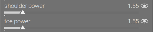
‘Bulb’ is often used in books, instructions etc. as a hint, or something to draw attention to - but doesn’t look right here:

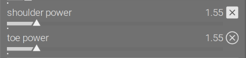
‘cancel’ (effect cancelled or not working) or ‘modified’ icon (adjustment potentially needed)
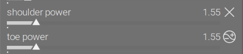
‘reject’ and ‘remove’ are similar:
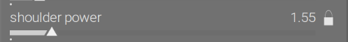
The ‘lock’ icon could make sense in a way (even if you move the slider, nothing changes), but it’d normally be used to indicate something cannot be modified, not that it has no effect:
The ‘switch’ and ‘switch off’ also might make sense, but they are normally used for buttons users may press:
Maybe ‘switch inactive’?

Quite honestly, I feel we would be misusing those icons, and breaking the ‘visual language’ of the GUI.
People can read (well, can but most don’t, but they can still watch YouTube videos, at least), and will get used to the warning icon, I think. It’s not displayed as prominently as the duplicate white balance warning. And I can update the text to say ‘this is not an error’, and change the wording so that it sounds less threatening:
Now:
the curve has lost its ‘S’ shape, toe power cannot be applied.
without inverting the toe (forcing it to bend downwards), it would be
impossible to reach target black with the selected contrast and pivot position.
increase contrast, move the pivot lower (reduce the pivot target output or…"
Could be:
toe power setting is ineffective, as the curve is no longer S-shaped.
without inverting the toe (forcing it to bend downwards), it would be
impossible to reach target black with the selected contrast and pivot position.
if you see artifacts, or wish to regain the control, try the following:
increase contrast, move the pivot lower (reduce the pivot target output or…"
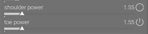
Looking through your experiments I think an exclamation mark is probably the most fitting. Placing it next to toe and shoulder power might make sense as it affects these controls.
That’s why it’s there. If you mean next to the labels, not to the sliders, I don’t think that’s possible.
1 Like
I wanted to confirm that your placement in the provided pictures makes sense to me :-).
I feel the UI as it is works well. Maybe the warning text could be tweaked for more clarity if anyone is confused.
To add my humble experience here, I get the curve warning a lot too, but it has its reasons:
As the general praise goes, AgX can treat the edges of the dynamic spectrum much more gracefully than Filmic. This allowed me to realize that I had developed an unconscious automatism of “underexposing” my images in the exposure module when using Filmic, since it could have some pretty harsh contrast along the white and black extremes, which could highlight the noise and lines in the shadows in low-light photography (thanks to my cropped sensor).
This means that I now can and should re-do the exposure module step of most of my RAWs before applying the color picker auto-tuners. Quite a bit of work, but really worth it.
Before you start, you may want to re-calibrate your hot pixels module to really find the sweet spot fitting your camera sensor’s behavior without losing details. In my case, it was not aggressive enough before.
To be sure, you can only use the colorpicker-autotuner in AgX and expect a functional curve (without inversion warnings) if the scene - and the way you captured it - has resulted in a sufficient dynamic range:
Mountains in the distance, the opposite shore of a wide lake, anything in the mist: All this may lack contrast (meaning the full dynamic spectrum isn’t used), and if you just slap the colorpicker-autotuners on top of that, it may result in a weird ratio between the range below and above middle gray that is way off balance, threatening in turn to invert the curve.
It also implies that you cannot just “artistically” under- or overexpose via the exposure module too much, straying too far from what your sensor captured, and still expect the autotuner to do all the rest of the work. You’d have to change contrast, or the dynamic range slider, or the relative dynamic range sliders themselves - if you want to use the full dynamic spectrum and avoid the weird sudden local contrast next to middle gray caused by an inverted curve. For me, such artistic shenanigans require too much fidgeting. All I want is a well-“readable,” normally exposed image, only correcting faulty exposure in my RAW due to erroneous technical settings in-camera. In my experience, many otherwise normal images get a curve warning in AgX because they are “underexposed” in the exposure module.
For me, a great help to finally get it right was to go back to the zone system, particularly that described in Freeman’s “Perfect Exposure” (2015), especially on pages 126-127 and 132: Each zone is linked to a brightness level which (at least with the levels around mid-gray) can be used as a target value for area mapping in the exposure module. One important thing to remember is that different skin types correspond to different brightness levels under normal illumination, with e.g. Caucasian skin landing in Zone VI, i.e. 67% brightness and not middle gray. Finally, it matters where to place this value: Neither on the highlights (direct reflections of light on greasy skin) nor in the complete shadows, but rather in the “normally-exposed half-shadow” on the side of the face, as Freeman points out with an arrow on page 132. In my experience, this works as a great helper to prepare images with “normal” scenes for the auto-tuners in AgX.
2 Likes
I think it’s not necessarily underexposure: in AgX (and filmic, and sigmoid, as far as I know), mid-grey is at value 18%. As long as you only have reflective surfaces, you cannot go brighter than 2.5 EV (100%) above that mid-grey, if my understanding is correct. In a studio portray shot, only the eyes, teeth, jewellery, sweaty or oily skin (glare and specular reflections) would be righter than that.
In the table I found on Wikipedia, the highest reflectance of skin was about 65%, which is log2(65/18)=1.85 EV above mid grey (would match with zone 7, ‘very light skin’). That would map to L=116 * 0.65^(1/3) - 16 ~= 85 in CIELab, I think.
2 Likes
I didn’t want to upload the screenshots from the pages, since that might get me in trouble as copyrighted material, but your calculation is impressive.
I guess to compare, I can quote some factoids from the Freeman book (p. 126f.).
| Zone | II | III | IV | V | VI | VII | VIII | IX |
|---|---|---|---|---|---|---|---|---|
| Brightness level | 26 | 51 | 85 | 128 | 172 | 205 | 230 | 255 |
| Brightness in percent | 10 | 20 | 33 | 50 | 67 | 80 | 90 | 100 |
| Reflectance in percent | 2.25 | 4.5 | 9 | 18 | 36 | 72 | 100 | |
| Features | first shadow texture | textured shadow, detail | typical shadow | dark skin, light foliage | caucasian skin, overcast concrete, shadows in snow | pale skin, bright concrete, yellow/pink/light colors | bright white | specular highlights |
(Freeman adds that [I guess considering tonemapping] the numeric values towards the extreme ends of the spectrum become unreliable, but we’re not talking about zone IX or I anyway.)
I think my error in the past was to place 67% brightness (i.e. zone VI for caucasian skin) on reflected specular highlights of a face, which would land the “actual” normal surface in a much darker zone. Of course, that also depends on the scene (frontally lit, backlit, dispersed lighting etc.), and in many cases, you can do this to produce a nice low-key image, but if those facial highlights were the brightest spots of the whole image (with a dark background), the curve may not have have enough headroom to reach white.
I’m sure you know the numbers better than me, but in my experience, there’s a warning if (in AgX) the white relative exposure gets lower than 3.15 EV (though this is certainly “relational”). Often it only takes a bit of brightening to reach the minimum of a straight-ish non-inverted right end of the curve.
One can play ‘zone system’ with darktable, too. ‘pale skin’ (highlights on skin) should go into zone 7, 2 EV above mid-grey. One could spot-meter from there, and dial in +2 EV compensation, or…
Taking the image of the lady, I turned off AgX and adjusted the image to get L=85 on the lightest part of the skin (corresponding to linear luminance 2 EV above mid-grey, as established before), the directly illuminated forehead:
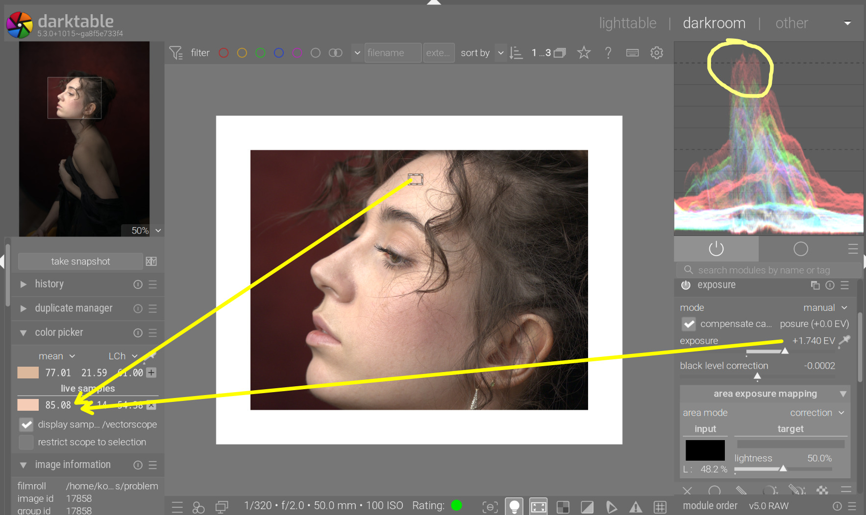
Red already goes into clipping (see the RGB parade).
Turning on AgX resulted in a dull image (there were no real highlights, but AgX was trying to compress the range anyway. The L reading of the forehead dropped to 76:
I pushed shoulder start into hard clipping (only the curve clips, not the colours in the image, we have plenty of headroom, as the image does not fill the 6.5 EV white ‘buffer’). That gave us an L reading of 80:
I increased contrast until I got that up back to our target, 85:
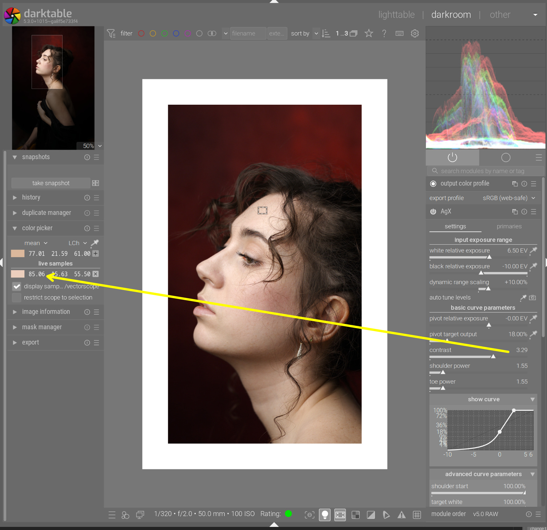
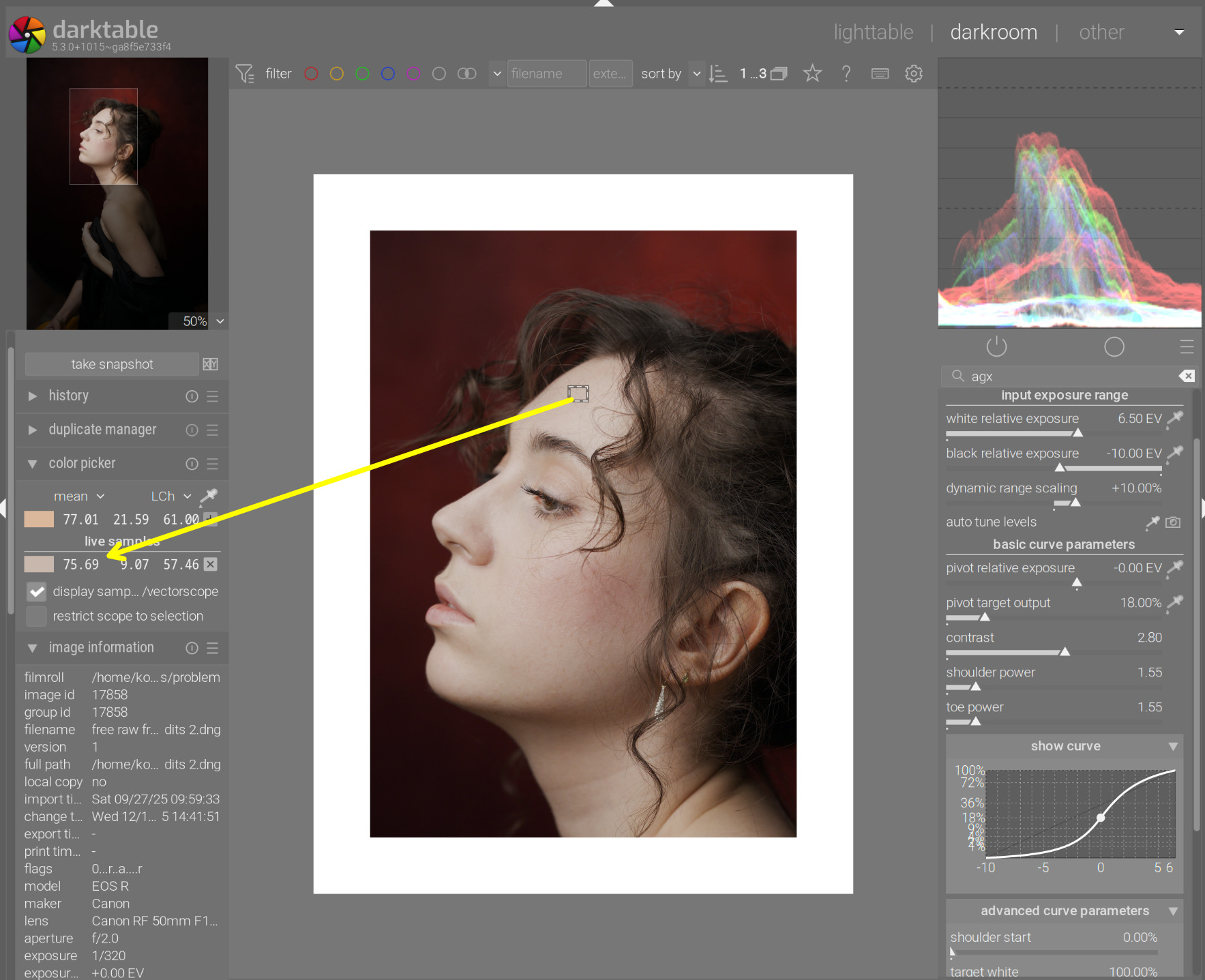
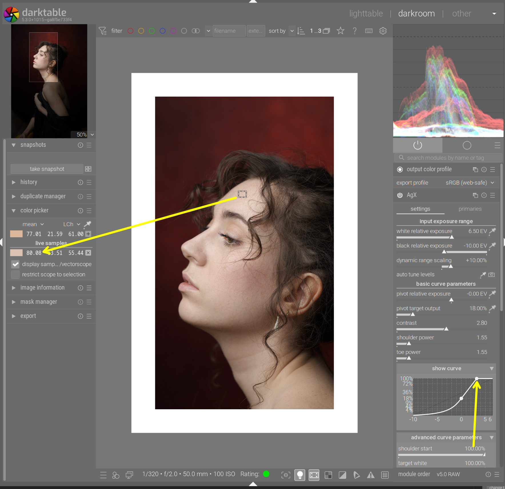
I dropped the shoulder power to 1, and reduced shoulder start until it started affecting the reading (so the (curve’s) shoulder ends on the (model’s) forehead – a bit of mixed anatomy):
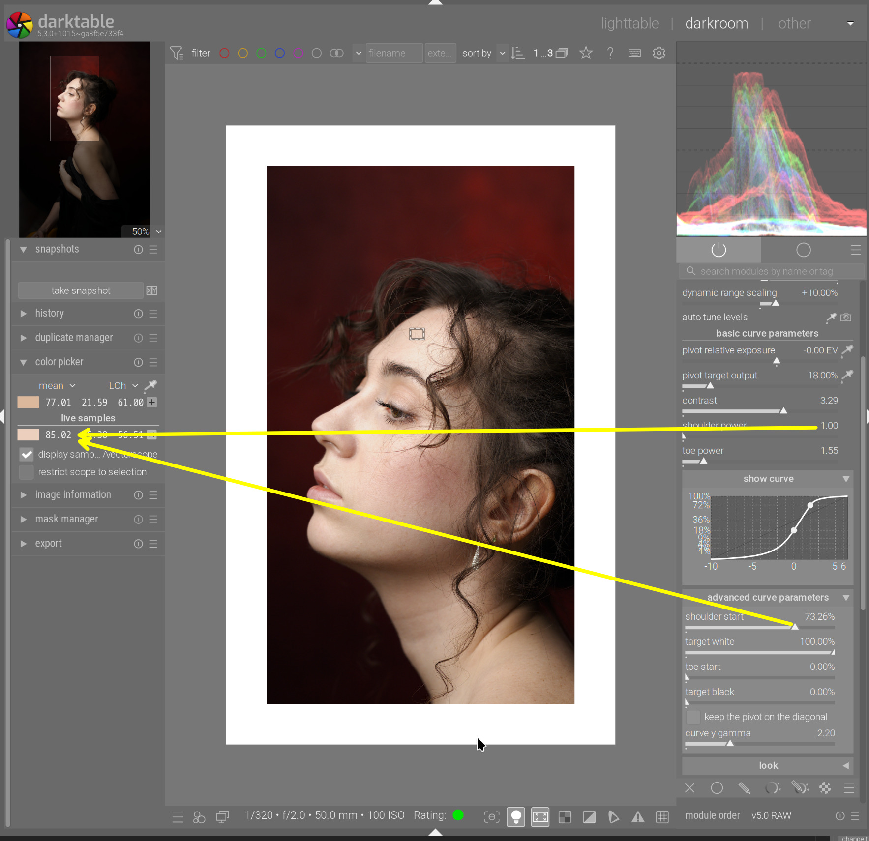
As there is very little that’s brighter in the image than the forehead, the shoulder power doesn’t really do much. Power = 1 vs 10:
We could increase the contrast further, reduce the shoulder start, and regain control of the shoulder power:
(with contrast = 3.5 and shoulder start = 50%)
And just to confirm, picking the values from the image shows a white relative exposure of 2.46 EV, which matches the expected theoretical value of log2(1/0.18) ~= 2.4739 pretty well. ![]()
11 Likes
I got a lot out of this post. What you are saying lines up well with my experience and has helped me finalize some ideas in my head. Thank you!
1 Like
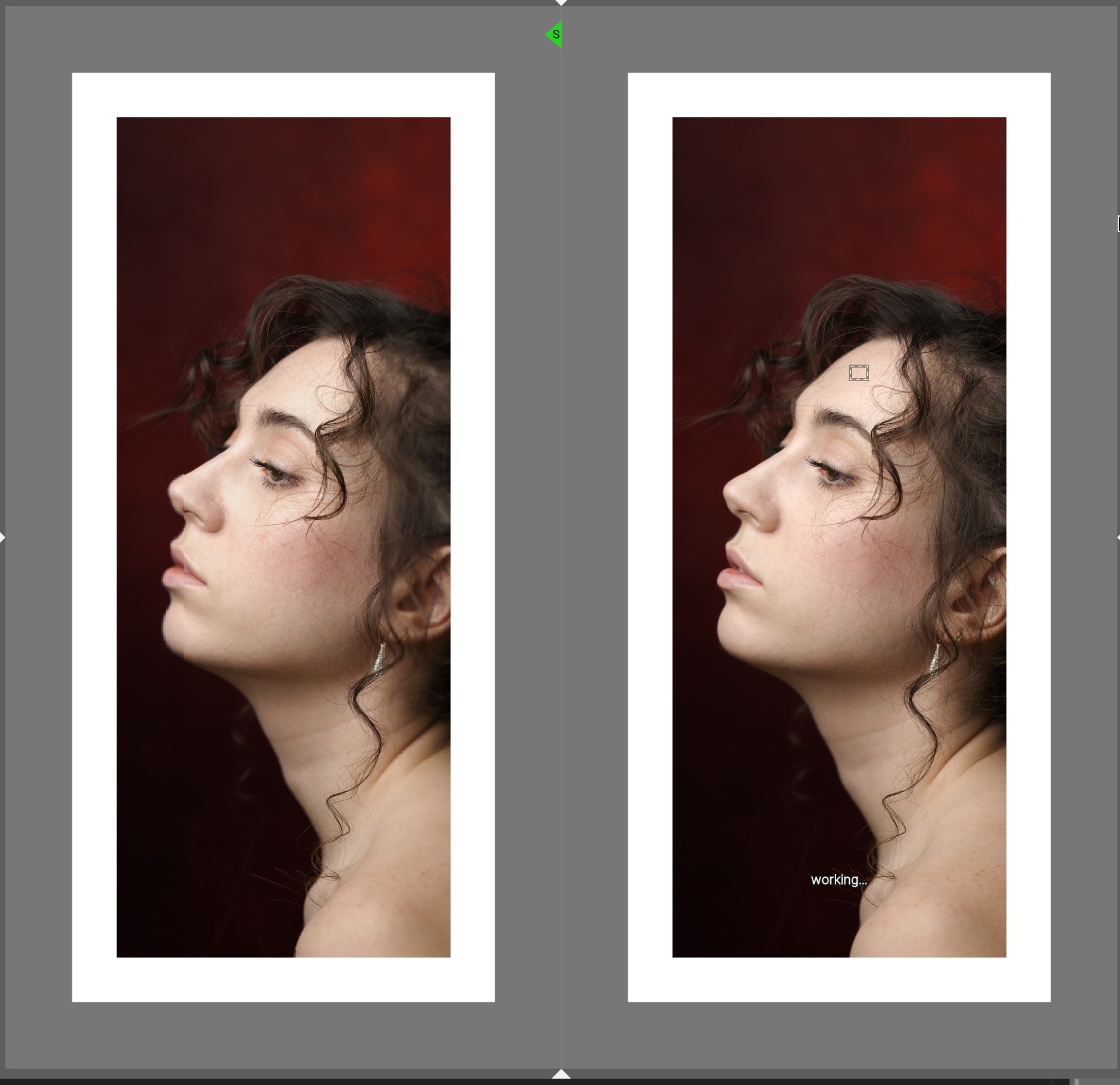
Thanks for sharing that demo. I’d like to play along. Do you have the source of this image?
It may be from
If not you might be interested…ignore if you are aware of the source.
Lots of models with a wide variety of lighting and skin tones to play with…
Lots of great colors in many shots…
Again ignore if you already know about the site
EDIT:
It is there…
4 Likes
5 Likes
Thanks, Todd! I’m obviously missing something. How do you locate images in that site? It seems to be a giant database with no filtering or tagging and you can only see 5-10 images at a time as you scroll.
Edit: I found it, just by scrolling a lot. I don’t know how many images there are but I found it within a few minutes. I let my eye look for dark red background and white skin. Knowing it could even be found helped me find it… I’ve tried to find darktable tutorial images in that site before with no luck. The video creators never seem to link them.
This is the download link, which should persist unless they periodically expire and regenerate the links:
https://drive.usercontent.google.com/download?id=17Nqm5PZA1QuAThWMSkS47Uakd1dweisp&export=download
2 Likes
I always have to scroll…There is a great variety of images to experiment with … Glad you found it…
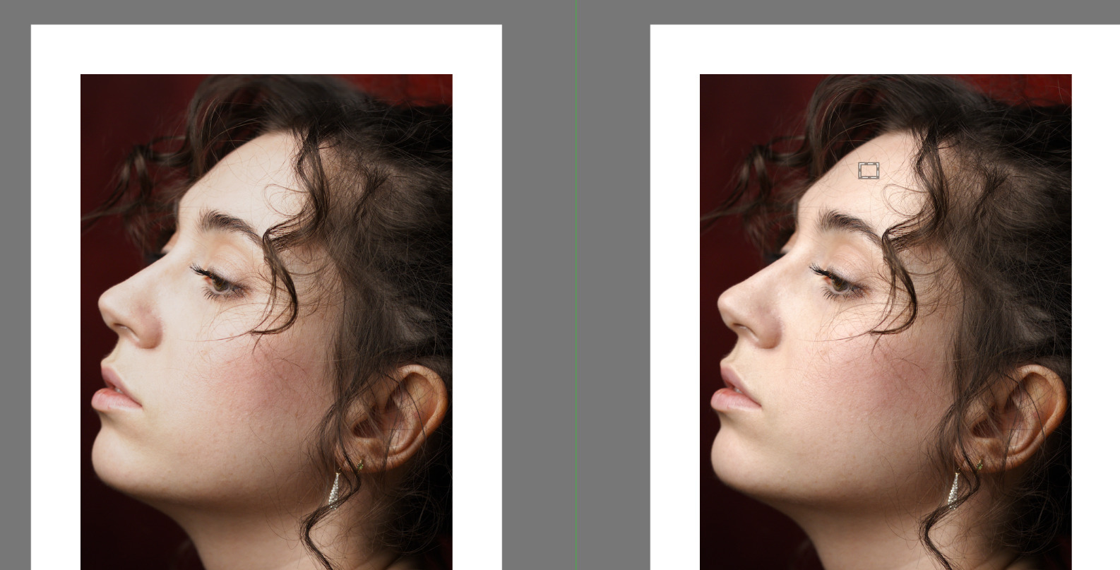
This topic also helped me a lot with AgX, especially the ‘yellow line on AgX curve above pivot = increasing contrast’ statement and the process and maths in the skin tone demonstration. Main reason I’m here was to look for help with that. I’ll leave the edit I’ve done here as well. It’s a lovely picture.

20251202_0019.CR3.xmp (17.7 KB)
3 Likes
I have just downloaded the image and tried to follow you step by step. I realised - without much surprise - that I know NOTHING about AgX and how to use it. After going through your adjustments, the result is much better than just AgX defaults: more detail in the shadow, smoother highlights… it’s great.
The most attractive lesson I see in your writeup is that it sounds like there’s almost a deterministic process to get good results.
Is there a place where I can learn step by step how to use AgX PROPERLY?
Thank you (for the writeup, and the module itself of course).
There’s a manual page, quite a few videos on YouTube (in several languages), and people have written blog posts, so you’ll find something that suits your style of learning, I’m sure. And here’s the forum, too. ![]()
1 Like
I have found the auto tune levels eyedropper (picker) a great starting point. for 99.999% of photos it sets the white and black relative exposures to my liking. I then use the pivot target output picker which sets the pivot relative exposure slider as well. I then manually adjust pivot target output slider to get the brightness I want. BTW, I use the sigmoid like preset that Kofa provided in one of his many posts.
This is my workflow and I am sure there are many other approaches as well. Of course read the manual and understand how all the sliders work. Toe and shoulder sliders are helpful with many images. Increasing the contrast slider also increases the saturation as well.
It is a relatively easy module to use.
1 Like