Thanks for the suggestions, I think I’ll update the docs based on those.
No, it’s not. In filmic, you can only choose the point that will be mapped to mid-grey (the output value is fixed). In agx, you choose your pivot freely; by default, it’s set to map mid-grey input to mid-grey output.
One slider moves the pivot relative to mid-grey. That’s why I called it a shift, to convey it’s not an absolute value, but rather a shift. It’s not in EV or in any absolute measure, but a ratio of the distance from the left or right side (depending on the direction of adjustment). Even the ‘step size’ is not the same; a 50% adjustment, if you have the black relative exposure set to -10 EV, will move you to -5 EV, but if your relative white exposure is at 4 EV, a 50% adjustment will move you by 2 EV.
The output is not the brightness (a perceived, non-linear quantity), but the output power (signal value), a linear, physical quantity. I didn’t want to add the technical term power, especially given that we already have toe / shoulder power, where it’s in the mathematical sense.
Finally, ‘pivot position / point’ would be ambiguous, I’m afraid.
Diagrams are hard to maintain (especially with translations), so we avoid them where possible, unless we think they’re easy to replicate or unlikely to change. As soon as something changes that affects the diagram, we’d probably drop a more complex diagram before updating it.
Generally I’d rather use the technically correct words and then explain them, than try to dumb it down so people don’t need to learn new concepts. I’m not convinced that polls are necessarily the best way to decide whether something is correct or not.
I fully agree with Chris. There is also a Dunning-Kruger effect. Some folks will offer suggestions to concepts they don’t understand yet and have not taken the time to even read the documentation.
Voting for leaving as is. While it’s tempting to simplify, water it down or what not, leaving the technical, mathematical term would be the accurate way of dealing with it. I understand that we want to make things easy for users, but AgX is an expert tool nicely wrapped in a user-friendly UI. The place for the layman or colorist-leaning terms is in the documentation. The learning curve may be steep, however the benefits far outweigh the time spent mastering it. Having a few canned presets is more than sufficient to get the user quickly started, just like Sigmoid did.
Later edit: Leaving the mathematical terminology intact also prevents changes in interpretation of what a value looks in the slider vs what it inputs in the algorithm. I think it’s good to stay consistent between the two.
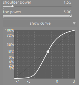
Ah I get that. I always wondered why there is such a lack of illustrations in the docs. How about diagrams with generic pointers like (1) or (a) - I think in this case it would really benefit new users in understanding the curve controls.
Is there any way to add screenshot creation to whatever document build flow you’re using? That way they will be automatically updated for each release?
I would prefer to force my self to learn the correct technical terminology that is accurate than to have an inaccurate layman’s term. I see now that contrast in shadows or highlights would be misleading because as
This is an advanced module after all and as I have said already the description upon hover mouse is clear and informative. But I default to what @kofa decides since he has put all the work in.
Sure but again, they need to be as simple as possible and illustrate basic concepts that we don’t think will need subsequent updating, because I’m not keen on having to keep diagrams up-to-date.
Regarding toe and shoulder: I like the terms in principle because they are well established. But people who do not know the terminology may find them non-intuitive. Maybe add an annotation to give context - like
You are correct, I also think they are non-intuitive for people (there have been some comments under Boris’ video, and on Reddit). Unfortunately, there’s limited space on the UI, especially on the Quick Access Panel, which is one of the beginner-friendly features (advanced users often use keyboard and mouse shortcuts instead, I think). We already have a tooltip to provide additional info.
I‘d not expect intuition can help using a module in a photo editing environment which originates in blender. The user needs to learn how to use the tool - not try to see it as an enhanced lightroom curve tool …
Intuition is driven by that what you spent time to learn
Sure, maybe the word ‘intuitive’ is not the right one. But an end user does not care if the slider uses a power function or dark magic, as long as it works, so shadow / highlight contrast is tempting, as it describes the function, not the means (the what, not the how).
I would have thought the whole primaries business would receive more feedback / criticism, as in my eyes it’s rather different from from the usual ‘saturation’ and ‘hue’ (or curve) controls. Maybe it’s so esoteric that people cannot even suggest something. I have no idea if it could be made more ‘user friendly’, without losing technical accuracy / meaning.
The primaries are intuitive and clear if you understand what they are. I guarantee than 90% of the users will not even click on that tab, they will select a preset, tweak the basic controls and the look sliders a bit, and have their final image. The documentation is the Rosetta Stone for that tab.
I have a small suggestion regarding the order of the two sliders: As the toe influences the bottom of the curve and shoulder its top, I would like to suggest exchanging the sliders:
The look > power slider for me also has a reversed behavior, as moving left makes the image lighter and darker to the right. I would have expected it the other way round.
No, me too. It should also be consistent with the power slider in Color balance rgb, which goes darker to the left. I also agree about the order of the toe/shoulder power sliders.