Agx terminology (UI)

As I understand, it’s color balance rgb that inverts the value provided on the user interface:
d->midtones_Y = 1.f / (1.f + p->midtones_Y);
(midtones_Y is connected to the slider power → luminance)

My implementation follows ACEScct Specification - ACES Documentation (with offset tweaked a bit).
You can also check What Is A CDL And When Do You Use It?, CDL, Color Decision List Explained - blog - Lowepost, An in-depth look at ASC-CDL based color controls - Pomfort.

1 Like

Thanks for the links. Perhaps I understood the formula of the linked articles wrongly, but from my understanding, power of a value p>1 leads to an output increase, while p<1 leads to a decreasing of the output ? The current center value of the power slider is currently 1, so moving it to the left should decrease the output?

Think back to school, y = x^2 (power = 2) between 0 (black) and 1 (white). What is y, if x = 0.5 ?

How about y = sqrt(x) (power = 0.5), when x = 0.5?

1 Like

edit: OK, I haven’t thought of numbers being between 0…1 :slight_smile:

Yes, that is (almost) the formula I have implemented. Only my offset is a bit different.

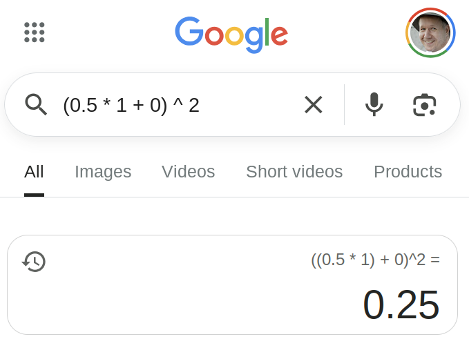
But even with the original formula, substitute in = 0.5, slope = 1, offset = 0, power = 2, then:
out = (0.5 * 1 + 0) ^ 2 = 0.25.

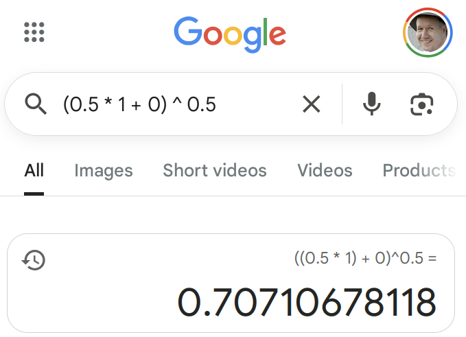
With power = 0.5:
out = (0.5 * 1 + 0) ^ 0.5 = 1 / sqrt(2) ~= 1/1.41 ~= 0.707

1 Like

Thanks @kofa, yes you are of course right. So it is just the “mismatch” of (my) user expectation (intuitively pulling a slider to the left expects a decreasing, whereas to the right expects an increasing) with the impact in the context of the underlying maths :blush:

Could we use “shadow rolloff” instead of “toe power”?

shadow rolloff and then a number looks weird, I think. shadow rolloff strength, perhaps? (I assume you mean the variant with shadow/highlight rolloff start).

1 Like

Yes, I get that a lower number gives a brighter image, but I think that misses my point. I didn’t want to bring in other software, because “this is how others do it” often backfires in this forum. Nevertheless, I can say pretty confidently that during my 35 years as a colorist in the tv world, I have almost never come across a way to adjust an image, either with hardware or software, that was anything else than left/counterclockwise means darker and right/clockwise means brighter. The only exception to this was lift/gamma/gain with negative film on a telecine, and that is because the negative is converted to positive after those controls.
The gamma control in daVinci Resolve is also the CDL Power, but turn it clockwise on a control surface or drag the slider to the right and the image gets brighter.
I think consistency is important, so a universal tool like a gamma/power control, that exists everywhere, should behave consistently, even though you can say that it is not matemathically correct. I don’t think most users care about the underlying maths, I think they want to drag a slider to the right to brighten the image.
Just my two cents about this. I don’t participate too much around here, I just wanted to say that I agreed with @Macchiato17 . Other than that, I love the AgX module so far, I think it will be a great addition to darktable.

9 Likes

OK, you have a point. Let’s ask what the others think.

look power
  • keep ‘power’ as-is: lower / to the left: brigher, higher / to the right: darker
  • flip it around: lower / to the left: darker, higher / to the right: brighter
0 voters

I’ll close this on 10 October in the evening CEST.

Edit: if we flip the value around, I suggest that it be called brightness.

3 Likes

You don’t even have to go other software to prefer left:darker and right:brighter. It’s also how most of the other modules in darktable are organised (histogram, exposure module, etc.).

2 Likes

For the look, I’ve discovered that the kind of offset tweak I did, which does not simply move all values up and down, but affects mostly the blacks, is called lift, even though the canonical formula is different (lift(x) = x * (1 - lift) + lift, or x + lift * (1 - x), adding all of lift to x if x = 0, and not adding anything if x = 1).

You can compare the two at lift vs current dt 'offset' | Desmos. Even though the effect is the same, I think the parametrisation (including usability) of the current dt solution is better: observe how asymmetric the y_l (lift) parameter, l is on the graph, running from -9 to +0.5 to cover the same range as o (the current darktable ‘offset’ in the look group), which runs from -0.9 to +1 to cover the same range, with 0 being the neutral position for both.

So, based on this, I suggest renaming offset to lift, but keeping the algorithm. ‘Like’ this post if you agree, otherwise post your objection below.

19 Likes

Well, my only objection is that I am used to using it as “offset”. I guess I could get used to “lift”.

Sorry that I don’t have the vocabulary to describe the UI elements in detail, but: if the voting decides for the renaming of toe/shoulder power to something like contrast in shadows/highlights, would it be interesting to have a subsection named “contrast”, just like the one that says “basic curve parameters” with the line spacing below, and then the three sliders with something like “midpoint”, “shadows” and “highlights”? My thought is that renaming “contrast around the pivot” to simply “contrast” takes away some important information about the slider. If there’s a dedicated subsection for contrast, you don’t have to repeat the word “contrast” and you can convey all the information about the sliders with a single word.

edit: This comes solely from my user experience, but I’ve rarely used the “pivot input shift” and “pivot target output” sliders, maybe they could be moved down to the advanced curve parameters? I know there’s a cohesion in having them together with the “contrast around the pivot” slider - you’re adjusting everything about the pivot point in one sequence of sliders. But if others can relate to this, maybe it makes sense to move them down and have the subsections as “input exposure range”, “contrast” and “advanced curve parameters”, and so on… It might simplify the experience.

1 Like

I like the proposed clean up (the fact the sliders are renamed in the hint popups says a lot) but I would propose deeper changes to sections:

  • show curve → curve, move it to the top and make it always visible. Ideally, some handles (pivot) could be editable/draggable directly on it.

  • input exposure range → input levels, containing:

    • pivot input shift → midtones brightness, use 0-100% scale with 18% as default
    • white relative exposure → white brightness
    • black relative exposure → black brightness
    • advanced (or simply remove them completely as they are mostly redundant)
      • dynamic range scaling → dynamic range
      • auto tune level → auto tune
  • basic curve parameters → output levels, containing:

    • contrast
    • shoulder power → contrast in highlights
    • toe power → contrast in shadows
    • pivot target output → midtones brightness
    • preserve hue (from the “look” section) → preserve highlights, with “saturation” on the left and “hue” on the right (I would prefer the default to be changed to “hue” as this is the main advantage of AgX)
    • advanced
      • target white → white brightness
      • target black → black brightness
      • shoulder start → highlight start
      • toe start → shadow start
  • Look [redesign/move to another module?] - this whole section (except preserve hue) feels like it does not belong to the AgX module. It interacts with / duplicates some of the settings above but it does not affect the curve. the changes are not visible on the curve preview. At very least I would like to see (another?) curve it is shaping. Better yet, it would be moved to a different module, so that it can benefit other processing pipelines as well.

  • Primaries - loose comments as that is a topic I am the most confused about

    • From Boris’s video I understood the rotation and desaturation/attenuation is applied only to highlights (to preserve their perceived hues) but this is clearly not the case - changing attenuation/rotation sliders affects the whole image.
      • How about adding a “highlights correction” section (as an advanced settings for “preserve highlights” slider above?
      • Do we even need a generic primaries manipulation in AgX? The same comment as for the “look” section applies - it could be moved to a separate module. In fact, there is already “RGB Primaries” module doing pretty much exactly that.
    • The split between “before/after tone mapping” is very confusing. Especially the “after” part.
      • What it is for?
      • What is the meaning/purpose of “set from above”
      • What is the meaning/purpose of “reverse all”
1 Like

agx keeps the state of the collapsible sections. If you edit curves, you can keep it open, if you edit an image, then you can collapse it, if you don’t need it to properly set the parameters :wink:
it’s a waste of space if you’re editing on a notebook …

these are for final touches - or if you just need a generic tone mapping and can do the fine tuning according to the agx concept in display referred space.

wait for the final documentation :wink:

I dont think that is true…ie “only” highlights but what is does do is desaturate in the highlights more as you get closer to white to create a nice transition so to a degree the whole image is desaturated and this is why there are lots of discussions around the washed out look of agx and also the provision for post transform tweaks to contrast and color… at least that is how I understand it…

While the DT version is not the direct equivalent of blender version you can see here its not a flaw but the byproduct of the tonemapping approach for agx.

1 Like

Hello,

Thanks for taking the time for a detailed write-up.
While it would be possible to physically rearrange sliders as you suggest, the current layout, namely the separation of the look controls, is important, as they are applied after the the curve.
I suggest that you read the documentation, where the steps are laid out in detail (this has been posted several times): dtdocs/content/module-reference/processing-modules/agx.md at agx · kofa73/dtdocs · GitHub

The curve will not be made always visible, as people with lower-resolution screens already have a hard time with the module. As it has been mentioned, once you expand it, it remains expanded, even if you restart darktable.

The exposure range is defined by the black and the white level; the pivot has nothing to do with that (only that it’s somewhere between those two).

pivot input shift → midtones brightness: no, this is not a brightness adjustment. It defines where the contrast is highest. Yes, if you shift it, it influences brightness (if you keep the y coordinate constant), but the y coordinate is an actual output (luminosity) control. BTW, ‘brightness’ is something we humans perceive (it’s non-linear), while the ‘pivot y’ is defined in terms of light (power) emitted by the display.
You suggest to redefine ‘pivot target output → midtones brightness’. So we’d have two ‘midtones brightness’ controls, which might be a tad confusing. :wink:

black relative exposure → black brightness - that would be a completely wrong name, sorry. You don’t control the ‘brightness of black’; you define where black is.

advanced (or simply remove them completely as they are mostly redundant)
dynamic range scaling → dynamic range
auto tune level → auto tune

Maybe you don’t use them. Others do.

Do we even need a generic primaries manipulation in AgX? The same comment as for the “look” section applies - it could be moved to a separate module. In fact, there is already “RGB Primaries” module doing pretty much exactly that.

Once you read the documentation, you’ll see it does not work that way. There’s a reason why both sigmoid and agx have it this way.

The split between “before/after tone mapping” is very confusing. Especially the “after” part.
What it is for?
What is the meaning/purpose of “set from above”
What is the meaning/purpose of “reverse all”

Those are answered in the docs. If you have more questions, please ask.
1 Like

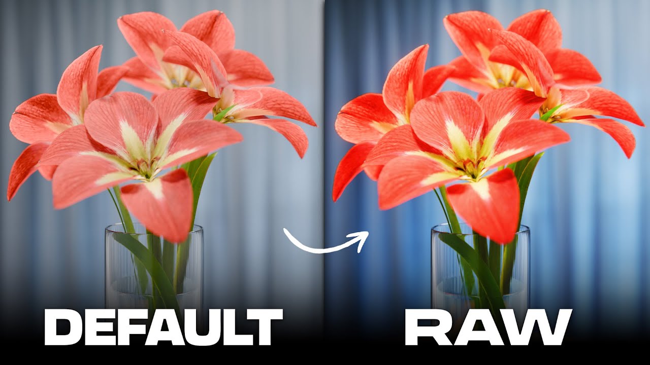
No, not a fault at all. This gradual desaturation is the main reason I am interested in AgX.

This is the reason I think the “preserve hue” slider should be more prominent in UI (it is a slider controlling the main function of AgX). And, indeed, some users/uses will prioritize saturation over hue accuracy.

I assumed primaries sliders are meant for controlling this desaturation/hue protection mechanism. E.g. the default rotation values are for correcting perception of bright colors (as nicely shown in Boris’s video). But when I tried them I saw something different - they control all colors regardless of brightness (even dark colors are being rotated/desaturated). That doesn’t make sense to me. If the intention was to add creative RGB sliders why chose these specific defaults for RGB rotations?

If you check that checkbox, It will now behave more or less what you expected, the attenuation is now affecting mainly the shoulder area. Its purpose is to help users that don’t want to deal with the complexity of the two sections, so they only need to deal with one section.