This may have been, so far, my most time-consuming picture (especially if I include the preparation time), so I thought I might as well share the (arguably) funniest part, i.e., the post-processing.
My RawTherapee 5.10 processing parameters follow (beware the hardcoded path to Adobe’s Canon EOS R6 Mark II Camera Neutral.dcp): G79A0640.pp3 (33.7 KB)
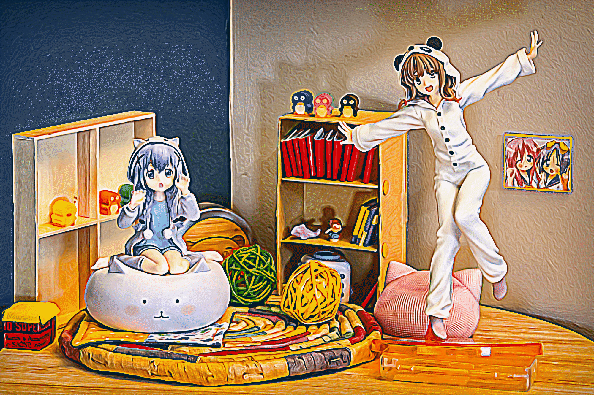
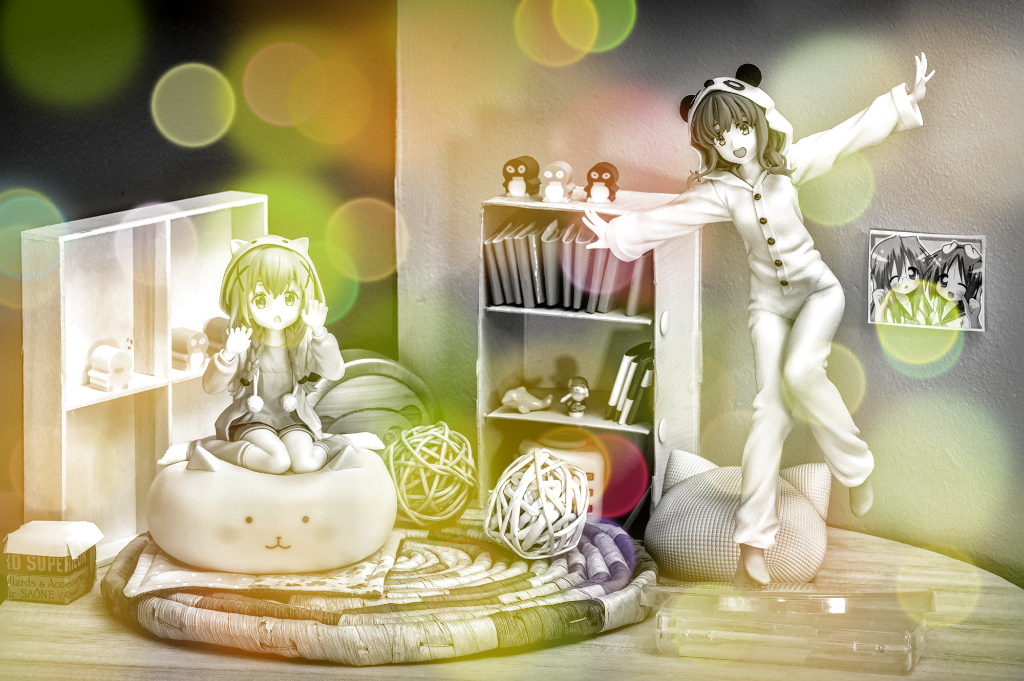
I initially thought I’d go crazy with the color vibrancy and so on, but ended up doing something fairly tame.
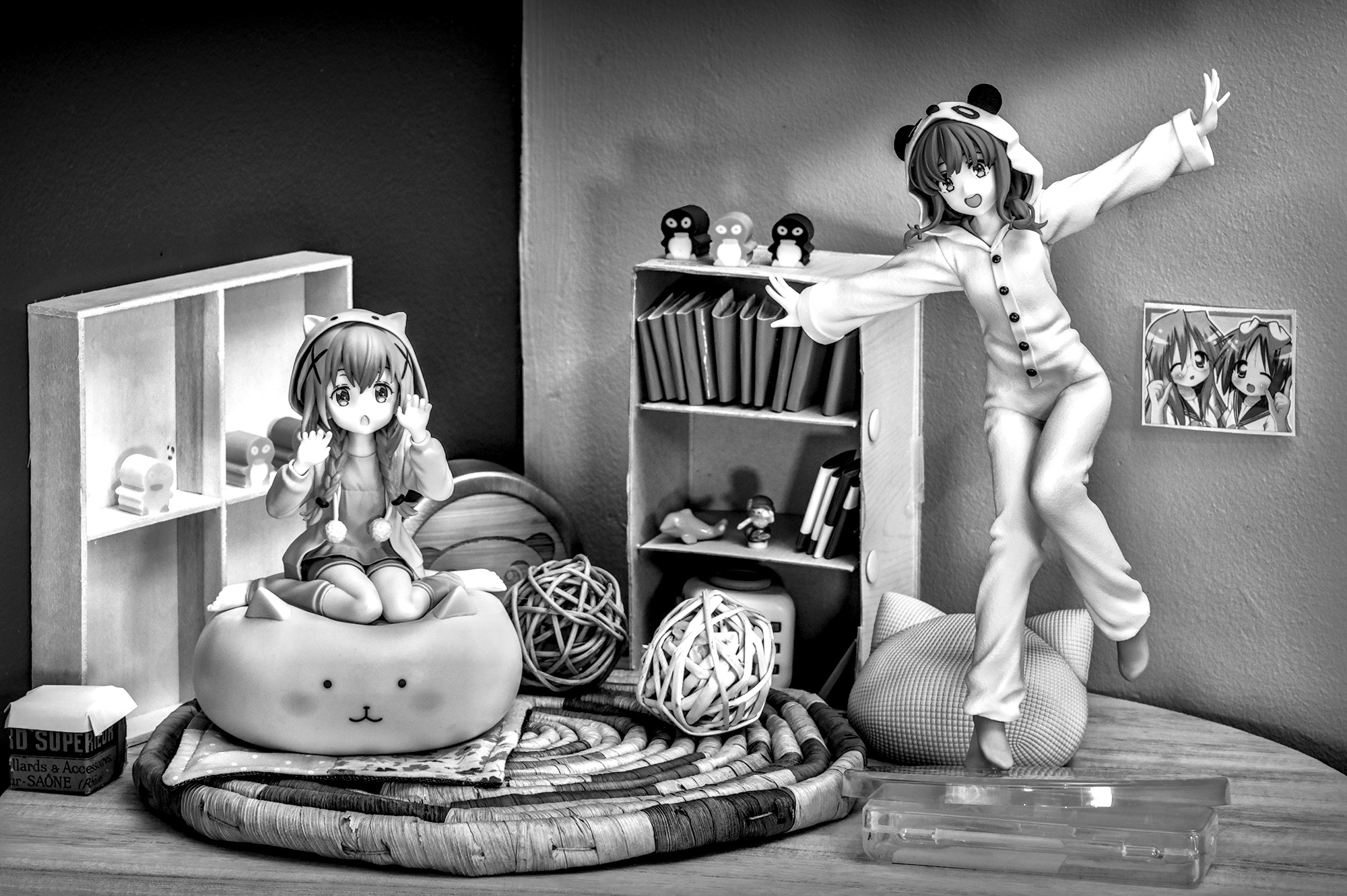
The lighting setup is a big mess (mix of open window, halogen, LED and silver reflector ), which makes it kinda hard to find a satisfying white balance. I was stuck in a room corner with a bed taking most of the space, and I’m a big newbie in such matters anyway.
These two (relatively cheap, which is kinda funny considering how much time I spent on this setup) figures are from different manufacturers and depict characters that are not even from the same franchise (⟨1⟩, ⟨2⟩), but they fit surprisingly well together despite the slight difference in scale. I’m not used to having two subjects to shoot, though, and it made everything significantly harder, including during post-processing.
(And kudos to the nice folks who helped me familiarize with that new camera in the couple of topics I created a little while back.)
I deleted my first attempt and re-did it with a different color calibration. It looks better, but the CC module now says that the illuminant is invalid. Oh, well!
While sorting the 100+ pictures and post-processing the first few, I told myself that I should try to restrain myself a bit on the number of displayed objects in the future.
The fact that I mixed too many (poor) sources probably didn’t help.
Thanks!
Perhaps I should give other profiles a chance every now and then, but it generally looks to me like the contrast and vibrancy boosts they seem to provide can be achieved via other tools when starting with the neutral one (and I shoot in neutral so I like the idea of having a starting point that is close to the thumbnails).
I indeed see texture boost in your parameters, but never heard of that. Maybe it’s an ART-only thing? Or another name for similar stuff in RT. *Launches ART to check* Oh it looks like a mix of sharpness and other things. Interestingly enough, with figure pics, I generally mostly sharpen the edges, and then lower the contrast for the two lowest levels of “Contrast by detail levels” in RT, in order to smooth the figures’ “skin”. (And sometimes I go overboard and it ends up looking like pure computer graphics rather than real-life objects )
I just know something like this would pop up.
The WB I used is a mixture of empirical trial-and-error, camera suggestion, color-picking on I don’t remember what, and color-picking on the four corners of a white piece of cardboard shot at the end of the session. And the worst part is that this value, while looking OK to me for that picture, is not so good for some others (especially for pics I took afterwards in the same spot with only one figure at a time rather than both). Not the funniest step for sure, but I’m starting to get the hang of it.
You got me wrong, not your setting is overloaded. It was me who was overloaded, because subjects like these are completely new to me. And I initially had absolutely no idea what to do with it.
Oh, OK, I wasn’t sure Sorry. Still, I do think I could have removed one or two things.
Personally, I tend to use more “extreme” parameters with those subjects, and avoid microcontrast in favor of more mid-scale contrasts. I also resort to local adjustments more often than usual (eyes, mostly), but with fairly basic tools. Apart from this, my processing is vaguely similar to what I do on other pictures.


 ), which makes it kinda hard to find a satisfying white balance. I was stuck in a room corner with a bed taking most of the space, and I’m a big newbie in such matters anyway.