That bothers me too, and the only reason for me to keep the top panel on is that that space is used to show tooltips, and those can be very useful. However, we could also show tooltips in a different way, and I would pretty much be in favor of that so that I could then do without that panel.
2 Likes
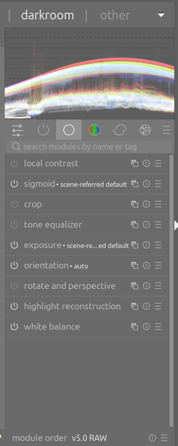
Maybe one very modest and also easy place to start is by reworking the beginners preset for the workflow. It’s currently display referred, using the base curve and other modules along with some others that aren’t used all that often.
The problem with that preset is it doesn’t help to transition users to the scene referred workflow.
Maybe replace it with a set of 12-15 core modules that most of us use to edit - some scene- and others display-referred - and make that the default so new users aren’t confronted with an huge selection of modules.
3 Likes
That’s a good example, and one that that I do to myself all the time. The problem is that I usually can’t just go back and tweak a previous module because all my subsequent edits are built on top that setting.
Changing the exposure module can easily throw everything else off, so I need to know how to remedy the situation, which I can do with power in Color Balance RGB, curves or even an new instance of Tone Equalizer.
Recognizing the problem and knowing how to fix it is often more important than knowing where the mistake was made.
And from my experience the same problem applies in other editors, including LR, C1, DxO, etc.
1 Like
Why? You can hide it ONCE and then your choice is remembered for next sessions. So you have the choice, you can do the setup once why removing this for people wanting to keep to top bar?
1 Like
I like this idea.
Use Sigmoid as the beginner tonemapper.
That’s not tooltip but information area, but right you’ll miss those information. Frankly after a bit of time you probably known those without having to read them.
To follow on from my earlier post, here is the beginner’s workflow:
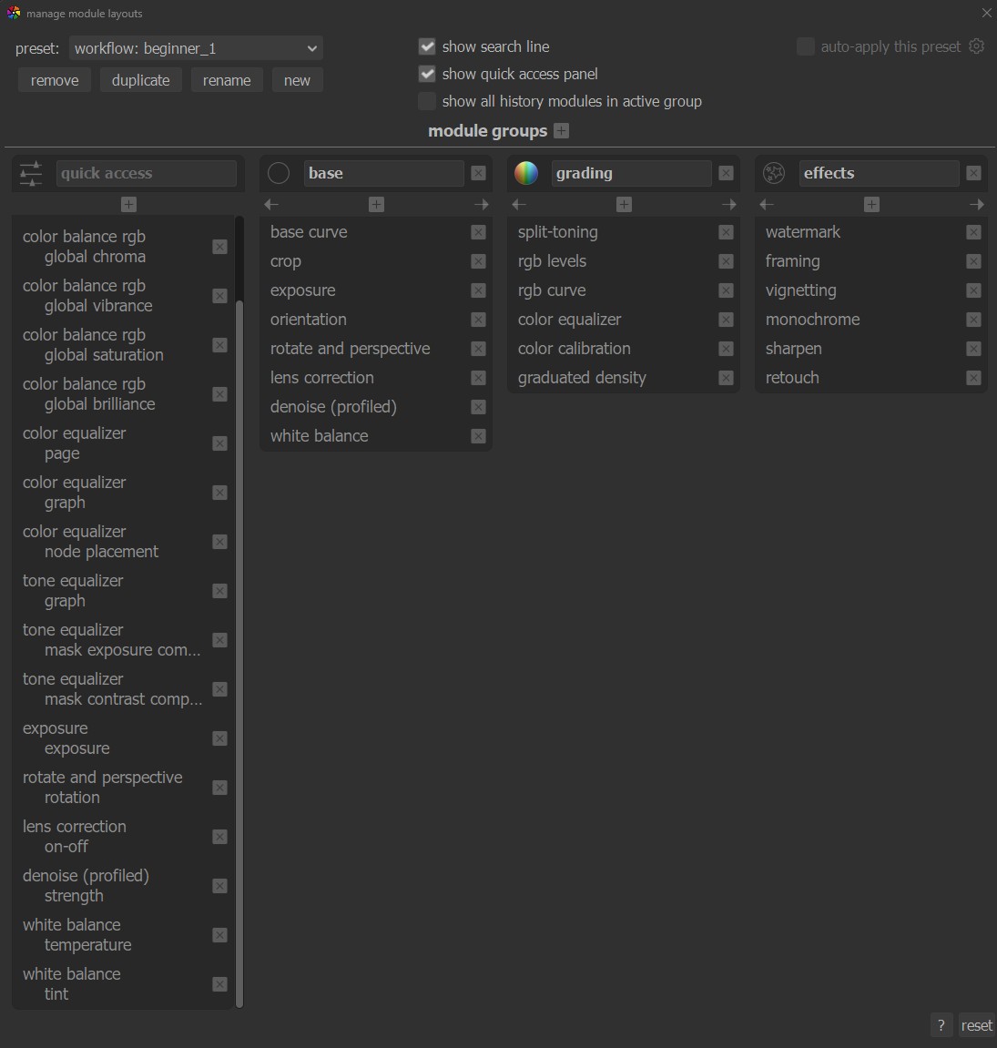
The quick access panel invokes controls from color balance rgb and tone equalizer that aren’t used in the menu, the workflow is display referred and it uses some modules that aren’t core to learning Darktable.
Instead, we could do something like this:
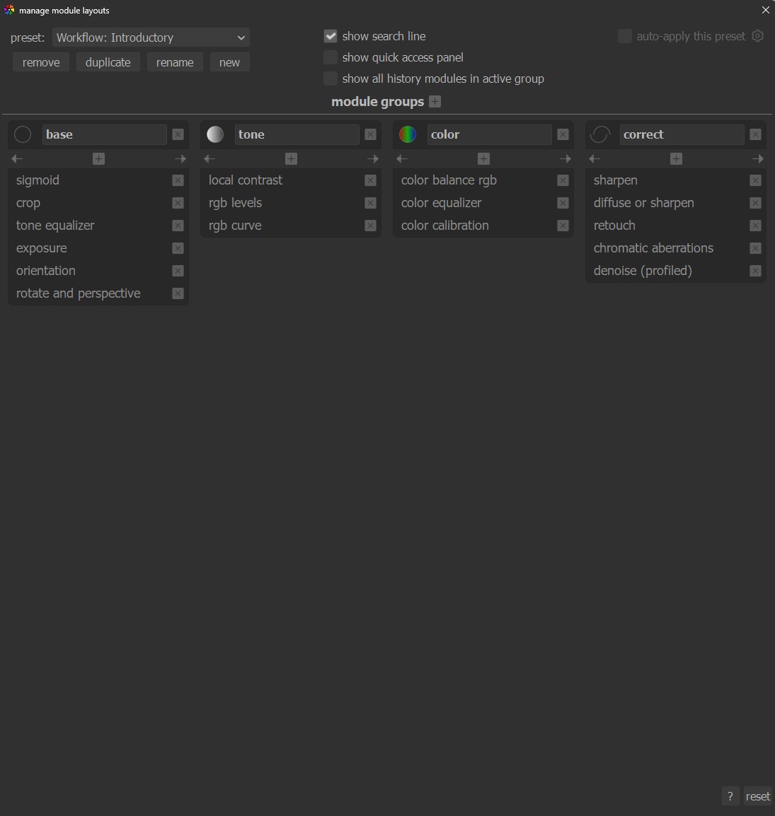
The quick access panel is removed because it can be confusing to a new comer, it begins with Sigmoid which is arguably the easiest of the scene referred tone mappers to use, and it has the basic set of “workhorse” modules.
If we went so far as to make this the default then new users won’t be bombarded with a huge list of modules, and they have what they need as a bare minimum to successfully edit with Darktable.
2 Likes
Interesting as the development of the QAP has been made for beginners.
5 Likes
This is exactly how I made Filmulator. The sliders are all in pipeline order from top to bottom. I even sprinkle in mid-pipeline histograms to add visibility to what each stage (raw values, scene-referred linear, post tonemapping, then display-referred) has done.
If I wanted to make it flexible like darktable, I’d make the UI so you can swap out chunks of the pipeline for other modules the way people can use base curve, Filmic, Sigmoid, and AgX.
In my case, I ASSumed that ctrl+z didn’t cross module boundaries. It was simply stupid of me to make that assumption with no investigation as to whether it was true.
1 Like
Yes, I remember those discussions as the QAP was implemented. I think specifically for the beginner workflow it causes confusion for new users if there are controls for modules that don’t appear on that list.
But I think in hindsight having a QAP with one set of controls positioned against the full modules raise additional questions in the minds of new users.
But that’s just my opinion, and I certainly don’t mean any disrespect towards the developers who put their time into it.
This is a great, practical suggestion, and it points to something worth unpacking. “Newcomers” here means two different things that often get conflated: novice photographers who are new to raw editing generally, and experienced photographers — including Lightroom migrants — who are new specifically to DT. The onboarding problem is the same for both. Neither group gets any signal from DT’s defaults about where to start or in what order to work. Marien_GB’s favourites approach solves that, and the fact that it has to be manually constructed rather than shipped as a sensible default is a real problem.
Which points to something deeper than module naming or scrolling friction. The defaults reflect a UI that feels like it was built without asking: what does someone need to do first when they open a raw image, and how do we make that obvious? That question isn’t about dumbing things down. DT’s complexity is a feature, not a bug. It’s about not making people fight the software before they’ve had a chance to learn it.
I tried DT recently and ran into this firsthand. Opening an image dropped me into the colour tab by default — not where anyone starting a raw edit would begin:
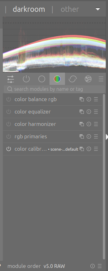
Switching to the base tab gave me a more relevant set of tools, but in no particular order I could discern:
My instinct was to drag the modules into a more logical sequence: exposure first, then white balance, and so on. The module followed my cursor so it looks like drag and drop is supported. Then it snapped back. Nothing explained why (apparently reordering is prohibited because it would change the pipeline). That’s a fixable problem: don’t enable interactions you don’t want users to attempt. But more importantly it’s a symptom of a design process that’s optimised for people who already know how it works, rather than asking what someone new would try first.
Marien_GB’s approach suggests the fix doesn’t require a major overhaul. Shipping a default group in pipeline order — exposure, white balance, color calibration, tone equalizer, color balance rgb — should be technically fairly easy, and it would remove most of the first-session friction for anyone, regardless of their background. Small defaults, deliberately chosen, do a lot of the work that documentation and tutorials can’t.
I’ve applied these kinds of principles across a lot of products over a long career, so I’m not speaking abstractly. Two of the most useful things you can do when improving a UI are to design around the most common workflow, and to count the clicks and mouse movements it takes to complete it. Then adjust as necessary to make things as easy and pleasant as possible.
2 Likes
You raise some good points, but something needs to be clarified.
Yes, the UX is by and large optimized for those who already know how to use it. But the hiccups that you mentioned are not by design. Those are just a symptom of lack of polish.
As someone who had - as you said - a long career, you will be familiar with the notion that sometimes it takes very little effort to ship a new feature (i.e., something that works in a sunny-day scenario) but it takes a hell of a lot more effort to smooth all the sharp corners, test and add support for all unplanned cases, etc. Non-developers may not have a clear understanding of the scale of this disproportion. It may take one afternoon and a few tens of lines of code to implement a new feature. But it can take many days if not weeks to go from “works well enough for me” to “works flawlessly for everyone”.
In a large software project like darktable, devs do not have a lot of incentives to focus on polish. If a bug does not prevent usage, but just creates some friction, it is difficult to find someone who is willing to tackle it. This is not because devs are evil, but because they prefer to spend their limited time to work on aspects that they care more about, or that for them are more rewarding.
2 Likes
This has been suggested, several times. The problem is that everyone wants this favorite module in that group. Its always been bikeshedding. This isn’t even a hard change to make technically, but for some reason there needs to be consensus (but there doesn’t actually need to be consensus, the maintainer just need to commit the change).
5 Likes
Completely agree with Mica. I don’t even think there needs to be consensus, we just need to follow a “minimal number of modules to get the work done” rule and your picks @chuckhenrich are absolutely that, just missing the tone mapper which I think sigmoid makes the most sense. I also believe that in this group the modules should all be expanded at once. Having all the controls visible helps the user find his footing, vs opening and closing modules constantly.
Along with this I think stronger defaults for demosaic would need to be used, the best for each type of sensor/resolution, and also default lens correction and denoise turned on, even if they work behind the scenes and are not visible on this panel.
1 Like
Hopefully as it is impossible to have a consensus on such a large project. What I usually need is at least some kind of a majority.
5 Likes
Pipeline works bottom to top not as noted in the quoted passage you shared…
That’s … odd.
To your point about exposure corrections, as you mention it a few times…just fyi there is a fulcrum slider in the blending part of modules so you can often use that as a sort of continuous exposure correction as you work rather than going back in the pipeline to exposure or adding new instances … but you can also do that … its just an option…
1 Like