ART and color -- Am I doing something wrong, a wrong setting or what?

Windows 11, ART 1.20.2 (AMD Zen2 optimized build from @gaaned92 if it matters)

I just noticed something that I don’t think has been happening for a while (or I’d have noticed before)…

First, to answer potential questions:

  • My computer is color managed, my monitor is calibrated, ART is set up to use the system profile, etc., etc. While I’m not a color expert I understand the basics of color management, gamuts, models / spaces, etc.

  • To edit in the largest color space possible, I have ART’s working space as ProPhoto and I export to either ROMM RGB (if I’m doing further edits in Affinity Photo) or SRGB for web. Rendering intent is Perceptual. I generally use AMAZE demosaicing.

  • The reason I export to ROMM RGB (which is ProPhoto) is because Affinity Photo ships with ROMM RGB and there’s no way to configure ProPhoto as the default space. So, despite the fact that ProPhoto == ROMM RGB (it’s just a different name) there’s a conversion warning every time a ProPhoto image is opened. Exporting to directly to ROMM RGB avoids this.

So, what I’m seeing …

The colors in the ART image preview are more saturated than in the exported images, regardless of space. Said another way, exported images are slightly washed-out.

For example, here’s a screen capture of the ART preview:

SCN ART ROMM working

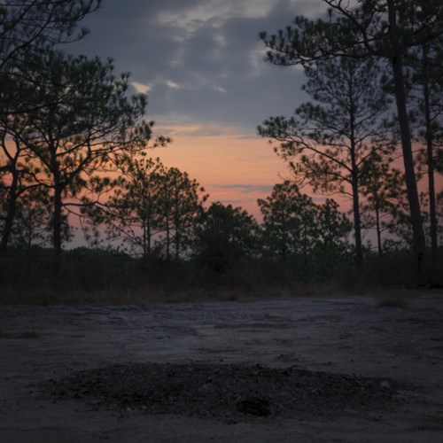
And here’s a ROMM RGB export (other color space exports show the same results) – Look at the less-orange sky:

EXP ROMM RGB

Yes, I know it’ll be displayed in SRGB in your browser, but you can save and view it with a wider-gamut program. Either way it’s noticeable.

So…

  • I’m using the system (hardware) display profile in ART and elsewhere, FWIW. Which really doesn’t matter in a relative sense as everything is viewed on that same monitor, so there should be no relative difference (even if there’s an absolute inaccuracy), but whatever …

  • I’m working in ProPhoto, exporting to “ProPhoto” (under the name ROMM RGB).

  • My other apps are color managed and are not down-convering the color space. They’re also in ProPhoto / ROMM RGB.

I know there are many ways to alter colors, per se, but regardless – from what I understand – what I see in the preview should be the same as what I get in an exported image of the same size color space, right? So relatively speaking the two should match.

But here on the same monitor in every other program I have (Affinity Photo, GIMP, XnView MP, FastStone) the exports are washed-out by comparison. I’ve compared every way I can but the only “outlier” is the ART preview.

PLEASE NOTE - I’m not assuming there’s anything wrong with ART, but more likely I’ve misconfigured something. Any ideas?

For giggles, here’s the original raw file:
IMG_9792.CR3 (25.3 MB)
IMG_9792.CR3.arp (17.7 KB)

Thanks!

What if you render in relative… closer??

I could be wrong but I think both monitor/output are set to relative by default for a new install… If your monitor is set to relative and you are only changing the output which I would guess is used by the exported pipeline then you might just be seeing a mismatch… also just guessing but worth a try…

1 Like

Hi,
Can you also share this romm ICC profile that you are using? Thanks!

My monitor profile is perceptual as well.

But I guess my point is, as long as I’m on the same monitor, same image data (whether raw or exported to TIFF, whatever) and everything is color-managed and consistent, shouldn’t the colors be consistent (on that same device at least)?

Thanks.

This is it (hopefully I didn’t violate any Serif agreement by posting it)…

ROMM RGB.icc (564 Bytes)

But as I wrote, I see the same effect whether using ROMM RGB, ProPhoto or any other profile for exports. I did a series of export tests with only the output profile changed between them:

image

They were all likewise less saturated.

Thanks.

P.S. - I’ll take it as a good sign that I at least expressed my intent with that rather long post. Your and @priort’s replies were logical questions, not “Huh? What are you asking??” :smiley:

I don’t think you can rescue rendering intents… colorspace yes but if you render in one and try to display that in another I don’t think it will be the same as if you render and view in the same intent….

I also think some viewers don’t support rendering intents and will default to the os or ignore it so that could also be a factor. I took your image and tested it using prophoto exports …no difference much with any intents but I am at work and just using my display profile which doesn’t support intents… If you have a display profile with luts it likely does so you could be seeing one thing in art and something else in others… I wonder if you try this in DT what happens… Also what if you use a standard profile…. Not your calibrated one just to see if you get this differential behaviour…you colors might overall be off or not calibrated but as a test it might show if your calibrated monitor icc is introducing any issues…. Just because you use the same one not all software can handle it exactly the same at least from what I have been told… the safest way for this to be true is with pure matrix profiles…if you have that then this should not be an issue as rendering intents wont be supported and cant therefore be the issue….for sure to me the difference you describe pretty much looks exactly like the difference between images that I render with profiles that support is and look at relative vs perceptual…

Stupid nuance question when you say your profile is perceptual do you mean the setting for display in ART is perceptual or do you mean you made a perceptual profile that you use??

No LUTs here…

It’ll look even worse! LOL And not because of darktable, but rather because whatever little DT mojo I had developed (no pun intended) has got up and left. I’m about useless in darktable at the moment. :slight_smile:

I’m wondering if it’s somehow related to that image, or at least some pathological case triggered by that image. I just played with a PlayRaw and it’s identical from what I can see. Top is XnView MP (color managed) display of the export and bottom is the ART preview:

image

Looks the same as expected. Maybe it’s a one-off of some kind?

Hmmm…

The setting in ART is perceptual:

image

Same for export profile.

In windows I find xnview the most faithful esp since you can exactly specify the ICC so you are sure you are getting a match… When I get these sort of things I use it… I feel like previews in Win photos have gotten even worse as of late and I used to also use faststone but I found many DT exports showed artifacts that didn’t seem to show elsewhere… try a few more with good colors… that should confirm it

I agree. This is how mine is setup:

image

I don’t worry too much about images without a profile, since mine always have one.

I paid for FastStone years ago, but found XnView after I moved to a Linux desktop. Since then it’s continued to be developed at a better rate than FastStone. Both are good programs, but even now that I’m back on Windows I use FastStone these days mostly as an extra, only when needed.

I pretty much stay away from the stuff bundled with Windows. Using third-party apps is more consistent (and usually higher quality) in the long run.

I can’t reproduce here, sorry. Different apps with identical color management settings produce identical pictures :man_shrugging:t5:
Did you try visualizing the exported image with ART itself? Does it look different from the raw preview also in that case?

Actually they look alike today. Yep – This is getting weird, but it’s kind of pointing to a temporary issue in ART yesterday. As per above, I edited a PlayRaw and it matched. I just loaded some of the exports and they match, but that’s because the preview (working) image in ART isn’t as orange-saturated as it was yesterday:

image

You can see for yourself this matches the exports upthread, whereas the previous preview capture was more saturated.

Hmmm… apparently a temporary thing? I’ve not rebooted since yesterday but I have restarted ART a few times in the course of editing a few images today.

Oh well, I’ll just keep my eyes open and see if it happens again. And if it does, restart ART before posting! :slight_smile:

Thanks.

Rendering intent (perceptual, relative_colorimetric, absolute_colorimetric, etc.) is not directly baked into the profile transform, it’s a function of how the color transform is encoded. The colorimetric intents are enabled by a matrix, and the perceptual intent is enabled by a LUT, and the profile can contain both, or either.

Perceptual specifies a consistent transform for ALL colors, so that could be why your colors look like they do. The colorimetric intents only transform the out-of-gamut colors, if a color is in-gamut it is left alone. You really want relative_colorimetric, it preserves hue in pulling an out-of-gamut color into the destination gamut.

So does relative compress or clip out-of-gamut values?

The reason I ask is, I was reading here and while the illustration appears to infer it compresses, the verbiage says it clips: “Note how perceptual maintains smooth color gradations throughout by compressing the entire tonal range, whereas relative colorimetric clips out of gamut colors…” Finally it offers this summary:

The decision about when to use each of these depends on image content and the intended purpose. Images with intense colors (such as bright sunsets or well-lit floral arrangements) will preserve more of their color gradation in extreme colors using perceptual intent. On the other hand, this may come at the expense of compressing or dulling more moderate colors. Images with more subtle tones (such as some portraits) often stand to benefit more from the increased accuracy of relative colorimetric (assuming no colors are placed within the gamut mismatch region). Perceptual intent is overall the safest bet for general and batch use, unless you know specifics about each image.

Perceptual compresses all hues to fit, but preserves relationships between all hues. So I guess in summary:

  • Relative might have less widespread but relatively stronger changes where they occur (compared between in and out of gamut hues)

  • Perceptual might have more widespread but also more evenly spread changes (due to the preserved inter-hue relationships).

Of course that’s all affected by the composition of the image being affected.

Is that about correct? :slight_smile:

At some point you just have to decide what looks best and also what the intended output is… web printer etc etc… For me who uses DT primarily I find the default srgb output was often too soft and not enough punch. When I started using one of the srgb profiles from color.org that actually supported rendering intents and started to use relative I was much happier with the color and contrast… I haven’t compared this across any other software for this specific effect and it could be a bit of personal bias… I often find perceptual exports have a quality that to me makes them look a bit washed out… so there are technical differences that you can cite and be aware of but in the end whatever pleases the eye wins. I mostly just take personal photos of family and travel so I really only need to please an n of 1 … me :slight_smile:

I guess it’s a compression, it piles all the out-of-gamut colors just inside the destination gamut. Relative colorimetric follows a line from the original color to the white point, so hue is preserved.

Mark LeVoy had a nice interactive graphic in one of his Stanford courses, built with Flash so it no longer works. Illustrated the intents quite nicely…

This isn’t a bad demonstration/explanation

At this point my only output is either my monitor or the web, no printer. I’ll maybe consider one if I ever make a printworthy image. :slight_smile:

I got some profiles from color.org a while back. They’re probably what I’m using for export now, primarily the sRGB (ICC V4) profile.