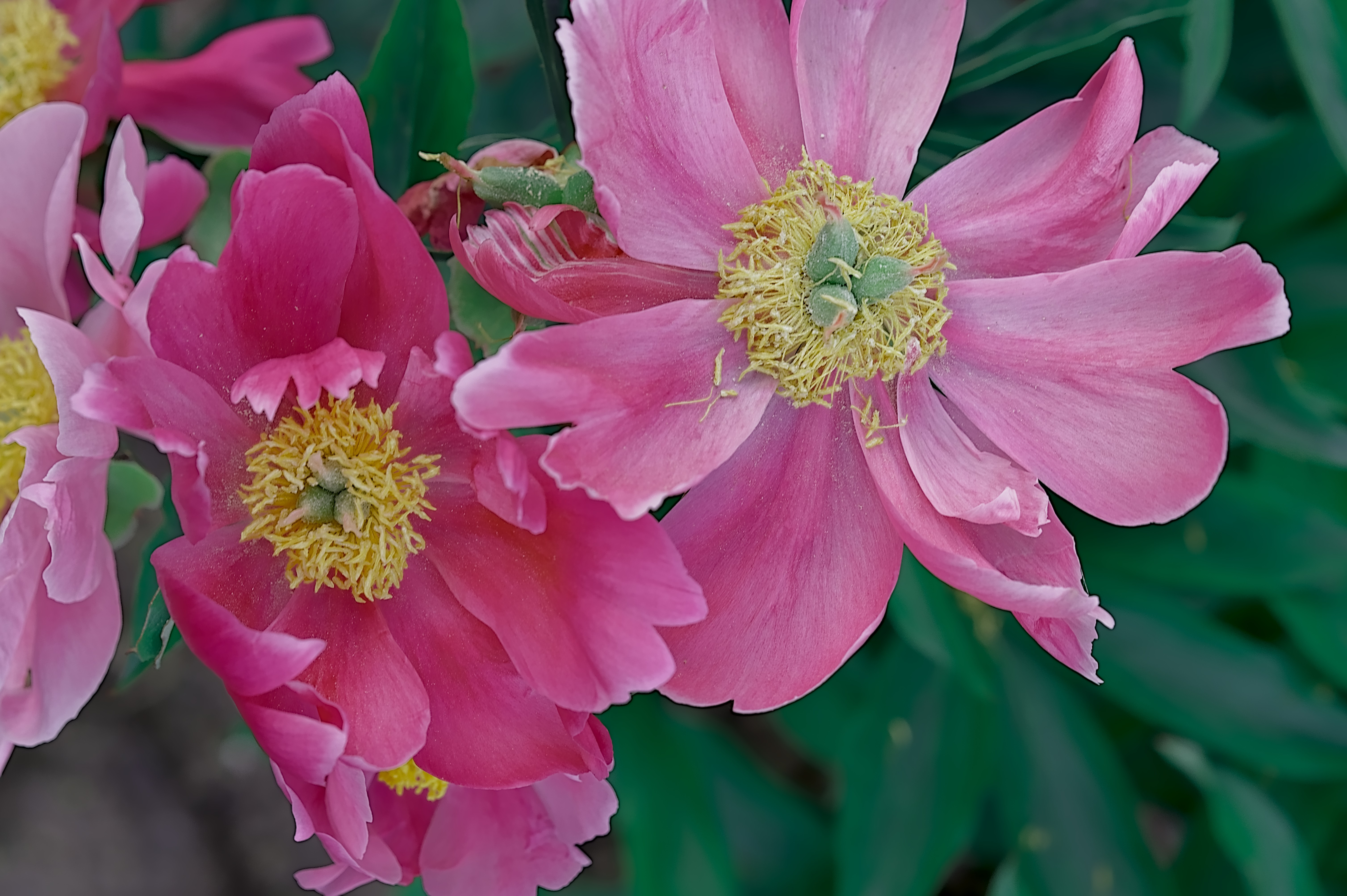
I have difficulty to render the colors of the petals of that peony. This is what I could achieve using Darktable 3.4.1.1. Especially, red color of the left petal tips over to unnatural color tones, if played a little bit.
Also, if you wait a couple of weeks or so (or you can build it now if you’re keen), darktable 3.6 will give you much more control over the rendered colours.
Thank you, Chris and pass712. It was difficult for me to get the right white balance for that picture. I try in most cases modules white balance and CAT of color calibration, alternatively. I like your darker green in the background that I get through brightness of color calibration (green channel).
I used the contrast equalizer along with the new (darktable 3.6) details masking feature. I have the sharpen module active too - I maybe overdid the sharpening a little on my edit.
In 3.6 using the rgb color balance module you will be able to pull back the color a bit to remove the over saturated parts.
WRT to WB I often let the CC module calculate the default wb and if I feel its not quite right then I select custom as the illuminant…nothing changes by doing that initially and then I use the hue chroma sliders. Just tweak the chroma a bit and you can usually dial in a WB that will hit what you remember from the shot.
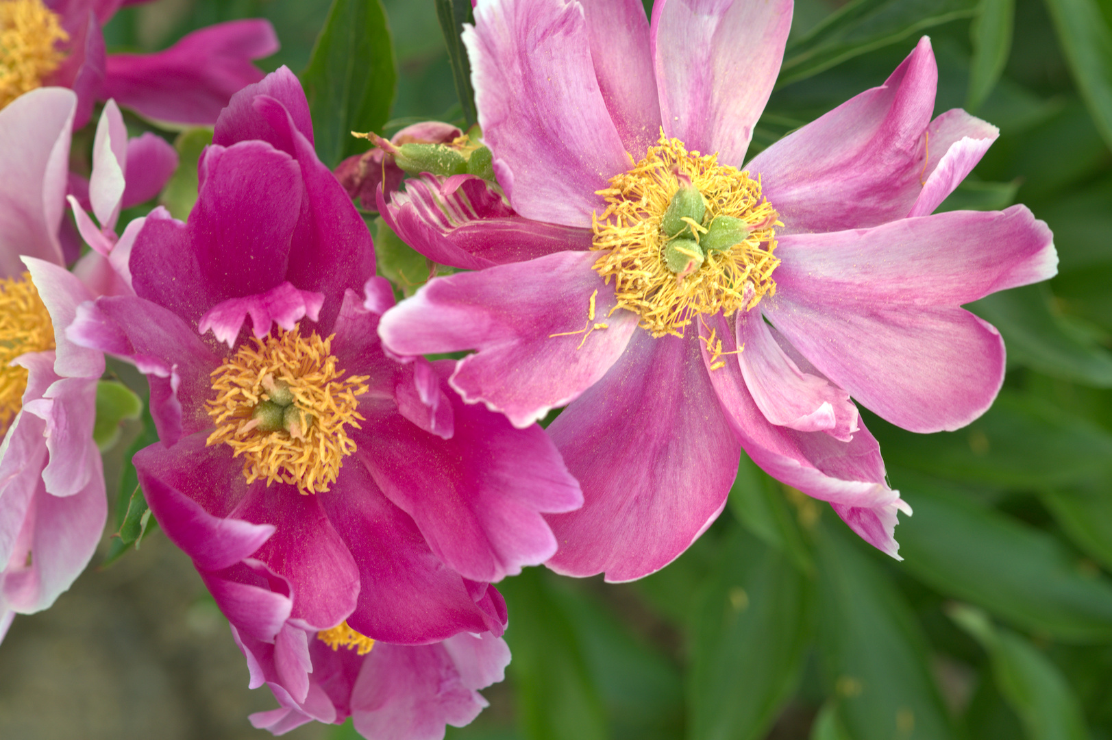
thank you for taking your time and showing three alternatives with an explanation of the method you prefer. I like the last one. It has most natural colors.
I assume WRT (abbreviation of?) is a module or submodule inside version 3.6.
I work mostly with the modules filmic RGB, color calibration and color balance.
Those look very natural close to the original flower. I like the rich colored (yellow) staminal that is convincing. Also, the petals have nice transition of colors. I will check your processing via xmp. Thank you!