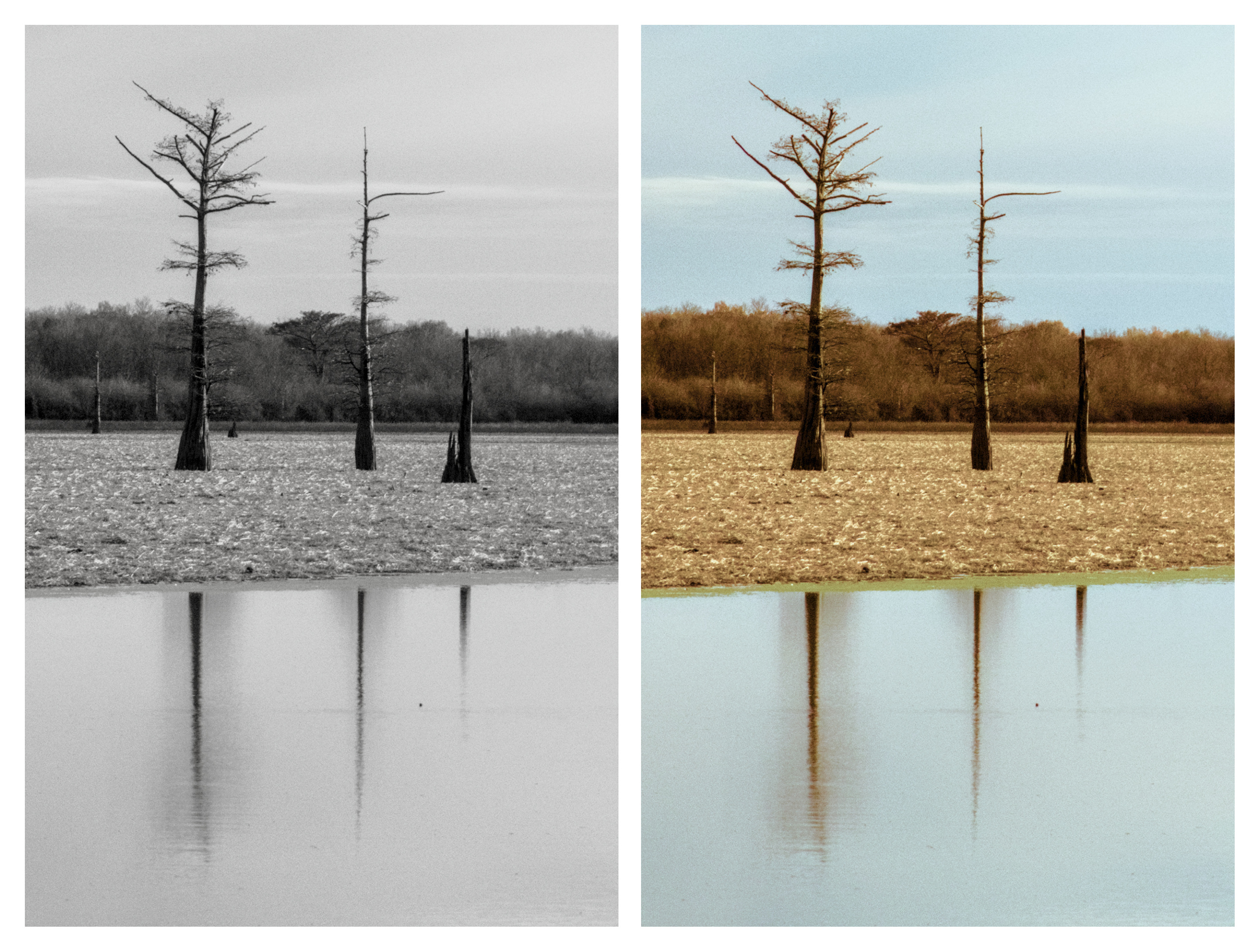
This image and a sibling were posted to the “charge your camera…” thread (with the story behind the title) but I thought it would be interesting to see how others would handle it. I initially thought I’d make a B&W of it, but wimped out and went color instead. I really suck at B&W conversions and never end up with what I think is a good result, but I’m sure others are better than I. Maybe this image just isn’t suited for it… ?
Anyway, have a shot at it. My version was done in ART 1.21 with a tiny bit of (inpainting) cleanup, resizing and export in Affinity Photo.
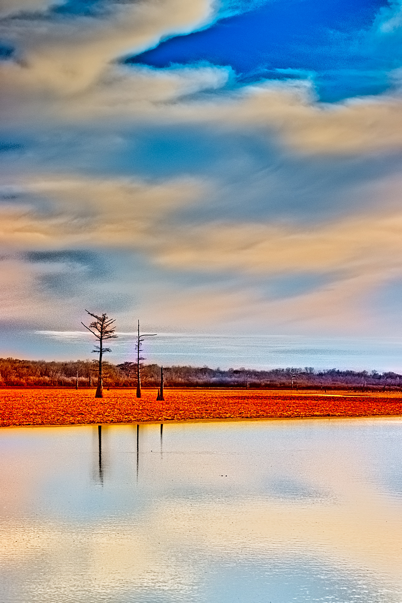
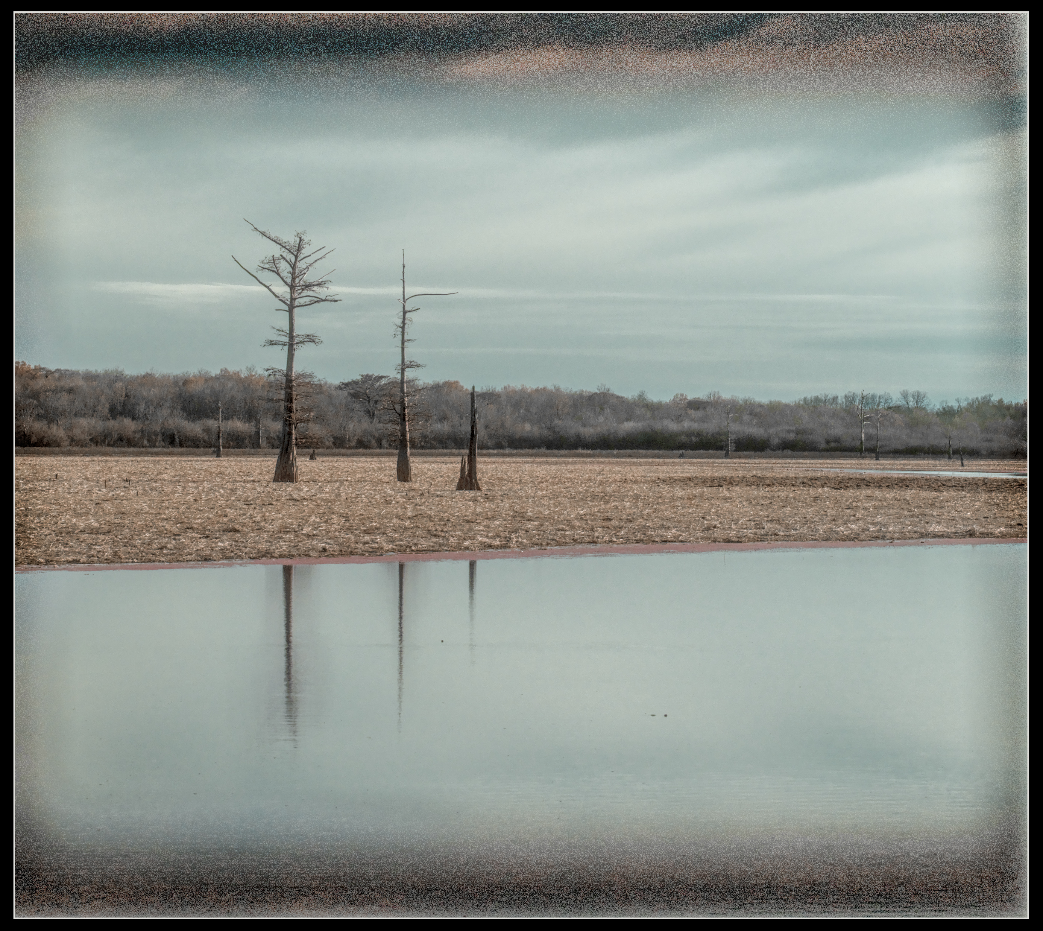
This time I chose to veer off a little from the ‘real’ view, felt like doing something “artistic”.
This was a lot of fun and I tried lots of new stuff!
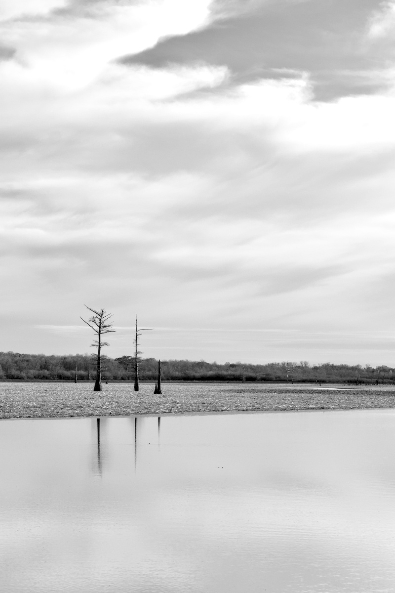
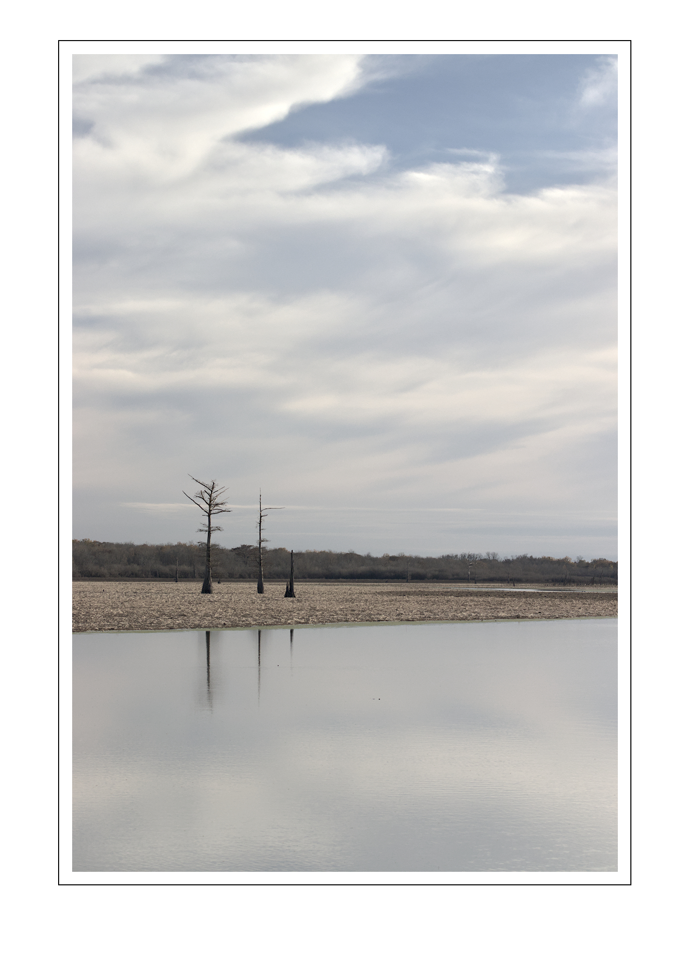
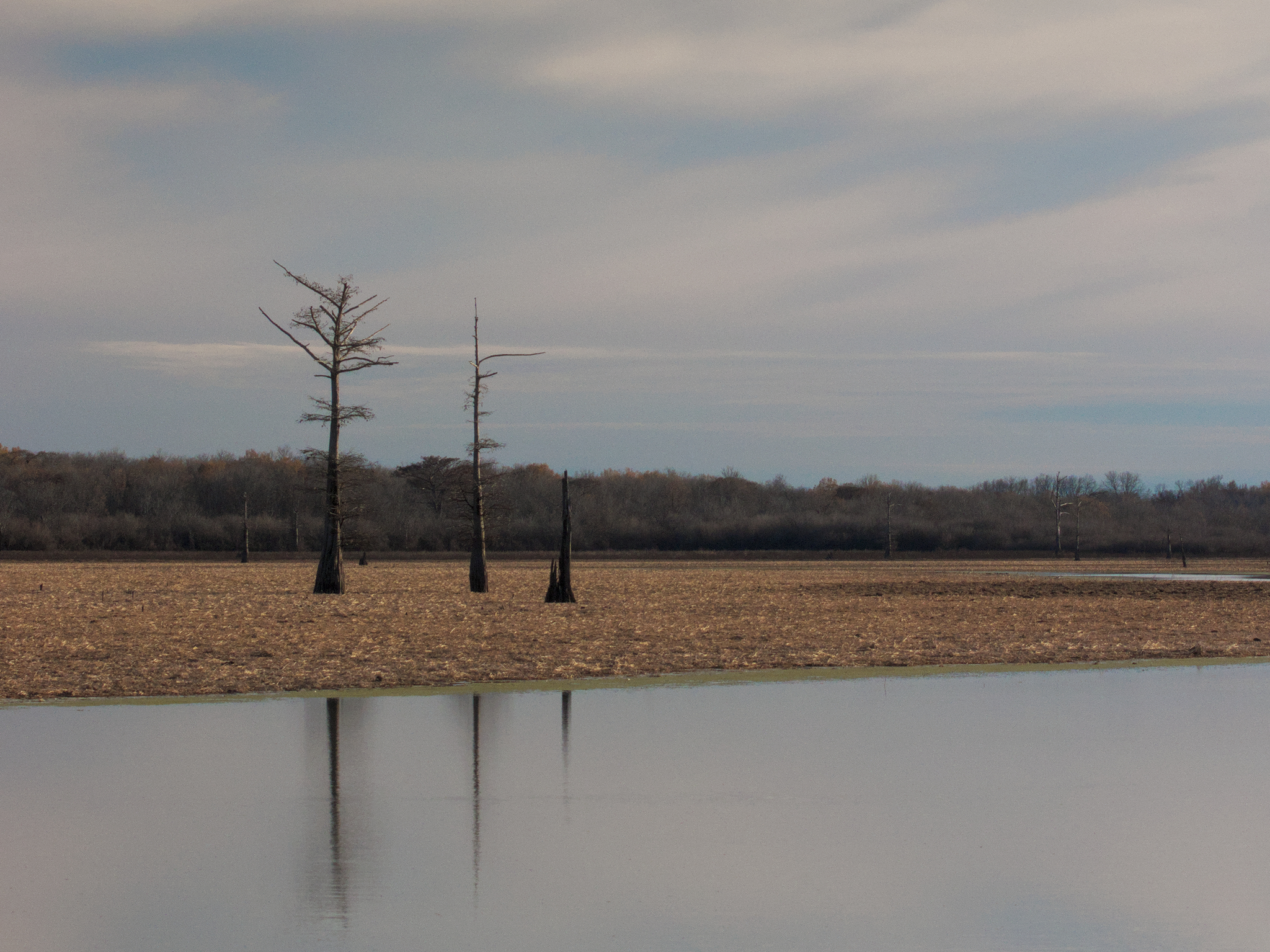
I actually shot several portrait versions, too. I wish there had been slightly more detail in the lower sky, though. I tried to bring out the subtle pink hues that were present. IMO it would’ve worked better if the trees had been larger but situationally that wasn’t an option. However I think it works as-is, compositionally. Looking at it now the vignette is ok but I wouldn’t want it any stronger. But that’s more of a style preference.
I often find minimalistic commissions challenging. It’s not so much that I try to “add” elements – I like the simplicity – but rather I have the tendency to keep on editing too long… “what if I can bring this out or if I can emphasize that…”
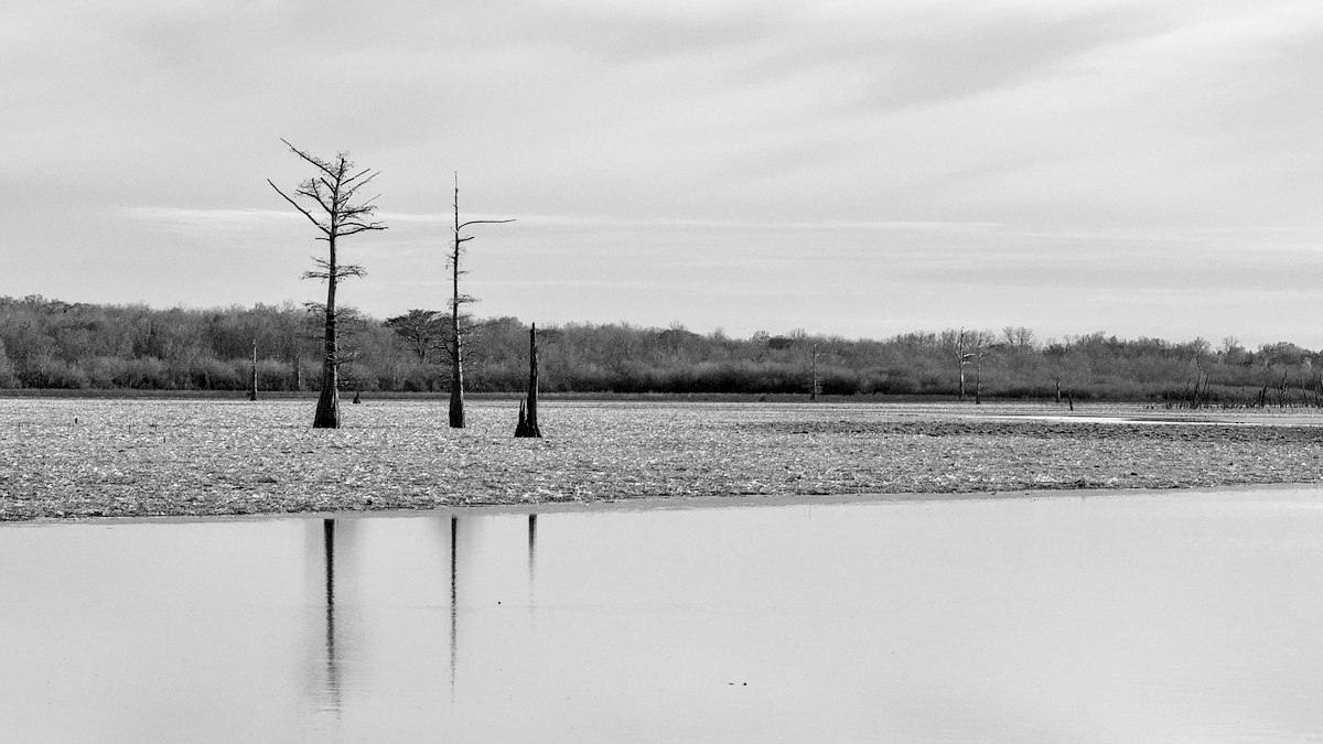
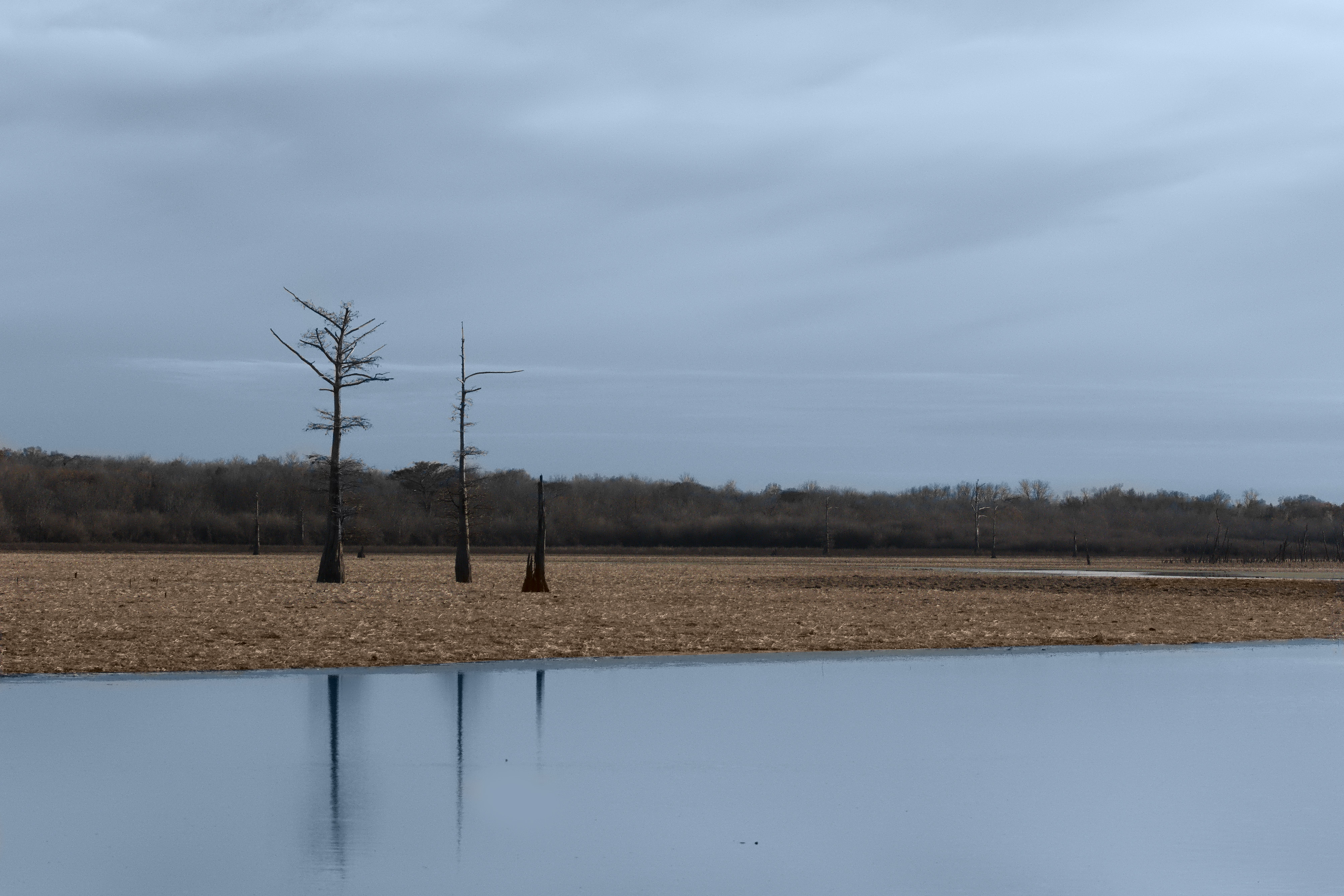
This was at the tail-end of an afternoon of driving and looking for subject matter… the first, and only, shots over three+ hours of looking, after about 90 miles of driving.
I’ve cooked it a bit… errm… maybe burnt would be more descriptive.
Lovely shot. I very much like the more minimalistic nature of it.
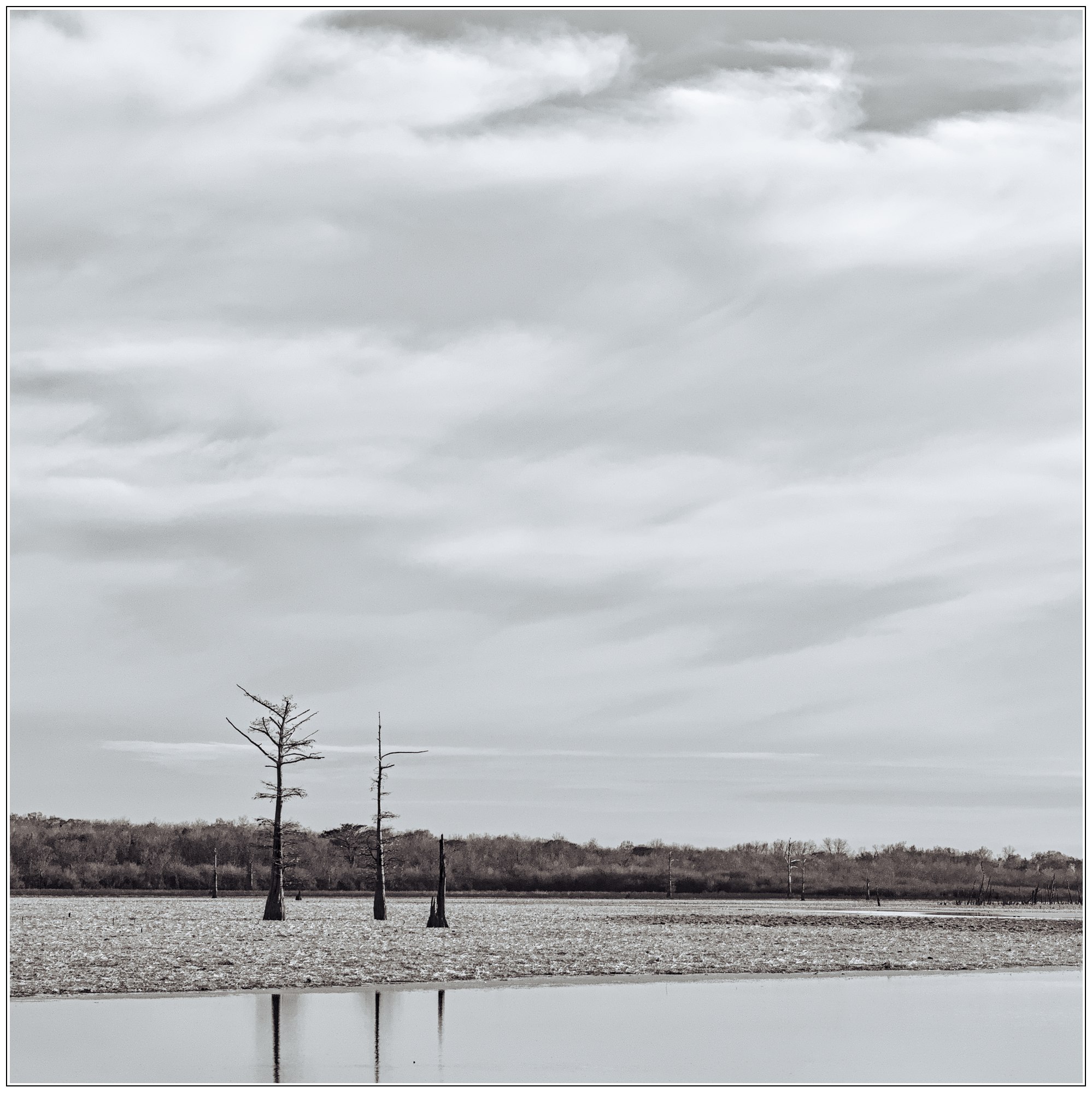
Lots of contrast, dropped the brightness of blue and raised that of red in the BW conversion, and used two gradients, on for the sky and one for the water to retrieve the details that I blew (well and truly) with the contrast.
It’s a bit grainy, mostly as a result of my heavy handed yanking of channels and contrast, but I feel like it kind of works.
Yeah, this is more along the lines of what I was thinking (but didn’t do). You could probably clean it up nicely with some masked NR. Nice job!
Re: the composition, I would’ve liked to get closer to the trees but there was no option for that other than walking out on the dry bottom. It was late, I wasn’t wearing boots and it looked pretty soft so I didn’t (not sure it was actually possible, anyway). Plus the visible footprints would’ve ruined any other compos. And given the little rain we’re getting, they would probably stay visible for a long time.