The warnings and the modification of the primaries reloading have been merged to master (thanks, @Pascal_Obry!). I’ll update the docs sometime later.
Speaking of docs: for those of you who have read both the updated and the rearranged/reworked docs, which one do you prefer? I don’t want to keep updating both.
If there is something you particularly like or dislike / find useless / uninteresting / confusing about one of the docs, feel free to mention it here or drop me a PM. Thanks for your help!
This probably comes down to broader darktable philosophy as to whether to prioritise QAP or not when naming items. If prioritising QAP is not done in other modules (eg. Filmic) then it would be consistent to do the same with AgX.
Does QAP need to have ‘exposure - white relative exposure’? Could it not just have ‘white relative exposure’ without the preceding ‘exposure -’?
Regardless, I like the proposed name changes in the ‘basic curve parameters’ section (although the juxtaposition between ‘basic’ and ‘advanced’ probably needs to be kept, so it’s clear why those sections are distinct from one another). I don’t really like the proposed changes in the ‘input exposure range’ section, since it becomes inconsistent with the similar controls in filmic. And while regulars will know DR = dynamic range, newcomers may not.
It’s done in others, e.g. see color balance rgb. And this affects not only QAP, but also shortcuts.
I’ll try to find time to improve this, but if the QAP is a priority over having shortcuts grouped by section, we can remove the sections. I don’t see a way to come up with even shorter names without abbreviations like DR.
Do the opposite of what the tooltips say.
The simplest is setting contrast around the pivot to a very low number, but you may increase the pivot shift so it gets very close to the right edge, or decrease it to push it near the left edge. Any time the contrast is not high enough to go from the pivot’s y value to 0 or 1, you’ll get a warning for the toe or shoulder, respectively.
We have the results on @Eary_Chow 's suggestion: more than half want it. It was rejected by over 40%, so I guess that means yet another configuration variable. Stay tuned.
The checkbox will stay visible, even if the configuration says it should be hidden, if agx settings from the XMP/DB indicate the checkbox was ticked when the image was edited.
Otherwise, the user would be left with a hidden checkbox that cannot be unticked, and no sliders. Or, if the setting were ignored, the processing result would be different depending on the configuration setting (imagine downloading a sidecar from pixls.us).
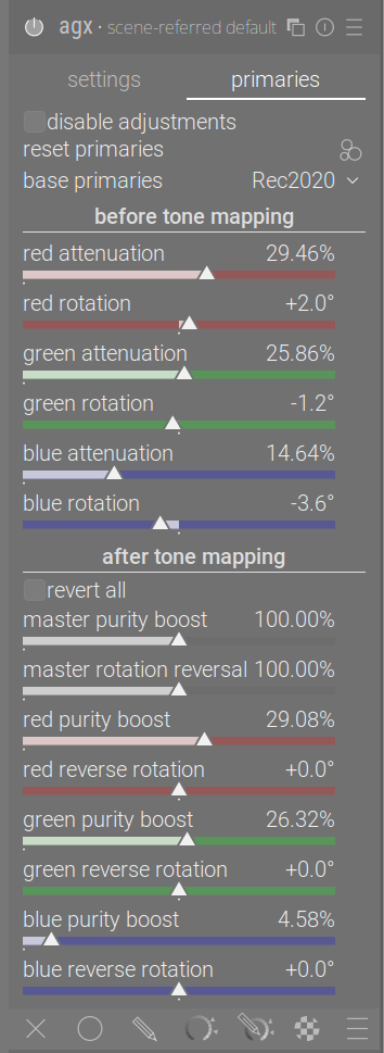
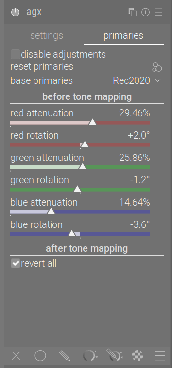
Once the user unticks the checkbox, it will be rendered invisible, and the reversal sliders appear.
And maybe ‘reverse all’ would be better. There will be a tooltip to provide details, ‘use same settings as before tone mapping’ would be too long for the UI. The tooltip would be “completely restore purity and undo all rotations”.
Why would the configuration say it should be hidden? In the Blender node that I have personally been working on, that checkbox is part of the pre-curve section, when checked, the post-curve section would get hidden as a whole.The checkbox itself as part of the pre-curve section would always be available.
Because over 40% of the users did not like your idea.
The checkbox will be visible visible by default. Those 40% of people who themselves never want to use it, and want to save space and complexity on the UI will be able to hide it. However, if they hit an edit where someone else used it, or where they previously used it, they will still see it was used, and will be able to disable the checkbox if they want.
I honestly don’t get it. The checkbox exists so that the users don’t need to jump back and forth between these two sections, especially for users that are not familiar with the relationship between the pre curve and post curve settings, When they don’t understand how the two sections interact with each other, this checkbox gives them a really convenient starting point. It reduced the complexity that the user needs to face.
If they don’t want to use it, just don’t check it, i don’t understand why they would want the checkbox itself to be disappeared. It doesn’t make logical sense to me.
Those users will most probably simply rely on the built-in presets. I hardly ever switch to the primaries page, and rely on the blender-like default primaries.
Please don’t expect an explanation from me. I’ve done my best to ask if others liked your suggestion and then to implement it, as the majority of users agree with you. Quite a few people, though, felt they don’t need such a checkbox, they always want to see and potentially use all sliders, e.g. to alter the defaults set from the presets. They may tell you why they think that, but is it going to change either your opinion or theirs? I did not single you out, there are other flags. Someone had the idea to always keep the ‘look’ section open, which was rejected by almost 70% of users, but I respected also the 30% who liked it, and added a flag for that. With your suggestion, I’m also honouring the wishes of the 40% who feel they don’t need the checkbox.
Well, I’m fine with it as long as you are fine with this conflicting logic. It’s essentially trying to hide a checkbox that is trying to simplify the UI elements, with the intention that hiding the checkbox would simplify the UI elements, it’s … weird
@kofa : Just a warning… If you run a poll for every suggestion we will ends up with lot of configuration variable in dt. Note also that we try to avoid this as much as possible because it makes lot of cases to cover when maintaining the code. At this stage my suggestion will be to wait for a release to gain more feedback, to gather them and see what to arrange for the next one.
Seems like it might be a good time to stop, let this module hit a release, see some feedback from more than a handful of people, give it time to rest, and come back with a fresh mindset?
Hi @kofa,
first of all, thank you so much for you massive effort of bringing Agx into darktable
I’m wondering whether it is possible to have a “smart” preset for Agx which auto-selects the white / black relative exposure as if you’d just click color picker buttons?
This could be helpful to get a default setting which is close to the out-of-camera look for a quick export, and a good starting point for a quick edit session. What do you think?
There are other modules for which this might be useful, however, presets are currently just a hard-coded list of module parameter values and can’t be used to automatically set things using pickers.
I currently use keyboard shortcuts on the pickers to do this sort of thing.