when printing images in the next supermarket I find it necessary to brighten them, otherwise they’ll be to dark. They don’t provide ICC profiles, but since these pictures are only for family and friends that’s fine.
In this context I wonder, if it’s better to use the tone curve module operating in RGB mode or the levels module? I noticed some colour clipping and shifting when using more extreme settings in the levels module, but since I only want to brighten up the image a touch I doubt this will be an issue.
Do you use either of them or maybe the exposure module instead? What do you think?
You can always adjust after. But if the darkening is important it probably means that your screen is too bright. So the first step would be to adjust the brightness of the screen around 70 or 80 cd/m2, and no more than 90 cd/m2.
Unfortunatly I don’t have the option to measure the brightness of the screen. However, the brightness of the screen is adjusted for comfortable working in the current lighting and usually isn’t a problem when printing elsewhere - only when printing at this store.
@sankos: Thanks for the tip with screen blending mode. I will try this.
There’s nothing levels can do which curves can’t. Curves are more powerful.
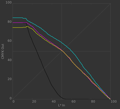
To compensate for the tonal changes between your output image and what you see on paper requires changing in/out values in a non-linear and non-simple way, i.e. curves.
Yes, not so long ago, I wanted a slider to do it for me. But then, I learned the simple concept of the curve, and now I’m at the point where I’m going to remove the Brightness, Contrast, Shadows, and HIghlights slider tools (the latter two really never worked well, anyway) from the rawproc (that’s my hack software) menu. All they do anyway is to take the slider reading, build a curve from it and apply.
With a curve, when you put a control point in the middle and just move it up a bit, you know that the image will get brighter, but you also know the effect tapers off as the brighter and darker tones are manipulated, because the curved line is still anchored at the bottom-left and top-right of the curve pane. It’s really good visual feedback regarding what you’re doing to your image.