Is this call for requests to show how color balance can mimic certain styles? If so, as no one else has yet replied, I’ll be greedy and kick things off with two requests.
Can we make this play raw:
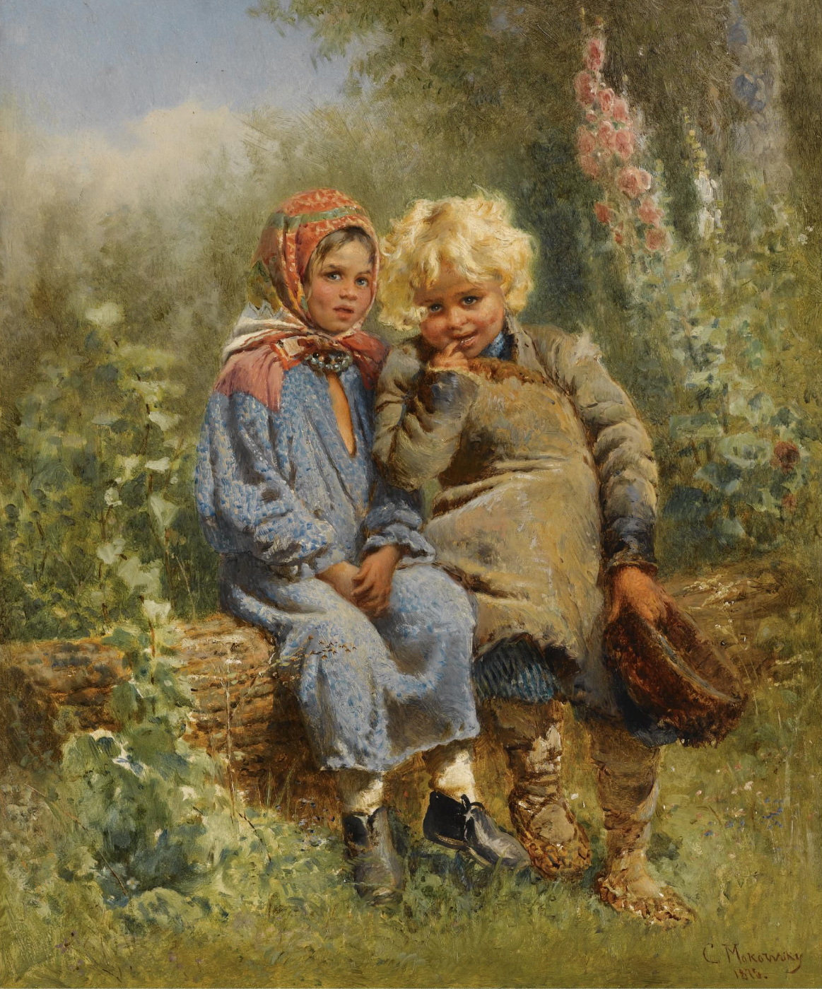
Look like 1) An Oil Painting
And 2) An Autochrome
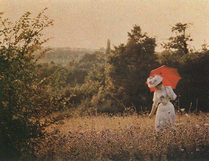
Reference images were purposefully chosen to have colours similar to the raw, and because it is easier for me to show a visual example of desired look and feel, rather than explain with words.
However Autochromes are known for having saturated reds (compared to other autochrome colours) with a tendency towards orange, and desaturated blues with a tendency towards violet. Less contrasty than modern photography and slightly dark or underexposed. A number of interesting gamut plots (limited to srgb) can be seen at this link (scroll down a short way until you see the autochrome heading): http://1.bp.blogspot.com/-UfDLmqK-yR4/TtQsDjPJEhI/AAAAAAAAF6Q/gQRNq78OWVo/s1600/Colors+found+in+example+Autochromes.png

Such as:

Hope I have understood the purpose of the thread correctly, and am not wasting your time.
Edit: As this is about the color balance module, I am interested in the colour and tone, not the texture like blur, grain or brush strokes.