I didn’t notice before (probably only obvious if there is both text above and below). May I ask why you chose it like that?
It’s a “tradition” in matting. For explanation see for example here.
I just played around with it and liked the look.
1 Like
What I was taught at uni (all those years ago when I was an art major) – and with which I agree – is the larger bottom border is visually heavier and provides “visual gravity” to stabilize the image in its environment. Now whether that’s desired or not is a completely separate question.
3 Likes
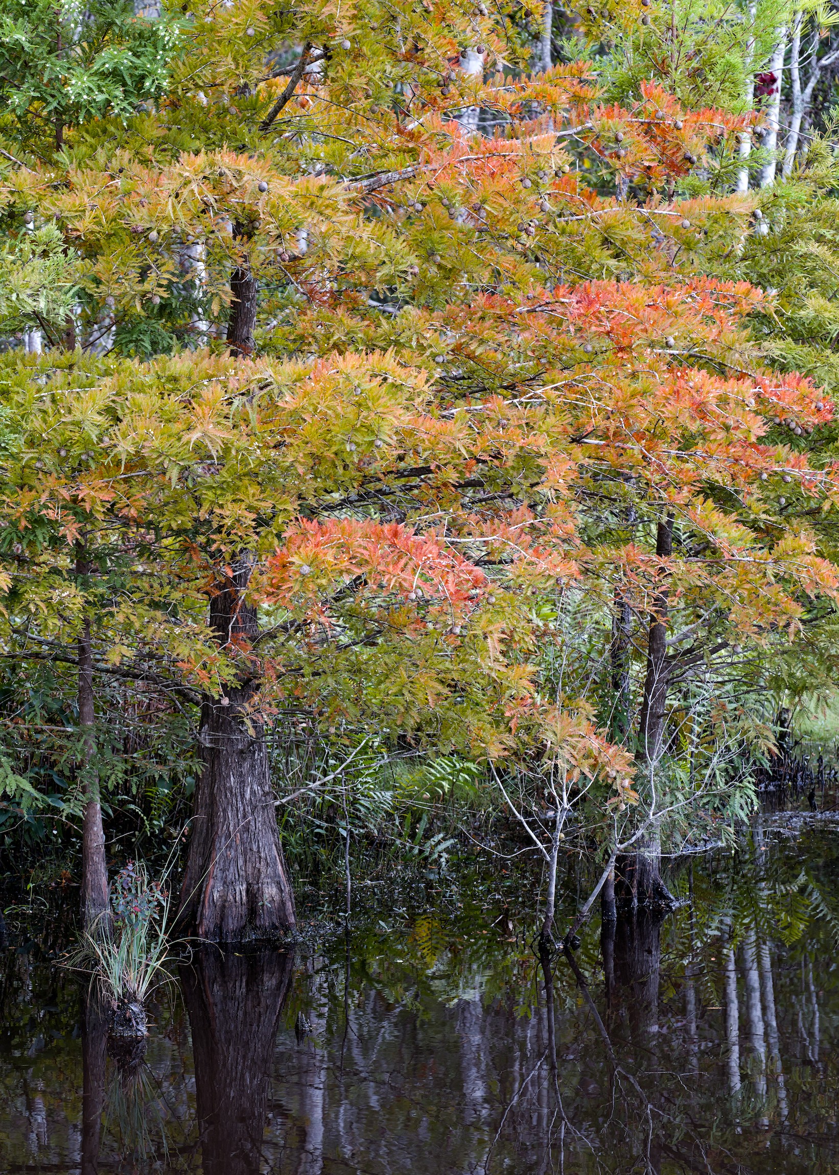
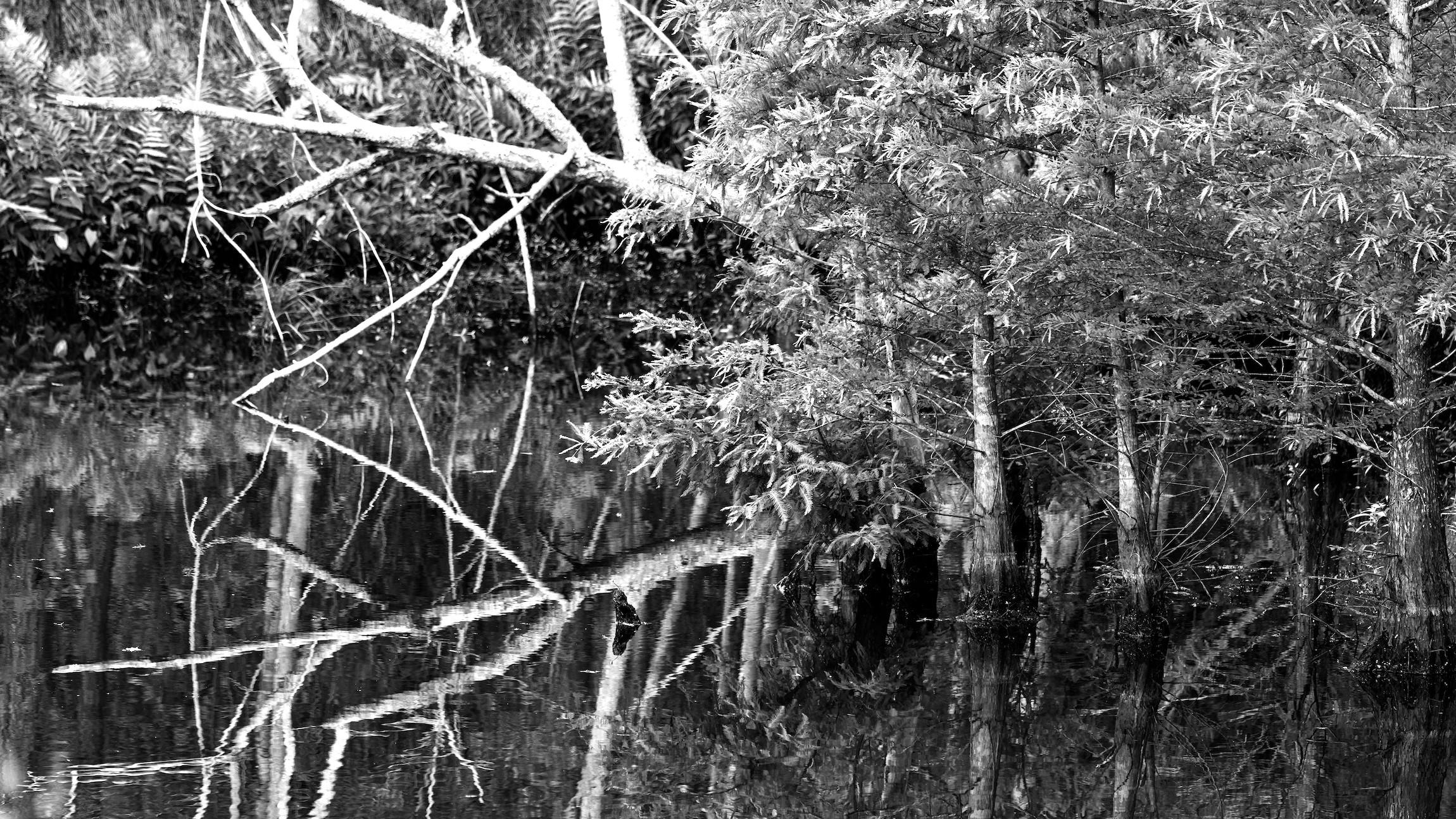
when my wife joined a wine tasting today, i was supposed to pick her up. I luckily had my cam and a stand at 11.00 pm:
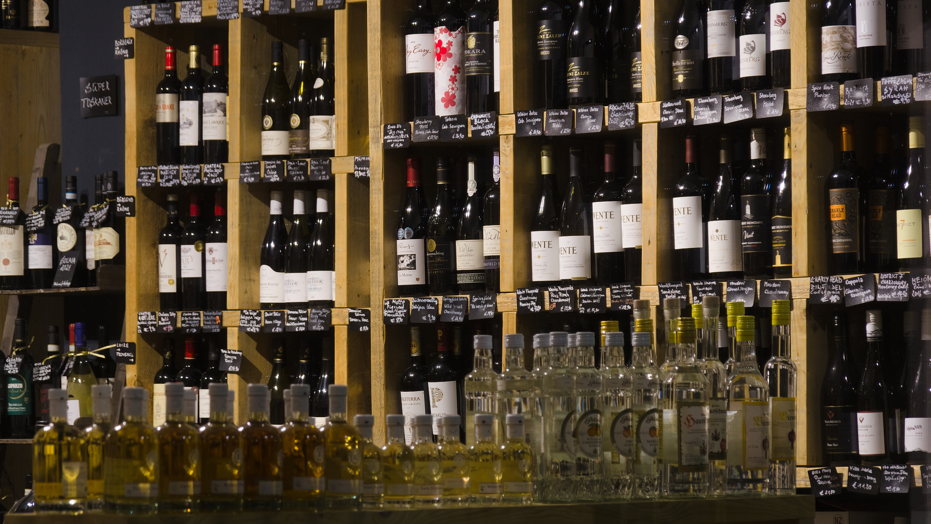
5 Likes