DSC_5188 showcase.jpg.out.pp3 (62.3 KB)
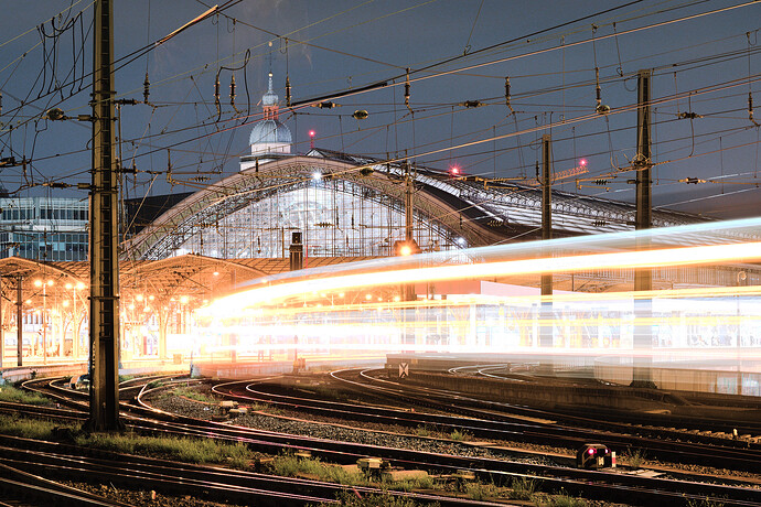
This image was taken in 2023. I posted a PlayRaw the same night because I sensed that there was something good to salvage from this exposure.
For reference, here’s a similar crop from the JPG OCC:
After editing the image on and off but never being quite satisfied, I had all but written it off at least in the sense of not editing it further because I simply lacked the editing skills.
Then in December 2024 I learned that a dear colleague of mine would soon be leaving our facility for a position in upper management. He has always been very very supportive with regard to my fledgling photography hobby, always encouraging me to keep at it. So it was clear that I wanted to gift him a print as a farewell present, and in looking over my hard drives, I rediscovered this shot. (It’s thematically fitting because Cologne Central Station is where our daily commute paths joined and diverged, respectively, and also train tracks are generally a good metaphor for how life paths join and diverge yada yada.)
Over the past month, I’ve spent WAY too much time looking at this image and part of the reason I’m now posting this as my first contribution to the Showcase category is that I need closure on this. When you stare at one image for too long, you lose all perspective on what actually looks good or plausible.
Imho I’ve finally nailed it with the version posted above. If you feel like trying your hand, you’re very welcome to add your version(s) to the PlayRaw linked above. Also, I’m still convinced that a professional could get a far better result regardless of the software used, and probably in much less time than it took me.
Nonetheless I’m quite happy that I achieved this edit exclusively using RawTherapee (5.11) which can evidently produce absolutely outstanding results, especially in aesthetically neutral technical image processing (maybe some other programs are more convenient and/or more powerful when it comes to more creative processing approaches).
Working on this image has taught me that the biggest obstacle is often neither the hardware nor the software used but instead getting accustomed (and therefore blind!) to settings. It’s definitely worthwhile to occasionally turn all modules on and off, and to play around with their settings, just to combat such effects. Some of my best breakthroughs in image processing (not just on this one) have come about when I finally adjusted that tonecurve which I thought was already optimal, or when disabling a module that I thought was integral to the edit.
Btw, on my way to this edit, I have to give some well-deserved credit to @Popanz, who provided helpful advice when I felt completely stuck.
So yeah, it’s not a grand opus or anything, but I’m happy enough with this version that I’m posting it here and declaring the image finished.
- Edit 1: obligatorily forgot the pp3
- Edit 2: replaced the JPG OOC because I had left some modules on in RT
- Edit 3: a few words


